In estimating global average temperatures there are a number of different measures to choose from. The UNIPCC tends to favour the British Hadley Centre HADCRUT data. Many of those who believe in the anthropogenic global warming hypothesis have a propensity to believe in the alternative NASA Goddard Institute for Space Studies data. Sceptics criticize GISTEMP due to its continual changes, often in the direction of supporting climate alarmism.
I had downloaded both sets of annual data in April 2011, and also last week. In comparing the two sets of data I noticed something remarkable. Over the last three years the two data sets have converged. The two most significant areas of convergence are in the early twentieth century warming phase (roughly 1910-1944) and the period 1998 to 2010. This convergence is mostly GISTEMP coming into line with HADCRUT. In doing so, it now diverges more from the rise in CO2.
In April 2011 I downloaded the HACRUT3 data, along with GISTEMP. The GISTEMP data carries the same name, but the Hadley centre now has replaced the HADCRUT3 data set with HADCRUT4. Between the two data sets and over just three years, one would expect the four sets of data to be broadly in agreement. To check this I plotted the annual average anomalies figures below.
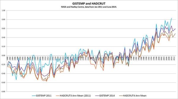
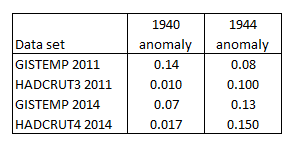
The GISTEMP 2011 annual mean data, (in light blue) appears to be an outlier of the four data sets. This is especially for the periods 1890-1940 and post 2000.
To emphasise this, I found the difference between data sets, then plotted the five tear centred moving average of the data.
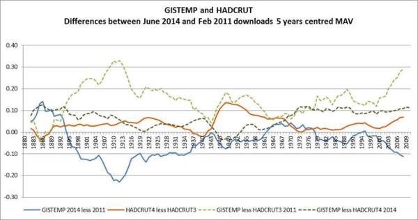
The light green dotted line shows the divergence in data sets three years ago. From 1890 to 1910 the divergence goes from zero to 0.3 degrees. This reduces to almost zero in the early 1940s, increases to 1950, reduces to the late 1960s. From 2000 to 2010 the divergence increases markedly. The current difference, shown by the dark green dotted line shows much greater similarities. The spike around 1910 has disappeared, as has the divergence in the last decade. These changes are more due to changes in GISTEMP (solid blue line) that HADCRUT (solid orange).
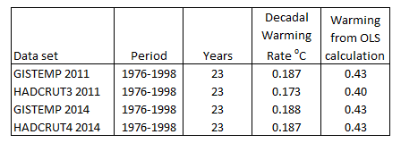
To see these changes more clearly, I applied OLS to the warming periods. The start of the period I took as the lowest year at the start, and the end point as the peak. The results of the early twentieth century were as follows:-
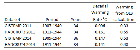
GISTEMP 2011 is the clear outlier for three reasons. First it has the most inconsistent measured warming, just 60-70% of the other figures. Second is that the beginning low point is the most inconsistent. Third is the only data set not to have 1944 as the peak of the warming cycle. The anomalies are below.
There were no such issues of start and end of the late twentieth century warming periods, shown below.
There is a great deal of conformity between these data sets. This is not the case for 1998-2010.
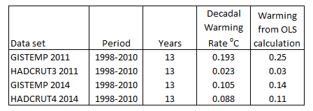
The GISTEMP 2011 figures seemed oblivious to the sharp deceleration in warming that occurred post 1998, which was also showing in satellite data. This has now been corrected in the latest figures.
The combined warming from 1976 to 2010 reported by the four data sets is as follows.
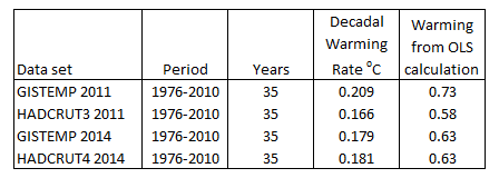
GISTEMP 2011 is the clear outlier here, this time being the highest of the four data sets. Different messages from the two warming periods can be gleaned by looking across the four data sets.
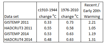
GISTEMP 2011 gives the impression of accelerating warming, consistent with the rise in atmospheric CO2 levels. HADCRUT3 suggests that rising CO2 has little influence on temperature, at least without demonstrating another warming element that was present in early part of the twentieth century and not in the latter part. The current data sets lean more towards HADCRUT3 2011 than GISTEMP 2011. Along with the clear pause from 1944 to 1976, it could explain why this is not examined too closely by the climate alarmists. The exception is by DANA1981 at Skepticalscience.com, who tries to account for the early twentieth century warming by natural factors. As it is three years old, it would be interesting to see an update based on more recent data.
What is strongly apparent from recent changes, is that the GISTEMP global surface temperature record contained errors, or inferior methods, that have now been corrected. That does not necessarily mean that it is a more accurate representation of the real world, but that it is more consistent with the British data sets, and less consistent strong forms of the global warming hypothesis.
Kevin Marshall