Defining “Temperature Homogenisation”

Summary

The standard definition of temperature homogenisation is of a process that cleanses the temperature data of measurement biases to only leave only variations caused by real climatic or weather variations. This is at odds with GHCN & GISS adjustments which delete some data and add in other data as part of the homogenisation process. A more general definition is to make the data more homogenous, for the purposes of creating regional and global average temperatures. This is only compatible with the standard definition if assume that there are no real data trends existing within the homogenisation area. From various studies it is clear that there are cases where this assumption does not hold good. The likely impacts include:-

  • Homogenised data for a particular temperature station will not be the cleansed data for that location. Instead it becomes a grid reference point, encompassing data from the surrounding area.
  • Different densities of temperature data may lead to different degrees to which homogenisation results in smoothing of real climatic fluctuations.

Whether or not this failure of understanding is limited to a number of isolated instances with a near zero impact on global temperature anomalies is an empirical matter that will be the subject of my next post.

Introduction

A common feature of many concepts involved with climatology, the associated policies and sociological analyses of non-believers, is a failure to clearly understand of the terms used. In the past few months it has become evident to me that this failure of understanding extends to term temperature homogenisation. In this post I look at the ambiguity of the standard definition against the actual practice of homogenising temperature data.

The Ambiguity of the Homogenisation Definition

The World Meteorological Organisation in its’ 2004 Guidelines on Climate Metadata and Homogenization1 wrote this explanation.

Climate data can provide a great deal of information about the atmospheric environment that impacts almost all aspects of human endeavour. For example, these data have been used to determine where to build homes by calculating the return periods of large floods, whether the length of the frost-free growing season in a region is increasing or decreasing, and the potential variability in demand for heating fuels. However, for these and other long-term climate analyses –particularly climate change analyses– to be accurate, the climate data used must be as homogeneous as possible. A homogeneous climate time series is defined as one where variations are caused only by variations in climate.

Unfortunately, most long-term climatological time series have been affected by a number of nonclimatic factors that make these data unrepresentative of the actual climate variation occurring over time. These factors include changes in: instruments, observing practices, station locations, formulae used to calculate means, and station environment. Some changes cause sharp discontinuities while other changes, particularly change in the environment around the station, can cause gradual biases in the data. All of these inhomogeneities can bias a time series and lead to misinterpretations of the studied climate. It is important, therefore, to remove the inhomogeneities or at least determine the possible error they may cause.

That is temperature homogenisation is necessary to isolate and remove what Steven Mosher has termed measurement biases2, from the real climate signal. But how does this isolation occur?

Venema et al 20123 states the issue more succinctly.

The most commonly used method to detect and remove the effects of artificial changes is the relative homogenization approach, which assumes that nearby stations are exposed to almost the same climate signal and that thus the differences between nearby stations can be utilized to detect inhomogeneities (Conrad and Pollak, 1950). In relative homogeneity testing, a candidate time series is compared to multiple surrounding stations either in a pairwise fashion or to a single composite reference time series computed for multiple nearby stations. (Italics mine)

Blogger …and Then There’s Physics (ATTP) partly recognizes these issues may exist in his stab at explaining temperature homogenisation4.

So, it all sounds easy. The problem is, we didn’t do this and – since we don’t have a time machine – we can’t go back and do it again properly. What we have is data from different countries and regions, of different qualities, covering different time periods, and with different amounts of accompanying information. It’s all we have, and we can’t do anything about this. What one has to do is look at the data for each site and see if there’s anything that doesn’t look right. We don’t expect the typical/average temperature at a given location at a given time of day to suddenly change. There’s no climatic reason why this should happen. Therefore, we’d expect the temperature data for a particular site to be continuous. If there is some discontinuity, you need to consider what to do. Ideally you look through the records to see if something happened. Maybe the sensor was moved. Maybe it was changed. Maybe the time of observation changed. If so, you can be confident that this explains the discontinuity, and so you adjust the data to make it continuous.

What if there isn’t a full record, or you can’t find any reason why the data may have been influenced by something non-climatic? Do you just leave it as is? Well, no, that would be silly. We don’t know of any climatic influence that can suddenly cause typical temperatures at a given location to suddenly increase or decrease. It’s much more likely that something non-climatic has influenced the data and, hence, the sensible thing to do is to adjust it to make the data continuous. (Italics mine)

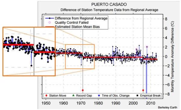
The assumption of a nearby temperature stations have the same (or very similar) climatic signal, if true would mean that homogenisation would cleanse the data of the impurities of measurement biases. But there is only a cursory glance given to the data. For instance, when Kevin Cowtan gave an explanation of the fall in average temperatures at Puerto Casado neither he, nor anyone else, checked to see if the explanation stacked up beyond checking to see if there had been a documented station move at roughly that time. Yet the station move is at the end of the drop in temperatures, and a few minutes checking would have confirmed that other nearby stations exhibit very similar temperature falls5. If you have a preconceived view of how the data should be, then a superficial explanation that conforms to that preconception will be sufficient. If you accept the authority of experts over personally checking for yourself, then the claim by experts that there is not a problem is sufficient. Those with no experience of checking the outputs following processing of complex data will not appreciate the issues involved.

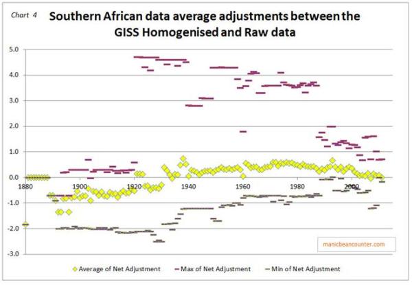
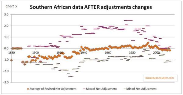
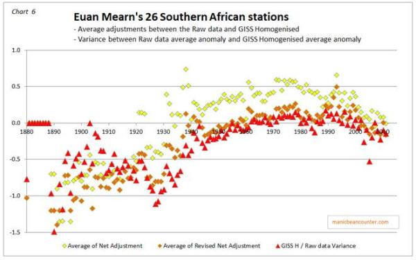
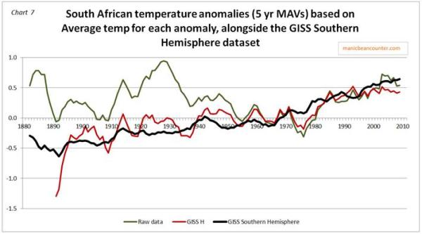
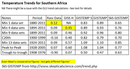
However, this definition of homogenisation appears to be different from that used by GHCN and NASA GISS. When Euan Mearns looked at temperature adjustments in the Southern Hemisphere and in the Arctic6, he found numerous examples in the GHCN and GISS homogenisations of infilling of some missing data and, to a greater extent, deleted huge chunks of temperature data. For example this graphic is Mearns’ spreadsheet of adjustments between GHCNv2 (raw data + adjustments) and the GHCNv3 (homogenised data) for 25 stations in Southern South America. The yellow cells are where V2 data exist V3 not; the greens cells V3 data exist where V2 data do not.

Definition of temperature homogenisation

A more general definition that encompasses the GHCN / GISS adjustments is of broadly making the data homogenous. It is not done by simply blending the data together and smoothing out the data. Homogenisation also adjusts anomalous data as a result of pairwise comparisons between local temperature stations, or in the case of extreme differences in the GHCN / GISS deletes the most anomalous data. This is a much looser and broader process than homogenisation of milk, or putting some food through a blender.

The definition I cover in more depth in the appendix.

The Consequences of Making Data Homogeneous

A consequence of cleansing the data in order to make it more homogenous gives a distinction that is missed by many. This is due to making the strong assumption that there are no climatic differences between the temperature stations in the homogenisation area.

Homogenisation is aimed at adjusting for the measurement biases to give a climatic reading for the location where the temperature station is located that is a closer approximation to what that reading would be without those biases. With the strong assumption, making the data homogenous is identical to removing the non-climatic inhomogeneities. Cleansed of these measurement biases the temperature data is then both the average temperature readings that would have been generated if the temperature station had been free of biases and a representative location for the area. This latter aspect is necessary to build up a global temperature anomaly, which is constructed through dividing the surface into a grid. Homogenisation, in the sense of making the data more homogenous by blending is an inappropriate term. All what is happening is adjusting for anomalies within the through comparisons with local temperature stations (the GHCN / GISS method) or comparisons with an expected regional average (the Berkeley Earth method).

But if the strong assumption does not hold, homogenisation will adjust these climate differences, and will to some extent fail to eliminate the measurement biases. Homogenisation is in fact made more necessary if movements in average temperatures are not the same and the spread of temperature data is spatially uneven. Then homogenisation needs to not only remove the anomalous data, but also make specific locations more representative of the surrounding area. This enables any imposed grid structure to create an estimated average for that area through averaging the homogenized temperature data sets within the grid area. As a consequence, the homogenised data for a temperature station will cease to be a closer approximation to what the thermometers would have read free of any measurement biases. As homogenisation is calculated by comparisons of temperature stations beyond those immediately adjacent, there will be, to some extent, influences of climatic changes beyond the local temperature stations. The consequences of climatic differences within the homogenisation area include the following.

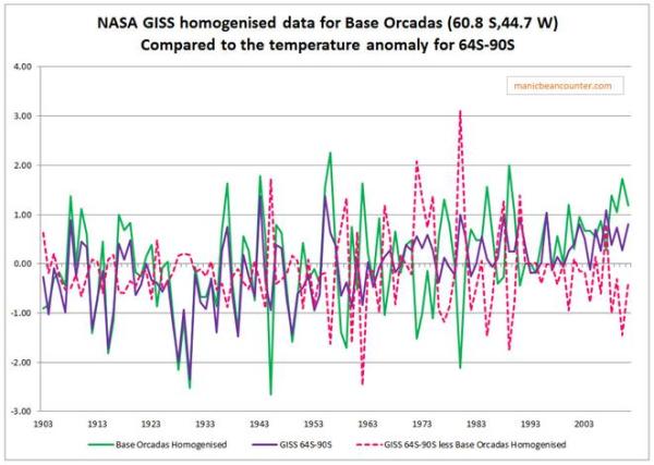
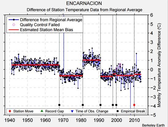
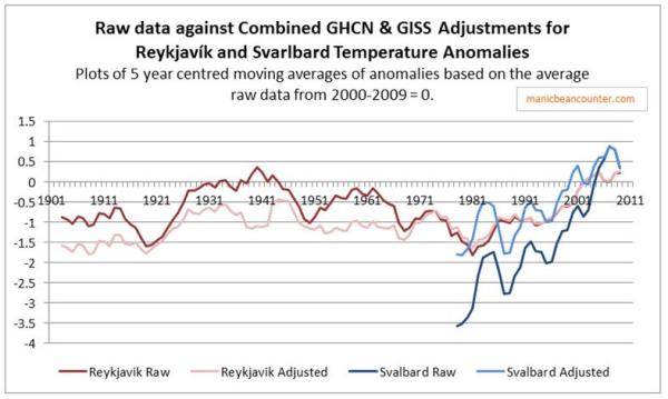
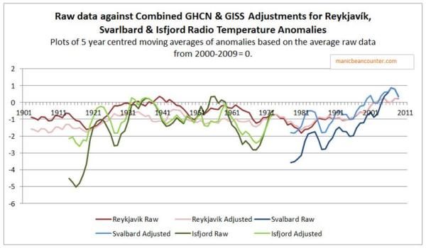
  • The homogenised temperature data for a location could appear largely unrelated to the original data or to the data adjusted for known biases. This could explain the homogenised Reykjavik temperature, where Trausti Jonsson of the Icelandic Met Office, who had been working with the data for decades, could not understand the GHCN/GISS adjustments7.
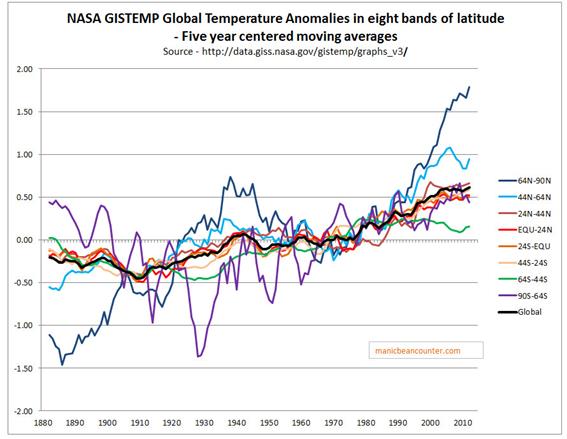
  • The greater the density of temperature stations in relation to the climatic variations, the less that climatic variations will impact on the homogenisations, and the greater will be the removal of actual measurement biases. Climate variations are unlikely to be much of an issue with the Western European and United States data. But on the vast majority of the earth’s surface, whether land or sea, coverage is much sparser.
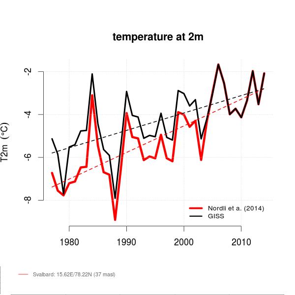
  • If the climatic variation at a location is of different magnitude to that of other locations in the homogenisation area, but over the same time periods and direction, then the data trends will be largely retained. For instance, in Svarlbard the warming temperature trends of the early twentieth century and from the late 1970s were much greater than elsewhere, so were adjusted downwards8.
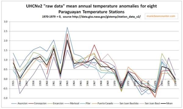
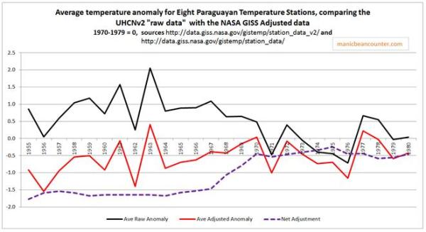
  • If there are differences in the rate of temperature change, or the time periods for similar changes, then any “anomalous” data due to climatic differences at the location will be eliminated or severely adjusted, on the same basis as “anomalous” data due to measurement biases. For instance in large part of Paraguay at the end of the 1960s average temperatures by around 1oC. Due to this phenomena not occurring in the surrounding areas both the GHCN and Berkeley Earth homogenisation processes adjusted out this trend. As a consequence of this adjustment, a mid-twentieth century cooling in the area was effectively adjusted to out of the data9.
  • If a large proportion of temperature stations in a particular area have consistent measurement biases, then homogenisation will retain those biases, as it will not appear anomalous within the data. For instance, much of the extreme warming post 1950 in South Korea is likely to have been as a result of urbanization10.

Other Comments

Homogenisation is just part of the process of adjusting data for the twin purposes of attempting to correct for biases and building a regional and global temperature anomalies. It cannot, for instance, correct for time of observation biases (TOBS). This needs to be done prior to homogenisation. Neither will homogenisation build a global temperature anomaly. Extrapolating from the limited data coverage is a further process, whether for fixed temperature stations on land or the ship measurements used to calculate the ocean surface temperature anomalies. This extrapolation has further difficulties. For instance, in a previous post11 I covered a potential issue with the Gistemp proxy data for Antarctica prior to permanent bases being established on the continent in the 1950s. Making the data homogenous is but the middle part of a wider process.

Homogenisation is a complex process. The Venema et al 20123 paper on the benchmarking of homogenisation algorithms demonstrates that different algorithms produce significantly different results. What is clear from the original posts on the subject by Paul Homewood and the more detailed studies by Euan Mearns and Roger Andrews at Energy Matters, is that the whole process of going from the raw monthly temperature readings to the final global land surface average trends has thrown up some peculiarities. In order to determine whether they are isolated instances that have near zero impact on the overall picture, or point to more systematic biases that result from the points made above, it is necessary to understand the data available in relation to the overall global picture. That will be the subject of my next post.

Kevin Marshall

Notes

  1. GUIDELINES ON CLIMATE METADATA AND HOMOGENIZATION by Enric Aguilar, Inge Auer, Manola Brunet, Thomas C. Peterson and Jon Wieringa
  2. Steven Mosher – Guest post : Skeptics demand adjustments 09.02.2015
  3. Venema et al 2012 – Venema, V. K. C., Mestre, O., Aguilar, E., Auer, I., Guijarro, J. A., Domonkos, P., Vertacnik, G., Szentimrey, T., Stepanek, P., Zahradnicek, P., Viarre, J., Müller-Westermeier, G., Lakatos, M., Williams, C. N., Menne, M. J., Lindau, R., Rasol, D., Rustemeier, E., Kolokythas, K., Marinova, T., Andresen, L., Acquaotta, F., Fratianni, S., Cheval, S., Klancar, M., Brunetti, M., Gruber, C., Prohom Duran, M., Likso, T., Esteban, P., and Brandsma, T.: Benchmarking homogenization algorithms for monthly data, Clim. Past, 8, 89-115, doi:10.5194/cp-8-89-2012, 2012.
  4. …and Then There’s Physics – Temperature homogenisation 01.02.2015
  5. See my post Temperature Homogenization at Puerto Casado 03.05.2015
  6. For example

    The Hunt For Global Warming: Southern Hemisphere Summary

    Record Arctic Warmth – in 1937

  7. See my post Reykjavik Temperature Adjustments – a comparison 23.02.2015
  8. See my post RealClimate’s Mis-directions on Arctic Temperatures 03.03.2015
  9. See my post Is there a Homogenisation Bias in Paraguay’s Temperature Data? 02.08.2015
  10. NOT A LOT OF PEOPLE KNOW THAT (Paul Homewood) – UHI In South Korea Ignored By GISS 14.02.2015

Appendix – Definition of Temperature Homogenisation

When discussing temperature homogenisations, nobody asks what the term actual means. In my house we consume homogenised milk. This is the same as the pasteurized milk I drank as a child except for one aspect. As a child I used to compete with my siblings to be the first to open a new pint bottle, as it had the cream on top. The milk now does not have this cream, as it is blended in, or homogenized, with the rest of the milk. Temperature homogenizations are different, involving changes to figures, along with (at least with the GHCN/GISS data) filling the gaps in some places and removing data in others1.

But rather than note the differences, it is better to consult an authoritative source. From Dictionary.com, the definitions of homogenize are:-

verb (used with object), homogenized, homogenizing.

  1. to form by blending unlike elements; make homogeneous.
  2. to prepare an emulsion, as by reducing the size of the fat globules in (milk or cream) in order to distribute them equally throughout.
  3. to make uniform or similar, as in composition or function:

    to homogenize school systems.

  4. Metallurgy. to subject (metal) to high temperature to ensure uniform diffusion of components.

Applying the dictionary definitions, data homogenization in science is not about blending various elements together, nor about additions or subtractions from the data set, or adjusting the data. This is particularly true in chemistry.

For UHCN and NASA GISS temperature data homogenization involves removing or adjusting elements in the data that are markedly dissimilar from the rest. It can also mean infilling data that was never measured. The verb homogenize does not fit the processes at work here. This has led to some, like Paul Homewood, to refer to the process as data tampering or worse. A better idea is to look further at the dictionary.

Again from Dictionary.com, the first two definitions of the adjective homogeneous are:-

  1. composed of parts or elements that are all of the same kind; not heterogeneous:

a homogeneous population.

  1. of the same kind or nature; essentially alike.

I would suggest that temperature homogenization is a loose term for describing the process of making the data more homogeneous. That is for smoothing out the data in some way. A false analogy is when I make a vegetable soup. After cooking I end up with a stock containing lumps of potato, carrot, leeks etc. I put it through the blender to get an even constituency. I end up with the same weight of soup before and after. A similar process of getting the same after homogenization as before is clearly not what is happening to temperatures. The aim of making the data homogenous is both to remove anomalous data and blend the data together.

Ivanpah Solar Project Still Failing to Achieve Potential

Paul Homewood yesterday referred to a Marketwatch report titled “High-tech solar projects fail to deliver.” This was reposted at Tallbloke.

Marketwatch looks at the Ivanpah solar project. They comment

The $2.2 billion Ivanpah solar power project in California’s Mojave Desert is supposed to be generating more than a million megawatt-hours of electricity each year. But 15 months after starting up, the plant is producing just 40% of that, according to data from the U.S. Energy Department.

I looked at the Ivanpah solar project last fall, when the investors applied for a $539million federal grant to help pay off a $1.5 billion federal loan. One of the largest investors was Google, who at the end of 2013 had Cash, Cash Equivalents & Marketable Securities of $58,717million, $10,000million than the year before.

Technologically the Ivanpah plant seems impressive. It is worth taking a look at the website.

That might have been the problem. The original projections were for 1065,000 MWh annually from a 392 MW nameplate implying a planned output of 31% of capacity. When I look at the costings on Which? for solar panels on the roof of a house, they assume just under 10% of capacity. Another site, Wind and Sun UK, say

1 kWp of well sited PV array in the UK will produce 700-800 kWh of electricity per year.

That is around 8-9.5% of capacity. Even considering the technological superiority of the project and the climatic differences, three times is a bit steep, although 12.5% (40% of 31%) is very low. From Marketwatch some of the difference is can be explained by

  • Complex equipment constantly breaking down
  • Optimization of complex new technologies
  • Steam pipes leaking due to vibrations
  • Generating the initial steam takes longer than expected
  • It is cloudier than expected

However, even all of this cannot account for the output only being at 40% of expected. With the strong sun of the desert I would expect daily output to never exceed 40% of theoretical, as it is only daylight for 50% of the time, and just after sunrise and before sunset the sun is less strong than at midday. As well as the teething problems with complex technology, it appears that the engineers were over optimistic. A lack of due diligence in appraising the scheme – a factor common to many large scale Government backed initiatives – will have let the engineers have the finance for a fully scaled-up version of what should have been a small-scale project to prove the technology.


Base Orcadas as a Proxy for early Twentieth Century Antarctic Temperature Trends

Temperature trends vary greatly across different parts of the globe, an aspect that is not recognized when homogenizing temperatures. At a top level NASA GISS usefully split their global temperature anomaly into eight bands of latitude. I have graphed the five year moving averages for each band, along with the Gistemp global anomaly in Figure 1.

Figure 1. Gistemp global temperature anomalies by band of latitude.

The biggest oddity is the 64S-90S band. This bottom slice of the globe roughly equates to Antarctica, which is South of 66°34′S. Not only was there massive cooling until 1930 – in contradiction to the global trend – but prior to the 1970 was very large volatility in temperatures, despite my using five year moving averages. Looking at the GHCN database of weather stations, there none listed in Antarctica until Rothera point started collecting data in 1946, as shown in Figure 21.

Figure 2. A selection of temperature anomalies in the Antarctica. The most numerous are either on the Antarctic Pennisula, or the islands just to the North.

The only long record is at Base Orcadas located at (60.8 S 44.7 W). I have graphed the GISS homogenised temperature anomaly data for station 701889680000 with the Gistemp 64S-90S band in Figure 3.

Figure 3. Gistemp 64S-90S annual temperature anomaly compared to Base Orcadas GISS homogenised data.

There is a remarkable similarity in the data sets until 1950, after which they appear unrelated. This suggests that in the absence of other data, Base Orcadas was the principle element in creating a proxy for the missing Antarctic data, despite it being located outside the area, and not being related to the actual data for well over half a century. The outcome is to bias the overall global temperature anomaly by suppressing the early twentieth century warming, making the late twentieth century warming appear relatively greater than is the underlying reality2. The error is due to assuming that temperature trends are the same at different latitudes are the same, an assumption that the homogenised data shows to be false.

Kevin Marshall


Notes

  1. Also in Antarctica (but not listed) there has been data collected at Amundsen-Scot base at the South Pole (90.0 S 0.0 E) since 1957, and at Vostok base (78.5 S 106.9 E) since 1958.
  2. Removing the Antarctic data would increase both the early twentieth century and post 1975 warming periods. But, given that 64S-90S is 5% of the global surface area, I estimate it would increase the earlier warming trends by 5-10% as against 1-3% for the later trend.


Temperature Homogenization at Puerto Casado

Summary

The temperature homogenizations for the Paraguay data within both the BEST and UHCN/Gistemp surface temperature data sets points to a potential flaw within the temperature homogenization process. It removes real, but localized, temperature variations, creating incorrect temperature trends. In the case of Paraguay from 1955 to 1980, a cooling trend is turned into a warming trend. Whether this biases the overall temperature anomalies, or our understanding of climate variation, remains to be explored.


A small place in Mid-Paraguay, on the Brazil/Paraguay border has become the centre of focus of the argument on temperature homogenizations.

For instance here is Dr Kevin Cowtan, of the Department of Chemistry at the University of York, explaining the BEST adjustments at Puerto Casado.

Cowtan explains at 6.40

In a previous video we looked at a station in Paraguay, Puerto Casado. Here is the Berkeley Earth data for that station. Again the difference between the station record and the regional average shows very clear jumps. In this case there are documented station moves corresponding to the two jumps. There may be another small change here that wasn’t picked up. The picture for this station is actually fairly clear.

The first of these “jumps” was a fall in the late 1960s of about 1oC. Figure 1 expands the section of the Berkeley Earth graph from the video, to emphasise this change.

Figure 1 – Berkeley Earth Temperature Anomaly graph for Puerto Casado, with expanded section showing the fall in temperature and against the estimated mean station bias.

The station move is after the fall in temperature.

Shub Niggareth looked at the metadata on the actual station move concluding

IT MOVED BECAUSE THERE IS CHANGE AND THERE IS A CHANGE BECAUSE IT MOVED

That is the evidence of the station move was vague. The major evidence was the fall in temperatures. Alternative evidence is that there were a number of other stations in the area exhibiting similar patterns.

But maybe there was some, unknown, measurement bias (to use Steven Mosher’s term) that would make this data stand out from the rest? I have previously looked eight temperature stations in Paraguay with respect to the NASA Gistemp and UHCN adjustments. The BEST adjustments for the stations, along another in Paul Homewood’s original post, are summarized in Figure 2 for the late 1960s and early 1970s. All eight have similar downward adjustment that I estimate as being between 0.8 to 1.2oC. The first six have a single adjustment. Asuncion Airport and San Juan Bautista have multiple adjustments in the period. Pedro Juan CA was of very poor data quality due to many gaps (see GHCNv2 graph of the raw data) hence the reason for exclusion.

GHCN Name

GHCN Location

BEST Ref

Break Type

Break Year


Concepcion

23.4 S,57.3 W

157453

Empirical

1969


Encarcion

27.3 S,55.8 W

157439

Empirical

1968


Mariscal

22.0 S,60.6 W

157456

Empirical

1970


Pilar

26.9 S,58.3 W

157441

Empirical

1967


Puerto Casado

22.3 S,57.9 W

157455

Station Move

1971


San Juan Baut

26.7 S,57.1 W

157442

Empirical

1970


Asuncion Aero

25.3 S,57.6 W

157448

Empirical

1969


Station Move

1972


Station Move

1973


San Juan Bautista

25.8 S,56.3 W

157444

Empirical

1965


Empirical

1967


Station Move

1971


Pedro Juan CA

22.6 S,55.6 W

19469

Empirical

1968


Empirical

3 in 1970s


Figure 2 – Temperature stations used in previous post on Paraguayan Temperature Homogenisations


Why would both BEST and UHCN remove a consistent pattern covering and area of around 200,000 km2? The first reason, as Roger Andrews has found, the temperature fall was confined to Paraguay. The second reason is suggested by the UHCNv2 raw data1 shown in figure 3.

Figure 3 – UHCNv2 “raw data” mean annual temperature anomalies for eight Paraguayan temperature stations, with mean of 1970-1979=0.

There was an average temperature fall across these eight temperature stations of about half a degree from 1967 to 1970, and over one degree by the mid-1970s. But it was not at the same time. The consistency is only show by the periods before and after as the data sets do not diverge. Any homogenisation program would see that for each year or month for every data set, the readings were out of line with all the other data sets. Now maybe it was simply data noise, or maybe there is some unknown change, but it is clearly present in the data. But temperature homogenisation should just smooth this out. Instead it cools the past. Figure 4 shows the impact average change resulting from the UHCN and NASA GISS homogenisations.

Figure 4 – UHCNv2 “raw data” and NASA GISS Homogenized average temperature anomalies, with the net adjustment.

A cooling trend for the period 1955-1980 has been turned into a warming trend due to the flaw in homogenization procedures.

The Paraguayan data on its own does not impact on the global land surface temperature as it is a tiny area. Further it might be an isolated incident or offset by incidences of understating the warming trend. But what if there are smaller micro climates that are only picked up by one or two temperature stations? Consider figure 5 which looks at the BEST adjustments for Encarnacion, one of the eight Paraguayan stations.

Figure 5 – BEST adjustment for Encarnacion.

There is the empirical break in 1968 from the table above, but also empirical breaks in the 1981 and 1991 that look to be exactly opposite. What Berkeley earth call the “estimated station mean bias” is as a result of actual deviations in the real data. Homogenisation eliminates much of the richness and diversity in the real world data. The question is whether this happens consistently. First we need to understand the term “temperature homogenization“.

Kevin Marshall

Notes

  1. The UHCNv2 “raw” data is more accurately pre-homogenized data. That is the raw data with some adjustments.

ATTP on Lomborg’s Australian Funding

Blogger …and then there’s physics (ATTP) joins in the hullabaloo about Bjorn Lomberg’s Lomborg’s Consensus Centre is getting A$4m of funding to set up a branch at the University of Western Australia. He says

However, ignoring that Lomborg appears to have a rather tenuous grasp on the basics of climate science, my main issue with what he says is its simplicity. Take all the problems in the world, determine some kind of priority ordering, and then start at the top and work your way down – climate change, obviously, being well down the list. It’s as if Lomborg doesn’t realise that the world is a complex place and that many of the problems we face are related. We can’t necessarily solve something if we don’t also try to address many of the other issues at the same time. It’s this kind of simplistic linear thinking – and that some seem to take it seriously – that irritates me most.

The comment about climatology is just a lead in. ATTP is expressing a normative view about the interrelationship of problems, along with beliefs about the solution. What he is rejecting as simplistic is the method of identifying the interrelated issues separately, understanding the relative size of the problems along with the effectiveness and availability of possible solutions and then prioritizing them.

This errant notion is exacerbated when ATTP implies that Lomborg has received the funding. Lomborg heads up the Copenhagen Consensus Centre and it is they who have received the funding to set up a branch in Australia. This description is from their website

We work with some of the world’s top economists (including 7 Nobel Laureates) to research and publish the smartest solutions to global challenges. Through social, economic and environmental benefit-cost research, we show policymakers and philanthropists how to do the most good for each dollar spent.

It is about bringing together some of the best minds available to understand the problems of the world. It is then to persuade those who are able to do something about the issues. It is not Lomborg’s personal views that are present here, but people with different views and from different specialisms coming together to argue and debate. Anyone who has properly studied economics will soon learn that there are a whole range of different views, many of them plausible. Some glimpse that economic systems are highly interrelated in ways that cannot be remotely specified, leading to the conclusion that any attempt to create a computer model of an economic system will be a highly distorted simplification. At a more basic level they will have learnt that in the real world there are 200 separate countries, all with different priorities. In many there is a whole range of different voiced opinions about what the priorities should be at national, regional and local levels. To address all these interrelated issues together would require the modeller of be omniscient and omnipresent. To actually enact the modeller’s preferred policies over seven billion people would require a level of omnipotence that Stalin could only dream of.

This lack of understanding of economics and policy making is symptomatic of those who believe in climate science. They fail to realize that models are only an attempted abstraction of the real world. Academic economists have long recognized the abstract nature of the subject along with the presence of strong beliefs about the subject. As a result, in the last century many drew upon the rapidly developing philosophy of science to distinguish whether theories were imparting knowledge about the world or confirming beliefs. The most influential by some distance was Milton Friedman. In his seminal essay The Methodology of Positive Economics he suggested the way round this problem was to develop bold yet simple predictions from the theory that, despite being unlikely, are nevertheless come true. I would suggest that you do not need to be too dogmatic in the application. The bold predictions do not need to be right 100% of the time, but an entire research programme should be establishing a good track record over a sustained period. In climatology the bold predictions, that would show a large and increasing problem, have been almost uniformly wrong. For instance:-

  • The rate of melting of the polar ice caps has not accelerated.
  • The rate of sea level rise has not accelerated in the era of satellite measurements.
  • Arctic sea ice did not disappear in the summer of 2013.
  • Hurricanes did not get worse following Katrina. Instead there followed the quietest period on record.
  • Snow has not become a thing of the past in England, nor in Germany.

Other examples have been compiled by Pierre Gosselin at Notrickszone, as part of his list of climate scandals.

Maybe it is different in climatology. The standard response is that the reliability of the models is based on the strength of the consensus in support. This view is not proclaimed by ATTP. Instead from the name it would appear he believes the reliability can be obtained from the basic physics. I have not done any physics since high school and have forgotten most of what I learnt. So in discerning what is reality in that area I have to rely on the opinions of physicists themselves. One of the greatest physicists since Einstein was Richard Feynman. He said fifty years ago in a lecture on the Scientific Method

You cannot prove a vague theory wrong. If the guess that you make is poorly expressed and the method you have for computing the consequences is a little vague then ….. you see that the theory is good as it can’t be proved wrong. If the process of computing the consequences is indefinite, then with a little skill any experimental result can be made to look like an expected consequence.

Climate models, like economic models, will always be vague. This is not due to being poorly expressed (though they often are) but due to the nature of the subject. Short of rejecting climate models as utter nonsense, I would suggest the major way of evaluating whether they say something distinctive about the real world is on the predictive ability. But a consequence of theories always being vague in both economics and climate is you will not be able to use the models as a forecasting tool. As Freeman Dyson (who narrowly missed sharing a Nobel Prize with Feynman) recently said of climate models:-

These climate models are excellent tools for understanding climate, but that they are very bad tools for predicting climate. The reason is simple – that they are models which have very few of the factors that may be important, so you can vary one thing at a time ……. to see what happens – particularly carbon dioxide. But there are a whole lot of things that they leave out. ….. The real world is far more complicated than the models.

This implies that when ATTP is criticizing somebody else’s work with a simple model, or a third person’s work, he is likely criticizing them for looking at a highly complex issue in another way. Whether his way is better, worse or just different we have no way of knowing. All we can infer from his total rejection of ideas of experts in a field to which he lacks even a basic understanding, is that he has no basis of knowing either.

To be fair, I have not looked at the earlier part of ATTP’s article. For instance he says:-

If you want to read a defense of Lomborg, you could read Roger Pielke Jr’s. Roger’s article makes the perfectly reasonable suggestion that we shouldn’t demonise academics, but fails to acknowledge that Lomborg is not an academic by any standard definition…….

The place to look for a “standard definition” of a word is a dictionary. The noun definitions are

noun

8. a student or teacher at a college or university.

9. a person who is academic in background, attitudes, methods, etc.:

He was by temperament an academic, concerned with books and the arts.

10. (initial capital letter) a person who supports or advocates the Platonic school of philosophy.

This is Bjorn Lomborg’s biography from the Copenhagen Consensus website:-

Dr. Bjorn Lomborg is Director of the Copenhagen Consensus Center and Adjunct Professor at University of Western Australia and Visiting Professor at Copenhagen Business School. He researches the smartest ways to help the world, for which he was named one of TIME magazine’s 100 most influential people in the world. His numerous books include The Skeptical Environmentalist, Cool It, How to Spend $75 Billion to Make the World a Better Place and The Nobel Laureates’ Guide to the Smartest Targets for the World 2016-2030.

Lomborg meets both definitions 8 & 9, which seem to be pretty standard. Like with John Cook and William Connolley defining the word sceptic, it would appear that ATTP rejects the authority of those who write the dictionary. Or more accurately does not even to bother to look. Like with rejecting the authority of those who understand economics it suggests ATTP uses the authority of his own dogmatic beliefs as the standard by which to evaluate others.

Kevin Marshall

Freeman Dyson on Climate Models

One of the leading physicists on the planet, Freeman Dyson, has given a video interview to the Vancouver Sun. Whilst the paper emphasizes Dyson’s statements about the impact of more CO2 greening the Earth, there is something more fundamental that can be gleaned.

Referring to a friend who constructed the first climate models, Dyson says at about 10.45

These climate models are excellent tools for understanding climate, but that they are very bad tools for predicting climate. The reason is simple – that they are models which have very few of the factors that may be important, so you can vary one thing at a time ……. to see what happens – particularly carbon dioxide. But there are a whole lot of things that they leave out. ….. The real world is far more complicated than the models.

I believe that Climate Science has lost sight of what this understanding of what their climate models actually are literally attempts to understand the real world, but are not the real world at all. It reminds me of something another physicist spoke about fifty years ago. Richard Feynman, a contemporary that Dyson got to know well in the late 1940s and early 1950s said of theories:-

You cannot prove a vague theory wrong. If the guess that you make is poorly expressed and the method you have for computing the consequences is a little vague then ….. you see that the theory is good as it can’t be proved wrong. If the process of computing the consequences is indefinite, then with a little skill any experimental result can be made to look like an expected consequence.

Complex mathematical models suffer from this vagueness in abundance. When I see supporters of climate arguing the critics of the models are wrong by stating some simple model, and using selective data they are doing what lesser scientists and pseudo-scientists have been doing for decades. How do you confront this problem? Climate is hugely complex, so simple models will always fail on the predictive front. However, unlike Dyson I do not think that all is lost. The climate models have had a very bad track record due to climatologists not being able to relate their models to the real world. There are a number of ways they could do this. A good starting point is to learn from others. Climatologists could draw upon the insights from varied sources. With respect to the complexity of the subject matter, the lack of detailed, accurate data and the problems of prediction, climate science has much in common with economics. There are insights that can be drawn on prediction. One of the first empirical methodologists was the preeminent (or notorious) economist of the late twentieth century – Milton Friedman. Even without his monetarism and free-market economics, he would be known for his 1953 Essay “The Methodology of Positive Economics”. Whilst not agreeing with the entirety of the views expressed (there is no satisfactory methodology of economics) Friedman does lay emphasis on making simple, precise and bold predictions. It is the exact opposite of the Cook et al. survey which claims a 97% consensus on climate, implying that it relates to a massive and strong relationship between greenhouse gases and catastrophic global warming when in fact it relates to circumstantial evidence for a minimal belief in (or assumption of) the most trivial form of human-caused global warming. In relation to climate science, Friedman would say that it does not matter about consistency with the basic physics, nor how elegantly the physics is stated. It could be you believe that the cause of warming comes from the hot air produced by the political classes. What matters that you make bold predictions based on the models that despite being simple and improbable to the non-expert, nevertheless turn out to be true. However, where bold predictions have been made that appear to be improbable (such as worsening hurricanes after Katrina or the effective disappearance of Arctic Sea ice in late 2013) they have turned out to be false.

Climatologists could also draw upon another insight, held by Friedman, but first clearly stated by John Neville Keynes (father of John Maynard Keynes). That is on the need to clearly distinguish between the positive (what is) and the normative (what ought to be). But that distinction was alienate the funders and political hangers-on. It would also mean a clear split of the science and policy.

Hattips to Hilary Ostrov, Bishop Hill, and Watts up with that.


Kevin Marshall

Massive Exaggeration on Southern Alaskan Glacial ice melt

Paul Homewood has a lovely example of gross exaggeration on climate change. He has found the following quote from a University of Oregon study

Incessant mountain rain, snow and melting glaciers in a comparatively small region of land that hugs the southern Alaska coast and empties fresh water into the Gulf of Alaska would create the sixth largest coastal river in the world if it emerged as a single stream, a recent study shows.

Since it’s broken into literally thousands of small drainages pouring off mountains that rise quickly from sea level over a short distance, the totality of this runoff has received less attention, scientists say. But research that’s more precise than ever before is making clear the magnitude and importance of the runoff, which can affect everything from marine life to global sea level.

The collective fresh water discharge of this region is more than four times greater than the mighty Yukon River of Alaska and Canada, and half again as much as the Mississippi River, which drains all or part of 31 states and a land mass more than six times as large.

“Freshwater runoff of this magnitude can influence marine biology, near shore oceanographic studies of temperature and salinity, ocean currents, sea level and other issues,” said David Hill, lead author of the research and an associate professor in the College of Engineering at Oregon State University.

“This is an area of considerable interest, with its many retreating glaciers,” Hill added, “and with this data as a baseline we’ll now be able to better monitor how it changes in the future.” (Bold mine)

This implies that melting glaciers are a significant portion of the run-off. I thought I would check this out. From the yukoninfo website I find

The watershed’s total drainage area is 840 000 sq. km (323 800 sq. km in Canada) and it discharges 195 cubic kilometres of water per year.

Therefore the runoff is about 780 cubic kilometres per year.

From Wikipedia I find that the Mississippi River has an average annual discharge of 16,792 m3/s. This implies the average discharge into the Gulf of Alaska is about 25,000 m3/s. This equates to 90,000,000 m3 per hour or 2,160,000,000 m3 per day. That is 2.16 cubic kilometres per day, or 788 cubic kilometres per year. If this gross runoff was net, it would account for two thirds of the 3.2mm sea level rise recorded by the satellites. How much of this might be from glacial ice melt? This is quite difficult to estimate. From the UNIPCC AR5 WGI SPM of Sept-13 we have the following statement.

Since the early 1970s, glacier mass loss and ocean thermal expansion from warming together explain about 75% of the observed global mean sea level rise (high confidence). Over the period 1993 to 2010, global mean sea level rise is, with high confidence, consistent with the sum of the observed contributions from ocean thermal expansion due to warming (1.1 [0.8 to 1.4] mm yr–1), from changes in glaciers (0.76 [0.39 to 1.13] mm yr–1), Greenland ice sheet (0.33 [0.25 to 0.41] mm yr–1), Antarctic ice sheet (0.27 [0.16 to 0.38] mm yr–1), and land water storage (0.38 [0.26 to 0.49] mm yr–1). The sum of these contributions is 2.8 [2.3 to 3.4] mm yr–1. {13.3}

How much of this 0.76 mm yr–1 (around 275 cubic kilometres) is accounted for by Southern Alaska?

The author of the Oregon study goes onto say.

This is one of the first studies to accurately document the amount of water being contributed by melting glaciers, which add about 57 cubic kilometers of water a year to the estimated 792 cubic kilometers produced by annual precipitation in this region.

That is 20% (range 14-40%) of the global glacial ice melt outside of Greenland and Iceland is accounted for by Southern Alaska. Northern and Central Alaska, along with Northern Canada are probably far more significant. The Himalayan glaciers are huge, especially compared to the Alps or the Andes which are also meant to be melting. There might be glaciers in Northern Russia as well. Maybe 1%-10% of the global total comes from Southern Alaska, or 3 to 30 cubic kilometres per annum, not 14-40%. The Oregon Article points to two photographs on Flikr (1 & 2) which together seem less than a single cubic kilometre of loss per year. From Homewood’s descriptions of the area, most of the glacial retreat in the area may have been in the nineteenth and early twentieth centuries.

Maybe someone can provide a reconciliation that will make the figures stack up. Maybe the 57 cubic kilometres is a short-term tend – a sibgle year even?

Kevin Marshall

Dixon and Jones confirm a result on the Stephan Lewandowsky Surveys

Congratulations to Ruth Dixon and Jonathan Jones on managing to get a commentary on the two Stephan Lewandowsky, Gilles Gignac & Klaus Oberauer surveys published in Psychological Science. Entitled “Conspiracist Ideation as a Predictor of Climate Science Rejection: An Alternative Analysis” it took two years to get published. Ruth Dixon gives a fuller description on her blog, My Garden Pond. It confirms something that I have stated independently, with the use of pivot tables instead of advanced statistical techniques. In April last year I compared the two surveys in a couple of posts – Conspiracist Ideation Falsified? (CIF) & Extreme Socialist-Environmentalist Ideation as Motivation for belief in “Climate Science” (ESEI).

The major conclusion through their analysis of the survey

All the data really shows is that people who have no opinion about one fairly technical matter (conspiracy theories) also have no opinion about another fairly technical matter (climate change). Complex models mask this obvious (and trivial) finding.

In CIF my summary was

A recent paper, based on an internet survey of American people, claimed that “conspiracist ideation, is associated with the rejection of all scientific propositions tested“. Analysis of the data reveals something quite different. Strong opinions with regard to conspiracy theories, whether for or against, suggest strong support for strongly-supported scientific hypotheses, and strong, but divided, opinions on climate science.

In the concluding comments I said

The results of the internet survey confirm something about people in the United States that I and many others have suspected – they are a substantial minority who love their conspiracy theories. For me, it seemed quite a reasonable hypothesis that these conspiracy lovers should be both suspicious of science and have a propensity to reject climate science. Analysis of the survey results has over-turned those views. Instead I propose something more mundane – that people with strong opinions in one area are very likely to have strong opinions in others. (Italics added)

Dixon and Jones have a far superior means of getting to the results. My method is to input the data into a table, find groupings or classifications, then analyse the results via pivot tables or graphs. This mostly leads up blind alleys, but can develop further ideas. For every graph or table in my posts, there can be a number of others stashed on my hard drive. To call it “trial and error” misses out the understanding to be gained from analysis. Their method (through rejecting linear OLS) is loess local regression. They derive the following plot.

This compares with my pivot table for the same data.

The shows in the Grand Total row that the strongest Climate (band 5) comprise 12% of the total responses. For the smallest group of beliefs about conspiracy theories with just 60/5005 responses, 27% had the strongest beliefs in about climate. The biggest percentage figure is the group who averaged a middle “3” score on both climate and conspiracy theories. That is those with no opinion on either subject.

The more fundamental area that I found is that in the blog survey between strong beliefs in climate science and extreme left-environmentalist political views. It is a separate topic, and its inclusion by Dixon and Jones would have both left much less space for the above insight in 1,000 words, and been much more difficult to publish. The survey data is clear.

The blog survey (which was held on strongly alarmist blogs) shows that most of the responses were highly skewed to anti-free market views (that is lower response score) along with being strongly pro-climate.

The internet survey of the US population allowed 5 responses instead of 4. The fifth was a neutral. This shows a more normal distribution of political beliefs, with over half of the responses in the middle ground.

This shows what many sceptics have long suspected, but I resisted. Belief in “climate science” is driven by leftish world views. Stephan Lewandowsky can only see the link between the “climate denial” beliefs and free-market, because he views left-environmentalist perspectives and “climate science” as a priori truths. This is the reality that everything is to be measured. From this perspective climate science has not failed due to being falsified by the evidence, but because scientists have yet to find the evidence; the models need refining; and there is a motivated PR campaign to undermine these efforts.

Kevin Marshall


Understanding GISS Temperature Adjustments

A couple of weeks ago something struck me as odd. Paul Homewood had been going on about all sorts of systematic temperature adjustments, showing clearly that the past has been cooled between the UHCN “raw data” and the GISS Homogenised data used in the data sets. When I looked at eight stations in Paraguay, at Reykjavik and at two stations on Spitzbergen I was able to corroborate this result. Yet Euan Mearns has looked at groups of stations in central Australia and Iceland, in both finding no warming trend between the raw and adjusted temperature data. I thought that Mearns must be wrong, so when he published on 26 stations in Southern Africa1, I set out to evaluate those results, to find the flaw. I have been unable to fully reconcile the differences, but the notes I have made on the Southern African stations may enable a greater understanding of temperature adjustments. What I do find is that clear trends in the data across a wide area have been largely removed, bringing the data into line with Southern Hemisphere trends. The most important point to remember is that looking at data in different ways can lead to different conclusions.

Net difference and temperature adjustments

I downloaded three lots of data – raw, GCHNv3 and GISS Homogenised (GISS H), then replicated Mearns’ method of calculating temperature anomalies. Using 5 year moving averages, in Chart 1 I have mapped the trends in the three data sets.

There is a large divergence prior to 1900, but for the twentieth century the warming trend is not excessively increased. Further, the warming trend from around 1900 is about half of that in the GISTEMP Southern Hemisphere or global anomalies. Looked in this way Mearns would appear to have a point. But there has been considerable downward adjustment of the early twentieth century warming, so Homewood’s claim of cooling the past is also substantiated. This might be the more important aspect, as the adjusted data makes the warming since the mid-1970s appear unusual.

Another feature is that the GCHNv3 data is very close to the GISS Homogenised data. So in looking the GISS H data used in the creation of the temperature data sets is very much the same as looking at GCHNv3 that forms the source data for GISS.

But why not mention the pre-1900 data where the divergence is huge?

The number of stations gives a clue in Chart 2.

It was only in the late 1890s that there are greater than five stations of raw data. The first year there are more data points left in than removed is 1909 (5 against 4).

Removed data would appear to have a role in the homogenisation process. But is it material? Chart 3 graphs five year moving averages of raw data anomalies, split between the raw data removed and retained in GISS H, along with the average for the 26 stations.

Where there are a large number of data points, it does not materially affect the larger picture, but does remove some of the extreme “anomalies” from the data set. But where there is very little data available the impact is much larger. That is particularly the case prior to 1910. But after 1910, any data deletions pale into insignificance next to the adjustments.

The Adjustments

I plotted the average difference between the Raw Data and the adjustment, along with the max and min values in Chart 4.

The max and min of net adjustments are consistent with Euan Mearns’ graph “safrica_deltaT” when flipped upside down and made back to front. It shows a difficulty of comparing adjusted, where all the data is shifted. For instance the maximum figures are dominated by Windhoek, which I looked at a couple of weeks ago. Between the raw data and the GISS Homogenised there was a 3.6oC uniform increase. There were a number of other lesser differences that I have listed in note 3. Chart 5 shows the impact of adjusting the adjustments is on both the range of the adjustments and the pattern of the average adjustments.

Comparing this with this average variance between the raw data and the GISS Homogenised shows the closer fit if the adjustments to the variance. Please note the difference in scale on Chart 6 from the above!

In the earlier period has by far the most deletions of data, hence the lack of closeness of fit between the average adjustment and average variance. After 1945, the consistent pattern of the average adjustment being slightly higher than the average variance is probably due to a light touch approach on adjustment corrections than due to other data deletions. The might be other reasons as well for the lack of fit, such as the impact of different length of data sets on the anomaly calculations.

Update 15/03/15

Of note is that the adjustments in the early 1890s and around 1930 is about three times the size of the change in trend. This might be partly due to zero net adjustments in 1903 and partly due to the small downward adjustments in post 2000.

The consequences of the adjustments

It should be remembered that GISS use this data to create the GISTEMP surface temperature anomalies. In Chart 7 I have amended Chart 1 to include Southern Hemisphere annual mean data on the same basis as the raw data and GISS H.

It seems fairly clear that the homogenisation process has achieved bringing the Southern Africa data sets into line with the wider data sets. Whether the early twentieth century warming and mid-century cooling are outliers that have been correctly cleansed is a subject for further study.

What has struck me in doing this analysis is that looking at individual surface temperature stations becomes nonsensical, as they are grid reference points. Thus comparing the station moves for Reykjavik with the adjustments will not achieve anything. The implications of this insight will have to wait upon another day.

Kevin Marshall

Notes

1. 26 Data sets

The temperature stations, with the periods for the raw data are below.

Location

Lat

Lon

ID

Pop.

Years

Harare

17.9 S

31.1 E

156677750005

601,000

1897 – 2011

Kimberley

28.8 S

24.8 E

141684380004

105,000

1897 – 2011

Gwelo

19.4 S

29.8 E

156678670010

68,000

1898 – 1970

Bulawayo

20.1 S

28.6 E

156679640005

359,000

1897 – 2011

Beira

19.8 S

34.9 E

131672970000

46,000

1913 – 1991

Kabwe

14.4 S

28.5 E

155676630004

144,000

1925 – 2011

Livingstone

17.8 S

25.8 E

155677430003

72,000

1918 – 2010

Mongu

15.2 S

23.1 E

155676330003

< 10,000

1923 – 2010

Mwinilunga

11.8 S

24.4 E

155674410000

< 10,000

1923 – 1970

Ndola

13.0 S

28.6 E

155675610000

282,000

1923 – 1981

Capetown Safr

33.9 S

18.5 E

141688160000

834,000

1880 – 2011

Calvinia

31.5 S

19.8 E

141686180000

< 10,000

1941 – 2011

East London

33.0 S

27.8 E

141688580005

127,000

1940 – 2011

Windhoek

22.6 S

17.1 E

132681100000

61,000

1921 – 1991

Keetmanshoop

26.5 S

18.1 E

132683120000

10,000

1931 – 2010

Bloemfontein

29.1 S

26.3 E

141684420002

182,000

1943 – 2011

De Aar

30.6 S

24.0 E

141685380000

18,000

1940 – 2011

Queenstown

31.9 S

26.9 E

141686480000

39,000

1940 – 1991

Bethal

26.4 S

29.5 E

141683700000

30,000

1940 – 1991

Antananarivo

18.8 S

47.5 E

125670830002

452,000

1889 – 2011

Tamatave

18.1 S

49.4 E

125670950003

77,000

1951 – 2011

Porto Amelia

13.0 S

40.5 E

131672150000

< 10,000

1947 – 1991

Potchefstroom

26.7 S

27.1 E

141683500000

57,000

1940 – 1991

Zanzibar

6.2 S

39.2 E

149638700000

111,000

1880 – 1960

Tabora

5.1 S

32.8 E

149638320000

67,000

1893 – 2011

Dar Es Salaam

6.9 S

39.2 E

149638940003

757,000

1895 – 2011

2. Temperature trends

To calculate the trends I used the OLS method, both from the formula and using the EXCEL “LINEST” function, getting the same answer each time. If you are able please check my calculations. The GISTEMP Southern Hemisphere and global data can be accessed direct from the NASA GISS website. The GISTEMP trends are from the skepticalscience trends tool. My figures are:-

3. Adjustments to the Adjustments

Location

Recent adjustment

Other adjustment

Other Period
Antananarivo

0.50


Beira


0.10

Mid-70s + inter-war
Bloemfontein

0.70


Dar Es Salaam

0.10


Harare


1.10

About 1999-2002
Keetmanshoop

1.57


Potchefstroom

-0.10


Tamatave

0.39


Windhoek

3.60


Zanzibar

-0.80


RealClimate’s Mis-directions on Arctic Temperatures

Summary

Real Climate attempted to rebut the claims that the GISS temperature data is corrupted with unjustified adjustments by

  • Attacking the commentary of Christopher Booker, not the primary source of the allegations.
  • Referring readers instead to a dogmatic source who claims that only 3 stations are affected, something clearly contradicted by Booker and the primary source.
  • Alleging that the complaints are solely about cooling the past, uses a single counter example for Svarlbard of a GISS adjustment excessively warming the past compared to the author’s own adjustments.
  • However, compared to the raw data, the author’s adjustments, based on local knowledge were smaller than GISS, showing the GISS adjustments to be unjustified. But the adjustments bring the massive warming trend into line with (the still large) Reykjavik trend.
  • Examination of the site reveals that the Stevenson screen at Svarlbard airport is right beside the tarmac of the runway, with the heat from planes and the heat from snow-clearing likely affecting measurements. With increasing use of the airport over the last twenty years, it is likely the raw data trend should be reduced, but at an increasing adjustment trend, not decreasing.
  • Further, data from a nearby temperature station at Isfjord Radio reveals that the early twentieth century warming on Spitzbergen may have been more rapid and of greater magnitude. GISS Adjustments reduce that trend by up to 4 degrees, compared with just 1.7 degrees for the late twentieth century warming.
  • Questions arise how raw data for Isfjord Radio could be available for 22 years before the station was established, and how the weather station managed to keep on recording “raw data” between the weather station being destroyed and abandoned in 1941 and being re-opened in 1946.

Introduction

In climate I am used to mis-directions and turning, but in this post I may have found the largest temperature adjustments to date.

In early February, RealClimate – the blog of the climate science consensus – had an article attacking Christopher Booker in the Telegraph. It had strong similarities the methods used by anonymous blogger ….andthentheresphysics. In a previous post I provided a diagram to illustrate ATTP’s methods.


One would expect that a blog supported by the core of the climate scientific consensus would provide a superior defence than an anonymous blogger who censors views that challenge his beliefs. However, RealClimate may have dug an even deeper hole. Paul Homewood covered the article on February 12th, but I feel it only scratched the surface. Using the procedures outlined above I note similarities include:-

  • Attacking the secondary commentary, and not mentioning the primary sources.
  • Misleading statements that understate the extent of the problem.
  • Avoiding comparison of the raw and adjusted data.
  • Single counter examples that do not stand up.

Attacking the secondary commentary

Like ATTP, RealClimate attacked the same secondary source – Christopher Booker – but another article. True academics would have referred Paul Homewood, the source of the allegations.

Misleading statement about number of weather stations

The article referred to was by Victor Venema of Variable Variability. The revised title is “Climatologists have manipulated data to REDUCE global warming“, but the original title can be found from the link address – http://variable-variability.blogspot.de/2015/02/evil-nazi-communist-world-government.html

It was published on 10th February and only refers to Christopher Booker’s original article in the Telegraph article of 24th January without mentioning the author or linking. After quoting from the article Venema states:-

Three, I repeat: 3 stations. For comparison, global temperature collections contain thousands of stations. ……

Booker’s follow-up article of 7th February states:-

Following my last article, Homewood checked a swathe of other South American weather stations around the original three. ……

Homewood has now turned his attention to the weather stations across much of the Arctic, between Canada (51 degrees W) and the heart of Siberia (87 degrees E). Again, in nearly every case, the same one-way adjustments have been made, to show warming up to 1 degree C or more higher than was indicated by the data that was actually recorded.

My diagram above was published on the 8th February, and counted 29 stations. Paul Homewood’s original article on the Arctic of 4th February lists 19 adjusted sites. If RealClimate had actually read the cited article, they would have known that quotation was false in connection to the Arctic. Any undergraduate who made this mistake in an essay would be failed.

Misleading Counter-arguments

Øyvind Nordli – the Real Climate author – provides a counter example from his own research. He compares his adjustments of the Svalbard, (which he did as part of temperature reconstruction for Spitzbergen last year) with those of NASA GISS.

Clearly, he is right in pointing out that his adjustments created a lower warming trend than those of GISS.

I checked the “raw data” with the “GISS Homogenised” for Svalbard and compare with the Reykjavik data I looked at last week, as the raw data is not part of the comparison. To make them comparable, I created anomalies based on the raw data average of 2000-2009. I have also used a 5 year centered moving average.

The raw data is in dark, the adjusted data in light. For Reykjavik prior to 1970 the peaks in the data have been clearly constrained, making the warming since 1980 appear far more significant. For the much shorter Svalbard data the total adjustments from GHCN and GISS reduce the warming trend by a full 1.7oC, bringing the warming trend into line with the largely unadjusted Reykjavik. The GHCN & GISS seem to be adjusted to a pre-conceived view of what the data should look like. What Nordli et. al have effectively done is to restore the trend present in the raw data. So Nordli et al, using data on the ground, has effectively reached a similar conclusion to Trausti Jonsson of the Iceland Met Office. The adjustments made thousands of miles away in the United States by homogenization algorithms are massive and unjustified. It just so happens that in this case it is in the opposite direction to cooling the past. I find it somewhat odd Øyvind Nordli, an expert on local conditions, should not challenge these adjustments but choose to give the opposite impression.

What is even worse is that there might be a legitimate reason to adjust downwards the recent warming. In 2010, Anthony Watts looked at the citing of the weather station at Svalbard Airport. Photographs show it to right beside the runway. With frequent snow, steam de-icers will regularly pass, along with planes with hot exhausts. The case is there for a downward adjustment over the whole of the series, with an increasing trend to reflect the increasing aircraft movements. Tourism quintupled between 1991 and 2008. In addition, the University Centre in Svalbad founded in 1993 now has 500 students.

Older data for Spitzbergen

Maybe the phenomenal warming in the raw data for Svarlbard is unprecedented, despite some doubts about the adjustments. Nordli et al 2014 is titled Long-term temperature trends and variability on Spitsbergen: the extended Svalbard Airport temperature series, 1898-2012. Is a study that gathers together all the available data from Spitzbergen, aiming to create a composite temperature record from fragmentary records from a number of places around the Islands. From NASA GISS, I can only find Isfjord Radio for the earlier period. It is about 50km west of Svarlbard, so should give a similar shape of temperature anomaly. According to Nordli et al

Isfjord Radio. The station was established on 1 September 1934 and situated on Kapp Linne´ at the mouth of Isfjorden (Fig. 1). It was destroyed by actions of war in September 1941 but re-established at the same place in July 1946. From 30 June 1976 onwards, the station was no longer used for climatological purposes.

But NASA GISS has data from 1912, twenty-two years prior to the station citing, as does Berkeley Earth. I calculated a relative anomaly to Reykjavik based on 1930-1939 averages, and added the Isfjord Radio figures to the graph.

The portion of the raw data for Isfjord Radio, which seems to have been recorded before any thermometer was available, shows a full 5oC rise in the 5 year moving average temperature. The anomaly for 1917 was -7.8oC, compared with 0.6 oC in 1934 and 1.0 oC in 1938. For Svarlbard Airport lowest anomalies are -4.5 oC in 1976 and -4.7 oC in 1988. The peak year is 2.4 oC in 2006, followed by 1.5 oC in 2007. The total GHCNv3 and GISS adjustments are also of a different order. At the start of the Svarlbard series every month was adjusted up by 1.7. The Isfjord Radio 1917 data was adjusted up by 4.0 oC on average, and 1918 by 3.5 oC. February of 1916 & 1918 have been adjusted upwards by 5.4 oC.

So the Spitzbergen warming the trough to peak warming of 1917 to 1934 may have been more rapid and greater than in magnitude that the similar warming from 1976 to 2006. But from the adjusted data one gets the opposite conclusion.

Also we find from Nordli at al

During the Second World War, and also during five winters in the period 18981911, no observations were made in Svalbard, so the only possibility for filling data gaps is by interpolation.

The latest any data recording could have been made was mid-1941, and the island was not reoccupied for peaceful purposes until 1946. The “raw” GHCN data is actually infill. If it followed the pattern of Reykjavik – likely the nearest recording station – temperatures would have peaked during the Second World War, not fallen.

Conclusion

Real Climate should review their articles better. You cannot rebut an enlarging problem by referring to out-of-date and dogmatic sources. You cannot pretend that unjustified temperature adjustments in one direction are somehow made right by unjustified temperature adjustments in another direction. Spitzbergen is not only cold, it clearly experiences vast and rapid fluctuations in average temperatures. Any trend is tiny compared to these fluctuations.