At the Conversation is an article on China’s lead in renewable energy.
China wants to dominate the world’s green energy markets – here’s why is by University of Sheffield academic Chris G Pope. The article starts:-
If there is to be an effective response to climate change, it will probably emanate from China. The geopolitical motivations are clear. Renewable energy is increasingly inevitable, and those that dominate the markets in these new technologies will likely have the most influence over the development patterns of the future. As other major powers find themselves in climate denial or atrophy, China may well boost its power and status by becoming the global energy leader of tomorrow.
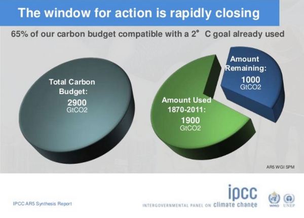
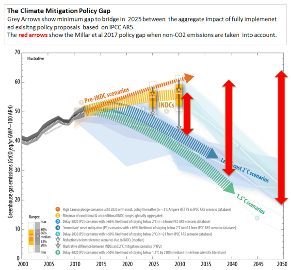
The effective response ought to be put into the global context. At the end of October UNEP produced its Emissions Gap Report 2017, just in time for the COP23 meeting in Bonn. The key figure on the aimed for constraint of warming to 1.5°C to 2°C from pre-industrial levels – an “effective polcy response” – is E5.2, reproduced below.
An “effective response” by any one country is at least reducing it’s emissions substantially by 2030 compared with now at the start of 2018. To be a world leader in response to climate change requires reducing emissions in the next 12 years by more than the required global average of 20-30%.
Climate Action Tracker – which, unlike myself strongly promotes climate mitigation – rates China’s overall policies as Highly Insufficient in terms of limiting warming to 1.5°C to 2°C. The reason is that they forecast on the basis of current policies emissions will increase in China in the next few years, instead of rapidly decreasing.
So why has Chris Pope got China’s policy so radically wrong? After all, I accept the following statement.
Today, five of the world’s six top solar-module manufacturers, five of the largest wind turbine manufacturers, and six of the ten major car manufacturers committed to electrification are all Chinese-owned. Meanwhile, China is dominant in the lithium sector – think: batteries, electric vehicles and so on – and a global leader in smart grid investment and other renewable energy technologies.
Reducing net emissions means not just have lots of wind turbines, hydro schemes, solar farms and electric cars. It means those renewable forms of energy replacing CO2 energy sources. The problem is that renewables are adding to total energy production, along with fossil fuels. The principal source of China’s energy for electricity and heating is coal. The Global Coal Plant Tracker at endcoal.org has some useful statistics. In terms of coal-fired power stations, China now has 922 GW of coal-fired power stations operating (47% of the global total) with a further 153 GW “Announced + Pre-permit + Permitted” (28%) and 147 GW under construction (56%). Further, from 2006 to mid-2017, China’s Newly Operating Coal Plants had a capacity of 667 GW, fully 70% of the global total. Endcoal.org estimates that coal-fired power stations account for 72% of global GHG emissions from the energy sector, with the energy-sector contributing to 41% of global GHG emissions. With China’s coal-fired power stations accounting for 47% of the global total, assuming similar capacity utilization, China’s coal-fired power stations account for 13-14% of global GHG emissions or 7 GtCO2e of around 52 GtCO2e. It does not stop there. Many homes in China use coal for domestic heating; there is a massive coal-to-liquids program (which may not be currently operating due to the low oil price); manufacturers (such as metal refiners) burn it direct; and recently there are reports of producing gas from coal. So why would China pursue a massive renewables program?
Possible reasons for the Chinese “pro-climate” policies
First, is for strategic energy reasons. I believe that China does not want to be dependent on world oil price fluctuations, which could harm economic growth. China, therefore, builds massive hydro schemes, despite it there being damaging to the environment and sometimes displacing hundreds of thousands of people. China also pursues coal-to-liquids programs, alongside promoting solar and wind farms. Although duplicating effort, it means that if oil prices suffer another hike, China is more immune from the impact than
Second, is an over-riding policy of a fast increase in perceived living standards. For over 20 years China managed average growth rates of up to 10% per annum, increasing average incomes by up to eight times, and moving hundreds of millions of people out of grinding poverty. Now economic growth is slowing (to still fast rates by Western standards) the raising of perceived living standards is being achieved by other means. One such method is to reduce the particulate pollution, particularly in the cities. The recent heavy-handed banning of coal burning in cities (with people freezing this winter) is one example. Another, is the push for electric cars, with the electricity mostly coming from distant coal-fired power stations. In terms of reducing CO2 emissions, electric cars do not make sense, but they do make sense in densely-populated areas with an emerging middle class wanting independent means of travel.
Third, is the push to dominate areas of manufacturing. With many countries pursuing hopeless renewables policies, the market for wind turbines and solar panels is set to increase. The “rare earths” required for the wind turbine magnets, such as neodymium, are produced in large quantities in China, such as in highly polluted Baotou. With lithium (required for batteries), China might only be currently world’s third largest producer – and some way behind Australia and Chile – but its reserves are the world’s second largest and sufficient on their own to supply current global demand for decades. With raw material supplies and low, secure energy costs from coal, along with still relatively low labour costs, China is well-placed to dominate these higher added-value manufacturing areas.
Concluding Comments
The wider evidence shows that an effective response to climate change is not emanating from China. The current energy policies are dominated, and will continue to be dominated, by coal. This will far out-weigh any apparent reductions in emissions from the manufacturing of renewables. Rather, the growth of renewables should be viewed in the context of promoting the continued rapid and secure increase in living standards for the Chinese people, whether in per capita income, or in standards of the local environment.
Kevin Marshall