The Millar et al. 2017 has severe problems with the numbers, as my previous post suggested. But there is a more fundamental problem in achieving emissions goals. It is contained in the introductory paragraphs to an article lead author Richard Millar posted at Carbon Brief
The Paris Agreement set a long-term goal of limiting global warming to “well-below” 2C above pre-industrial levels and to pursue efforts to restrict it to 1.5C.
A key question for the upcoming rounds of the international climate negotiations, particularly when countries review their climate commitments next year, is exactly how fast would we have to cut emissions to reach these goals?
In a new paper, published in Nature Geoscience, we provide updated estimates of the remaining “carbon budget” for 1.5C. This is the total amount of CO2 emissions that we can still emit whilst limiting global average warming to 1.5C.
Our estimates suggest that we would have a remaining carbon budget equivalent to around 20 years at current emissions rates for a 2-in-3 chance of restricting end-of-century warming to below 1.5C.
This suggests that we have a little more breathing space than previously thought to achieve the 1.5C limit. However, although 1.5C is not yet a geophysical impossibility, it remains a very difficult policy challenge.
The problem is with the mixing of singular and plural statements. The third paragraph shows the problem.
In a new paper, published in Nature Geoscience, we provide updated estimates of the remaining “carbon budget” for 1.5C. This is the total amount of CO2 emissions that we can still emit whilst limiting global average warming to 1.5C.
In the first sentence, the collective “we” refers to the ten authors of the paper. That is Richard J. Millar, Jan S. Fuglestvedt, Pierre Friedlingstein, Joeri Rogelj, Michael J. Grubb, H. Damon Matthews, Ragnhild B. Skeie, Piers M. Forster, David J. Frame & Myles R. Allen. In the second sentence, the collective “we” refers to approximately 7500 million people on the planet, who live about 195 countries. Do they speak for all the people in Russia, India, Nigeria, Iran, Iraq, China, Taiwan, North and South Korea, the United States and Australia for instance? What I would suggest is they are speaking figuratively about what they believe the world ought to be doing.
Yet the political realities are that even though most countries have signed the Paris Agreement, it does not commit them to a particular emissions pathway, nor to eliminate their emissions by a particular date. It only commits them to produce further INDC submissions every five years, along with attending meetings and making the right noises. Their INDC submissions are not scrutinized, still less sent back for “improved ambition” if they are inadequate in contributing to the aggregate global plan.
Looking at the substance of the Adoption proposal of the Paris Agreement, section II, point 17 notes gives an indication of the policy gap.
17. Notes with concern that the estimated aggregate greenhouse gas emission levels in 2025 and 2030 resulting from the intended nationally determined contributions do not fall within least-cost 2 ˚C scenarios but rather lead to a projected level of 55 gigatonnes in 2030, and also notes that much greater emission reduction efforts will be required than those associated with the intended nationally determined contributions in order to hold the increase in the global average temperature to below 2 ˚C above pre-industrial levels by reducing emissions to 40 gigatonnes or to 1.5 ˚C above pre-industrial levels by reducing to a level to be identified in the special report referred to in paragraph 21 below;
But the actual scale of the gap is best seen from the centerpiece graphic of the UNFCCC Synthesis report on the aggregate effect of INDCs, prepared in the run-up to COP21 Paris. Note that this website also has all the INDC submissions in three large Pdf files.
The graphic I have updated with estimates of the policy gap with my take on revised Millar et. al 2017 policy gaps shown by red arrows.
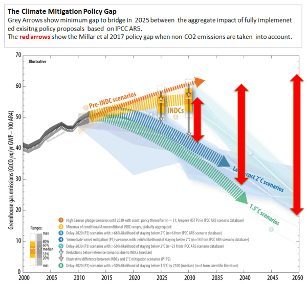
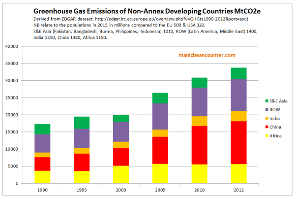
The extent of the arrows could be debated, but will not alter the fact that Millar et. al 2017 are assuming that by adjusting the figures and assuming that they are thinking for the whole world, that the emissions objectives will be achieved. The reality is that very few countries have committed to reducing their emissions by anything like an amount consistent with even a 2°C pathway. Further, that commitment is just until 2030, not for the 70 years beyond that. There is no legally-binding commitment in the Paris Agreement for a country to reduce emissions to zero sometime before the end of the century. Further, a number of countries (including Nigeria, Togo, Saudi Arabia, Turkmenistan, Iraq and Syria) have not signed the Paris Agreement – and the United States has given notification of coming out of the Agreement. Barring huge amounts of funding or some technological miracle most developing countries, with a majority of the world population, will go on increasing their emissions for decades. This includes most of the countries who were Non-Annex Developing Countries to the 1992 Rio Declaration. Collectively they accounted for just over 100% of the global GHG emissions growth between 1990 and 2012.
As some of these Countries’ INDC Submissions clearly state, most will not sacrifice economic growth and the expectations of their people’s for the unproven dogma of politicalized academic activists in completely different cultures say that the world ought to cut emissions. They will attend climate conferences and be seen to be on a world stage, then sign meaningless agreements afterward that commit them to nothing.
As a consequence, if catastrophic anthropogenic global warming is true (like the fairies at the bottom of the garden) and climate mitigation reduction targets are achieved, the catastrophic climate change will be only slightly less catastrophic and the most extreme climate mitigation countries will be a good deal poorer. The non-policy countries will the ones better off. It is the classic free-rider problem, which results in an underprovision of those goods or services. If AGW is somewhat milder, then even these countries will be no worse off.
This is what really irritates me. I live in Britain, where the Climate Change Act 2008 has probably the most ludicrous targets in the world. That Act was meant to lead the world on climate change. The then Environment Secretary David Miliband introduced the bill with this message in March 2007.
From the graphic above COP21 Paris showed that most of the world is not following Britain’s lead. But the “climate scientists” are so stuck in their manipulated models, they forget that their models and beliefs of their peers are not the realities of the wider world. The political realities mean that reduction of CO2 emissions are net harmful to the people of Britain, both now and for future generations of Britains. The activists are just as wilfully negligent in shutting down any independent review of policy as a pharmaceutical company who would push one of its products onto the consumers without an independent evaluation of both the benefits and potential side effects.

stewgreen
/ 29/09/2017So to snap our alarmist friends out of their zombiefied state
We could say
#1 Draw a Global Average temperature trend graph for business as usual
#2 Now add on a curve for scenario with heavy use of solar/wind power gimicks
#3 mark what happens when one year there is a super volcano eruption
#4 Consider a point when something like a magic change happens like practical fusion power of CCS
Is the situation similar to when people worried that the world would be drowned in horse poo ?
manicbeancounter
/ 29/09/2017Stewgreen
What I have found is that you must never let those who support policy draw on any scenarios. Two examples.
1. In the run-up to COP21 Paris UNFCCC Executive Secretary Christiana Figueres claimed the policy proposals would constrain warming in 2100 to 2.7C instead of 4.5C in the BAU scenario. Basically, global emissions in 2100 with policy proposals would be around half what they would be without policy. I wondered where Ms Figueres got the figures from. After a lot of digging found that the policy proposals were just from 2015 to 2030. From 2030 to 2100 a couple of groups had spliced on modelled policy scenarios.
2. A group called Climate Interactive only have global emissions about one-third lower in 2100 as a result of the INDC submissions covering the period 2015 to 2030. They divided up the world into about 17-20 countries or groupings. China, USA, India, Japan, Russia and the EU were separated out. There plans for countries without policy were ridiculous when looked at emissions per capita. In the EU and USA, where emissions per capita had stabilised or been falling for decades, without policy they were assumed to rise. In China and Russia, where emissions per capita will peak without any policy in a less than a generation, Climate Interactive has then emissions per capita rising for decades. But in India and Africa where there is no intention of having any restrictions on emissions growth, they are assumed to be economic (and hence emissions) basket cases.
An earlier version is here.