Introduction
At heart I am beancounter. That is when presented with figures I like to understand how they are derived. When it comes to the claims about the quantity of GHG emissions that are required to exceed 2°C of warming I cannot get even close, unless by making some a series of assumptions, some of which are far from being robust. Applying the same set of assumptions I cannot derive emissions consistent with restraining warming to 1.5°C
Further the combined impact of all the assumptions is to create a storyline that appears to me only as empirically as valid as an infinite number of other storylines. This includes a large number of plausible scenarios where much greater emissions can be emitted before 2°C of warming is reached, or where (based on alternative assumptions) plausible scenarios even 2°C of irreversible warming is already in the pipeline.
Maybe an expert climate scientist will clearly show the errors of this climate sceptic, and use it as a means to convince the doubters of climate science.
What I will attempt here is something extremely unconventional in the world of climate. That is I will try to state all the assumptions made by highlighting them clearly. Further, I will show my calculations and give clear references, so that anyone can easily follow the arguments.
Note – this is a long post. The key points are contained in the Conclusions.
The aim of constraining warming to 1.5 or 2°C
The Paris Climate Agreement was brought about by the UNFCCC. On their website they state.
The Paris Agreement central aim is to strengthen the global response to the threat of climate change by keeping a global temperature rise this century well below 2 degrees Celsius above pre-industrial levels and to pursue efforts to limit the temperature increase even further to 1.5 degrees Celsius.
The Paris Agreement states in Article 2
1. This Agreement, in enhancing the implementation of the Convention, including its objective, aims to strengthen the global response to the threat of climate change, in the context of sustainable development and efforts to eradicate
poverty, including by:
(a) Holding the increase in the global average temperature to well below 2°C above pre-industrial levels and pursuing efforts to limit the temperature increase to 1.5°C above pre-industrial levels, recognizing that this would significantly reduce the risks and impacts of climate change;
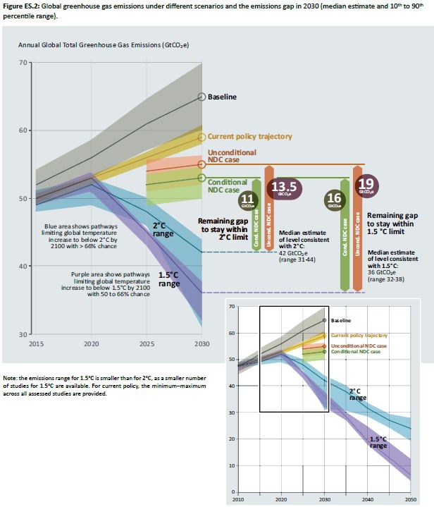
Translating this aim into mitigation policy requires quantification of global emissions targets. The UNEP Emissions Gap Report 2017 has a graphic showing estimates of emissions before 1.5°C or 2°C warming levels is breached.

Figure 1 : Figure 3.1 from the UNEP Emissions Gap Report 2017
The emissions are of all greenhouse gas emissions, expressed in billions of tonnes of CO2 equivalents. From 2010, the quantity of emissions before the either 1.5°C or 2°C is breached are respectively about 600 GtCO2e and 1000 GtCO2e. It is these two figures that I cannot reconcile when using the same assumptions to calculate both figures. My failure to reconcile is not just a minor difference. Rather, on the same assumptions that 1000 GtCO2e can be emitted before 2°C is breached, 1.5°C is already in the pipeline. In establishing the problems I encounter I will clearly endeavor to clearly state the assumptions made and look at a number of examples.
Initial assumptions
1 A doubling of CO2 will eventually lead to 3°C of rise in global average temperatures.
This despite the 2013 AR5 WG1 SPM stating on page 16
Equilibrium climate sensitivity is likely in the range 1.5°C to 4.5°C
And stating in a footnote on the same page.
No best estimate for equilibrium climate sensitivity can now be given because of a lack of agreement on values across assessed lines of evidence and studies.
2 Achieving full equilibrium climate sensitivity (ECS) takes many decades.
This implies that at any point in the last few years, or any year in the future there will be warming in progress (WIP).
3 Including other greenhouse gases adds to warming impact of CO2.
Empirically, the IPCC’s Fifth Assessment Report based its calculations on 2010 when CO2 levels were 390 ppm. The AR5 WG3 SPM states in the last sentence on page 8
For comparison, the CO2-eq concentration in 2011 is estimated to be 430 ppm (uncertainty range 340 to 520 ppm)
As with climate sensitivity, the assumption is the middle of an estimated range. In this case over one fifth of the range has the full impact of GHGs being less than the impact of CO2 on its own.
4 All the rise in global average temperature since the 1800s is due to rise in GHGs.
5 An increase in GHG levels will eventually lead to warming unless action is taken to remove those GHGs from the atmosphere, generating negative emissions.
These are restrictive assumptions made for ease of calculations.
Some calculations
First a calculation to derive the CO2 levels commensurate with 2°C of warming. I urge readers to replicate these for themselves.
From a Skeptical Science post by Dana1981 (Dana Nuccitelli) “Pre-1940 Warming Causes and Logic” I obtained a simple equation for a change in average temperature T for a given change in CO2 levels.
ΔTCO2 = λ x 5.35 x ln(B/A)
Where A = CO2 level in year A (expressed in parts per million), and B = CO2 level in year B.
I use λ = .809, so that if B = 2A, ΔTCO2 = 3.00
Pre-industrial CO2 levels were 280ppm. 3°C of warming is generated by CO2 levels of 560 ppm, and 2°C of warming is when CO2 levels reach 444 ppm.
From the Mauna Loa CO2 data, average CO2 levels averaged 407 ppm in 2017. Given the assumption (3) and further assuming the impact of other GHGs is unchanged, 2°C of warming would have been surpassed in around 2016 when CO2 levels averaged 404 ppm. The actual rise in global average temperatures is from HADCRUT4 is about half that amount, hence the assumption that the impact of a rise in CO2 takes an inordinately long time for the actual warming to reveal itself. Even with the assumption that 100% of the warming since around 1800 is due to the increase in GHG levels warming in progress (WIP) is about the same as revealed warming. Yet the Sks article argues that some of the early twentieth century warming was due to other than the rise in GHG levels.
This is the crux of the reconciliation problem. From this initial calculation and based on the assumptions, the 2°C warming threshold has recently been breached, and by the same assumptions 1.5°C was likely breached in the 1990s. There are a lot of assumptions here, so I could have missed something or made an error. Below I go into some key examples that verify this initial conclusion. Then I look at how, by introducing a new assumption it is claimed that 2°C warming is not yet reached.
100 Months and Counting Campaign 2008
Trust, yet verify has a post We are Doomed!
This tracks through the Wayback Machine to look at the now defunct 100monthsandcounting.org campaign, sponsored by the left-wing New Economics Foundation. The archived “Technical Note” states that the 100 months was from August 2008, making the end date November 2016. The choice of 100 months turns out to be spot-on with the actual data for CO2 levels; the central estimate of the CO2 equivalent of all GHG emissions by the IPCC in 2014 based on 2010 GHG levels (and assuming other GHGs are not impacted); and the central estimate for Equilibrium Climate Sensitivity (ECS) used by the IPCC. That is, take 430 ppm CO2e, and at 14 ppm for 2°C of warming.
Maybe that was just a fluke or they were they giving a completely misleading forecast? The 100 Months and Counting Campaign was definitely not agreeing with the UNEP Emissions GAP Report 2017 in making the claim. But were they correctly interpreting what the climate consensus was saying at the time?
The 2006 Stern Review
The “Stern Review: The Economics of Climate Change” (archived access here) that was commissioned to provide benefit-cost justification for what became the Climate Change Act 2008. From the Summary of Conclusions
The costs of stabilising the climate are significant but manageable; delay would be dangerous and much more costly.
The risks of the worst impacts of climate change can be substantially reduced if greenhouse gas levels in the atmosphere can be stabilised between 450 and 550ppm CO2 equivalent (CO2e). The current level is 430ppm CO2e today, and it is rising at more than 2ppm each year. Stabilisation in this range would require emissions to be at least 25% below current levels by 2050, and perhaps much more.
Ultimately, stabilisation – at whatever level – requires that annual emissions be brought down to more than 80% below current levels. This is a major challenge, but sustained long-term action can achieve it at costs that are low in comparison to the risks of inaction. Central estimates of the annual costs of achieving stabilisation between 500 and 550ppm CO2e are around 1% of global GDP, if we start to take strong action now.
If we take assumption 1 that a doubling of CO2 levels will eventually lead to 3.0°C of warming and from a base CO2 level of 280ppm, then the Stern Review is saying that the worst impacts can be avoided if temperature rise is constrained to 2.1 – 2.9°C, but only in the range of 2.5 to 2.9°C does the mitigation cost estimate of 1% of GDP apply in 2006. It is not difficult to see why constraining warming to 2°C or lower would not be net beneficial. With GHG levels already at 430ppm CO2e, and CO2 levels rising at over 2ppm per annum, the 2°C of warming level of 444ppm (or the rounded 450ppm) would have been exceeded well before any global reductions could be achieved.
There is a curiosity in the figures. When the Stern Review was published in 2006 estimated GHG levels were 430ppm CO2e, as against CO2 levels for 2006 of 382ppm. The IPCC AR5 states
For comparison, the CO2-eq concentration in 2011 is estimated to be 430 ppm (uncertainty range 340 to 520 ppm)
In 2011, when CO2 levels averaged 10ppm higher than in 2006 at 392ppm, estimated GHG levels were the same. This is a good example of why one should take note of uncertainty ranges.
IPCC AR4 Report Synthesis Report Table 5.1
A year before the 100 Months and Counting campaign The IPCC produced its Fourth Climate Synthesis Report. The 2007 Synthesis Report on Page 67 (pdf) there is table 5.1 of emissions scenarios.
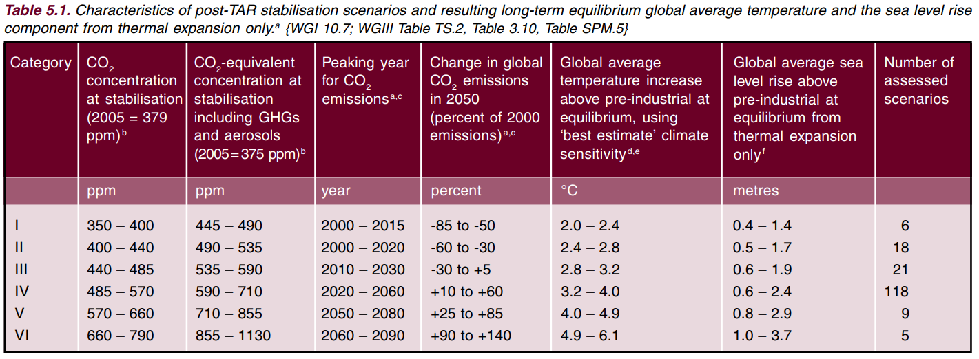
Figure 2 : Table 5.1. IPCC AR4 Synthesis Report Page 67 – Without Footnotes
I inputted the various CO2-eq concentrations into my amended version of Dana Nuccitelli’s magic equation and compared to the calculation warming in Table 5.1
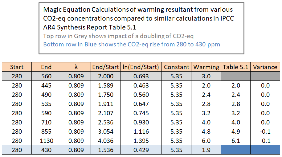
Figure 3 : Magic Equation calculations of warming compared to Table 5.1. IPCC AR4 Synthesis Report
My calculations of warming are the same as that of the IPCC to one decimal place except for the last two calculations. Why are there these rounding differences? From a little fiddling in Excel, it would appear to me that the IPCC got the warming results from a doubling of 3 when calculating to two decimal places, whilst my version of the formula is to four decimal places.
Note the following
- That other GHGs are translatable into CO2 equivalents. Once translated other GHGs they can be treated as if they were CO2.
- There is no time period in this table. The 100 Months and Counting Campaign merely punched in existing numbers and made a forecast ahead of the GHG levels that would reach the 2°C of warming.
- No mention of a 1.5°C warming scenario. If constraining warming to 1.5°C did not seem credible in 2007, which should it be credible in 2014 or 2017, when CO2 levels are higher?
IPCC AR5 Report Highest Level Summary
I believe that the underlying estimates of emissions to achieve the 1.5°C or 2°C of warming used by the UNFCCC and UNEP come from the UNIPCC Fifth Climate Assessment Report (AR5), published in 2013/4. At this stage I introduce an couple of empirical assumptions from IPCC AR5.
6 Cut-off year for historical data is 2010 when CO2 levels were 390 ppm (compared to 280 ppm in pre-industrial times) and global average temperatures were about 0.8°C above pre-industrial times.
Using the magic equation above, and the 390 ppm CO2 levels, there is around 1.4°C of warming due from CO2. Given 0.8°C of revealed warming to 2010, the residual “warming-in-progress” was 0.6°C.
The highest level of summary in AR5 is a Presentation to summarize the central findings of the Summary for Policymakers of the Synthesis Report, which in turn brings together the three Working Group Assessment Reports. This Presentation can be found at the bottom right of the IPCC AR5 Synthesis Report webpage. Slide 33 of 35 (reproduced below as Figure 4) gives the key policy point. 1000 GtCO2 of emissions from 2011 onwards will lead to 2°C. This is very approximate but concurs with the UNEP emissions gap report.
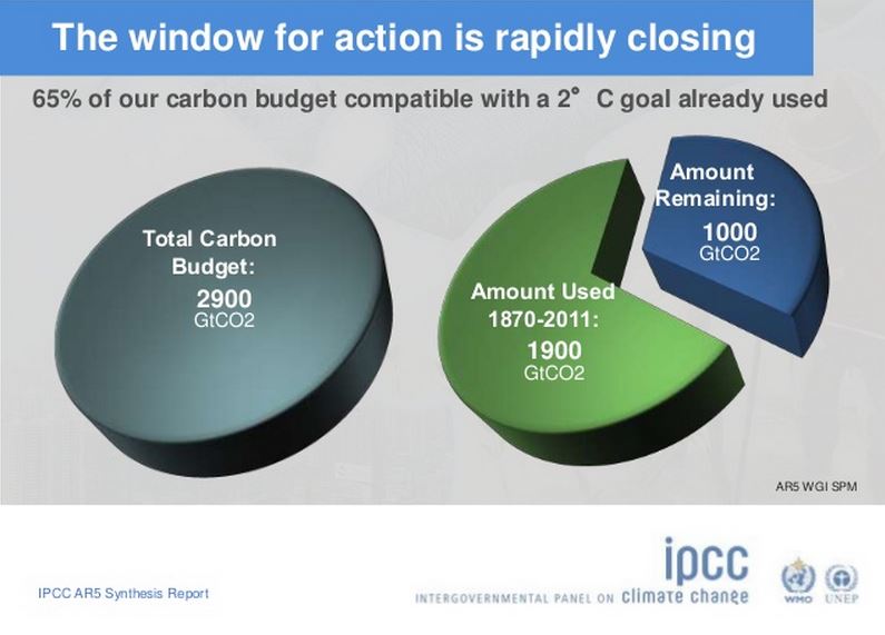
Figure 4 : Slide 33 of 35 of the AR5 Synthesis Report Presentation.
Now for some calculations.
1900 GtCO2 raised CO2 levels by 110 ppm (390-110). 1 ppm = 17.3 GtCO2
1000 GtCO2 will raise CO2 levels by 60 ppm (450-390). 1 ppm = 16.7 GtCO2
Given the obvious roundings of the emissions figures, the numbers fall out quite nicely.
Last year I divided CDIAC CO2 emissions (from the Global Carbon Project) by Mauna Loa CO2 annual mean growth rates (data) to produce the following.

Figure 5 : CDIAC CO2 emissions estimates (multiplied by 3.664 to convert from carbon units to CO2 units) divided by Mauna Loa CO2 annual mean growth rates in ppm.
17GtCO2 for a 1ppm rise is about right for the last 50 years.
To raise CO2 levels from 390 to 450 ppm needs about 17 x (450-390) = 1020 GtCO2. Slide 33 is a good approximation of the CO2 emissions to raise CO2 levels by 60 ppm.
But there are issues
- If ECS = 3.00, and 17 GtCO2 of emissions to raise CO2 levels by 1 ppm, then it is only 918 (17*54) GtCO2 to achieve 2°C of warming. Alternatively, in future if there are assume 1000 GtCO2 to achieve 2°C of warming it will take 18.5 GtCO2 to raise CO2 levels by 1 ppm, as against 17 GtCO2 in the past. It is only by using 450 ppm as commensurate with 2°C of warming that past and future stacks up.
- If ECS = 3, from CO2 alone 1.5°C would be achieved at 396 ppm or a further 100 GtCO2 of emissions. This CO2 level was passed in 2013 or 2014.
- The calculation falls apart if other GHGs are included. Emissions are assumed equivalent to 430 ppm at 2011. Therefore with all GHGs considered the 2°C warming would be achieved with 238 GtCO2e of emissions ((444-430)*17) and the 1.5°C of warming was likely passed in the 1990s.
- If actual warming since pre-industrial times to 2010 was 0.8°C, ECS = 3, and the rise in all GHG levels was equivalent to a rise in CO2 from 280 to 430 ppm, then the residual “warming-in-progress” (WIP) was just over 1°C. That it is the WIP exceeds the total revealed warming in well over a century. If there is a short-term temperature response is half or more of the value of full ECS, it would imply even the nineteenth century emissions are yet to have the full impact on global average temperatures.
What justification is there for effectively disregarding the impact of other greenhouse emissions when it was not done previously?
This offset is to be found in section C – The Drivers of Climate Change – in AR5 WG1 SPM . In particular the breakdown, with uncertainties, in table SPM.5. Another story is how AR5 reached the very same conclusion as AR4 WG1 SPM page 4 on the impact of negative anthropogenic forcings but with a different methodology, hugely different estimates of aerosols along with very different uncertainty bands. Further, these historical estimates are only for the period 1951-2010, whilst the starting date for 1.5°C or 2°C is 1850.
From this a further assumption is made when considering AR5.
7 The estimated historical impact of other GHG emissions (Methane, Nitrous Oxide…) has been effectively offset by the cooling impacts of aerosols and precusors. It is assumed that this will carry forward into the future.
UNEP Emissions Gap Report 2014
Figure 1 above is figure 3.1 from the UNEP Emissions GAP Report 2017. The equivalent report from 2014 puts this 1000 GtCO2 of emissions in a clearer context. First a quotation with two accompanying footnotes.
As noted by the IPCC, scientists have determined that an increase in global temperature is proportional to the build-up of long-lasting greenhouse gases in the atmosphere, especially carbon dioxide. Based on this finding, they have estimated the maximum amount of carbon dioxide that could be emitted over time to the atmosphere and still stay within the 2 °C limit. This is called the carbon dioxide emissions budget because, if the world stays within this budget, it should be possible to stay within the 2 °C global warming limit. In the hypothetical case that carbon dioxide was the only human-made greenhouse gas, the IPCC estimated a total carbon dioxide budget of about 3 670 gigatonnes of carbon dioxide (Gt CO2 ) for a likely chance3 of staying within the 2 °C limit . Since emissions began rapidly growing in the late 19th century, the world has already emitted around 1 900 Gt CO2 and so has used up a large part of this budget. Moreover, human activities also result in emissions of a variety of other substances that have an impact on global warming and these substances also reduce the total available budget to about 2 900 Gt CO2 . This leaves less than about 1 000 Gt CO2 to “spend” in the future4 .
3 A likely chance denotes a greater than 66 per cent chance, as specified by the IPCC.

4 The Working Group III contribution to the IPCC AR5 reports that scenarios in its category which is consistent with limiting warming to below 2 °C have carbon dioxide budgets between 2011 and 2100 of about 630-1 180 GtCO2
The numbers do not fit, unless the impact of other GHGs are ignored. As found from slide 33, there is 2900 GtCO2 to raise atmospheric CO2 levels by 170 ppm, of which 1900 GtC02 has been emitted already. The additional marginal impact of other historical greenhouse gases of 770 GtCO2 is ignored. If those GHG emissions were part of historical emissions as the statement implies, then that marginal impact would be equivalent to an additional 45 ppm (770/17) on top of the 390 ppm CO2 level. That is not far off the IPCC estimated CO2-eq concentration in 2011 of 430 ppm (uncertainty range 340 to 520 ppm). But by the same measure 3670 GTCO2e would increase CO2 levels by 216 ppm (3670/17) from 280 to 496 ppm. With ECS = 3, this would eventually lead to a temperature increase of almost 2.5°C.
Figure 1 above is figure 3.1 from the UNEP Emissions GAP Report 2017. The equivalent report from the 2014 report ES.1

Figure 6 : From the UNEP Emissions Gap Report 2014 showing two emissions pathways to constrain warming to 2°C by 2100.
Note that this graphic goes through to 2100; only uses the CO2 emissions; does not have quantities; and only looks at constraining temperatures to 2°C. To achieve the target requires a period of negative emissions at the end of the century.
A new assumption is thus required to achieve emissions targets.
8 Sufficient to achieve the 1.5°C or 2°C warming targets likely requires many years of net negative emissions at the end of the century.
A Lower Level Perspective from AR5
A simple pie chart does not seem to make sense. Maybe my conclusions are contradicted by the more detailed scenarios? The next level of detail is to be found in table SPM.1 on page 22 of the AR5 Synthesis Report – Summary for Policymakers.

Figure 7 : Table SPM.1 on Page 22 of AR5 Synthesis Report SPM, without notes. Also found as Table 3.1 on Page 83 of AR5 Synthesis Report
The comment for <430 ppm (the level of 2010) is "Only a limited number of individual model studies have explored levels below 430 ppm CO2-eq. ” Footnote j reads
In these scenarios, global CO2-eq emissions in 2050 are between 70 to 95% below 2010 emissions, and they are between 110 to 120% below 2010 emissions in 2100.
That is, net global emissions are negative in 2100. Not something mentioned in the Paris Agreement, which only has pledges through to 2030. It is consistent with the UNEP Emissions GAP report 2014 Table ES.1. The statement does not refer to a particular level below 430 ppm CO2-eq, which equates to 1.86°C. So how is 1.5°C of warming not impossible without massive negative emissions? In over 600 words of notes there is no indication. For that you need to go to the footnotes to the far more detailed Table 6.3 AR5 WG3 Chapter 6 (Assessing Transformation Pathways – pdf) Page 431. Footnote 7 (Bold mine)
Temperature change is reported for the year 2100, which is not directly comparable to the equilibrium warming reported in WGIII AR4 (see Table 3.5; see also Section 6.3.2). For the 2100 temperature estimates, the transient climate response (TCR) is the most relevant system property. The assumed 90% range of the TCR for MAGICC is 1.2–2.6 °C (median 1.8 °C). This compares to the 90% range of TCR between 1.2–2.4 °C for CMIP5 (WGI Section 9.7) and an assessed likely range of 1–2.5 °C from multiple lines of evidence reported in the WGI AR5 (Box 12.2 in Section 12.5).
The major reason that 1.5°C of warming is not impossible (but still more unlikely than likely) for CO2 equivalent levels that should produce 2°C+ of warming being around for decades is because the full warming impact takes so long to filter through. Further, Table 6.3 puts Peak CO2-eq levels for 1.5-1.7°C scenarios at 465-530 ppm, or eventual warming of 2.2 to 2.8°C. Climate WIP is the difference. But in 2018 WIP might be larger than all the revealed warming in since 1870, and certainly since the mid-1970s.
Within AR5 when talking about constraining warming to 1.5°C or 2.0°C it is only the warming which is estimated to be revealed in 2100. There is no indication of how much warming in progress (WIP) there is in 2100 under the various scenarios, therefore I cannot reconcile back the figures. However, for GHG would appear that the 1.5°C figure relies upon a period of over 100 years for impact of GHGs on warming failing to come through as (even netting off other GHGs with the negative impact of aerosols) by 2100 CO2 levels would have been above 400 ppm for over 85 years, and for most of those significantly above that level.
Conclusions
The original aim of this post was to reconcile the emissions sufficient to prevent 1.5°C or 2°C of warming being exceeded through some calculations based on a series of restrictive assumptions.
- ECS = 3.0°C, despite the IPCC being a best estimate across different studies. The range is 1.5°C to 4.5°C.
- All the temperature rise since the 1800s is assumed due to rises in GHGs. There is evidence that this might not be the case.
- Other GHGs are netted off against aerosols and precursors. Given that “CO2-eq concentration in 2011 is estimated to be 430 ppm (uncertainty range 340 to 520 ppm)” when CO2 levels were around 390 ppm, this assumption is far from robust.
- Achieving full equilibrium takes many decades. So long in fact that the warming-in-progress (WIP) may currently exceed all the revealed warming in over 150 years, even based on the assumption that all of that revealed historical warming is due to rises in GHG levels.
Even with these assumptions, keeping warming within 1.5°C or 2°C seems to require two assumptions that were not recognized a few years ago. First is to assume net negative global emissions for many years at the end of the century. Second is to talk about projected warming in 2100 rather than warming as a resultant on achieving full ECS.
The whole exercise appears to rest upon a pile of assumptions. Amending the assumptions means one way means admitting that 1.5°C or 2°C of warming is already in the pipeline, or the other way means admitting climate sensitivity is much lower. Yet there appears to be a very large range of empirical assumptions to chose from there could be there are a very large number of scenarios that are as equally valid as the ones used in the UNEP Emissions Gap Report 2017.
Kevin Marshall


 Figure 2 : AR5 WG3 SPM.1 Total annual anthropogenic GHG emissions (GtCO2eq/yr) by groups of gases 1970-2010. FOLU is Forestry and Other Land Use.