The Nub of the Climate Change Policy Problem

Over at the Conversation, Climate Scientist Mike Hulme has a short article “Science can’t settle what should be done about climate change“. He argues the politics, not science, must take centre stage. He makes four points.

  • How do we value future public goods and natural assets relative to their value today?
  • Is “commodifying” nature appropriate?
  • The morality of technologies for mitigation or adaptation. For instance, fracking and GM crops.
  • The role of national governments against multilateral treaties or international governing bodies. Also the consequent impacts on democracy.

Christopher Wright (Professor of Organisation Studies at University of Sydney) commented

The one problem I have with the above analysis is that the focus on climate science has been a quite deliberate strategy by those seeking to deny or cast doubt on the urgency of the problem. This has meant the debate has continually stalled around issues of whether climate change is a problem or not. The science highlights that it is a very big problem indeed. However, while the science continues to be questioned, we will be unable to have the serious policy conversation about what we need to do to avoid catastrophic changes to our ecosystem.

My reply (with references) is

Science might point to a very big problem, but it cannot translate that into coherent policy terms. Nor can it weigh that against the effectiveness of policies, nor the harms policies can cause. Economics is central to asking those questions. The key figure that encapsulates the predicted harm of climate change is the social cost of carbon SCC, expressed in tonnes of CO2 equivalent. In 2006 Stern measured this as $85/tCO21. A year later the AR4 SPM2 stated a range of -$3 to $95/tCO2 from peer reviewed studies, with an average of $12/tCO2.

The key figure for the effectiveness to policy is the marginal abatement cost. Basically this refers to the marginal cost of preventing a tonne of CO2 equivalent entering the atmosphere. For policy to be of net benefit, MAC needs to be less than SCC.

$85 is about £52, and $12 about £7.50. In the UK onshore wind turbines receive a direct subsidy equivalent to £98/tCO23 saved, and offshore £195/tCO2. Then there are the extra costs of transmission lines, and other costs which could double those figures.

Then you need to recognize that a global problem will not be solved by unilateralist policies by a country with producing less than 2% of global emissions. So the UK is impoverished now by harmful, ineffectual, policies, and still future generations suffer >90% of the consequences of unmitigated climate change. Mike Hulme’s four points above are in addition to this, weighing further against mitigation policy.

Notes

  1. The Stern review noted on pages xvi-xvii

    Preliminary calculations adopting the approach to valuation taken in this Review suggest that the social cost of carbon today, is of the order of $85 per tonne of CO2……. This number is well above marginal abatement costs in many sectors.

  2. The UNIPCC AR4 Summary for Policymakers in 2007 stated on page 22.

    Peer-reviewed estimates of the social cost of carbon in 2005 average US$12 per tonne of CO2, but the range from 100 estimates is large (-$3 to $95/tCO2).

  3. The renewables obligation credit (ROC) buy-out price is currently £42.02 per megawatt hour, as determined by OFGEM. The British renewable industry lobby group renewableUK, uses DECC’s carbon saving figure of 430g/kWh, as stated in an appendix to the Energy Efficiency Innovation Review in 2005. £42.02/.430 = £97.67. Onshore wind turbines get one ROC per MWh generated, offshore wind turbines 2 ROCs.

Kevin Marshall

Jo Nova discusses Mike Hulme’s four points here.

The rising costs of the Renewables Obligation Certificate Scheme

Summary

The cost of Renewables Obligation Certificate scheme ROCs to covert the UK to renewable electricity has more than doubled in less than four years. Whilst the majority of this increase is down to volume increases and inflation, a significant part is down to switching to higher levels of subsidy, particularly for offshore wind farms. This means that the unit cost of electricity from renewables is rising. One wonders if the DECC has factored this into its projected costs of energy to households.

Main Analysis

In my previous posting “Labour’s Hypocrisy on Rising Energy Bills”, I identified that the rise in energy bills over the last few years was mostly due to rising costs external to the energy companies. I only briefly alluded to the causes. This posting looks at the growth in “Renewables Obligation Certificates” (ROCs), the major vehicle to encourage the energy industry to switch to renewables from fossil fuels. Working out the proportion of the “other cost” increases is difficult to work out, but it could be up to a half.

On the 19th December, the Department for Environment, Energy and Climate Change (DECC), issued a great rash of postings to its website. Amongst these of particular interest was “Energy trends section 6: renewables“. This contains a spreadsheet of interest – ET 6.3 “Renewables obligation: certificates and generation”. This gives monthly data covering the period January 2010 to August 2013.

Not all renewables are equal. Different types of renewables attract different ROC rates per MWh (megawatt-hour) of electricity generated. These vary from 0.25 to 5.00. In practice more than 99% of renewable power generated falls into four bands – 0.50, 1.00, 1.50 and 2.00.

Charting the electricity generated in megawatt hours for the period gives the following graph:-


In less than 4 years there has been a spectacular growth in total electricity generated from renewables, from around 1.5m MWh per month in early 2010, to over 3.0m in early 2013. But there has been even greater growth in the generation of renewables with 2.00 ROCs, and the disappearance of the 0.50 ROCs. This can be better seen by the proportions of generation in each of the ROC bands.


In early 2010, less than 5% of renewables generated qualified for 2 ROCs, whereas by 2013 over 20% did. To show the impact more clearly I have devised three indexes. These include all ROC bands for declarations on a monthly basis. (A very tiny number of schemes have annual declarations.)

  1. Renewable electricity generated qualifying for ROCs.
  2. Renewable Obligation Certificates issued.
  3. The buy-out value of the ROCs. This value is declared by the regulator OFGEM, and inflated each year by the Retail Prices Index. The 2013/14 declaration is here, with all the previous rates.

The index is for 12 month periods, with the period January to December 2010 set to 100.


From the period Jan-Dec 2010 to the period Sept 2012-Aug 2013, volume of renewables electricity generated increased by 80%; volume of ROCs by 116%; and value of ROCs by 140%.

There is a rapid growth in renewables, but the real cost per unit generated is increasing more rapidly. In buy-out values terms, the ROCs issued were worth £862m for Jan-Dec 2010 and £2,069m for Sept 2012-Aug 2013. But what type of renewable is responsible for this real cost per unit increase?

The Growth in Wind Turbine generation and ROCs

A major component of renewables has always been wind turbines, but the proportion is increasing. They are split between onshore and offshore. There are three graphs showing this increase.

  1. The proportion of renewables generated from Wind Turbines


    This shows that not only has the proportion of generation from wind turbines increased from around 40% to nearly 60%. More than 100% of the increased proportion is due to offshore wind turbines with 2.00 ROCs per MWh generated.

  2. Wind generated ROCs as a proportion of ROCs issued


    The share of total ROCS for wind turbines now accounts for over 60% of the total. Around 30% is from offshore wind turbines with 2.00 ROCs per MWh generated.

  3. Index of Changes in Renewables Obligation Credits for wind turbines.


From the period Jan-Dec 2010 to the period Sept 2012-Aug 2013, volume of renewables electricity generated increased by 134%; volume of ROCs by 177%; and value of ROCs by 209%. In buy-out values terms, the ROCs issued for wind turbines were worth £426m (49% of the total) for Jan-Dec 2010 and £1,315m (64% of the total) for Sept 2012-Aug 2013.

The true cost of offshore wind power

This analysis has solely concentrated on ET 6.3. The “Renewable electricity capacity and generation” (ET 6.1) file has some useful data on load factors. For wind turbines I have extracted the annual data.


Offshore wind turbines have around 35% higher load factors than onshore.

The vast majority of income for wind turbines is in two parts. There is the wholesale price at around £60 per MWh and the ROC income, which is £42 for onshore and £84 for offshore.

Per annum, with 35% more load, the offshore wind farm can expect about 90% more income per MWh of capacity than the onshore to cover capital and maintenance costs. It is even worse when compared with the gas-fired alternative. The only income for the generator is the £60 per MWh from selling wholesale, but they have the additional costs of at least £20 per MWh for fuel.

Biomass

An area not covered is the growth in the use of Biomass / other fuels at coal-fired power stations. This will be in a posting next year.

Questions on the subsidising of offshore wind turbines

  1. Given that prior to 2010 offshore wind farms were being commissioned with ROCs of 1.00 and 1.50, how much of this increased rate of 2.0 accommodates greater costs (more distant from the shore, and in deeper water) and how much gives greater profits?
  2. Given that a gas-fired power station can cover its operating and capital costs with less than £40 per MWh, should we be considering alternative, and less reliable, forms of electricity generation that seem to need up to four times the income to operate?
  3. Was any independent studies done of the costs of wind-generated power in setting the ROC rates, or was it just on the advice of the renewables industry and a DECC desperate to meet its carbon budget?
  4. Have the DECC factored in the need to give ever higher levels of subsidies to meet renewables targets?

Kevin Marshall

Labour’s Hypocrisy on Rising Energy Bills

If you go to the Labour Party’s website there is an announcement.

Clicking down will take you to energy price calculator. I found out with Ed’s policy I could save £112 per year.

Two weeks after the announcement, still no links to the actual plan, but there is a video to watch.

Just one minute and twenty-six seconds for a distinguished actor to say the following:-

How do you feel when you see your energy bill sitting at the front door and you know that it is going to be even higher than the last one?

And how do you feel when you read in the newspaper that your energy providers’ profits are up yet again?

Millions of ordinary families are struggling to keep up with bills. Bills that are rising faster than wages.

Since David Cameron became Prime Minister, he’s allowed gas and electricity to rise by an average of £300 a year and sat by as energy companies make record profits. Under this Government a privileged few come before hard-families. Ed Miliband and Labour are going to change that. Ed’s energy plan will mean a tough new regulator with the power to challenge the energy companies and keep prices down. Under Ed’s energy plan gas and electricity bills will be frozen. That’s right frozen. Under the Tories you have overpaid. Labour will fight the cost of living crisis and build an economy that works for working people.

The inference is that your bills are rising solely due to the ever-increasing profits of the energy companies. Further the nasty Tories had it in their power stop it. Along will come Labour and stop all that.

I have looked up the figures. Since the 2009, the energy regulator OFGEM has required the six big energy companies to produce financial data by five segments. That is for electricity generation, along with supply data for electricity and gas, each split between domestic and non-domestic supply. I have analysed all four years of data for the six companies, using links provided by OFGEM. There is, of course, no financial data available for 2013 as the year has yet to finish.

If Labour are correct in their inference of price rises being due to increasing profits then profits will be increasing as a percentage of sales. With the typical household’s bill rising by over 20% between May 2010 and the end of 2012, profits as a percentage of revenue would be rising sharply. The following shows the percentage components of revenue.

The narrow band in purple for profit increased from 1.8% of sales to 3.8%. It is not increasing profits that have caused the price rises. The reason for doubling is because, in total, the six major companies lost money on gas supply in 2009. Nor is there a sharp difference between domestic and non-domestic supply margins. You could claim that the energy companies are making more money on generation instead. They are not, as the full margins, by segment, by year, show below.

The total sales breakdown enhances the picture.

Although total are broadly the same in 2009 and 2012, revenue from domestic customers was 13%, whilst that from non-domestic customers was 17% lower. The reason Labour have a higher figure is they rely on OFGEM’s notional average user, who uses the same amount of energy year-in-year out. Real hard-working families have responded to rising prices by reducing consumption.

What is most important is why unit costs have risen. Labour are correct when they say it is not due to the wholesale price of energy. As already demonstrated, they are incorrect to say it is due to rising profits. The real reason is “other costs”. These rose from 32% to 40% of revenue in just four years. That is from £14.1bn to £17.7bn in just four years or a 25% increase. On declining volumes this is more significant for consumers.

These figures are corroborated by a breakdown by my energy supplier, Scottish Power.

With VAT at 5%, the Scottish power says that its charges to the domestic customer in 2013 are made up of 53% for fuel and 43% for other charges. This compares to the industry average in 2012 of 55.7% for fuel and 40.6% for “other costs” plus “amortization”. The higher proportion of other charges to domestic customers is to be expected, as small domestic customers have lower costs. The relevant domestic figures from the big six are 51.8% for fuel and 44.0% for other charges. Given the obviously rounded Scottish Power figures, they are remarkably close to the industry average.

The supply market is fiercely competitive, hence the real reason for the ability of customers to save money by switching suppliers. Therefore it is doubtful that internal costs will have risen. What has risen is the delivery of the energy to the home (National Grid, local delivery, and cost of meters), along with green levies. So it is likely over 75% of the price increases to the customer are due to factors outside of the energy supplier’s control.

Where does responsibility lie for the above-inflation price increases?

The dash for “clean” energy to save the planet is enshrined in the Climate Change Act 2008. It was pushed through the House of Commons when Ed Miliband was Environment Secretary. This accelerated the growth in green levies and the requirement for a more extensive grid network to carry the wind-generated electricity from remote turbines. Delve further in the profits on electricity generation and you will find that fossil fuel generation has margins of 10%. A price freeze will eliminate the supply profits in six months, and the generation profits in two years. The is a sure way to get a near monopoly in gas supply, and cause the rapid shut-down of three-quarters of generating capacity. It is an act of gross hypocrisy by Ed Miliband to threaten to destroy a competitive industry to remedy a problem that he is responsible for.


NB First time comments are moderated. The comments can be used as a point of contact.

Kevin Marshall

Lewandowsky’s false inference from an absurd correlation

Steve McIntyre has posted a number of instances where Stephan Lewandowsky has reported correlations for which there is little or no evidence. My comment is

Even more bizarre than absurd correlations, is to draw inferences of cause and effect from correlations, when there are a huge number of equally valid (or invalid) inferences that can be made.

The title of the Hoax paper is “NASA faked the moon landing|Therefore (Climate) Science is a Hoax: An Anatomy of the Motivated Rejection of Science“. The first part implies that, due to coming to believe that the moon landing was faked, survey respondents reasoned that climate science was also a hoax. But, given that this survey was only on climate blogs, is it not more likely that the respondent’s rejection of “official” or orthodox version of events goes the other way?

Looking at the data there is a similar issue of low numbers on support of the paired statements. Only 10/1145 supported CYMoon. Of these only 3 supported CYClimChange. Of these only 2 scored “4” for both. And these were the two faked/scam/rogue respondents 860 & 889 whose support of every conspiracy theory underpinned many of the correlations. The third, 963, also supported every conspiracy theory. Let us assume that they are genuine believers in all the conspiracy theories. Further, let us assume that one of the 13 conspiracies in the survey did trigger a response of the form “because I now know A was a conspiracy, I now believe B is a conspiracy”. There are 2n(n-1)= 312 possible versions of this statement. Or, more likely, no such reasoning process went through any respondent’s mind at all. Given the question was never asked, and there is no supporting evidence for the statement “NASA faked the moon landing|Therefore (Climate) Science is a Hoax” it most likely a figment of someone’s imagination.

Data in support of this statement

In the survey the answer 1 was a strong rejection, 4 a strong support. Out of 1145 responses, only 6 strongly supported the “NASA faked the Moon Landing” hypothesis, and a further 4 lent support to it. Of these 10, only 3 support the “Climate Change is a Hoax” statement.

The strong support for conspiracy theories is shown by giving the average score of respondents over all 13 conspiracy questions. The 3 that supported by CYMoon and CYClimChange had the highest average scores of all 1145 respondents.

1 Replicating Stern – The Costs of Climate Change and Policy Graph

One aspect of neoclassical economics that is extremely useful is the representation of an economic theory in a graphical form. Where would any introductory course be without Alfred Marshall’s supply and demand curves? For many years, the ideas of John Maynard Keynes’s ideas were synthesised in the Sir John Hicks’s IS-LM curves. These graphs have the advantage of enabling analysis of the logical consequences of changes in the overall context of the problem under consideration. In climate, there is a lot of shouting between the different camps, but what appears to be a complete inability to put the consequences of global warming and the mitigation policy option of globally constraining the growth of greenhouse gas emissions into their proper context. Therefore, when assumptions are changed, or new information becomes available, it is difficult to put those into the overall context of the “climate change” issue.

Sir Nicholas (now Lord) Stern’s report of 2006 (In the Summary of Conclusions) had the two ideas separated when it claimed

Using the results from formal economic models, the Review estimates that if we don’t act, the overall costs and risks of climate change will be equivalent to losing at least 5% of global GDP each year, now and forever. If a wider range of risks and impacts is taken into account, the estimates of damage could rise to 20% of GDP or more. In contrast, the costs of action – reducing greenhouse gas emissions to avoid the worst impacts of climate change – can be limited to around 1% of global GDP each year.


This leads to two offsetting sets of costs. The first is the “do-nothing approach” of letting greenhouse gas emissions spiral out of control, raising global temperatures by a number of degrees and throwing the weather systems out of control. The other is the policy costs of constraining the rise in emissions by switching to “cleaner” forms of living in general and energy-production in particular. It is should not be confused with a cost-benefit approach. Stern is proposing to exchange a very high set of costs in the distant future, with a much lower set of policy costs now. His proposal is not to incur costs in exchange for a stream of benefits (like when constructing a new motorway), but to minimize total costs of climate change and policy.

Constructing the graph

We are told by the climate scientists that some of the minor consequences of around 0.8oC of warming over the last century are already visible. But their climate models project this is utterly insignificant compared to what will happen if greenhouse gases continue to increase unchecked for the next century or more. The large increases in temperature – around 4oC to 7oC or higher – would cause massive disruption to the climate system. It is fair to say that as global temperatures increase, these costs would increase exponentially. These “costs” are in the broadest sense. They are not just the human costs of property damage, failed harvests, population migrations and land being submerged by rising seas. These include the damage to the eco-systems and species extinction. Assuming a top end of 7oC the cost curve would look something like this.

The relative cost scales 7oC of warming are set to be twenty times the costs of constraining global warming to 3oC, or the mid-range of estimates by the IPCC for a doubling of CO2 from pre-industrial levels of 280ppm, and an approximate policy target.

Conversely, the cost of stopping any more warming will be huge. Hugely aggressive policies would quickly stop any increases in emissions and could bring about major reductions. But such policies would bring to a halt the fast-growing economies of China and India, and would considerably worsen the recession in much of Europe. However, it is possible to postulate that low-cost policies that give the odd nudge here and there over a long period could reap large rewards. In line with climate costs, I have set the relative cost of constraining the rise in global temperatures to 3oC above the pre-industrial levels to 1. So the curve might look like the one below.

Combining the two curves gives a total cost graph.

The total costs curve is derived by the addition of the climate and policy cost curves.

This replicates Stern’s statement above. The “do-nothing” scenario is ten times more expensive than the optimal cost-minimization scenario.

Some points to note.

First is that the total cost curve has quite a wide minimum area. Even if a lot of the main policy targets are missed, doing something looks to be far better than doing nothing at all.

Second, is that cost minimization strategy is at a higher temperature level than the intersection of the curves. However, a risk-averse strategy (which most people would expect in avoiding a prospective global catastrophe) would aim for a somewhat lower temperature increase.

Third is that “policy” should be called mitigation policy. That is preventing climate change costs from occurring by constraining the rise in greenhouse gases. As will be seen later, the alternative (or complementary) adaptation policies are included within the climate costs curve. The full reasons will be explained later, but the main one is that climate mitigation is something that, by definition, needs to be tackled at a global level, whereas adaptation can be done at the local, country or regional levels.

Fourth, is a clear separation of mitigation policy considerations from the projections of climate science. Yet new information from the science and policy areas can be put into a total context of acting in the best interests of the planet and the human population.

Fifth, an issue with the policy curve is the change in gradient. There must exist a set of policy options which are low cost, high impact (LC-HI) as well as the high cost, low impact (HC-LI). There are two possible types of policies which should be avoided. First are those with costs, but with zero impact (C-ZI) and second are those with a net negative impact (NNI).

Sixth, any look at climate projections and policy options show they are all over the place. The assumptions of single curves are highly restrictive ones. But like in

Finally, on climate costs there is an issue with projections about future costs. The data we have is from less than one degree of warming, and a minute fraction of projected costs. As shall be shown, the handling of this issue is crucial.

Kevin Marshall

2 Climate Change Policy Choices

The risks from policy are becoming increasingly well-known. The question is how to manage these risks. Assuming there is a genuine problem, which is possible to overcome through policy, what are we doing to make a real difference? The policy curve gradient assumes there must exist a set of policy options which are low cost, high impact (LC-HI) as well as the high cost, low impact (HC-LI).

There are two possible types of policies which should be avoided. First are those with costs, but with zero impact (C-ZI) and second are those with a net negative impact (NNI). All of these costs may include unintended consequences, which may not be fully recognized.

The choice is quite clear. Policy creation and policy implementation requires a high degree of focus in driving through effective emission reductions.


3 The Mitigation Policy Curve – Part 1

One of the aspects of neoclassical economics is that you make a whole host of assumptions, some of which are highly unrealistic. This enables one to look at the consequences of removing or changing the assumptions one at a time. For this exercise, let us assume the global cost curves are correct. That is to assume that if no policy is enacted that there will be significant global warming with catastrophic consequences for the planet and the people upon it, whilst there are a set of feasible global policies that mitigate against this.

As stated above, for a viable mitigation policy curve to exist, there must exist a set of low cost, high impact (LC-HI) policies. If you believe, as I do, that public policy should aim to make the maximum positive difference, and at a minimum to avoid net harm, then for climate change there is a duty of care in creation and implementation of policy that this truly happens.

The Small Country Problem

A small country is faced with the same climate cost curve as the entire planet. That is, if nothing is done to constrain the growth in greenhouse gas (GHG) emissions this country will face the same escalating costs of climate change. The only difference is that this cost is no longer relative to total gross world product (GWP), but relative to its own GDP. Assuming that the country’s emissions are an insignificant part of the total world amount to begin with, no matter how effective that country is in constraining its own emissions growth path, or even in cutting its total emissions, its policy cost curve will be vertical. It will move to the right with the relentless rise in global temperatures.

The total costs curve, for any temperature level will simply be the addition of the climate change costs and the money spent on emissions reductions.

The more spent by this small country, the greater its prestige in the green movement for unilaterally leading the way on “saving the planet.” But if nobody follows the small country’s example, then its “conspicuous impoverishment”(1) will be in vain.

Avoiding the small country example

How do we avoid the small country example, where the total costs are just added to by wasted effort on cutting emissions?

The standard answer is along the lines of saying if everybody does their bit, with the rich countries taking the lion’s share of the responsibility, then everything will be just fine. What is more, Britain already has some of most draconian emissions reductions targets in the world, as imposed by the Climate Change Act 2008 and others, such as the EU and Australia are also contributing. The small country argument does not hold.

The minority of countries pursuing emission reduction policies I will term the PC1 group. Still assume for the moment that the policy cost curve is correct. The current issue is to enlarge that group to make it the PC2 group. Eventually it is to convince every country to join making the policy curve truly global. As the group enlarges the policy curve shifts to the left.

If all PC1 countries commit to restrain global warming to 3oC, then they can only do so by crippling their economies. The relative cost is a global one after all. They still could cripple their economies if they went to the climate costs equal policy costs point. If the PC1 countries accounted for 25% of GWP, then they would have a benefit a quarter of all the countries acting together. So should the in the economic interests of an outsider country to help create an enlarged group PC2, that represents 50% of GWP? The PC1 group will rid the planet of over 75% of the climate change costs. The PC2 group could halve that again.

Would it be in the economic interests of a country to join the PC2 group, or stay outside?

My Excel graph gets a bit blocky here – sorry.

Let’s do the maths, with approximate numbers. Enlarging the policy-enacting group moves from point A to point B.

PC1 group members have a climate cost of 3.1 plus a policy cost of 3.1/25% = 12.4

Non PC1 members have a climate cost of 3.1 = 3.1

PC2 group members have a climate cost of 1.7 plus a policy cost of 1.7/50% = 5.1

Non PC1 members have a climate cost of 1.7 = 1.7.

So to join the enlarged PC2 group, would increase costs from 3.1 to 5.1. To stay outside the policy countries would be better for the citizens of that country, even if there is a workable policy to adopt and the clear prospect of catastrophic global warming if no mitigation policy is enacted.

Later arguments on the effectiveness of policy and prospective costs of climate will make this choice look even more unambiguous. This aspect of all countries not acting together to share proportionately the costs has not, as far as I am aware, been seriously looked at in the literature. This is why the annual COP meetings – conferences in exotic locations – will never get anywhere. Any leaders that are persuaded to join the policy-enactors, unless their country will be disproportionately made worse by climate change, are acting against their own national interests.


Policy Risk

Policies carry risks. There is a risk of them not being effective, and costs running out of control. There is also a risk of a ratchet effective. That is once the policy is implemented, vested interests are created that make it very difficult to withdraw the policy even if results fall far short of those expected. The above assumes policy success. Policy failure within PC1 countries will demonstrate to potential PC2 countries that they should avoid adopting mitigation policies, no matter how great they believe in the looming climate catastrophe.


  1. Thorstein Veblen attacked in the rich for the “conspicuous consumption”. The “conspicuous impoverishment” of the global warming movement is a variant on this, the difference is that the “prestige” that Veblen went to those wasting their money. The “prestige” heaped on the unilateralist country by the green movement on those implementing the policy and not those suffering the policy consequences.


4 The Mitigation Policy Curve – Part 2 – Counter-Examples

In the first part on the mitigation policy curve I looked at

  • The Small Country Problem. How one small country acting unilaterally will make an insignificant impacts of global climate change.
  • How it is very likely to be against the economic interests of any country to join the small group of countries already with climate mitigation policies.

In this section I will look at two examples that go completely against logical thinking. There can be instances (like in Britain) where bold policies increase global warming at great cost to that economy, but the shale gas, which constrains global warming at net benefit to the gas-producing country?

To see the effect of policy, there is a need for analysis both at the front-end (prior to implementation), during and after. The question is about the gradient of the policy cost curve, at the point

Policy increasing global emissions?

We know that policy countries are in a minority of countries. With the structure of global growth this amount will fall.

Look at the long-term. Implementing a policy, you are saying to businesses that, ceteris paribus, your energy costs are going to rise year-on-year relative to those in non-policy countries. There will be a bigger incentive to make technological efficiency gains in these countries, but those gains can be transplanted to non-policy countries. In this global emissions may decrease more rapidly than they would have done, but the policy countries bear well over 100% of the costs and it becomes a policy benefit to the non-policy countries. By implication they will achieve around 200% of the global decline in emissions.

Question is, will it be more or less than 200% of the decline? Could it be that the policy countries energy-efficient factories are replaced by less energy-efficient factories in the non-policy countries?
There is some economic theory needed here. The Solow growth model shows a technological growth curve. Developing countries can achieve rapid growth by adapting to higher-productivity by adapting existing technologies. Their lower-unit labour costs will enable to undercut the more advanced economies, but the growth in these economies will grow the global economy as well. Most of this is unit labour costs. But by adapting previous generation technologies and exploiting labour costs less than a tenth those of the rich countries, they can under-cut the rich world. Greater technological advance is mostly in unit labour costs, but it can also mean lower unit energy costs. The portion of global output transferred from the rich countries to the poorer developing countries could result in higher total energy use, and ceteris paribus, higher CO2 emissions.

What is clear is that policy countries will increase unit energy costs. There is a two-pronged approach in Britain. The European-wide carbon-trading scheme will restrict supply of energy, bidding up the price. But also renewables cost more than fossil fuels. So the two-pronged approach doubly increases unit energy costs. Increasing unit energy costs accelerates the switching of manufacturing to developing countries, mostly China. The blue bit above postulates that energy per unit of output is globally could increase. But that is part of the problem. China has much higher CO2 emissions per unit of output as Britain. If Britain’s aggressive rush to renewables is successful, then this gap will increase, as much of Chinese energy output is from coal. A de-carbonised British economy will also be a de-industrialised one. But overall global emissions will have increased through switching of output to China.

The biggest cost of the policy for Britain is nothing to do with switching low-CO2 emitting production to high CO2 emitting countries. It is the restriction on economic growth. Loss of jobs from manufacturing, and pushing up higher energy costs elsewhere constrains growth. Due to the long-term consequences of that pushes policy costs through the roof. In the sectors where jobs are lost overseas, the policy curve is positive. If British Climate Change Act 2008 is massively unsuccessful in meeting the carbon targets, it could be a very expensive policy to increase global CO2 emissions.

The Shale-Gas Counter Example

In the USA, a consequence of the shale gas revolution has been to drastically reduce unit energy costs to industry. But also there has been a switch away from coal. As CO2 emissions of gas are around half that of coal, US CO2 emissions have been falling with electricity prices. The US is enjoying both cheaper and cleaner energy. Consequently, some chemical factories that relocated to China have returned to the USA. China has a greater proportion in its electricity production than USA, and the gap is widening. So the switching of a factory from USA reduces global CO2 emissions, even though the total energy usage remains the same.

Let me show this graphically.

Suppose (as is likely at present), the Climate Change Act 2008 falls a long way short of its target but unintentionally moves a substantial part of manufacturing to China through higher costs. For Britain this will be a large cost relative to British, but may be a net contributor to global warming. The policy curve points gets a positive slope! Conversely, “free market” shale gas in the USA has constrained global carbon emissions doubly by reducing US carbon emissions per unit of output, and switching production from China, where carbon emissions per unit of output are higher. It is having positive benefits on the US economy as well (hence negative costs), whilst constraining (slightly) the top-end of global warming.

5 The Climate Cost Curve

This is a draft proposal in which to frame our thinking about the climatic impacts of global warming, without getting lost in trivial details, or questioning motives. It is an updated version of a draft posted on 26/10/2012.

The continual rise in greenhouse gases due to human emissions is predicted to cause a substantial rise in average global temperatures. This in turn is predicted to lead severe disruption of the global climate. Scientists project that the costs (both to humankind and other life forms) will be nothing short of globally catastrophic.

That is

CGW= f {K}                 (1)

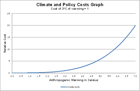
The costs of global warming, CGW are a function of the change in the global average surface temperatures K. This is not a linear function, but of increasing costs per unit of temperature rise. That is

CGW= f {Kx} where x>1            (2)
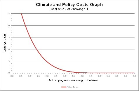
Graphically

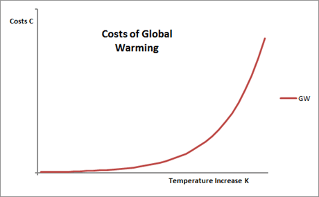
The curve is largely unknown, with large variations in the estimate of the slope. Furthermore, the function may be discontinuous as, there may be tipping points, beyond which the costly impacts of warming become magnified many times. Being unknown, the cost curve is an expectation derived from computer models. The equation thus becomes

E(CGW)= f {Kx}                (3)

The cost curve can be considered as having a number of interrelated elements of magnitude M, time t and likelihood L. There are also the adaptation costs/benefits (which should lead to a planned credit) along with the costs involved in taking actions based on false expectations. Over a time period, costs are normally discounted by r. Then there are two subjective factors – The collective risk factor R, and, when considering a policy response, a weighting W should be given to the scientific evidence. That is

E(CGW)=f {M,1/t,L,A,│Pr-E()│,r,R,W}    (4)

Magnitude M is the both severity and extent of the impacts on humankind or the planet in general in a physical sense.

Time t is highly relevant to the severity of the problem. Rapid changes in conditions are far more costly than gradual changes. Also impacts in the near future are more costly than those in the more distant future due to the shorter time horizon to put in place measures to lessen those costs.

Likelihood L is also relevant to the issue. Discounting a possible cost that is not certain to happen by the expected likelihood of that occurrence enables due unlikely but catastrophic events to be considered alongside near certain events.

Adaptation A is for a project to adapt to the changed climate, to lessen or null the costs. It is the difference between the actual costs spent and the climate impacts saved. Upon completion, a project should have a net credit value.

│Pr-E()│ is the difference between the predicted outcome, based on the best analysis of current data at the local level, and the expected outcome, that forms the basis of adaptive responses. It can create a cost in two ways. If there is a failure to predict and adapt to changing conditions then there is a cost. If there is adaptation to an anticipated future condition that does not emerge, or is less severe than forecast, there is also a cost. │Pr-E()│= 0 when the outturn is exactly as forecast in every case. Given the uncertainty of future outcomes, there will always be costs incurred if the climate cost savings from adaptation is a unitary value. If there are a range of possible scenarios, then this value could be a credit.

Discount rate r is a device that recognizes that people prioritize according to time horizons. Discounting future costs or revenue enables us to evaluate the discount future alongside the near future.

Collective risk factor R, is the risk preference weighting. If policy-makers assume a collective risk-neutral position, then this weighting will be 1. Risk lovers – the gamblers and many self-made billionaires – have a weighting of less than one. Those who take out insurance are risk averse. Insurance gives a certain premium to compensate if a much greater probabilistic loss occurs. For instance, the probability of a £200,000 house being completely destroyed in a year is around 1 in 10,000. So the expected loss is just £20 in any year. Most people are risk averse when it comes to their most valuable asset, so would pay a premium of far greater than £20 compensate for this unlikely loss. With respect to potential catastrophes, we usually expect governments to take a risk-averse approach. That is to potentially spend more on certain costs (like flood defences) than the total expected losses from letting catastrophes from happening. For any problem on a vast scale, we need to articulate the risk preference weighting. The “precautionary principle”, used in arguing for tough and immediate mitigation policies, effectively creates a collective risk factor many times greater than 1. NB, as the costs of climate change will increase with time, a risk averse weighting is the equivalent of a negative discount rate r. That is, you could assume R = f {-r}.
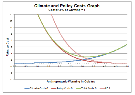
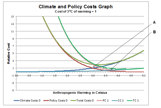
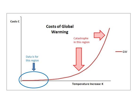
Finally the Weighting (W) is concerned with the strength of the evidence. How much credence do you give to projections about the future? Here is where value judgements come into play. I believe that we should not completely ignore alarming projections about the future for which there is highly circumstantial evidence, but neither should we accept such evidence as the only possible future scenario. In fact, by its very nature the “evidence” will be highly circumstantial. Consider the costs of climate change graph again. The data we have (which needs to converted into evidence) is for a very short section, and for miniscule fluctuations in costs, compared to the predicted catastrophe.

This leads to a vast area of evidence quality as

  • Small errors or biases in temperature measurement will have huge impacts on future projections. (Impacts on historical climate sensitivity)
  • Small errors or biases in distinguishing between natural and human-caused extreme weather events or short-run climatic changes will have huge impacts on projected costs.

If we assume that some sort of climate catastrophe is going to happen, convincing an independent third-party could include

  • Science building a clear track record of short-run predictive successes, both on warming trends and damage impacts.
  • Learning from the errors and exaggerations.
  • Be very clear as to the quality and relevance of the evidence.
  • Corroborating evidence. Show the coherence of one part of the picture with another. For instance, trying to reconcile with estimates of polar ice cap rate of melt with the rate of sea level rise reveals some very interesting questions.
  • Corroboration of between different techniques and evaluation methods.
  • For a junior science, show the underlying methodology draws upon the best of the mature sciences and philosophies of science.

The prediction of catastrophe is highly emotive. There are comparisons here with the justice system in has Britain failed where there are highly emotive crimes, for instance the IRA bringing their bombing campaign to the British mainland in the early 1970s.

  • Clear separation of the understandable emotion, from the evidence gathering.
  • Developing, and continually improving, quality standards for evidence gathering
  • A dim view taken for tampering with, or suppression of evidence.
  • A dim view taken on influencing the jury.
  • Allowing the accused a strong defence. The lack of any credible defence argument, despite a strong defence team, will remove any “reasonable doubt” in the minds of the jury, where the accused is in denial of the overwhelming evidence of their guilt.

6 A halving of climate sensitivity

Lord Lawson, in a spirited attack on the Energy Bill passing through parliament, said in the House of Lords on 18th June 2013

There is an emerging consensus among scientists that the climate sensitivity of carbon is probably less than they thought. That means, importantly, that any dangers from warming, if they occur, are postponed well into the next century. It means that there is no urgency to go ahead in this way, not only because the uncertainties are in the distant future but because we have no idea what technologies will develop over the next 100 years.

The analysis I have developed shows Lord Lawson understates how significant the climate sensitivity issue to the problem of catastrophic warming and mitigation policy.

In my analysis, the maximum warming would be 7oC. There can be a case for warming topping out at some level, as

  • There are diminishing returns to increases in greenhouse gas on temperature.
  • There are diminishing returns at some point for unit rises in emissions on levels of GHGs. That is, higher levels of GHGs in the atmosphere will lead to higher levels of absorption.

I will assume that climate sensitivity is halved, but will assume that temperatures eventually reach 5oC above pre-industrial levels.

The simple curve to work out the consequences is the policy curve. Any constraint of greenhouse gas levels will only have half the impact on temperature. The policy curve will shift to the right to PC1.

The climate costs curve is somewhat more difficult. The elements to consider in the curve are

E(CGW)=f {M,1/t,L,A,│Pr-E()│,r,R,W}

I have highlighted the elements to consider.

Time t will be doubled. Warming rates will therefore be halved. Some of the harmful consequences of warming are from unprecedented rapid change. For many animals and plants, it is speculated sudden change is much more damaging than a slower change. More importantly, sudden changes in average temperature could jolt climate systems into different patterns. Savannahs could become deserts, or the monsoon could shift. Another aspect to consider is that rapid warming of the tundra could release massive amounts of CH4 into the atmosphere, further accelerating warming. Or rapid warming could lead to rapid disintegration and breakup of the polar ice caps, leading to rapid acceleration of sea level rise. The slower warming will make us much less likely to cross these climate tipping points.

Adaptations A
can be phased in more gradually. For instance, with sea level rise, the Thames Barrier will no longer be adequate. A replacement to last 50 years will need to be much less extensive. If warming causes crop yields to fall by increased drought there is more time to adjust.

With changes happening more slowly, (and less chaotically), the adaptation cost errors, │Pr-E()│, are likely to be less.

For any positive rate of discount r, then the current net present value will be lower for the much extended warming period. However, as Stern had a discount value of not much different to zero, allowing for a discount rate would totally cover the other issues.

For all of these reasons, the climate cost curve will move down to CC1 and total cost curve to TC1. The point where policy costs equals climate change costs moves from A to B. That is at a significantly higher temperature, and for a much lower level of policy cost.

I have steered away from the weighting W issues. But given that sensitivity is a core issue that the climate models have got consistently wrong, then any weighting given to other predictions should be viewed with greater scepticism.