Lewandowsky’s false inference from an absurd correlation

Steve McIntyre has posted a number of instances where Stephan Lewandowsky has reported correlations for which there is little or no evidence. My comment is

Even more bizarre than absurd correlations, is to draw inferences of cause and effect from correlations, when there are a huge number of equally valid (or invalid) inferences that can be made.

The title of the Hoax paper is “NASA faked the moon landing|Therefore (Climate) Science is a Hoax: An Anatomy of the Motivated Rejection of Science“. The first part implies that, due to coming to believe that the moon landing was faked, survey respondents reasoned that climate science was also a hoax. But, given that this survey was only on climate blogs, is it not more likely that the respondent’s rejection of “official” or orthodox version of events goes the other way?

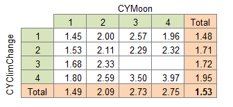
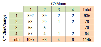
Looking at the data there is a similar issue of low numbers on support of the paired statements. Only 10/1145 supported CYMoon. Of these only 3 supported CYClimChange. Of these only 2 scored “4” for both. And these were the two faked/scam/rogue respondents 860 & 889 whose support of every conspiracy theory underpinned many of the correlations. The third, 963, also supported every conspiracy theory. Let us assume that they are genuine believers in all the conspiracy theories. Further, let us assume that one of the 13 conspiracies in the survey did trigger a response of the form “because I now know A was a conspiracy, I now believe B is a conspiracy”. There are 2n(n-1)= 312 possible versions of this statement. Or, more likely, no such reasoning process went through any respondent’s mind at all. Given the question was never asked, and there is no supporting evidence for the statement “NASA faked the moon landing|Therefore (Climate) Science is a Hoax” it most likely a figment of someone’s imagination.

Data in support of this statement

In the survey the answer 1 was a strong rejection, 4 a strong support. Out of 1145 responses, only 6 strongly supported the “NASA faked the Moon Landing” hypothesis, and a further 4 lent support to it. Of these 10, only 3 support the “Climate Change is a Hoax” statement.

The strong support for conspiracy theories is shown by giving the average score of respondents over all 13 conspiracy questions. The 3 that supported by CYMoon and CYClimChange had the highest average scores of all 1145 respondents.

Dehumanizing Climate Sceptics

Steve Mcintyre did some research on Dr Paul Bain – the same who Jo Nova had a long correspondence with a few months ago.

Dehumanizing Language
A few months ago, in an article in Nature Climate Change, Paul Bain, another Australian psychologist, repeatedly used the term “denier” to refer to climate skeptics. Bain defended this usage at Judy Curry’s on the basis that it would “activate the strongest confirming stereotypes” in his target audience:
By using the term “denier” we wanted to start with something that would activate the strongest confirming stereotypes in this audience
Bain’s usage was sharply criticized by skeptic blogs (though it was not an issue that I bothered with.) Judy Curry made the following interesting suggestion:

Somebody needs to research the sociology and psychology of people that insist that anyone that does not accept AGW as a rationale for massive CO2 mitigation efforts is a “denier.”

Judy’s invitation unfortunately was not followed up in the comments. Had this been done, people would have made the surprising discovery that, in his “day job”, Bain primarily wrote about the use and function of derogatory epithets (e.g. cockroach in the Hutu-Tutsi and other racially charged terms). Bain observed that a primary function of dehumanizing language is to reinforce the self-esteem of the “in group”:
For example, Bain observed

Subtle forms of dehumanization are often explained with reference to …the idea that the in group is attributed “the human essence” more than outgroups, and hence outgroups are implicitly seen as “non-human”. ..

People typically evaluate their in-groups more favorably than out-groups and themselves more favorably than others…

such labeling has the effect of denying full humanness to the out group, reinforcing the self-esteem of the in-group..

The denial of full humanness to others, and the cruelty and suffering that accompany it, is an all-too familiar phenomenon…

Despite Bain’s prolific writing on the use and abuse of dehumanizing epithets, he was oddly oblivious to the function of the term “denier” as a means of dehumanizing IPCC critics.

My interpretation of Bains’ scientific research is that likening sceptics to Nazis or pedophiles shows the collective insecurities and feelings of inadequacy of those making the comments. Deep down they know that their beliefs are built on sand, and are desperately finding ways not to acknowledge this. Dehumanizing those who challenge their beliefs is nothing new. It is an easy position to fall into, and takes courage to challenge.

Gergis 2012 Mark 2 – Hurdles to overcome

BishopHill reported yesterday on the withdrawn Gergis paper that

The authors are currently reviewing the data and methods. The revised paper will be re-submitted to the Journal of Climate by the end of July and it will be sent out for peer review again.

It is worth listing the long list of criticisms that have been made of the paper. There are a lot of hurdles to overcome before Gergis et al 2012 should qualify for the status of a scientific paper.

My own, quite basic, points are:-

  1. Too few proxies for such a large area. Just 27 for > 5% of the globe.
  2. Even then, 6 are well outside the area.
  3. Of these six, Gergis’s table makes it appear 3 are inside the area. My analysis is below.


  4. Despite huge area, there are significant clusters – with massive differences between proxies at the same or nearby sites.
  5. There are no proxies from the sub-continental land mass of Australia.
  6. Need to remove the Palmyra Proxy because (a) it has errant readings (b) fails the ‘t’ test (c) > 2000km outside of the area, in the Northern Hemisphere.
  7. Without Palmyra the medieval period becomes the warmest of the millennium. But with just two tree ring proxies, one at 42 O South and the other at 43 O S representing an range from 0 to 50O S, this is hardly reliable. See the sum of proxies by year. Palmyra is the coral proxy in the 12th, 14th and 15th centuries.


On top of this are Steve McIntyre’s (with assistance from JeanS and RomanM) more fundamental criticisms:-

  1. The filtering method of Gergis excluded the high quality Law Dome series, but included the lower quality Vostok data, and the Oroko tree ring proxy. McIntyre notes that Jones and Mann 2003 rejected Oroko, but included Law Dome on different criteria.
  2. Gergis screening correlations were incorrectly calculated. JeanS calculated properly. Only 6 out of 27 proxies passed. (NB none of the six proxies outside the area passed)


  3. The Gergis initially screened 62 proxies. Given that the screening included proxies that should not have included 21 proxies, but should it have included some of the 35 excluded proxies. We do not know, as Gergis has refused to reveal these excluded proxies.
  4. Screening creates a bias in the results in favour of the desired result if that correlation is with a short period of the data. RomanM states the issues succinctly here. My, more colloquial take, is that if the proxies (to some extent) randomly show C20th warming or not, then you will accept proxies with a C20th uptick. If proxies show previous fluctuations (to some extent) randomly and (to some extent) independently of the C20th uptick, then those previous fluctuations will be understated. There only has to be a minor amount of randomness to show bias given that a major conclusion was

    The average reconstructed temperature anomaly in Australasia during A.D. 1238-1267, the warmest 30-year pre-instrumental period, is 0.09°C (±0.19°C) below 1961-1990 levels.

UPDATE 03/08/12

The end of July submissions date seems to have slipped to the end of September.

How Gergis Suppressed The Medieval Warm Period

The now withdrawn Gergis paper proudly proclaimed in the abstract

The average reconstructed temperature anomaly in Australasia during A.D. 1238-1267, the warmest 30-year pre-instrumental period, is 0.09°C (±0.19°C) below 1961-1990 levels.

On this basis, Gergis was able to say

A preliminary assessment of the roles of solar, volcanic, and anthropogenic forcings and natural ocean–atmosphere variability is performed using CSIRO Mk3L model simulations and independent palaeoclimate records. Solar and volcanic forcing does not have a marked influence on reconstructed Australasian temperature variations, which appear to be masked by internal variability.

This conclusion is from a single rogue proxy – the coral proxy from Palmyra Atoll.

There were only three temperature proxies covering this medieval peak period. Both Mt. Read in Tasmania and Oroko in New Zealand are tree ring proxies that cover the entire millennium. The Palymyra Atoll coral proxy data covers just 398 years over 4 periods. These are 1151-1221, 1319-1465, 1637-1704 and 1888-1999. Following Gergis, I have calculated the decadal averages. Below is the plot from my pivot table for the three proxies.


I contend that Palmyra is distinctly “odd” due to the following.

  1. Nowhere in the world am I aware of a single instance of massive cooling during the early 13th Century. If not rogue data, the it must be a purely local phenomena.
  2. Nowhere in the world am I aware of a single instance of massive cooling during the 17th Century. Nor was I aware the early 17th century had significant warm period. If not rogue data, it must be a purely local phenomena.
  3. The Hadcrut3 global temperature set has slight cooling at the end of the 19th century / start of the 20th Century, and a warming period from 1910 to 1940 almost as large as the warming period from 1975 to 1998. If not rogue data, it must be a purely local phenomena.
  4. The post 1960 warming trend is phenomenal. In fact it makes the twentieth century warming trend the largest of all the 27 proxies. (See table “Analysis of the Proxies in Gergis et al. 2012” below)

For these three reasons it would appear to be an outlier. So what is the impact?

I looked at the decadal average of the two tree-ring proxies and ranked the hundred decades from 1 for the highest to 100 for the lowest. I then took the decadal average of the three tree-ring proxies and similarly ranked the results.

The change is the decadal ranking was as follows:-


The medieval warm period is suppressed, and the twentieth century is “enhanced”.

Now let us be clear. There were 24 other proxies in the data set. However, none of the others were prior to 1430. Therefore the impact on the overall ranking will not be quite so marked. However, the fact remains that the conclusion that last decade of the 20th century is the warmest of the millennium is based on this one rogue data set.

But there are two more reasons that the Palmyra data set should not have been included in the reconstruction.

Firstly, the Gergis paper was withdrawn upon the publication of the JeanS ‘Gergis Significance’ t-values. Unsurprisingly, Palmyra was one of the proxies that failed the t-test, so is a rogue data set. See table below.

Secondly, is geography. The study is a “temperature reconstruction for the combined land and oceanic region of Australasia (0°S-50°S, 110°E-180°E)“. Palmyra Atoll is located at 5°52′ N, 162°06′ W, or over 2100Km (1300 miles) outside the study area.

Conclusion.

The Palmyra Atoll coral proxy study is clearly an outlier statistically and geographically. In no way can it be considered a suitable proxy for the Australasia region, yet the major, headline, conclusion of the Gergis et al 2012 temperature reconstruction relied upon it.


George Monbiot’s narrow definition of “charlatan”

Bishop Hill quotes George Monbiot

I define a charlatan as someone who won’t show you his records. This looks to me like a good [example]: http://t.co/5hDF57sI

Personally, I believe that for word definitions one should use a consensus of the leading experts in the field. My Shorter OED has the following definition that is more apt.

An empiric who pretends to wonderful knowledge or secrets.

Like John Cook’s definition of “skeptic“, Monbiot’s definition is narrower and partisan. Monbiot was referring to maverick weather forecaster Piers Corbyn. If someone has a “black box” that performs well under independent scrutiny, then they are charlatan under Monbiot’s definition, but not the OED’s. This could include the following.

  • A software manufacturer who does not reveal their computer code.
  • A pharmaceutical company that keeps secret the formulation of their wonder drug.
  • A soft drink manufacturer, who keeps their formulation secret. For instance Irn-Bru®.

The problem is that these examples have a common feature (that Piers Corbyn would claim to share to some extent). They have predictive effects that are replicated time and time again. A soft drink might just be the taste. Climate science cannot very well replicate the past, and predictions from climate models have failed to come about, even given their huge range of possible scenarios. This is an important point for any independent evaluation. The availability of the data or records matter not one iota. It is what these black boxes say about the real world that matters. I would claim that as empirical climate science becomes more sophisticated, no one person will be able to replicate a climate model. Publishing all the data and code, as Steve McIntyre would like, will make as much difference as publishing all the data and components of a mobile phone. Nobody will be able to replicate it. But it is possible to judge a scientific paper on what it says about the real world, either through predictions or independent statistical measures of data analysis.

NASA excludes an inconvenient figure on 2010 Temperatures

The NASA Earth Observatory has a nice graph to show average global surface temperatures.

I noticed a small anomaly with the 2010 figures. The blue line, for the British Hadley Centre, appears to be missing.

You can check this by downloading the HADCRUT3 data set from here. Popping these figures into an Excel graph I get the following.

Excel even defaulted to the correct colour! The 2010 average temperature anolmaly on this data set is .468, as against .474 in 2005 and .529 in 1998. This is significant in that the NASA GISS figures show 2010 to be the warmest year on record, something that was pre-announced by leader James Hansen before the year was half way through. Try Googling 2010 Warmest Year on record to see the number of hits. But inclusion of the HADCRUT figures refutes the headline. Statistically it may not be significant, but the headlines show that politically it is important. It is the difference between the claim that global warming stopped in 1998, and that it is continuing.

There is previous form in the climate community, as Steve McIntyre has noted. McIntyre has the following graphic (at page 28 of McIntyre, S. 2008b. How do we “know” that 1998 was the warmest year of the millennium?. Ohio State University Seminar, may 16, 2008.)

As Steve McIntyre states

“In the IPCC Third Assessment Report, they did worse than simply ignoring the problem.

They deleted the declining portion after 1960, thereby giving a false sense of coherence

between the proxies. In AR4, as a reviewer, I asked them to restore the deleted portion.

They refused saying that showing this information would be “inappropriate” (See


IPCC WG1 chapter 6 29 Review Comments) and the downward late 20th century portion

of the Briffa et al 2001 reconstruction was once again deleted in IPCC AR4.”

Copygate – the Underlying Significance

Steve McIntyre puts the Copygate scandal (paper here) of the 2006 Wegman Report into context.

A minor, but potentially significant, point in all of this is the timing issue. The Wegman Report was published in 2006. Given the Hockey Stick Team are keen to pick up on any points that may undermine any criticism of their scientific work, why has it taken four years to pick up on this accusation of plagiarism. I can see two possibilities.

  1. The climate consensus only reads what it wishes to read. Why would Bradley himself, who was cited in this very important report for paleo-climatology, did not have a quick read through it? Or at least a bright student who used his textbook and read around the subject a little.
  2. The hockey stick team is reeling at present. Montford’s Hockey Stick Illusion lays out clearly the debate, so “evidence” that may damage the reputation of the “opposition” is welcome.

Something that is perhaps related is why it took so long for anyone to ask for the data that underpinned MBH98. On the back of it Mann (and to a lesser extent, Bradley) received world-wide fame. Yet there was no upstart PhD student to take it apart, even when it overturned the established perception of there have been a medieval warm period.

This relates to a point I have made before on this blog. There seems to be a lack of critical and balanced analysis within climate science, coupled with the inability to compare and contrast the arguments.

The Hockey Stick and Climate Science

Posted Yesterday to the discussion at Climate Audit on the topic of “The Team Defends Paleo-Phrenology”

It may help …. to understand the nature of the science. It relies on statistical techniques to establish results. These, crucially, depend for their validity on the elimination of bias. If a researcher has faulty data, then the results are undermined. If the researcher is selective in the data, then the results are undermined. It outliers are not eliminated then the results are undermined. This all means that where there is extremely complex data, and problems of measurement, it is extremely difficult to establish conclusions that cannot be overturned. This is both true of economics and of paleoclimate.

I would contend that climate scientists, as a junior scientists, need to learn from other disciplines.
– From accountancy, about sense-checking the data (see link below)
– From research into new drugs, about the necessity for more technicians to collect and collate data, and to experiance dead-ends.
– From law, to distinguish between levels of evidence and distinguish baseless rhetoric from cogent arguement
– Most of all from statistical theory, where you will find you results will have no validity unless you take active steps to eliminate bias. Even then, with complex data, your results may still be later undermined, despite passing a battery of tests.

For all of these reasons, we should accept that the results of research are tentative. We should recognise the limits of our knowledge. In recognising the boundaries, and establishing procedures to quickly identify error, paleoclimate may be able to move forward.


The whole hockey stick issue, brought to a head with the Tamino posting, shows the problem of bias. To obtain a temperature reconstruction requires using data that usually gives a very weak signal indeed. Therefore any data needs to be carefully collected and every conceivable bias removed. It is only by eliminating bias that the statistical analysis can begin. In many cases there will be no significant results. Much painstaking work will achieve a dead end. And there is the rub. Careers are not made by failing to get a result. In this arena phenomenal fame and prestige can come to those who produce results that fortify the consensus. And there is plenty of recognition to those with supporting roles as well.

The original MBH98 may never have emerged in a more muted form if an expert reviewer had asked how such a novel result could be reconciled with the existing view that there was a medieval warm period. Hence my point about sense-checking in the previous blog posting. Similarly the comment that the 20th century warming was unprecedented should be answered with how do you know that? Read the Hockey Stick Illusion and you will find that the claim lacks scientific validity.  

If climate science it to mature it needs more painstaking data collection and analysis. As a science, it needs to find the current boundaries and limits of our current knowledge.

For those who believe that the Hockey Stick Team still have something worthwhile to say, should start with Steve McIntyres repost of “Tamino and the Magic Flute“. Compare that with Tamino’s posting “The Montford Delusion”.

Look at

1. Who gives the fullest answers?

2. Which side evades the points, or attempts sleight of hand?

3. How are contrary or neutral points treated. Clue – look at how Judith Curry (who is trying to remain neutral) is treated. Further, look at how contrary opinions are treated.

4. Finally who are the real deniers in all of this?

Tamino v. Montford – A Sense-Check

Clarification – This post is an attempt to say two things – but badly.

First, a simplistic verification of a global temperature reconstruction is to cross-check against local temperature reconstructions from around the world. These, on average, strongly contradict the hockey stick.

Second, Tamino’s claim is essentially McIntyre has just been taking pot-shots at sound science. Instead McIntyre has looked at all the steps in making a reconstruction, and found all wanting.

So what of a neutral lay-person trying to compare the Montford’s Hockey Stick Illusion and Tamino’s debunking? From my accountancy experience, it is normal to try to get a sense-check. What is the expected result? If the actual is different from the expected, then difference needs to be reconciled. The MBH98, MBH99, and the subsequent reconstructions in the book, completely overturned perceived thinking, so there needs to be a sense-check to make sure the results are valid. 

 The sense-check for the global temperature reconstructions can be from localized reconstructions from around the world, to see if the global reconstruction replicates the typical pattern. A website, CO2science.org, documents peer-reviewed articles estimating temperatures in the medieval warm period. For those that have a temperature estimate, those that agree with the hockey stick – that temperatures were lower than today – are out-numbered 5 to 1 by those that say temperatures were higher in the MWP. The raw median, median, and mode values are that temperatures were about 0.75oC warmer than today. The weaker, qualitative, studies have a similar picture. Those that suggest that temperatures in the MWP were similar to or lower than today are outnumbered more than 4 to 1 by those that suggest temperatures were higher. So when the more scientific, global, reconstructions come up with a novel, contrary, result, there needs to a full reconciliation to explain why. Without such an explanation, we just have McIntyre’s multi-layered* findings that the global reconstructions are critically flawed stands.

*McIntyre’s findings are multi-layered, including.

a)      Hockey Stick shapes were given undue weighting by the short-centering of the PC analysis. For instance, McIntyre calculated that Sheep Mountain had 390 times the weighting of Mayberry Slough (p113-114). Of the 112 original proxies in MBH9, just 13 had a hockey stick shape. Tamino does not counter this, only looking at the 22 longer hockey stick series, made up of individual series, such as Gaspe, along with regional combinations such as NOAMERPC1.

b)      Dodgy data and infilling. Looking across the columns of data, McIntyre noticed identical data in adjacent columns, as though infilling had taken place. (p78-81)

c)      Many of these series were based on old data. If Mann had used the most recent data available in 1998, could the final Hockey Stick have been less pronounced? (p83-84)

d)      Some of the most important original proxies were flawed.

  1.  
    1. Gaspé has better data, but was unpublished. (p174) It also had an alternative proxy with better data in Alaska. (More here)
    2. Sheep mountain had updated proxies that fails to show an HS (p 357-361)
    3. The Graybill bristlecone series had a number of flaws (e.g. p121-125 & p353-357)

e)      The failure of alternative reconstructions. (Chapter 10).

f)        There was considerable evidence of biases in the data selection in the proxies (along with small sample sizes); the selection of the proxies in the reconstruction; and the short-centring which gave rise to hockey sticks on random data 99% of the time. Given this, any measure of correlation statistic was rendered largely meaningless. McIntyre did not explore this. However, Montford provides evidence that the verification statistic used was highly irregular in the disciplines outside of climate science. (e.g. p156-164)  Latest – McIntyre shows the evidence that to suggest verification statistic was cherry-picked.

That is, the selection of data in the proxies, the proxy selection, the bias by short-centering, and the selection of verification statistic are all different levels in establishing a reconstruction, and all shown by McIntyre to have failed.

For a different take – which side pursues scientific understanding, see the follow-up https://manicbeancounter.wordpress.com/2010/07/27/the-hockey-stick-and-climate-science/

Tamino v Montford on the Gaspé series

Have just finished reading A.W. Montford’s (alias Bishop Hill) The Hockey Stick Illusion. Although I thought it excellent, and agree with the reviews (e.g. Air Vent), I thought I would look for contrary opinions, to allow me to compare and contrast the different sides. It just so happens that Tamino has posted a critical review at Real Climate blog on July 22nd. Bishop Hill has responded.

In the spirit of allowing you to make up your own mind, let me present one aspect, which does not need a scientific background to evaluate.

Tamino claims that McIntyre rejects Gaspé because

 “This particular series doesn’t extend all the way back to the year 1400, it doesn’t start until 1404, so MBH98 had extended the series back four years by persistence — taking the earliest value and repeating it for the preceding four years. This is not at all an unusual practice, and — let’s face facts folks — extending 4 years out of a nearly 600-year record on one out of 22 proxies isn’t going to change things much.”


I would agree with Tamino, if that was the only problem with Gaspé. But other problems Montford recounts.

  1. It had the biggest hockey stick of any of the 112 series. 1975 was 3.05 standard deviations from the series mean. Only 12 others had any sort of hockey stick shape. (p.75)
  2. It was included twice in the proxies – once as part of the North American PC series and once on its own. (p.140).
  3. It did start in 1404, but until 1421 relied on a single tree, and two up to 1447. The original authors “had not used the early portion of the series at all in their own reconstruction”, but Mann had. (p165.)
  4. Mann’s own claim for its’ inclusion was that the study represented the northern treeline. But Gaspé was well south of the treeline. As a sensitivity analysis, McIntyre replaced Gaspé with the Sheenjek River Series in Mid-Alaska. It was further north and had more trees. When this was replaced, the medieval warm period re-appeared. (p.166).*
  5. McIntyre showed “that you could only get rid of the Medieval Warm Period by using the Gaspé series twice and by including the unreliable early portion, and by extending this highly dubious data back to the start of the fifteenth century.”
  6. An updated study was done taking the data to 1991, instead of 1982. There was nothing like the same growth spurt in recent times. The data went unpublished, and the author claiming to have lost the location. So the results could not be independently replicated. (p.174).
  7. Montford says in reply to Tamino

“The observation that “McIntyre argued that the entire Gaspe series should be eliminated because it didn’t extend all the way back to 1400” is wrong. MBH had its steps starting at 50-year intervals. Gaspe should therefore have been in the 1450 step not the 1400 one.”


From my simple view, the criticism of the Gaspé proxy series is multilayered. It was used inappropriately; there was a better proxy available (or an update); it was clearly an outlier; and was used twice.

Finally, Steve McIntyre has already criticised Tamino on Gaspé here. McIntyre makes the additional point

“The Gaspé series is a cedar chronology. There is no botanical evidence that cedars respond linearly to warmer temperatures. World experts on cedar are located at the University of Guelph, Ross McKitrick’s university. Ross and I had lengthy discussions with these cedar experts about this chronology – they said that cedars like cool and moist climate.”


* Gaspé is around 49o North (same as Paris), Sheenjek River 65o North. (same as Iceland).