There is a belief, throughout the world, that a particular emissions reduction policy will save the planet from a climate catastrophe. An extreme form was the Just Stop Oil protests that plagued London and other cities. Their major demand was for no new oil and gas production within UK territory. A particular target was the proposed Rosebank oil field, a site about 200km due north of the Scottish mainland and located under 1100 metres of water. The field may contain up to 300 million barrels of oil. The developers were ordered in January 2025 to conduct a climate impact assessment. The results are in, at least according to a recent BBC article.
The UK’s largest undeveloped oil field has revealed the full scale of its environmental impact, should it gain approval by the government.
Developers of the Rosebank oil field said nearly 250 million tonnes of planet warming gas would be released from using oil products from the field.
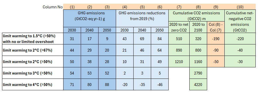
This is a ridiculous comment to make. Why? The climate impact of CO2 emissions is through raising atmospheric CO2 levels, which in turn causes rising global average temperatures. It is believed that this warming could have catastrophic consequences for the planet. So, how much warming will 250 million tonnes of CO2 (0.25 GtCO2) cause? I will first make the assumption that the oil from Rosebank will add to global oil consumption and not be instead of oil from say Russia, the Middle East, or Venezuela. The most authoritative source of data is from the UN IPCC Assessment Reports. In particular, from the 2021 AR6 WG3 Summary for Policymakers. This states historical cumulative net CO2 emissions from 1850 to 2019 were 2400 ± 240 GtCO2 (high confidence). A footnote on page 10 states that the ± 240 is at the 68% confidence interval. In statistics, a 95% confidence interval is conventional, which is double the ± 240 GtCO2. In AR6 various emissions pathways were calculated using that figure. Figure 1 is an extract from “Table SPM.2 | Key characteristics of the modelled global emissions pathways” on pages 18-19, looking at the additional emissions to reach various warming levels in 2100.
Figure 1: Extract from “Table SPM.2 | Key characteristics of the modelled global emissions pathways“, IPCC AR6 SPM. Uncertainty ranges not included. Data shaded orange are additions. Shaded blue refers to greenhouse gas (GHG) emissions. Shaded green refers to cumulative CO2 emissions. The report estimates that in 2019, CO2 emissions accounted for 75% of GHG emissions measured in CO2 equivalent tonnes.
Even though I have simplified the table (full table here), there are still a lot of figures to digest. Look at the top row – limit warming to 1.5 °C (>50%) – columns (7) – (9). To reach net zero requires 510 GtCO2, with -190 GtCO2 before 2100 to get a >50% chance of global average temperature rise not exceeding 1.5 °C above 1850 levels in 2100.* The similar figures for 2.0 °C are 1210 and -50 GtCO2. Taking the difference of the col (8) figures (1160-320) gives 840 GtCO2 for 0.5 °C of “warming”. By inference, 0.25 GtCO2 will give about 0.00015 °C of warming.
Thus, even if the Rosebank oil field were 1000 times larger – containing over 8 years of global oil production instead of 3 days – it would still have no significant impact on global average temperatures in the context of the AR6 climate pathways. Hence, the climate impact of the Rosebank oil field is nil. The same can be said of any project in the UK, or indeed, the whole of UK climate policies slavishly tracking the 1.5 °C pathway, including net negative emissions after 2050.
But could it be argued that, although the quantity of emissions that would emanate from Rosebank oil is insignificant, it is still part of a successful global emissions reduction policy? This is not the case. The UNEP Emissions Gap Report 2024 highlights that 2023 was a new record for GHG emissions at 57.1 GtCo2e. 2030 is likely to see emissions slightly higher than in 2019, consistent with just over 3 °C of warming in 2100 in IPCC AR6 projections. Why some countries, like the UK, follow emissions reduction policies in line with the 1.5 °C pathway when the world as a whole does not is a question that will be answered in an article in preparation.
Kevin VS Marshall
*NB. The net 320 GtCO2 for 2020-2100 1.5 °C emissions pathway is less than the 480 GtCO2 confidence interval in the historical CO2 emissions estimate.
Whilst Anthony Watts was speaking on the Climate Realism show, the main screen was scrolling through the Environmental Defense Fund (EDF) and the Union of Concerned Scientists (UCS) “COMPLAINT FOR DECLARATORY, INJUNCTIVE, AND MANDAMUS RELIEF” document. Part of Paragraph 27 stood out.
EPA’s final finding rested on a vast body of rigorous, peer-reviewed scientific research confirming that greenhouse gas pollution is driving destructive changes in our climate that pose a grave and growing threat to Americans’ health, security, and economic well-being.
Let us follow the “Consensus Science” on this one. Hansen et al. 1988 (the paper behind the 1988 staged event that really launched the global climate hysteria), states that greenhouse gases are well-mixed. That means it does not matter where in the world anthropogenic emissions originate; each unit of these trace gases affects the levels in equal measure. Capitalist countries do not emit a more pernicious form of CO2 than, say, communist ones. Yet, International law related to climate is written as if this were the case. A detailed exposition of that international law is contained in a recently issued Judgement by the International Court of Justice, “OBLIGATIONS OF STATES IN RESPECT OF CLIMATE CHANGE“. Paragraph 179 states
The principle of common but differentiated responsibilities and respective capabilities is a cardinal principle of the climate change treaty framework, which is incorporated in several provisions of the climate change treaties (see UNFCCC, preamble, Article 3, paragraphs 1 and 2, and Article 4; Kyoto Protocol, Article 10; Paris Agreement, Article 2, paragraph 2, and Article 4, paragraphs 3, 4 and 19; see also paragraphs 148-151 above)……
What does “the principle of common but differentiated responsibilities” mean? This is spelt out in the UN Framework Convention on Climate Change (UNFCCC) 1994 Article 4.7
The extent to which developing country Parties will effectively implement their commitments under the Convention … will take fully into account that economic and social development and poverty eradication are the first and overriding priorities of the developing country Parties.
Developed country Parties should continue taking the lead by undertaking economy-wide absolute emission reduction targets. Developing country Parties should continue enhancing their mitigation efforts, and are encouraged to move over time towards economy-wide emission reduction or limitation targets in the light of different national circumstances.
That is, under UN law, there is a two-track approach to cutting emissions. Only developed Western countries have an obligation to cut their emissions in the near future. The rest of the world following on at a some yet to be agreed upon point in the future. The idea of a unified global approach to emissions reductions are an illusion in the mind of climate activists. Therefore, net zero policies, or talk of achieving following some 1.5 °C and 2 °C emissions pathways are just narratives to impose costly and pretty much useless policies on a few countries.
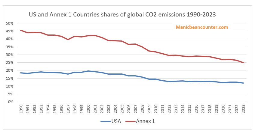
How has this played out? Under the UNFCCC Treaty, the developed (or Annex 1) countries include the more developed parts of the former Soviet Union. But Russia, Belarus and Ukraine have been temporarily excluded for the last 30+ years as “economies in transition”. That leaves the USA, EU, Japan, Canada, Australia and UK as the main radical emissions-cutting countries, along with Mexico and Türkiye, whose emissions have massively increased since 1990. How does that work out? US CO2 Emissions declined 3% from 1990-2023, but have declined as a share of the global total from 18.5% to 12.0%. The share declined due to CO2 emissions in the “developing countries” increasing during 1990-2023 by 105%. In other words, now seven-eighths of the CO2 “pollution” affecting Americans emanates from outside the USA. Further, the EPA endangerment finding covers just a part of the national policies. These consensus scientists should realise that the EPA Endangerment Finding is severely limited territorially. If policy is evaluated from the standpoint of achievable goals, then any emissions constraint policy by the US in whole or in part that aims to stop “climate change” will fail.
Figure 1 : US and Annex 1 Countries’ shares of global CO2 emissions 1990-2023. Source : Global Carbon Budget – Sum of “Territorial” CO2 emissions (mostly fossil fuel emissions) and “Land-use Changes”.
For the first time this report highlights that UK sea level is rising faster than the global average.
As sea levels continue to rise around the UK, the risk of flooding is only going to increase further, says Dr Svetlana Jevrejeva from the National Oceanography Centre.
The examples that the BBC gives of flooding in 2024 at Tetbury and Stratford-upon-Avon are significantly above sea level, and many miles inland. But why let facts get in the way of a good narrative.
On sea-level rise, the Met Office Executive Summary states
Sea level rise around the UK is accelerating.
Since 1901, the sea level around the UK has risen by about 19.5 cm, with two-thirds of this rise happening in just over the last three decades.
The last 3 years were the three highest on record for UK annual mean sea level in a series from 1901, with the 21st Century so far (2001–2024) including the 17 highest years.
Over the past 32 years (1993–2024) UK sea level has risen by 13.4 cm. This is higher than the global estimate of 10.6 cm calculated from satellite altimetry over the same period,
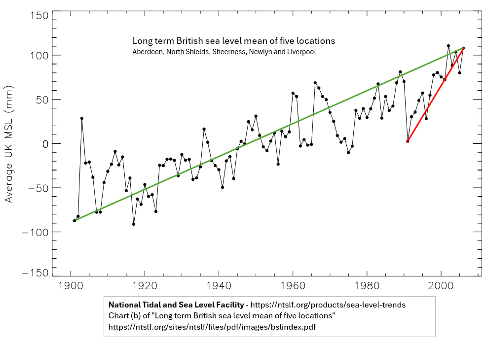
My first reaction on reading this was to assume that the Met Office had copied the methodology of the IPCC AR6 2022. That is, to splice the tide-gauge average data of 1901-1992 with the satellite data from 1993, then hope no one would notice that this splicing accounted for nearly all the apparent acceleration. However, although the year 1993 is there, it is apparent that the comments are derived from a single UK data set. A little research gets a graph of “long-term British sea level mean of five locations” at the National Tidal and Sea Level Facility. I have annotated the graph a little.
The graph does show that 2024 sea levels were about 19.5cm higher than in 1901. But 2024 sea levels were more like 10.5 cm higher than in 1993, not 13.4 cm. Further from 1992 to 1993, sea levels fell dramatically. Almost 7cm, equivalent to a third of the net increase over 124 years. From 1992 to 2024 sea levels rose about 3.8 cm or 1.2 mm yr-1, compared with 1.6 mm yr-1 in 1901-2024. In future Met Office ought to get a professional statistician to calculate trends and perform significance and sensitivity tests on the data. As for the 2024 report, it should be reissued with the unsubstantiated claims about accelerating sea-level rise removed.
This is an expanded version of a comment made at Paul Homewood’s notalotofpeopleknowthat blog.
Projected power demand is likely high, as demand will likely fall as energy becomes more expensive.
Report assumes massively increased load factors for wind turbines. A lot of this increase is from using benchmarks contingent on technological advances.
The theoretical UK scaling up of wind power is implausible. 3.8x for onshore wind, 9.4x for fixed offshore and >4000x for floating offshore wind. This to be achieved in less than 27 years.
Most recent cost of capital figures are from 2018, well before the recent steep rises in interest rates. Claim of falling discount rates is false.
The current wind turbine capacity is still a majority land based, with a tiny fraction floating offshore. A shift in the mix to more expensive technologies leads to an 82% increase in average levelised costs. Even with the improbable load capacity increases, the average levilised cost increase to 37%.
Biggest cost rise is from the need for storing days worth of electricity. The annual cost could be greater than the NHS 2023/24 budget.
The authors have not factored in the considerable risks of diminishing marginal returns.
Demand Estimates
The briefing summary states
The analysis shows that GB’s estimated practical wind and solar energy resources (2,896 TWh/year) are almost ten times current electricity needs (299 TWh/year) and easily exceed even the highest 2050 demand forecasts for all energy (1,500 TWh/year), including scenarios that involve electrification of much of the economy.
299 TWh/year is an average of 34 GW, compared with 30 GW average demand in 2022 at grid.iamkate.com. I have no quibble with this value. But what is the five-fold increase by 2050 made-up of?
From page 7 of the full report.
In 2021, UK primary energy demand was 1,978 TWh and final energy demand 1,599 TWh (Harris, 2022, p. 3). This was 4.7% higher than 2020, but 7.8% lower than pre-pandemic levels (Harris, 2022, p. 3). Electricity consumption in GB was 299 TWh (McGarry, 2022).
So 2050 maximum energy demand will be slightly lower than today? For wind (comprising 78% of potential renewables output) the report reviews the estimates in Table 1, reproduced below as Figure 1
Figure 1: Table 1 from page 10 of the working paper
The study has quite high estimates of output compared to previously, but things have moved on. This is of course output per year. If the wind turbines operated at 100% capacity then the required for 24 hours a day, 365.25 days a year would be 265.5 GW, made up of 23.5GW for onshore, 64GW for fixed offshore and 178GW for floating offshore. In my opinion 1500 TWh is very much on the high side, as demand will fall as energy becomes far more expensive. Car use will fall, as will energy use in domestic heating when the considerably cheaper domestic gas is abandoned.
Wind Turbine Load Factors
Wind turbines don’t operate at anything like 100% of capacity. The report does not assume this. But it does assume load factors of 35% for onshore and 55% for offshore. Currently floating offshore is insignificant, so offshore wind can be combined together. The UK Government produces quarterly data on renewables, including load factors. In 2022 this average about 28% for onshore wind (17.6% in Q3 to 37.6% in Q1) and 41% for offshore wind (25.9% in Q3 to 51.5% in Q4). This data, shown in four charts in Figure 2 does not seem to shown an improving trend in load capacity.
Figure 2 : Four charts illustrating UK wind load capacities and total capacities
The difference is in the report using benchmark standards, not extrapolating from existing experience. See footnote 19 on page 15. The first ref sited is a 2019 DNV study for the UK Department for Business, Energy & Industrial Strategy. The title – “Potential to improve Load Factor of offshore wind farms in the UK to 2035” – should give a clue as to why benchmark figures might be inappropriate to calculate future average loads. Especially when the report discusses new technologies and much larger turbines being used, whilst also assuming some load capacity improvements from reduced downtimes for maintenance.
Scaling up
The report states on page 10
UK wind capacity totals 28.5 GW comprising 14.7 GW onshore and 13.8 GW offshore.
From the UK Government quarterly data on renewables, these are the figures for Q3 2022. Q1 2023 gives 15.2 GW onshore and 14.1 GW offshore. This offshore value was almost entirely fixed. Current offshore floating capacity is 78 MW (0.078 GW). This implies that to reach the reports objectives of 2050 with 1500 TwH, onshore wind needs to increase 3.8 times, offshore fixed wind 9.4 times and offshore floating wind over 4000 times. Could diminishing returns, in both output capacities and costs per unit of capacity set in with this massive scaling up? Or maintenance problems from rapidly installing floating wind turbines of a size much greater than anything currently in service? On the other hand, the report notes that Scotland has higher average wind speeds than “Wales or Britain”, to which I suspect they mean that Scotland has higher average wind speeds to the rest of the UK. If so, they could be assuming a good proportion of the floating wind turbines will be located off Scotland, where wind speeds are higher and therefore the sea more treacherous. This map of just 19 GW of proposed floating wind turbines is indicative.
Cost of Capital
On page 36 the report states
According to BEIS, 2020 discount rates for solar, onshore, and offshore wind projects were 5.0%, 5.2%, and 6.3% respectively in the UK, down from 6.5%, 6.7%, and 8.9% in 2015 (BEIS, 2020b).
You indeed find these rates on “Table 2.7: Technology-specific hurdle rates provided by Europe Economics”. My quibble is not that they are 2018 rates, but that during 2008-2020 interests rates were at historically low levels. In a 2023 paper it should recognise that globally interest rates have leapt since then. In the UK, base rates have risen from 0.1% in 2020 to 5.25% at the beginning of August 2023. This will surely affect the discount rates in use.
Wind turbine mix
Costs of wind turbines vary from project to project. However, the location determines the scale of costs. It is usually cheaper to put up a wind turbine on land than fix it to a sea bed, then construct a cable to land. This in turn is cheaper than anchoring a floating turbine to a sea bed often in water too deep to fix to the sea bed. If true, moving from land to floating offshore will increase average costs. For this comparison I will use some 2021 levilized costs of energy for wind turbines from US National Renewable Energy Laboratory (NREL).
Figure 3 : Page 6 of the NREL presentation 2021 Cost of Wind Energy Review
The levilized costs are $34 MWh for land-based, $78 MWh for fixed offshore, and $133 MWh for floating offshore. Based on the 2022 outputs, the UK weighted average levilized cost was about $60 MWh. On the same basis, the report’s weighted average levilized cost for 2050 is about $110 MWh. But allowing for 25% load capacity improvements for onshore and 34% for offshore brings average levilized cost down to $82 MWh. So the different mix of wind turbine types leads to an 83% average cost increase, but efficiency improvements bring this down to 37%. Given the use of benchmarks discussed above it would be reasonable to assume that the prospective mix variance cost increase is over 50%, ceteris paribus.
The levilized costs from the USA can be somewhat meaningless for the UK in the future, with maybe different cost structures. Rather than speculating, it is worth understanding why the levilized cost of floating wind turbines is 70% more than offshore fixed wind turbines, and 290% more (almost 4 times) than onshore wind turbines. To this end I have broken down the levilized costs into their component parts.
Figure 3 : NREL Levilized Costs of Wind 2021 Component Breakdown. A) Breakdown of total costs B) Breakdown of “Other Capex” in chart A
Observations
Financial costs are NOT the costs of borrowing on the original investment. The biggest element is cost contingency, followed by commissioning costs. Therefore, I assume that the likely long-term rise interest rates will impact the whole levilized cost.
Costs of turbines are a small part of the difference in costs.
Unsurprisingly, operating cost, including maintenance, are significantly higher out at sea than on land. Similarly for assembly & installation and for electrical infrastructure.
My big surprise is how much greater the cost of foundations are for a floating wind turbine are than a fixed offshore wind turbine. This needs further investigation. In the North Sea there is plenty of experience of floating massive objects with oil rigs, so the technology is not completely new.
What about the batteries?
The above issues may be trivial compared to the issue of “battery” storage for when 100% of electricity comes from renewables, for when the son don’t shine and the wind don’t blow. This is particularly true in the UK when there can be a few day of no wind, or even a few weeks of well below average wind. Interconnectors will help somewhat, but it is likely that neighbouring countries could be experiencing similar weather systems, so might not have any spare. This requires considerable storage of electricity. How much will depend on the excess renewables capacity, the variability weather systems relative to demand, and the acceptable risk of blackouts, or of leaving less essential users with limited or no power. As a ballpark estimate, I will assume 10 days of winter storage. 1500 TWh of annual usage gives 171 GW per hour on average. In winter this might be 200 GW per hour, or 48000 GWh for 10 or 48 million Mwh. The problem is how much would this cost?
In April 2023 it a 30 MWh storage system was announced costing £11 million. This was followed in May by a 99 MWh system costing £30 million. These respectively cost £367,000 and £333,000 per MWh. I will assume there will be considerable cost savings in scaling this up, with a cost of £100,000 per MWh. Multiplying this by 48,000,000 gives a cost estimate of £4.8 trillion, or nearly twice the 2022 UK GDP of £2.5 trillion. If one assumes a 25 year life of these storage facilities, this gives a more “modest” £192 billion annual cost. If this is divided by an annual usage of 1500 TWh it comes out at a cost of 12.8p KWh. These costs could be higher if interest rates are higher. The £192 billion costs are more than the 2023/24 NHS Budget.
This storage requirement could be conservative. On the other hand, if overall energy demand is much lower, due to energy being unaffordable it could be somewhat less. Without fossil fuel backup, there will be a compromise between costs energy storage and rationing with the risk of blackouts.
Calculating the risks
The approach of putting out a report with grandiose claims based on a number of assumptions, then expecting the public to accept those claims as gospel is just not good enough. There are risks that need to be quantified. Then, as a project progresses these risks can be managed, so the desired objectives are achieved in a timely manner using the least resources possible. These are things that ought to be rigorously reviewed before a project is adopted, learning from past experience and drawing on professionals in a number of disciplines. As noted above, there are a number of assumptions made where there are risks of cost overruns and/or shortfalls in claimed delivery. However, the biggest risks come from the law of diminishing marginal returns, a concept that has been understood for over 200 years. For offshore wind the optimal sites will be chosen first. Subsequent sites for a given technology will become more expensive per unit of output. There is also the technical issue of increased numbers of wind turbines having a braking effect on wind speeds, especially under stable conditions.
Concluding Comments
Technically, the answer to the question “could Britain’s energy demand be met entirely by wind and solar?” is in the affirmative, but not nearly so positively at the Smith School makes out. There are underlying technical assumptions that will likely not be borne out with further investigations. However, in terms of costs and reliable power output, the answer is strongly in the negative. This is an example of where rigorous review is needed before accepting policy proposals into the public arena. After all, the broader justification of contributing towards preventing “dangerous climate change” is upheld in that an active global net zero policy does not exist. Therefore, the only justification is on the basis of being net beneficial to the UK. From the above analysis, this is certainly not the case.
Good example of the key logical error in climate policy justifications is illustrated by an article posed in a Los Angeles Times article and repeated by Prof. Roger Pielke Jnr on Twitter. This error completely undermines the case for cutting greenhouse gas emissions.
The question is
What’s more important: Keeping the lights on 24 hours a day, 365 days a year, or solving the climate crisis?
What’s more important: Keeping the lights on 24 hours a day, 365 days a year, or solving the climate crisis? https://t.co/arCgxIX6Wl
It looks to be a trade-off question. But is it a real trade-off?
Before going further I will make some key assumptions for the purposes of this exercise. This is simply to focus in on the key issue.
There is an increasing human-caused climate crisis, that will only get much worse, unless…
Human greenhouse gas (GHG) emissions are cut to zero in the next few decades.
The only costs of solving the climate crisis to the people of California are the few blackouts every year. This will remain fixed into the future. So the fact that California’s electricity costs are substantially higher than the US national average I shall assume for this exercise are nothing to do with any particular state climate-related policies.
The relevant greenhouse gases are well-mixed in the atmosphere. Thus the emissions of California, do not sit in a cloud forever above the sunshine state, but are evenly dispersed over the whole of the earth’s atmosphere.
Global GHG emissions are the aggregate emissions of all nation states (plus international emissions from sea and air). The United States’ GHG emissions are the aggregate emissions of all its member states.
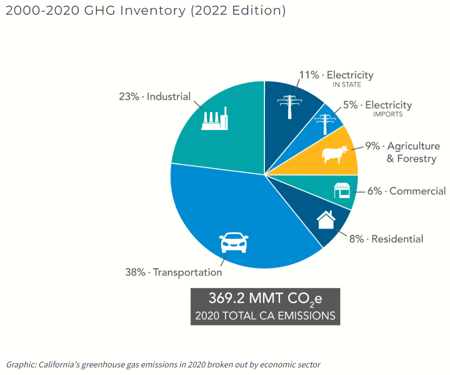
Let us put the blackouts in context. The State of California has a helpful graphic showing a breakdown of the state GHG emissions.
Figure 1: California’s greenhouse gas emissions in 2020 broken out by economic sector
Electricity production, including imports, accounts for just 16% of California’s GHG emissions or about 60 MMtCO2e. Globally in 2020 global GHG emissions were just over 50,000 MMtCO2e. So the replacing existing electricity production from fossil fuels with renewables will cut global emissions by 0.12%. Replacing all GHG emissions from other sources will cut global emissions by 0.74%. So California alone cannot solve the climate crisis. There is no direct trade-off, but rather enduring the blackouts (or other costs) for a very marginal impact on climate change for the people of California. These tiny benefits of course will be shared by the 7960 million people who do not live in California.
The error is in believing that California’s climate policies are leading the rest of the planet.
More generally, the error is in assuming that the world follows the “leaders” on climate change. Effectively, the world the rest of the world is assumed to think as the climate consensus. An example is from the UK in March 2007 when then Environment Minister David Miliband was promoting a Climate Bill, that later became the Climate Change Act 2008.
In the last 16 years under the UNFCCC COP process there has been concerted efforts to get all countries to come “onboard”, so that the combined impact of local and country-level sacrifices produces the total benefit of stopping climate change. Has this laudable aim been achieved?
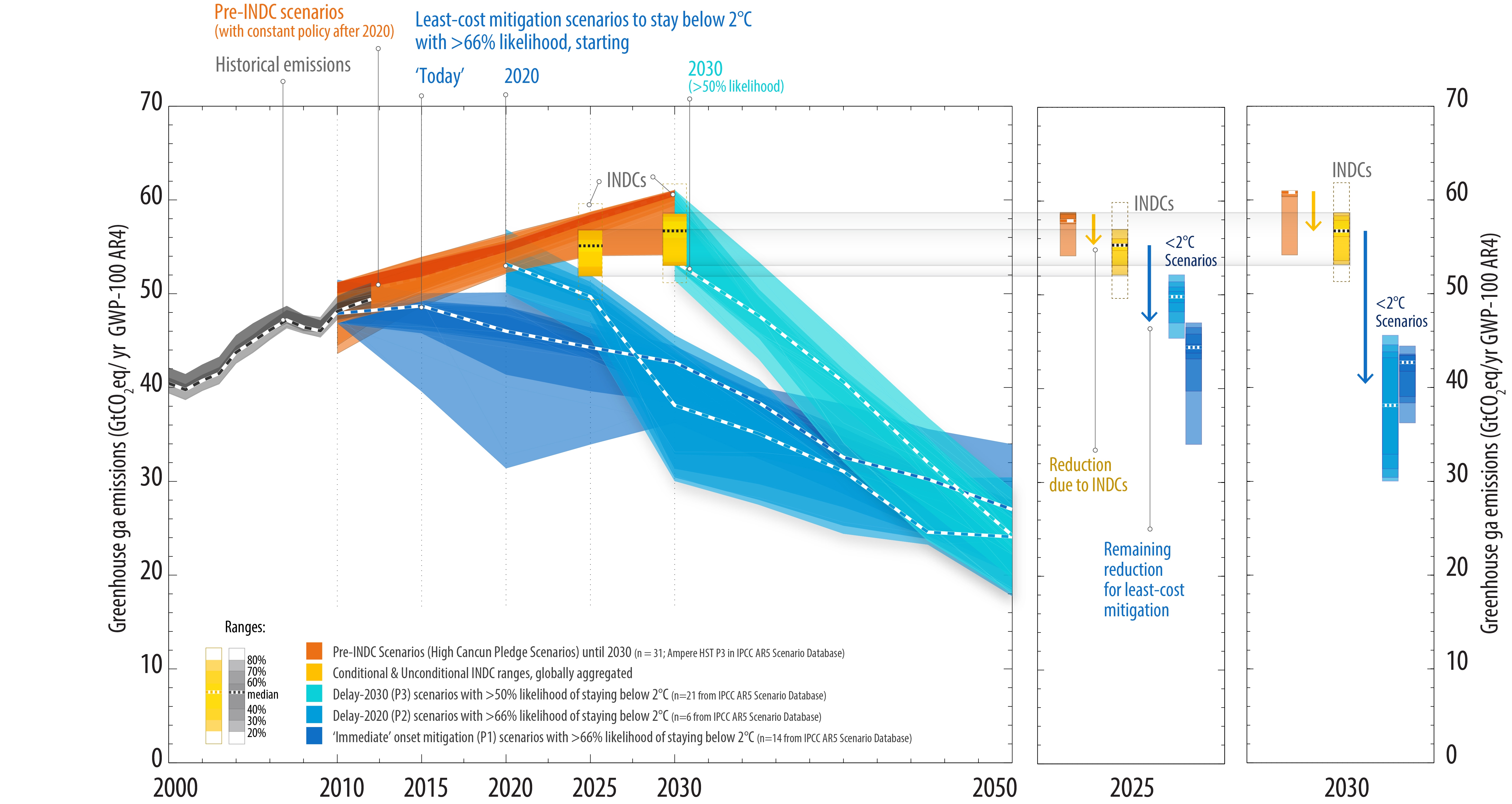
I will just go back to 2015, despite the United Nations Framework Convention on Climate Change Treaty (that set up the UNFCCC body) entering into force in March 1994. In preparation for COP 21 Paris most countries submitted “Intended Nationally Determined Contributions” (INDCs). The submissions outlined what post-2020 climate actions they intended to take under a new international agreement, now called the Paris Agreement. On the 1st November 2015 the UNFCCC produced a Synthesis Report of the aggregate impact of the INDCs submitted up to 1st October. The key chart is reproduced below.
Figure 2 : Summary results on the aggregate effect of INDCs to 1st November 2015.
The aggregate impact is for emissions still to rise through to 2030, with no commitments made thereafter. COP21 Paris failed in it’s objectives of a plan to reduce global emissions as was admitted in the ADOPTION OF THE PARIS AGREEMENT communique of 12/12/2015.
Notes with concern that the estimated aggregate greenhouse gas emission levels in 2025 and 2030 resulting from the intended nationally determined contributions do not fall within least-cost 2 ˚C scenarios but rather lead to a projected level of 55 gigatonnes in 2030, and also notes that much greater emission reduction efforts will be required than those associated with the intended nationally determined contributions in order to hold the increase in the global average temperature to below 2 ˚C above pre-industrial levels by reducing emissions to 40 gigatonnes or to 1.5 ˚C above pre-industrial levels by reducing to a level to be identified in the special report referred to in paragraph 21 below;
Paragraph 21 states
Invites the Intergovernmental Panel on Climate Change to provide a special report in 2018 on the impacts of global warming of 1.5 °C above pre-industrial levels and related global greenhouse gas emission pathways;
The request lead, 32 months later, to the scary IPCC SR1.5 of 2018. The annual COP meetings have also been pushing very hard for massive changes. Has this worked?
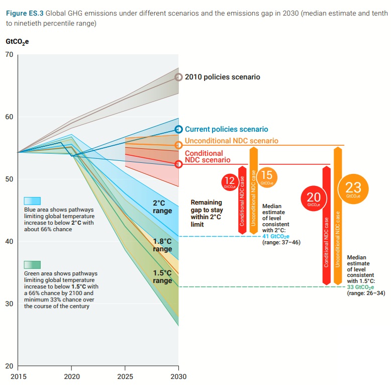
Figure 3 : Fig ES.3 from UNEP Emissions Gap Report 2022 demonstrating that global emissions have not yet peaked
The answer from the UNEP Emissions Gap Report 2022 executive summary Fig ES.3 is a clear negative. The chart, reproduced above as Figure 3, shows that no significant changes have been made to the commitments since 2015, in that aggregate global emissions will still be higher in 2030 than in 2015. Indeed the main estimate is for emissions in 2030 is 58 GtCO2e, up from 55 GtCO2e in 2015. Attempts to control global emissions, hence the climate, have failed.
Thus, in the context of the above assumptions the question for the people of California becomes.
What’s more important: Keeping a useless policy that is causing blackouts, or not?
To help clarify the point, there is a useful analogy with medicine.
If a treatment is not working, but causing harm to the patient, should you cease treatment?
In medicine, like in climate policy, whether or not the diagnosis was correct is irrelevant. Morally it is wrong to administer useless and harmful policies / treatments. However, there will be strong resistance to any form of recognition of the reality that climate mitigation has failed.
Although the failure to reduce emissions at the global level is more than sufficient to nullify any justification for emissions reductions at sub-global levels, there are many other reasons that would further improve the case for a rational policy-maker to completely abandon all climate mitigation policies.
Kevin VS Marshall
Revised 31/07/2023 or July 31st 2023 for US readers
If a fantasy is something impossible, or highly improbable, then I believe that I more than justify the claim concerning the latest BP Energy Outlook. A lot of ground will be covered but will be summarised at the end.
Trigger warning. For those who really believe that current climate policies are about saving the planet, please exit now.
The BP Energy Outlook 2023 was published on 26th June. From the introduction
Energy Outlook 2023 is focused on three main scenarios: Accelerated, Net Zero and New Momentum. These scenarios are not predictions of what is likely to happen or what BP would like to happen. Rather they explore the possible implications of different judgements and assumptions concerning the nature of the energy transition and the uncertainties around those judgements.
One might assume that the order is some sort of ascent, or decent. That is not the case, as New Momentum is the least difficult to achieve, then Accelerated, with Net Zero being the hardest to achieve. The most extreme case is Net Zero. Is this in line with what is known as Net Zero in the UNFCCC COP process? From the UNEP Emissions Gap Report 2018 Executive Summary, major point 2
Global greenhouse gas emissions show no signs of peaking. Global CO2 emissions from energy and industry increased in 2017, following a three-year period of stabilization. Total annual greenhouse gases emissions, including from land-use change, reached a record high of 53.5 GtCO2e in 2017, an increase of 0.7 GtCO2e compared with 2016. In contrast, global GHG emissions in 2030 need to be approximately 25 percent and 55 percent lower than in 2017 to put the world on a least-cost pathway to limiting global warming to 2°C and 1.5°C respectively.
With Net Zero being accomplished for 2°C in 2070 and 1.5°C in 2050, this gives 20 years of 2017 emissions from 2020 for 2°C of warming and just 12 years for 1.5°C. Figure 1 in the BP Energy Outlook 2023 Report, reproduced below, is roughly midway between 12 and 20 years of emissions, although with only about three-quarters of the emissions, in equivalent CO2 tonnes that the UN uses for policy. This seems quite reasonable course to take to keep things simple.
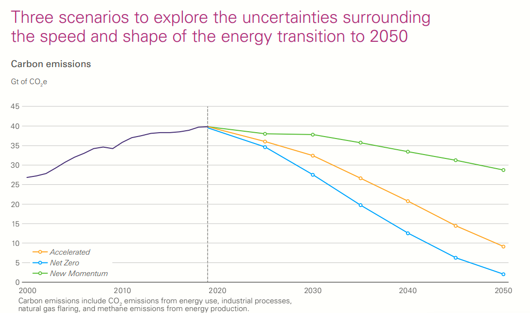
The BP Energy Outlook summarises the emissions pathways in a key chart, reproduced below.
Fig 1 : BP Energy Outlook 2023 scenario projections, with historical emissions up to 2019
One would expect the least onerous scenario would be based on current trends. The description says otherwise.
New Momentum is designed to capture the broad trajectory along which the global energy system is currently travelling. It places weight on the marked increase in global ambition for decarbonization in recent years, as well as on the manner and speed of decarbonization seen over the recent past. CO2e emissions in New Momentum peak in the 2020s and by 2050 are around 30% below 2019 levels.
That is the most realistic scenario based on current global policies is still based on a change in actual policies. How much though? Fig 1 above, shows, actual emissions up to 2019 are increasing, then a decrease in all three scenarios from 2020 onwards.
At Notalotofpeopleknowthat, in an article on this report, the slightly narrower CO2 emissions narrow CO2 emissions are shown.
There was a significant drop in emissions in 2020 due to covid lockdowns, but emissions more than recovered to break new records in 2022. But all scenarios in Fig 1 show a decline in emissions from 2019 to 2025. Neither do emissions show signs of peaking? The UNEP Emissions GAP Report 2022 forecasts that GHG emissions (the broadest measure of emissions) could be up to 9% higher than in 2017, with a near zero chance of being the same. The key emissions gap chart is reproduced in Fig 3.
Fig 3. Emissions gap chart ES.3 from UNEP Emissions Gap Report 2022
Clearly under current policies global GHG emissions will rise this decade. The “new momentum” was nowhere in sight last October, nor was there any sight of emissions peaking after COP27 at Sharm el-Sheikh in December. Nor is there any real prospect of that happening at COP28 in United Arab Emirates (an oil state) later this year.
Yet even this chart is flawed. The 2°C main target for 2030 is 41 GtCO2e and the 1.5°C main target is 33 GtCO2e. Both are not centred in their ranges. From the EGR 2018, a 25% reduction on 53.5 is 40, and a 55% reduction 24. But at least there is some pretence of trying to reconcile desired policy with the most probable reality.
It gets worse…
In the lead-up to COP21 Paris 2015 countries submitted “Intended Nationally Determined Contributions” (INDCs). The UNFCCC said thank you and filed them. There appears to be no review or rejection of any INDCs that clearly violated the global objective of substantially reducing global greenhouse gas emissions by 2030. Thus an INDC was not rejected in the contribution was highly negative. That is if the target implied massively increasing emissions. The major example of this is China. Their top targets of peaking CO2 emissions around 2030 & “to lower carbon dioxide emissions per unit of GDP by 60% to 65% from the 2005 level” (page 21) can be achieved even if emissions more than double between 2015 and 2030. This is simply based on the 1990-2010 GDP average growth of 10% and the emissions growth of 6%. Both India and Turkey (page 5) plan to double emissions in the same period. (page 5) and Pakistan to quadruple theirs (page 26). Iran plans to cut its emissions by 4% up to 2030 compared with a BAU scenario. Which is some sort of increase.
There are plenty of other non-OECD countries planning to increase their emissions. As of mid-2023 no major country seems to have reversed course. Why is this important? The answer lies in a combination of the Paris Agreement & the data
The flaw in the Paris Agreement
Although nearly every country has signed the Paris Agreement, few have understood its real lack of teeth in gaining reductions in global emissions. Article 4.1 states
In order to achieve the long-term temperature goal set out in Article 2, Parties aim to reach global peaking of greenhouse gas emissions as soon as possible, recognizing that peaking will take longer for developing country Parties, and to undertake rapid reductions thereafter in accordance with best available science, so as to achieve a balance between anthropogenic emissions by sources and removals by sinks of greenhouse gases in the second half of this century, on the basis of equity, and in the context of sustainable development and efforts to eradicate poverty.
The agreement lacks any firm commitments but does make a clear distinction between developed and developing countries. The latter countries have no obligation even to slow down emissions growth in the near future. Furthermore, the “developed” countries are quite small in population. These are basically all the members of the OECD. This includes some of the upper middle-income countries like Turkey, Costa Rica and Columbia, but excludes the small Gulf States with very high per capita incomes.
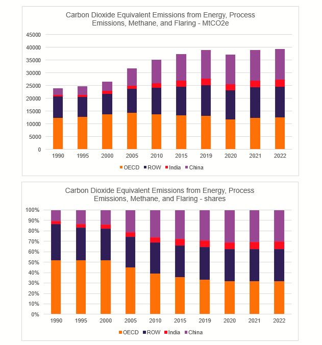
BP is perhaps better known for its annual Statistical Review of World Energy. The 2023 edition was published on the same day as the Energy Outlook but for the first time by the Energy Institute. From this, I have used the CO2 emissions data to split out the world emissions into four groups – OECD, China, India, and Rest of the World. The OECD countries collectively have a population of about 1.38bn, or about the same as India or China.
Fig 4: Global Emissions from the Energy Institute Statistical Review of World Energy 2023 shown in MtCO2e and shares.
From 1990 to 2022, OECD countries increased their emissions by 1%, India by 320%, China by 370% and ROW by 45%. As a result the OECD share of global emissions fell from 52% in 1990 to 32%. Even if all the non-OECD countries kept the emissions constant in the 2020s, the 2°C target could only be achieved by OECD countries reducing their emissions by nearly 80% and for the 1.5°C target by over 170%. The reality is that obtaining deep global emissions cuts are about as much fantasy as believing an Official Monster Raving Loony Party candidate could win a seat in the House of Commons. Their electoral record is here.
The forgotten element….
By 2050, we find that nearly 60 per cent of oil and fossil methane gas, and 90 per cent of coal must remain unextracted to keep within a 1.5 °C carbon budget.
Welsby, D., Price, J., Pye, S. et al. Unextractable fossil fuels in a 1.5 °C world. Nature597, 230–234 (2021).
It has been estimated that to have at least a 50 per cent chance of keeping warming below 2°C throughout the twenty-first century, the cumulative carbon emissions between 2011 and 2050 need to be limited to around 1,100 gigatonnes of carbon dioxide (Gt CO2). However, the greenhouse gas emissions contained in present estimates of global fossil fuel reserves are around three times higher than this, and so the unabated use of all current fossil fuel reserves is incompatible with a warming limit of 2°C
McGlade, C., Ekins, P. The geographical distribution of fossil fuels unused when limiting global warming to 2 °C. Nature517, 187–190 (2015).
I am not aware of any global agreement to keep most of the considerable reserves of fossil fuels in the ground. Yet is clear from these two papers that meeting climate objectives requires this. Of course, the authors of the BP Energy Outlook may not be aware of these papers. But they will be aware of the Statistical Review of World Energy. It has estimates of reserves for oil, gas, and coal. They have not been updated for two years, but there are around 50 years of gas & oil and well over 100 years of coal left. Once
Key points covered
Energy Outlook scenarios do not include an unchanged policy
All three scenarios show a decline between 2019 & 2025. 2022 actual emissions were higher than 2019.
In aggregate Paris climate commitments mean an increase emissions by 2030, something ignored by the scenarios.
The Paris Agreement exempts developing countries from even curbing their emissions growth in the near term. Accounting for virtually all the emissions growth since 1990 and around two-thirds of current emissions makes significantly reducing global emissions quite impossible.
Then totally bypassing the policy issue of keeping most of the available fossil fuels in the ground.
Given all the above labelling the BP Energy Outlook 2023 scenarios “fantasies” is quite mild. Even though they may be theoretically possible there is no general recognition of the policy constraints which would lead to action plans to overcome these constraints. But in the COP process and amongst activists around the world there is just a belief that proclaiming the need for policy will achieve a global transformation.
In an article at Conservative Women, I believe Paul Homewood vastly understates the insignificance of keeping new discoveries of UK oil & gas in the ground. We need to look at the accepted numbers.
In the 2014 UNIPCC AR5 WG3 report it was estimated that 1100 GtCO2 from 2011 was needed to reach the dreaded 2°C of warming. McGlade & Ekins 2015 (DOI: 10.1038/nature14016) estimated that known fossil fuel reserves were 3 times this. On quick search on the internet in 2017 I found that potential fossil fuel sources are a number of times these known reserves.
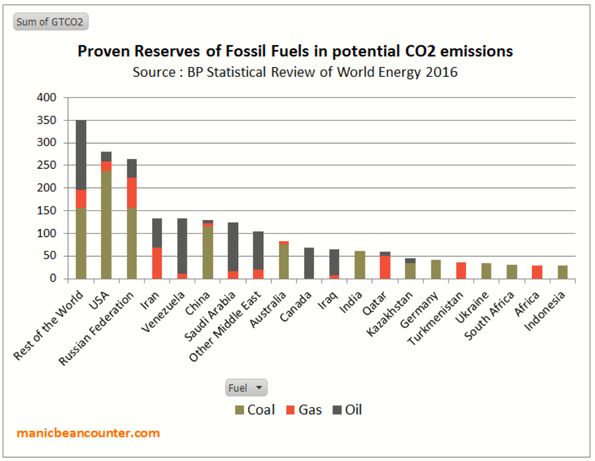
The oil & gas licences cover trivial amounts of global fossil fuels available. Using the BP’s measure of proven reserves, I did a quick conversion to representative CO2 emissions, then divided it into major locations. Total emissions figures were up to 20% lower than McGlade & Ekins due to (a) different reserves figures & (b) Not allowing for higher emitting fossil fuel sources like oil from Canadian tar sands or German lignite coal, reproduced in figure 1. Still, given the unequal global distribution of fossil fuel reserves
Figure 1 – Estimates of the approximate potential CO2 emissions from proven fossil reserves using data from the BP Statistical Review of World Energy 2016. These figures may understate coal.
In 2018, it was projected that the emissions to meet the 1.5°C targets were equivalent to a straight line reduction in emissions to zero between 2020 and 2050. That is producing 15 years of 2020 emissions in a 30 year period, or about less than 13 years starting January 2024. Using the BPs estimates of production & proven reserves for 2019, there are about 50 years of oil, 50 years of gas and 132 years of coal. That means leaving >70% of oil, >70% of gas and >90% of coal reserves in the ground. How significant is the UK in this. It is well out of the top 20 countries in oil, gas and coal reserves, so would not have appeared in Figure 1 with far more countries itemised. Using the 2019 estimated reserve figures the UK had 0.16% of oil, 0.094% of gas and 0.0024% of coal reserves. Overall UK fossil fuel reserves in terms of potential emissions are less than 1 part is a 1000 of the global total. The new oil & gas licences may increase the UK reserves, but it is highly unlikely to significantly increase the global share.
If the activists were in reality concerned about stopping dangerous climate change, then they would be trying to persuade Russia, China, India, Indonesia, Saudi Arabia, Iran, Venezuela etc. to all leave their considerable fossil fuel reserves on the ground. This is aside from Western countries such as USA, Canada, Australia, Germany & Poland.
Just Stop Oil have literally no sense of proportion. I have no doubt they are sincere in their beliefs. But their policy demands are in no way connected to their beliefs in some sort of impending climate apocalypse.
In a recent comment at Cliscep Jit made the following request
I’ve been considering compiling some killer graphs. A picture paints a thousand words, etc, and in these days of short attention spans, that could be useful. I wanted perhaps ten graphs illustrating “denialist talking points” which, set in a package, would be to the unwary alarmist like being struck by a wet fish. Necessarily they would have to be based on unimpeachable data.
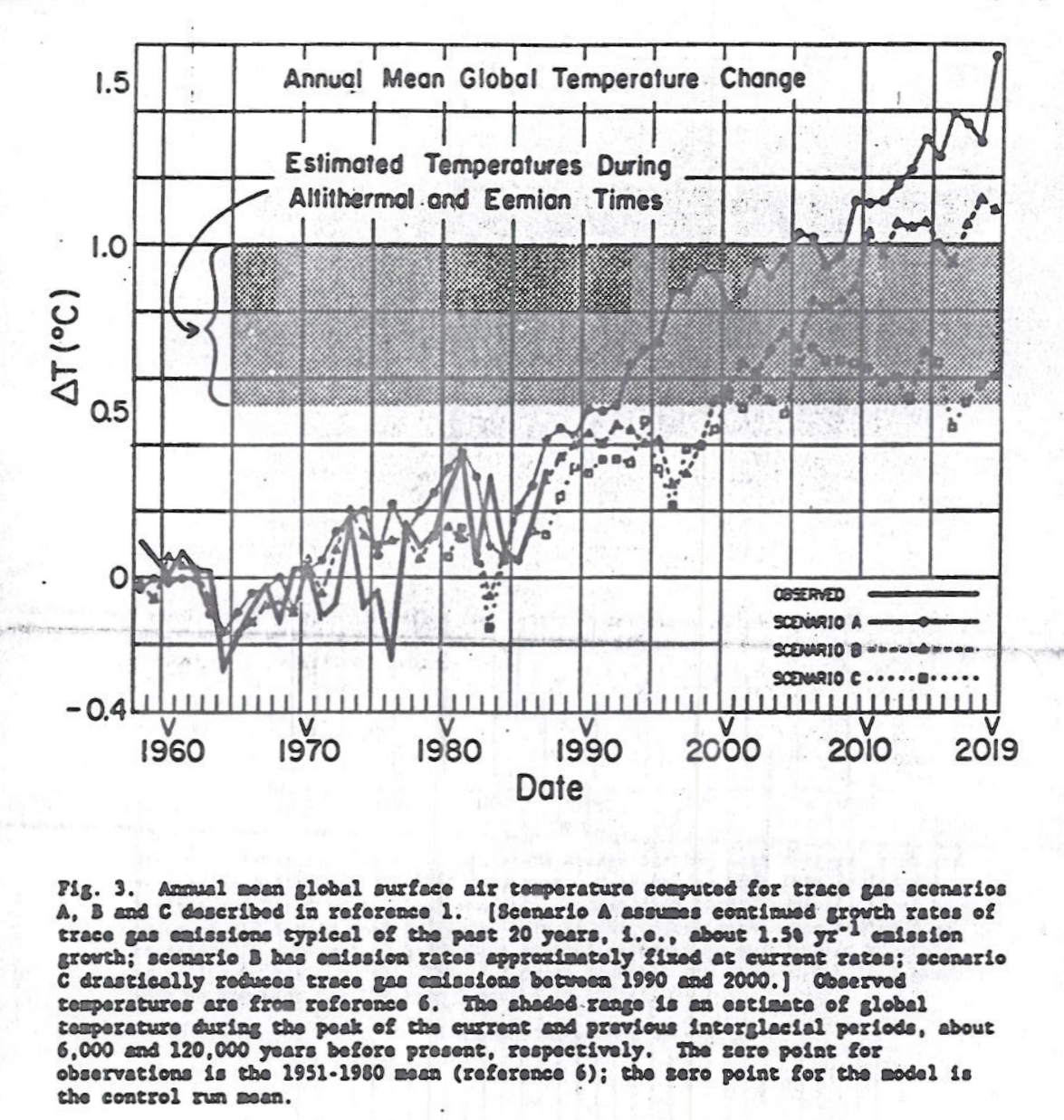
One of the most famous graphs in climate is of the three scenarios used in Congressional Testimony of Dr James Hansen June 23 1988. Copies are poor, being copies of a type-written manuscript. The following is from SeaLevel.info website.
Fig 3 of Hansen’s Congressional Test June 23 1988
The reason for choosing this version rather than the clearer version in the paper online is that the blurb contains the assumptions behind the scenarios. In particular “scenario C drastically reduces trace gas emissions between 1990 and 2000.” In the original article states
scenario C drastically reduces trace gas emissions between 1990 and 2000such that greenhouse forcing ceases to increase after 2000.
In current parlance this is net zero. In the graph this results in temperature peaking about 2007.
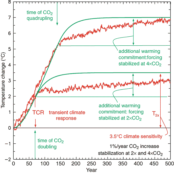
In the IPCC Third Assessment Report (TAR) 2001 there is the concept of Transient Climate Response.
TAR WG1 Figure 9.1: Global mean temperature change for 1%/yr CO2 increase with subsequent stabilisation at 2xCO2 and 4cCO2. The red curves are from a coupled AOGCM simulation (GFDL_R15_a) while the green curves are from a simple illustrative model with no exchange of energy with the deep ocean. The transient climate response, TCR, is the temperature change at the time of CO2 doubling and the equilibrium climate sensitivity, T2x, is the temperature change after the system has reached a new equilibrium for doubled CO2, i.e., after the additional warming commitment has been realised.
Thus, conditional on CO2 rising at 1% a year and the eventual warming from a doubling of CO2 being around 3C, then at the point when doubling has been reached temperatures will have risen by about 2C. From the Mauna Loa data annual average CO2 levels have risen from 316 ppm in 1959 to 414 ppm in 2020. That is 31% in 60 years or less than 0.5% a year. Assuming 3C of eventual warming from a CO2 doubling then the long time period of the transient climate response
much less than 1C of warming could so far have resulted from the rise in CO2 since 1959
it could be decades after net zero is achieved that warming will cease.
the rates of natural absorption of CO2 from the atmosphere are of huge significance.
Calculation of climate sensitivity even with many decades CO2 data and temperature is near impossible unless constraining assumptions are made about the contribution of natural factors; the rate of absorption of CO2 from the atmosphere; outgassing or absorption of CO2 by the oceans; & the time period for the increase in temperatures from actual rates of CO2 increase.
That is, change in a huge number variables within a range of acceptable mainstream beliefs significantly impacts the estimates of emissions pathways to constrain warming to 1.5C or 2C.
If James Hansen in 1988 was not demonstrably wrong false about the response time of the climate system and neither is TAR on the transient climate response, then it could be not be possible to exclude within the range of both the possibility that 1.5C of warming might not be achieved this century and that 2C of warming will be surpassed even if global net zero emissions is achieved a week from now.
As a (slightly manic) beancounter I like to reconcile data sets. The differing estimates behind the claims of accelerating ice mass loss in Antarctica do not reconcile, nor with sea level rise data. The problem of ice loss needs to be looked at in terms of the net of ice losses (e.g. glacier retreat) and ice gains (snow accumulation). Any estimate then needs to be related to other estimates. The Guardian article referred in the cliscep post states
Separate research published in January found that ice loss from the entire Antarctic continent had increased six-fold since the 1980s, with the biggest losses in the west. The new study indicates West Antarctica has caused 5mm of sea level rise since 1992, consistent with the January study’s findings.
The total mass loss increased from 40 ± 9 Gt/y in 1979–1990 to 50 ± 14 Gt/y in 1989–2000, 166 ± 18 Gt/y in 1999–2009, and 252 ± 26 Gt/y in 2009–2017. In 2009–2017, the mass loss was dominated by the Amundsen/Bellingshausen Sea sectors, in West Antarctica (159 ± 8 Gt/y), Wilkes Land, in East Antarctica (51 ± 13 Gt/y), and West and Northeast Peninsula (42 ± 5 Gt/y). The contribution to sea-level rise from Antarctica averaged 3.6 ± 0.5 mm per decade with a cumulative 14.0 ± 2.0 mm since 1979, including 6.9 ± 0.6 mm from West Antarctica, 4.4 ± 0.9 mm from East Antarctica, and 2.5 ± 0.4 mm from the Peninsula (i.e., East Antarctica is a major participant in the mass loss).
The Antarctic Ice Sheet is an important indicator of climate change and driver of sea-level rise. Here we combine satellite observations of its changing volume, flow and gravitational attraction with modelling of its surface mass balance to show that it lost 2,720 ± 1,390 billion tonnes of ice between 1992 and 2017, which corresponds to an increase in mean sea level of 7.6 ± 3.9 millimeters (errors are one standard deviation). Over this period, ocean-driven melting has caused rates of ice loss from West Antarctica to increase from 53 ± 29 billion to 159 ± 26 billion tonnes per year; ice-shelf collapse has increased the rate of ice loss from the Antarctic Peninsula from 7 ± 13 billion to 33 ± 16 billion tonnes per year. We find large variations in and among model estimates of surface mass balance and glacial isostatic adjustment for East Antarctica, with its average rate of mass gain over the period 1992–2017 (5 ± 46 billion tonnes per year) being the least certain.
The key problem is in the contribution to sea level rise. The Rignot study from 1979-2017 gives 3.6 mm a decade from 1989-2017, about 4.1 mm and from 1999-2017 about 5.6 mm. The IMBIE team estimates over the period 1992-2017 7.9 mm sea level rise, or 3 mm per decade. The Rignot study estimate is over 50% greater than the IMBIE team. Even worse, neither the satellite data for sea level rise from 1992, nor the longer record of tide gauges, show an acceleration in sea level rise.
For instance from NOAA, the satellite data shows a fairly steady 2.9mm a year. rise in sea levels from 1992.
Using the same data, the University of Colorado estimates the average sea level rise to be 3.1 mm a year.
Note that in both the much greater variability in the Jason 2 data, and the slowdown in rise after 2016 when Jason 3 started operating.
The tide gauges show a lesser rate of rise. A calculation from 155 of the best tide gauges around the world found the mean and median rate of sea level rise to be 1.48 mm/yr.
Yet, if Rignot is correct in recent years Antarctic ice loss must now account for around 22-25% of the sea level rise (satellite record) or almost 50% (tide gauges) of the measured sea level rise. Both show no accleration. What factors have a diminishing contribution to sea level rise over the last 25 years? It cannot be less thermal expansion, as heat uptake is meant to have increased post 2000, more than offsetting the slowdown in surface temperature rise when emissions accelerated.
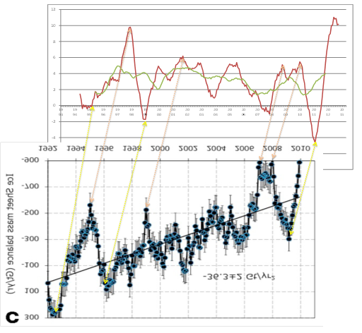
I compared the 12 monthly rise in sea surface temperatures with the corressponding chart of ice mass balance loss for Greenland and Antarctica. The peaks and troughs corressponded nicely, with about 18 months between ice loss and sea level rise. This is quite remarkable considering that from Rignot et 2011 in the 1990s ice loss would have had very little influence on sea level rise. It is almost as though the modelling has taken the sea level data, multiplied by 360, flipped it, moved it back a few months then tilted to result show acceleration.
Yet the acceleration of 14.5 ± 2 Gt/yr2 for Antarctica results in decadal increases not too dismillar from those in the abstract of Rignot et al 2018. This would validate the earlier results except for another paper. Shepherd et al Nov 2012 – Reconciled Estimate of Ice-Sheet Mass Balance had a long list of authors including Rignot and three of the four co-authors of the Rignot et al 2011. It set the standard for the time, and was the key article on the subject in IPCC AR5 WG1. Shepherd et al Nov 2012 has the following Table 1.
For Antartica as experienced no significant acceleration in ice mass loss in the period 1992-2011.
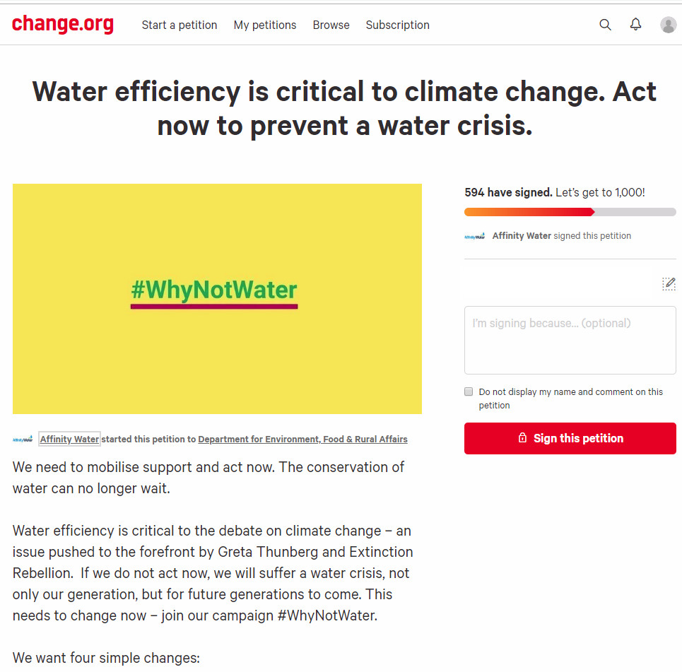
At Guido Fawkes this morning I was confronted with a bright green and yellow advert.
It is an appeal for increased regulation. The reason for the regulation is political.
Water is not part of the climate change debate It is treated like an add on when it is critical to life. We need to change this now.
Water might be critical to life, but that does not mean the supply is critical. Provision of food and healthcare are also critical to life, and successful provision of both is much more complex and challanging than the supply of the most basic and plentiful of commodities.
If we don’t act now we face a £40 billion water crisis Sign our petition at change.org
Clicking on the link takes us to a Change.org petition headed
Water efficiency is critical to climate change. Act now to prevent a water crisis.
The petition starts with the statement
We need to mobilise support and act now. The conservation of water can no longer wait.
Water efficiency is critical to the debate on climate change – an issue pushed to the forefront by Greta Thunberg and Extinction Rebellion. If we do not act now, we will suffer a water crisis, not only our generation, but for future generations to come. This needs to change now – join our campaign #WhyNotWater.
The heading states “Water efficiency is critical to climate change” implying that changes in water efficiency will affect the actual course of the climate. But the text is “Water efficiency is critical to the debate on climate change”, where some activists claim water efficiency should be part of a debate. The heading implies backing empirical evidence, whereas the text is about beliefs.
Further, a superficial reading of the statement would give the impression that climate change is causing water shortages, and will cause a water crisis. But clicking on the Affinity Water link takes us to a press release on 10th May
Affinity Water warns of water shortages unless government acts now
The UK’s largest water only company, Affinity Water has warned that within the next 25 years and beyond, there may not be enough water due to climate change, population growth and increases in demand.
….
Unlike the advert and the petition there are mentions of other factors that might affect climate change, but no data on the relative magnitudes.
Note that Affinity Water is a limited company, with gross revenues in year to 31 March 2018 of £306.3m, operating profit of £72.3m and profit after tax of £29.6m (Page 107).
The piece finishes with
To find out more about the manifesto visit www.whynotwater.co.ukand to sign a petition to demand the legislation needed for water efficient labelling and water efficient goods and housing visit www.affinitywater.co.uk/ourpetition
The whynotwater website is a bit more forthcoming with the data.
Why should we act?
Climate change is likely to reduce our supply of water in our area by 39 million litres of water per day by 2080.
The population is growing and is expected to increase 51% by 2080. This is equivalent to approximately 1.8 million more people in our supply area, putting further strain on our resources.
Using water wisely is critical in the South East – a severely water-stressed area; did you know there was less rainfall than other parts of the country? Between July 2016 and April 2017 the area received 33% less rainfall than the national average.
Customers in the South East also use more water daily – 152 litres per person per day, which is higher than the national average of 141 litres per person per day.
From the above population in the supply area is projected to increase from 3.53 to 5.33 million. With unchanged average water usage of 152 litres, this is implies an increase in consumption of 274 million litres. Population change is projected to have seven times the influence on water demand than climate change on supply. It should be noted that these figures is domestic consumption. Currently Affinity Water supplies around 900 million litres per day, implying over 350 litres per day is from other sources. Based on total average supply, climate change ove 60 years is projected to reduce supply by just 4.3%.
But which projection is more robust, that of population increase, or of falls in water availability? With population it is possible to extrapolate from existing data. From the World Bank data, the population of the UK increased by 11% from 2001 to 2016. At this rate, in 2076 the population will be 52% higher than 2016. Within the South East using national data might be unreliable, as population shifts between regions. But it is likely that by 2080 population in Affinity’s supply areas will be significantly higher than today.
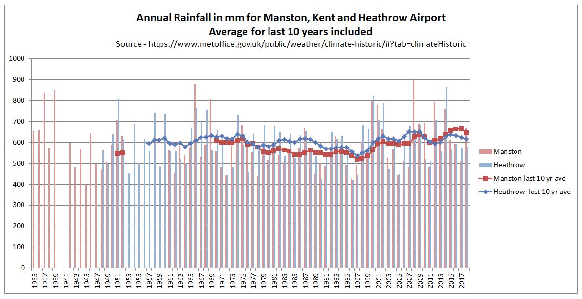
Water availability is not so precise, yet the fall due to climate change of 39 million litres per day is just 7% of existing domestic demand, or 4.3% of total water usage. There are some records at the Met Office of rainfall. In particular in the South East are records for Heathrow Airport and Manston in Kent. I have graphed annual rainfall data, with averages of the last 10 years.
In the past twenty years rainfall has increased in both Manston and Heathrow. Compared to 1979-1998, average annual rainfall in 1999-2018 was 17% higher in Manston and 9% higher in Heathrow. In 60 years from now it might be higher or lower due to random natural climate variability. Any projection of a 4-7% reduction in rainfall is guesswork. If this is still a scientific estimate of unmitigated human-induced climate change, then Affinity better pass the message onto Greta Thurnberg and Extinction Rebellion. From the XR! Website.
THE TRUTH
We are facing an unprecedented global emergency. Life on Earth is in crisis: scientists agree we have entered a period of abrupt climate breakdown, and we are in the midst of a mass extinction of our own making.
This may seem sensationalist even by the the worst tabloid standards, but is the group have toned down a bit. When launched XR! were proclaiming “human-caused (anthropogenic) climate breakdown alone is enough to wipe out the human species by the end of this century.”
As there was no real water crisis in the 1980s and 1990s, why should there be in 2080? The only way there will be a water crisis is if water supply does not increase in line with the projections of rising population. Even then it will hardly contribute to the mass deaths of people in Britain as part of a species extinction. Meeting long-term changing demands should be within the control of the British Government and the regulated water companies. Instead a monopoly water company appears to be falsely attributing the whole problem to an issue outside of its control, campaigning to introduce regulations that are aimed at controlling consumer demand. Rather than serving their client base by additional investment, Affinity Water looks to be deriving fixed demand by controlling them. That investment in new reservoirs, wells, water recycling plants, pipelines from wetter places (Scotland has on average twice the rainfall of the South-East) and even desalination plants could cost billions of pounds. In so doing Affinity Water is listening to a bunch of revolutionaries rather than serving their customers. This must be especially galling for the Affinity Water customers who commute into London and have been inconvenienced by Extinction Rebellion’s blockades over recent months.
Kevin Marshall
Postscript at 4.00pm
The screenshot of the petition petition was taken at around 9.30 this morning, with 594 signatures. It now has 622 signatures. That is less than 5 signatures per hour. In that time Guido Fawkes has likely had over 10,000 unique visitors, based on last weeks figures,
Update 16/05/19 at 23.50
Another day of advertising a Guido Fawkes (and maybe elsewhere) has seen the number of signatures rise to 678. The petition was raised two weeks ago.