Reconciling UNIPCC AR5 polar ice melt data with sea level rise

For over a year I have been pondering how to reconcile the near constant rise in sea levels with the accelerating polar ice melt. At the end of September the UNIPCC published the AR5 Working Group II (the Physical Science Basis) Summary for Policymakers which provides some useful evidence.

The following from the UNIPCC gives some estimates of the rate of polar ice melt. In page 9

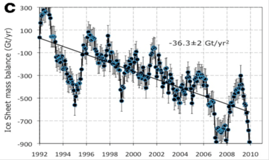
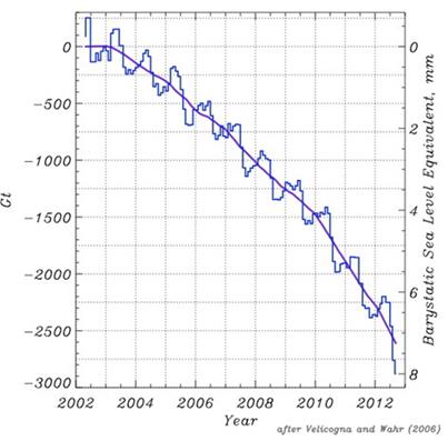
• The average rate of ice loss from the Greenland ice sheet has very likely substantially increased from 34 [–6 to 74] Gt yr–1 over the period 1992 to 2001 to 215 [157 to 274] Gt yr–1 over the period 2002 to 2011.

• The average rate of ice loss from the Antarctic ice sheet has likely increased from 30 [–37 to 97] Gt yr–1 over the period 1992–2001 to 147 [72 to 221] Gt yr–1 over the period 2002 to 2011. There is very high confidence that these losses are mainly from the northern Antarctic Peninsula and the Amundsen Sea sector of West Antarctica.

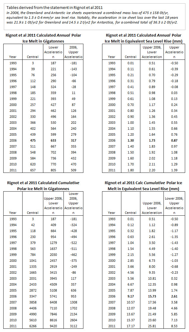
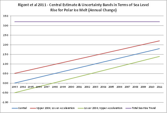
Put in sea level rise terms, the combined average rate of ice loss from the polar ice caps increased from 0.18 mm yr–1 over the period 1992 to 2001 to 1.00mm yr–1 over the period 2002 to 2011.

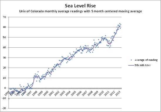
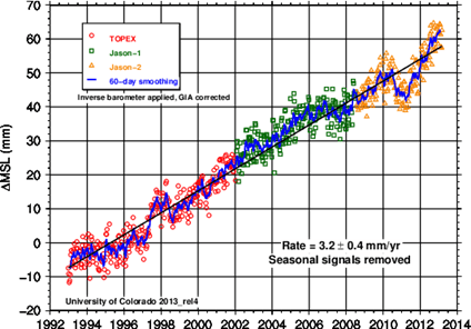
There is a problem with these figures. The melting ice will end up raising sea levels. The satellite data from the University of Colorado shows a near constant rate of rise of 3.2mm yr–1.

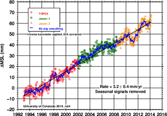
Assuming a one year lag in raising sea levels, the 0.18 mm yr–1 over the period 1992 to 2001 is equivalent to 5% of the 3.3mm yr–1 average sea level rise from 1993 to 2002, whilst the 1.00mm yr–1 over the period 2002 to 2011 is equivalent to 32% of the 3.1mm yr–1 average sea level rise from 2003 to 2012. Some other component of sea level rise must be decreasing. The estimates of the other components are given on page 11

Since the early 1970s, glacier mass loss and ocean thermal expansion from warming together explain about 75% of the observed global mean sea level rise (high confidence). Over the period 1993 to 2010, global mean sea level rise is, with high confidence, consistent with the sum of the observed contributions from ocean thermal expansion due to warming (1.1 [0.8 to 1.4] mm yr–1), from changes in glaciers (0.76 [0.39 to 1.13] mm yr–1), Greenland ice sheet (0.33 [0.25 to 0.41] mm yr–1), Antarctic ice sheet (0.27 [0.16 to 0.38] mm yr–1), and land water storage (0.38 [0.26 to 0.49] mm yr–1). The sum of these contributions is 2.8 [2.3 to 3.4] mm yr–1.

The biggest component of sea level rise is thermal expansion. The contribution from this element must be decreasing. Ceteris paribus, that suggests the rate of heat accumulation is decreasing. This contradicts the idea that the lack of surface temperature warming is accounted for by this heat accumulation.

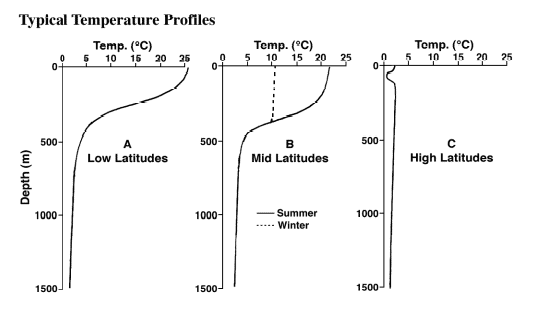
The problem is that all things are not equal. Thermal expansion of water varies greatly with temperature of that water. On page 10 there is the following graphic

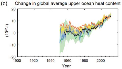
The heat content of the upper ocean increased by around 10 x 1022 J from 1993 to 2010. For 700m of ocean depth I estimate this would be 0.1oC. It is a tiny amount that varies greatly with temperature, as shown by the graph below.

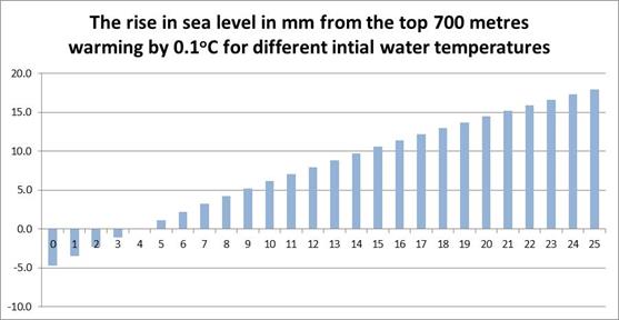
As sea temperature varies greatly according to location and depth, it is possible to hypothesise a decline in the thermal expansion with an increase in heat content. This whilst also accepting that both the rate of rise in the heat content of the oceans has accelerated and the contribution to sea level rise due the increase in heat content has decreased. For example one would just have to hypothesise that the increasing heat content had been predominately in the tropics during the 1990s and switched to the Arctic in the 2000s.

Even this switch is not necessary. There is huge variation between areas of the amount of temperature increase over a twenty year period. Consistent with an increase of 0.1 could have been a decrease in average temperatures in an area of ocean as large as the Atlantic and Indian Oceans combined.

But, what makes this less than credible is that this shift almost exactly offset the estimated increase in the ice melt component. Most likely no-one will try to calculate this, as the data is not there. Even with 3,000 Argo Buoys in the oceans, there is still on average just one buoy per 200,000 km3 of ocean, taking about 25 dips a year. The consensus viewpoint appears the less likely than the view that climate models have an exaggerated belief in the impact of greenhouse gases on average temperatures.

There is an opportunity for some further investigation with the data. But a huge amount of work may not yield anything, or may yield conclusion at odds with the “real”, unknown one. However, the first step is to determine how the UNIPCC calculated the figure for thermal expansion. Hopefully it was more substantial than from the difference between the total sea level rise and the estimates for other factors.

Update

At Bishop Hill Unthreaded michael hart Jun 1, 2014 at 4:13 AM refers to some other variables that determines how warming oceans will affect sea level rise through thermal expansion. So now the list includes.

  • The quantity of heat. (see above)
  • The initial temperature of the water which the heat was applied to. (see above)
  • The initial temperature is in turn related to
  1. Latitude – at mid latitudes there is a seasonal variation temperature variation down to about 300 metres.
  2. Depth
  3. Density variation due to salinity (see pdf page 9)

However, there are local variations as well, due to ocean currents that shift over time.

For these reasons, any attempt at estimating thermal expansion will be reliant on assumptions and estimates. The UNIPCC will have simply estimated the difference between estimated “known” factors – ice melt and land water storage – and deducted from the known sea level rise.

In terms of reconciling polar ice melt to sea level rise, there is something that I missed. According to the UNIPCC, glacier melt has a larger contribution to sea level rise than polar ice melt – 0.76 mm yr–1 against 0.60 mm yr–1. It is quite conceivable – particularly since temperatures have stopped rising – that have glacier melt has effectively ceased or even gone into reverse. Unlike with thermal expansion, there should be estimates available to confirm this.


Rignot et al 2011 on ice sheet melt acceleration – reconciling with sea level rise

In this posting I will look at Rignot et al 2011 and compare with the University of Colorado “official” level figures.

The basic conclusions are

  1. Rignot et al 2011 estimate that over an 18 year period the acceleration in polar ice melt contribution around 1.8mm extra to annual sea level rise that either stayed constant at 3.2mm, or showed a slight decline. Examination of the Rignot figures suggests this result is a bit too neat.
  2. Although that acceleration in ice melt are not reflected in average long-term rise, large short-term variations ice-melt in the rate of ice melt do show up in swings in the rate of sea level rise two or three years later. In fact using an 11 month moving average sea level rise, the fit on some of those changes in sea levels are almost a mirror image of that rise.
  3. The mirrored similarities between the graphs would be improved by removing the acceleration trend in the ice-melt.
  4. When I measure the magnitude of the swings in the sea levels they are six to eight times greater than the expected 1mm rise from 365 billion tonnes of water. Considering possible errors makes the problem worse and would reduce the similarities between the two graphs.

This is where I need people to critically review the figures. Point 1 I believe is beyond doubt. Points 2 and 3 are easy to replicate if you have something like Excel 2010 where you can ghost one graph over another. But on point 4 I have been scratching my head over for a couple of days now, and cannot see any way that will correct the figures in the right direction.

The Rignot Paper Abstract

Rignot et al 2011 et al says the following.

Ice sheet mass balance estimates have improved substantially in recent years using a variety of techniques, over different time periods, and at various levels of spatial detail. Considerable disparity remains between these estimates due to the inherent uncertainties of each method, the lack of detailed comparison between independent estimates, and the effect of temporal modulations in ice sheet surface mass balance. Here, we present a consistent record of mass balance for the Greenland and Antarctic ice sheets over the past two decades, validated by the comparison of two independent techniques over the last 8 years: one differencing perimeter loss from net accumulation, and one using a dense time series of time variable gravity. We find excellent agreement between the two techniques for absolute mass loss and acceleration of mass loss. In 2006, the Greenland and Antarctic ice sheets experienced a combined mass loss of 475 ± 158 Gt/yr, equivalent to 1.3 ± 0.4 mm/yr sea level rise. Notably, the acceleration in ice sheet loss over the last 18 years was 21.9 ± 1 Gt/yr2 for Greenland and 14.5 ± 2 Gt/yr2 for Antarctica, for a combined total of 36.3 ± 2 Gt/yr2. This acceleration is 3 times larger than for mountain glaciers and ice caps (12 ± 6 Gt/yr2). If this trend continues, ice sheets will be the dominant contributor to sea level rise in the 21st century.

In 2006 combined mass loss was 475 billion tonnes, sufficient to raise sea levels 1.3mm. This gives 365 billion tonnes to raise sea levels by 1mm, something that I have verified in other studies. So the paper estimates the sea level rise from Greenland and Antarctic ice sheets mass loss is accelerating by 0.1mm per annum. The authors also claim that from mountain glaciers and ice caps there is a further 0.033mm of acceleration. Multiply that by 18 years means melting ice must be raising sea levels in 2011 by around 2.4mm more than in 1993. We can also backtrack to when the start point of net ice melt by deducting 36.3 from yearly figure. In 1993, the first year of the study, ice melt comes to 3.1 billion tonnes. That is effectively zero.

Further, the 2006 ice mass loss has a calculated uncertainty figure at 158 is quite large. To the nearest whole number it is exactly one-third of 475 central ice-mass loss figure. From this we can then calculate the upper and lower uncertainty bands on the contribution to sea level rise in 1993. The upper band is to assume the highest figure for 2006 (+475+158) and the lowest acceleration (+36.3-2). The lower band is to assume the lowest figure for 2006 (+475-158) and the highest acceleration (+36.3+2).

I have put the results in giga tonnes, and equivalent sea level rise into a couple of tables below.

Rignot2011 implied polar ice melt

The whole structure of figures seems somewhat contrived. However, it does not mean that the figures are outside of the bounds of what could be actually happening. To assess that we must look to the seasonally adjusted sea level rise figures from the University of Colorado.


At this stage, the point to note is the trend line. Since the first satellite data in 1993, sea levels have been rising at about 3.2 mm per year. This I have plotted against the modelled contribution from Rignot.


If you add in the contribution from mountain glaciers and ice caps, in 18 years ice melt is alleged to have increased from 0% to 75% of the sea level rise trend in that period. That does not stack up. A model that fits so conveniently into the study period and nicely rounds to sea level rise equivalents, shows a trend that is completely out of line with the sea level rise.

To probe further, I downloaded the sea level data figures from the University of Colorado.

Replicating the Colorado Sea Level Rise graph

From the website I downloaded the seasonally adjusted figures, as that is what Rignot had used for ice melt.

I only use Excel, not the R statistical package like proper statisticians use. So I had to simplify the data. Please bear with me, as my “dumb” analysis still yields some very interesting results in the next section.

There are currently 710 lines of data, of which the first is “1992.9595 -5.800“. Each data point has a date and a value. The four places of decimals enable not only the actual day, but even the hour do be identified. As such, if readings are irregularly spaced, it will not bias the analysis, despite there only being about three readings a month, or one every ten days. I split the data into calendar months by first multiplying the decimal by days in the year and doing a lookup from here. I then took the average value per month. I know that February is likely to be under represented, by with 245 months of data, it will not make much of a difference to the general picture.

To validate this, I created a simplified version of the cumulative sea level rise graph. It still shows a cumulative rise of 64mm in 20 years. It shows the data points and a 5 month centred moving average.


The problem with the graph is that it visually under represents significant short term fluctuations. The rise in the last twelve months is obtained by subtracting figure from 12 months previous from the current month. This generated some enormous fluctuations. I therefore created 11 month and 35 month centred moving averages.


Even though smoothed, there are some pretty large fluctuations in the rate of sea level rise, particularly in 1997 to 2000 and after the start of 2010.

The 35 month centred is much smoother and it is possible to see a distinct decline from 2001 to 2007 by more than 50%.

Rignot graph compared

The Rignot et al 2011 paper posts three nice graphs of estimated ice losses. There are separate ones for Greenland and Antarctica, then a combined graph. It is this graph C that I reproduce below.


The annualised rate takes each month reading and multiplies by 12. So change is exaggerated?

My graph smooth the peaks, as it is a moving average. However, the Rognot graph appears to be almost a mirror of the sea level rise 11-month centred, except ice mass balance has a slope. For instance

  • Rognot has a peak of ice loss around the end of 1994, with an opposite peak of ice gain by a low at the end of 1994. The rate of sea level rise peaked in early 1996, followed by sharp change to small decline in sea levels at the end of 1998.
  • Rognot has a peak of ice loss at the end of 2007, with an opposite low in ice loss in early 2009. The rate of sea level rise peaked in early in late 2009, followed by sharp change to significant decline in sea levels in early 2012.

The peaks and troughs are so similar I flipped over the Rignot graph and aligned it up with rate of sea level rise graph.


Not only do major turning points correspond, but whole sections as well. The delay in the ice sheet melt is reflected in sea rise about 20 to 36 months after, so it not that exact. Also, a much better fit would be obtained if Rignot had not built in a slope in the graph. It seems the acceleration is anomalous.

I have uploaded a file here that contains the images. In Excel try moving the upper image over the lower one, without releasing. I have also included another graph with a centred 13 month moving average. It obtains similar results. It seems that in Rignot et al polar ice melt model (modified for slope) would appear to be an excellent short-run predictive model of the rate sea level rise.

There is a slight snag with my numbers. Before doing the above comparison, I looked at various movements between high and low points.


I have had to estimate the sea ice changes and dates of changes from the graph. In light blue is the number of gigatonnes of ice/water that is apparently needed to raise see levels by 1mm. The figure in deeper blue is how many times more effective Rignot ice melt appears to be in raising sea levels. I cannot see where I have made an error in this table. Or, at least, everything I can think of makes the problem worse. Here are some possibilities.

  1. Annualised data on ice-melt. Each monthly figure is multiplied by twelve. But smoothing would not only make the movements less of a fit between graphs but would exaggerate the problem.
  2. Moving average figure for sea level rise. But de-smoothing would not only make the movements less of a fit between graphs but would exaggerate the problem. Further, I would expect a lagged response to smudge the sharpness of the initial impulse, not make it more acute.

Please look at the figures carefully, as there is bound to be an issue. After all, one (slightly) manic beancounter is more likely to be wrong that four leading experts in their field.

Kevin Marshall

NB. I have comment moderation set for anyone who has not previously commented. If you would like to contact, but do not wish publication, please use the comments, making this clear. I will respect any non-threatening request.

Rignot, E., I. Velicogna, M. R. van den Broeke, A. Monaghan, and J. Lenaerts (2011), Acceleration of the contribution of the Greenland and Antarctic ice sheets to sea level rise, Geophys. Res. Lett., 38, L05503, doi:10.1029/2011GL046583.,

NOAA Greenland Ice Sheet Report Card 2012 – False Statement on Ice Mass Balance Change

There is an error with my interpretation of the graph. Please see comment

On 14th January 2013, NOAA produced a 2012 report on the Greenland Ice Sheet by Box et al.

Under the section “Greenland Mass Changes from GRACE“, is contained the following graphic as Fig 5.19.


The Velicogna and Wahr 2006 citation should set alarm bells ringing for the following reasons.

  1. The paper only included observations to the end of April 2006. From 49 months of data the graph extrapolates a trend 74 months ahead.
  2. The title is “Acceleration of Greenland ice mass loss in spring 2004″. This should suggest that the authors found a discontinuity in the series bang slap in the middle of the data set. To quote the paper,

    A fit to the GRACE results for all Greenland before and after April 2004 yielded ice loss trends of 104 +/- 54 km3 yr-1 during April 2002–April 2004, and 342 +/- 66 km3 yr-1 during May 2004–April 2006.

    That is the author’s found two functions. There is no quadratic function with 49 months of data to extrapolate, but two linear functions. The latter has just 24 months of data.

  3. The satellite is still operating, churning out data, and there are more recent scientific papers, with much better data. I have put some suggestions in a table below.
  4. Sea level rise trend has remained more or less linear at around 3.2mm per year over the last twenty years. So, if this graph is accurate, the contribution from Greenland ice melt has risen from 0% to 250% of the sea level rise in a decade. By implication, the contribution of all other factors (including Antarctica ice melt and cooling of the oceans) has slipped from 100% to -150% in the same period.


The Shepard paper has 47 authors, including Velicogna, Wahr, and 4 of the 5 contributors to Rignot 2011. Although only published weeks before the NOAA report card, John Wahr was an author on both.

Isabella Velicogna was co-author of both Rignot and Sheppard paper, but the Velicogna Research Group still posts up an updated graph from Velicogna 2009, in the full knowledge that that its 2012 predictions have been falsified by higher quality scientific papers that the professor has co-authored.

Finally, although the Shepard paper is likely to be the most accurate, total polar ice melt is modelled to have risen from 10% to 30% of sea level rise in 20 years. It would be an interesting exercise to try to reconcile the difference.

In summary, Fig 5.19 of the NOAA gives a modelled ice melt for Greenland Ice Sheet Report Card 2012 that is more than ten times the value of much more recent and higher quality data. Further, the expert on ice melt, John Wahr, was a co-author of the unpublished data, and therefore would have known that the graph did not fit experience. The other climate scientists should have enough knowledge of the rest of climatology to know that the graph was totally out of line with the consensus estimates of sea level rise.

Kevin Marshall

Rignot, E., I. Velicogna, M. R. van den Broeke, A. Monaghan, and J. Lenaerts (2011), Acceleration of the contribution of the Greenland and Antarctic ice sheets to sea level rise, Geophys. Res. Lett., 38,

Shepard et al. 2012. A Reconciled Estimate of Ice-Sheet Mass Balance, Science 338, 1183 (2012); DOI: 10.1126/science.1228102

Velicogna, I. (2009), Increasing rates of ice mass loss from the Greenland and Antarctic ice sheets revealed by GRACE, Geophys. Res. Lett., 36, L19503, doi:10.1029/2009GL040222

Velicogna, I. and J. Wahr. 2006. Acceleration of Greenland ice mass loss in spring 2004. Nature, 443(7109), 329-331. doi:10.1038/Nature05168.