Thomas Fuller on polar-bear-gate at Cliscep

This is an extended version of a comment made at Thomas Fuller’s cliscep article Okay, just one more post on polar-bear-gate… I promise…

There are three things highlighted in the post and the comments that illustrate the Polar Bear smear paper as being a rich resource towards understanding the worst of climate alarmism.

First is from Alan Kendall @ 28 Dec 17 at 9:35 am

But what Harvey et al. ignores is that Susan Crockford meticulously quotes from the “approved canon of polar bear research” and exhorts her readers to read it (making an offer to provide copies of papers difficult to obtain). She provides an entree into that canon- an entree obviously used by many and probably to the fury of polar bear “experts”.

This is spot on about Susan Crockford, and, in my opinion, what proper academics should be aiming at. To assess an area where widely different perspectives are possible, I was taught that it is necessary to read and evaluate the original documents. Climate alarmists in general, and this paper in particular, evaluate in relation collective opinion as opposed to more objective criteria. In the paper, “science” is about support for a partly fictional consensus, “denial” is seeking to undermine that fiction. On polar bears this is clearly stated in relation to the two groups of blogs.

We found a clear separation between the 45 science-based blogs and the 45 science-denier blogs. The two groups took diametrically opposite positions on the “scientific uncertainty” frame—specifically regarding the threats posed by AGW to polar bears and their Arctic-ice habitat. Scientific blogs provided convincing evidence that AGW poses a threat to both, whereas most denier blogs did not.

A key element is to frame statements in terms of polar extremes.

Second, is the extremely selective use of the data (or selective analysis methods) to enable the desired conclusion to be reached. Thomas Fuller has clearly pointed out in the article and restated in the comments with respect to WUWT, the following.

Harvey and his 13 co-authors state that WUWT overwhelmingly links to Crockford. I have shown that this is not the case.

Selective use of data (or selective analysis methods) is common on climate alarmism. For instance

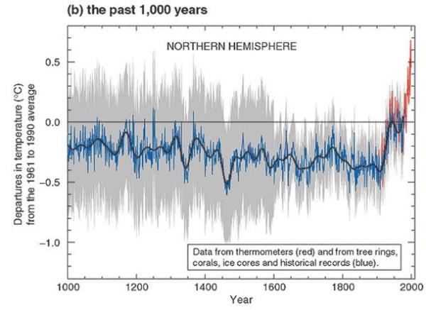
  • The original MBH 98 Hockey-Stick graph used out-of-date temperature series, or tree-ring proxies such as at Gaspe in Canada, that were not replicated by later samples.
  • Other temperature reconstructions. Remember Keith Briffa’s Yamal reconstruction, which relied on one tree for the post-1990 reconstructions? (see here and here)
  • Lewandowsky et al “Moon Hoax” paper. Just 10 out of 1145 survey respondents supported the “NASA faked the Moon Landings” conspiracy theory. Of these just 2 dogmatically rejected “climate”. These two faked/scam/rogue respondents 860 & 889 supported every conspiracy theory, underpinning many of the correlations.
  • Smoothing out the pause in warming in Risbey, Lewandowsky et al 2014 “Well-estimated global surface warming in climate projections selected for ENSO phase”. In The Lewandowsky Smooth, I replicated the key features of the temperature graph in Excel, showing how no warming for a decade in Hadcrut4 was made to appear as if there was hardly a cessation of warming.

Third, is to frame the argument in terms of polar extremes. Richard S J Tol @ 28 Dec 17 at 7:13 am

And somehow the information in those 83 posts was turned into a short sequence of zeros and ones.

Not only one many issues is there a vast number of intermediate positions possible (the middle ground), there are other dimensions. One is the strength of evidential support for a particular perspective. There could be little or no persuasive evidence. Another is whether there is support for alternative perspectives. For instance, although sea ice data is lacking for the early twentieth-century warming, average temperature data is available for the Arctic. NASA Gistemp (despite its clear biases) has estimates for 64N-90N.

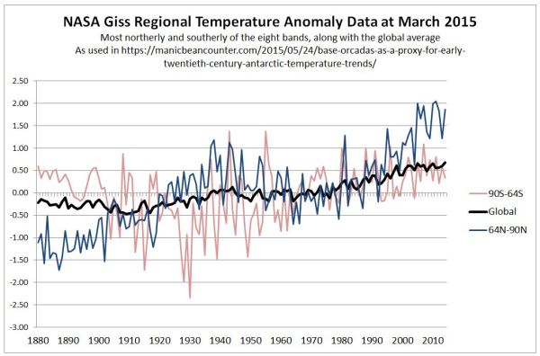
The temperature data seems to clearly indicate that all of the decline in Arctic sea ice from 1979 is unlikely to be attributed to AGW. From the 1880s to 1940 there was a similar magnitude of Arctic warming as from 1979 t0 2010 with cooling in between. Yet the rate of increase in GHG levels was greater from greater in 1975-2010 than 1945-1975, which was in turn greater than the period decades before.

Kevin Marshall


Michael Mann’s bias on Hockey Sticks

Two major gripes of mine with the “Climate Consensus” are their making unsubstantiated claims from authority, and a total failure to acknowledge when one of their own makes stupid, alarmist comments that contradict the peer-reviewed consensus.

An example is from Professor Michael Mann commenting on his specialist subject of temperature reconstructions of the past for a Skeptical science “97% Consensus” spin-off campaign.


I will break this statement down.

“There are now dozens of hockey sticks and they all come to the same basic conclusion”

His view is that warming is unprecedented, shown by dozens of hockey sticks that replicate his famous graph in the UNIPCC Third Assessment Report of 2001.

Rather than look at the broader picture warming being unprecedented on any time scale1, I will concentrate on this one thousand year period. If a global reconstruction shows a hockey stick, then (without strong reasoned arguments to the contrary) one would expect the vast majority of temperature reconstructions from actual sites by various methods to also show hockey sticks

CO2Science.com, in their Medieval Warm Period Project, have catalogued loads of these reconstructions from all over the world. They split them into two categories – quantitative and qualitative differentials in the average temperature estimates between the peak of the medieval warm period and now.

It would seem to me that Mann is contradicted by the evidence of dozens of studies, but corroborated by only a few. Mann’s statement of dozens of hockey sticks reaching the same basic conclusion ignores the considerable evidence to the contrary.

“The recent warming does appear to be unprecedented as far back as we can go”

Maybe, as Mann and his fellow “scientists” like to claim, that the people behind this website are in “denial” of the science. Maybe they have just cherry-picked a few studies from a much greater number of reconstructions. So let us look at the evidence the SkS team provide. After all, it is they who are running the show. Under their article on the medieval warm period, there is the following graph of more recent climate reconstructions.


It would seem the “Mann EIV” reconstruction in green does not show a hockey stick, but flat (or gently rising) temperatures from 500-1000 AD; falling temperatures to around 1800; then an uptick starting decades before the major rise in CO2 levels post 1945. The twentieth century rise in temperatures appears to be about half the 0.7oC recorded by the thermometers, leading one to suspect that reconstructions understate past fluctuations in temperature as well. The later Ljungqvist reconstructions shows a more pronounced medieval warm period and a much earlier start of the current warming phase, in around 1700. This is in agreement with the Moberg and Hegerl reconstructions. Further the Moberg reconstruction has a small decline in temperatures post 1950.

Even worse, the graphic was from the Pages2K site. On temperature reconstructions of the last two millennia Pages2K state:-

Despite significant progress over the last few decades, we still do not sufficiently understand the precise sequence of changes related to regional climate forcings, internal variability, system feedbacks, and the responses of surface climate, land-cover, and bio- and hydro-sphere.

Furthermore, at the decadal-to-centennial timescale we do not understand how sensitive the climate is to changes in solar activity, frequency of volcanic eruptions, greenhouse gas and aerosol concentration, and land cover.

So Michael Mann’s statement if warming being unprecedented is contradicted by peer-reviewed science. Skeptical Science published this statement when it was falsified by Mann’s own published research and that of others.

“But even if we didn’t have that evidence, we would still know that humans are warming the planet, changing the climate and that represent a threat if we don’t do something about it”

There is no corroborating evidence to the climate models from temperature reconstructions. In fact, empirical data shows that the models may be claiming as human-caused temperature increases that are naturally-caused, but for reasons not fully understood. So the “knowing” must be assumed to be from belief, just as the threat and the ability of the seven billion “us” to counter that threat are beliefs as well.

Kevin Marshall


Notes

  1. The emergence from the Younger Dryas cooling period 11,500 years ago was at least 10 times the warming of the past 100 years, and was maybe in a period of less than 300 years. See WUWT article here, or the emerging story on the causes here.

AR5 First Order Draft Summary for Policymakers – a few notes on pages 1 to 8

Alec Rawls has taken the brave step of releasing the first order draft of the UNIPCC AR5 Report. Anthony Watts has republished at Wattsupwiththat.

Although Alec Rawls published in breach of signed undertakings, I comment and quote the report in the public interest. There is more than a single, unequivocal, interpretation of the data. To claim otherwise is dogma. This dogma is being used to justify policies that promote net harm to western economies, particularly the poorer and more vulnerable sections of society. In the name of this dogma, impartiality is being annulled and dissenters called nutters.

I have started with some initial observations on the first eight pages on the Summary for Policymakers – the only bit that people ever read. Like utterings from the Kremlin on the 1970s and 1980s, the coded language says as much or more than the actual words.

Major points

  1. No admission of lack of recent rise in the surface temperature record.
  2. But the lack of recent rise is accounted for by a step change in the warming in the Southern Oceans.
  3. AR4 got it wrong on decreasing precipitation in the tropics (which underlay Africagate), and they got it wrong on increasing hurricanes.
  4. Sea level rise is not accelerating. In fact the recent rise since 1993 is similar to the 1930-1950 period.
  5. Global glacier melt is not accelerating. Himalayas do not even get a mention.
  6. Medieval Warm Period gains more recognition than the AR4. However, recent studies will render AR5 out of date before it even published.

Page 3 Lines 21-25.
On temperatures there is a cover-up of the recent lack of warming. They cannot admit that global average temperatures have not changed for 15 years.

Page 3 Lines 38-40. Precipitation in the tropics likely increased over the last decade, reversing a previous trend from mid-70s to mid-90s. The AR4 prediction of some African countries experiencing up to a 50% reduction in crop yields by 2020 (Africagate) was based upon a belief increasing extreme drought.

Page 3 Lines 46-48

Changes in many extreme weather and climate events have been observed, but the level of confidence in these changes varies widely depending on type of extreme and regions considered. Overall the most robust global changes are seen in measures of temperature {FAQ 2.2, 2.6} (see Table SPM.1).

Translation – Saying that an extreme weather events are evidence of global warming has no scientific validity. Best measures are of global temperature, which we can’t admit have been failing to rise.

Page 4 Line 14. An admission that previous IPCC reports got it wrong on tropical cyclones getting more extreme.

Page 4. Lot of stuff on Trenberth’s missing heat being in the oceans. Oceans have been warming since 1971. The lack of warming of air temperatures since the mid-90s could be accounted for by this comment on lines 36-37

It is very likely that the Southern Ocean has warmed throughout the full ocean depth since the 1990s, at a rate of about 0.03°C per decade.

The lack temperature rise is explained by the heating up of the oceans. Global warming is now confined to the Southern Ocean. It is imperceptible, so on the Southern perimeter it is not sufficient to have stopped the increase in Antarctic sea ice from extending slightly.

Then this

Warming of the ocean accounts for more than 90% of the extra energy stored by the Earth between 1971 and 2010. Upper ocean (0–700 m) heat content very likely increased at a rate between 74 [43 to 105] × 1012 W and 137 [120 to 154] × 1012 W for the relatively well-sampled 40 year period from 1971 to 2010. Warming has also been observed globally below 4000 m and below 1000 m in the Southern Ocean, in spite of sparse sampling (see Figure SPM.1). {3.2, Box 3.1, Figure 3.2, Figure 3.3}

The very likely heating of the Southern Ocean, is based on sparse sampling?

Page 4. Line 46. Seas have very likely become saltier. That is has become less alkaline. On Page 6 lines 30-31, Ph decline is 0.015 to 0.024 per decade over last 3 decades. Call becoming less alkaline “acidification”, which is inaccurate. Oceans are heading towards Ph neutrality.

Page 5. Glaciers are globally still shrinking. No mention of Himalayas, and no mention of global acceleration. Range is “210 [145 to 275] Gt yr–1 to 371 [321 to 421] Gt yr–1“. Omit to convert these to sea level rise. 210 Gt = 0.64mm. 421 Gt = 1.29mm (Oceans = 326.2m km2 & 1 Gt water = 1 km3). In old money, glaciers are contributing 2.5 to 5.1 inches per century.

Page 5 Lines 47-49. Sea levels

It is virtually certain that over the 20th century the mean rate of increase was between 1.4 to 2.0 mm yr-1, and between 2.7 and 3.7 mm yr-1 since 1993. It is likely that rates of increase were similar to the latter between 1930 and 1950.

Translation. Sea levels are rising but not accelerating. If sea levels are a lagged response to rising surface temperatures, then (using the HADCRUT3 surface temperature data) we would expect the rise in sea levels to level off in the next few years, unless there is continued warming in the oceans.

Pages 6 to 7 Long-Term Perspective from Paleoclimatic Records

There was a medieval warm period, despite what Micheal Mann and others said in 1998 and 1999. But the MWP is less than the temperatures at the end of the twentieth century. However, due to time schedules for acceptance into AR5, they ignore Christiansen and Ljungqvist April 2012 and Ljungqvist et al 2012. The later, despite including discredited proxies such as Briffa’s notorious Yamal data, quite clearly shows rom 120 proxies that the 10th century had higher temperatures than at the end of the 20th century.


Similarly the Esper et. al 2012 of summer temperatures in Northern Scandinavia will render this part of the report out-of-date prior to it being published.

In 2006 the UNIPCC could bring themselves to bend the rules to allow in a corrupt scientific paper that suited their purposes, but this time they ignore two strong cases that undermine their case. If there is an AR6 around 2020, the UNIPCC will have to face the scientific evidence.

Page 8 The last IPCC report overestimated the impact of aerosols. The net impact of greenhouse gases and aerosols rises from 1.72 W m-2 to 2.40 W m-2. Negative forcings dramatically fall. The positive forcing impact falls, despite the major contributor, CO2 rising from 1.66 W m-2 to 1.82 W m-2. The net impact of CO2 reduces from 100% to around 75% of warming impact. It is no longer possible to talk of “rising CO2” as a shorthand for anthropogenically-caused rising greenhouse gases.

NB – the SPM file I refer to can be accessed below. Please compare my comments with the file.

SummaryForPolicymakers_WG1AR5-SPM_FOD_Final

Kevin Marshall

Gergis 2012 Mark 2 – Hurdles to overcome

BishopHill reported yesterday on the withdrawn Gergis paper that

The authors are currently reviewing the data and methods. The revised paper will be re-submitted to the Journal of Climate by the end of July and it will be sent out for peer review again.

It is worth listing the long list of criticisms that have been made of the paper. There are a lot of hurdles to overcome before Gergis et al 2012 should qualify for the status of a scientific paper.

My own, quite basic, points are:-

  1. Too few proxies for such a large area. Just 27 for > 5% of the globe.
  2. Even then, 6 are well outside the area.
  3. Of these six, Gergis’s table makes it appear 3 are inside the area. My analysis is below.


  4. Despite huge area, there are significant clusters – with massive differences between proxies at the same or nearby sites.
  5. There are no proxies from the sub-continental land mass of Australia.
  6. Need to remove the Palmyra Proxy because (a) it has errant readings (b) fails the ‘t’ test (c) > 2000km outside of the area, in the Northern Hemisphere.
  7. Without Palmyra the medieval period becomes the warmest of the millennium. But with just two tree ring proxies, one at 42 O South and the other at 43 O S representing an range from 0 to 50O S, this is hardly reliable. See the sum of proxies by year. Palmyra is the coral proxy in the 12th, 14th and 15th centuries.


On top of this are Steve McIntyre’s (with assistance from JeanS and RomanM) more fundamental criticisms:-

  1. The filtering method of Gergis excluded the high quality Law Dome series, but included the lower quality Vostok data, and the Oroko tree ring proxy. McIntyre notes that Jones and Mann 2003 rejected Oroko, but included Law Dome on different criteria.
  2. Gergis screening correlations were incorrectly calculated. JeanS calculated properly. Only 6 out of 27 proxies passed. (NB none of the six proxies outside the area passed)


  3. The Gergis initially screened 62 proxies. Given that the screening included proxies that should not have included 21 proxies, but should it have included some of the 35 excluded proxies. We do not know, as Gergis has refused to reveal these excluded proxies.
  4. Screening creates a bias in the results in favour of the desired result if that correlation is with a short period of the data. RomanM states the issues succinctly here. My, more colloquial take, is that if the proxies (to some extent) randomly show C20th warming or not, then you will accept proxies with a C20th uptick. If proxies show previous fluctuations (to some extent) randomly and (to some extent) independently of the C20th uptick, then those previous fluctuations will be understated. There only has to be a minor amount of randomness to show bias given that a major conclusion was

    The average reconstructed temperature anomaly in Australasia during A.D. 1238-1267, the warmest 30-year pre-instrumental period, is 0.09°C (±0.19°C) below 1961-1990 levels.

UPDATE 03/08/12

The end of July submissions date seems to have slipped to the end of September.

How Gergis Suppressed The Medieval Warm Period

The now withdrawn Gergis paper proudly proclaimed in the abstract

The average reconstructed temperature anomaly in Australasia during A.D. 1238-1267, the warmest 30-year pre-instrumental period, is 0.09°C (±0.19°C) below 1961-1990 levels.

On this basis, Gergis was able to say

A preliminary assessment of the roles of solar, volcanic, and anthropogenic forcings and natural ocean–atmosphere variability is performed using CSIRO Mk3L model simulations and independent palaeoclimate records. Solar and volcanic forcing does not have a marked influence on reconstructed Australasian temperature variations, which appear to be masked by internal variability.

This conclusion is from a single rogue proxy – the coral proxy from Palmyra Atoll.

There were only three temperature proxies covering this medieval peak period. Both Mt. Read in Tasmania and Oroko in New Zealand are tree ring proxies that cover the entire millennium. The Palymyra Atoll coral proxy data covers just 398 years over 4 periods. These are 1151-1221, 1319-1465, 1637-1704 and 1888-1999. Following Gergis, I have calculated the decadal averages. Below is the plot from my pivot table for the three proxies.


I contend that Palmyra is distinctly “odd” due to the following.

  1. Nowhere in the world am I aware of a single instance of massive cooling during the early 13th Century. If not rogue data, the it must be a purely local phenomena.
  2. Nowhere in the world am I aware of a single instance of massive cooling during the 17th Century. Nor was I aware the early 17th century had significant warm period. If not rogue data, it must be a purely local phenomena.
  3. The Hadcrut3 global temperature set has slight cooling at the end of the 19th century / start of the 20th Century, and a warming period from 1910 to 1940 almost as large as the warming period from 1975 to 1998. If not rogue data, it must be a purely local phenomena.
  4. The post 1960 warming trend is phenomenal. In fact it makes the twentieth century warming trend the largest of all the 27 proxies. (See table “Analysis of the Proxies in Gergis et al. 2012” below)

For these three reasons it would appear to be an outlier. So what is the impact?

I looked at the decadal average of the two tree-ring proxies and ranked the hundred decades from 1 for the highest to 100 for the lowest. I then took the decadal average of the three tree-ring proxies and similarly ranked the results.

The change is the decadal ranking was as follows:-


The medieval warm period is suppressed, and the twentieth century is “enhanced”.

Now let us be clear. There were 24 other proxies in the data set. However, none of the others were prior to 1430. Therefore the impact on the overall ranking will not be quite so marked. However, the fact remains that the conclusion that last decade of the 20th century is the warmest of the millennium is based on this one rogue data set.

But there are two more reasons that the Palmyra data set should not have been included in the reconstruction.

Firstly, the Gergis paper was withdrawn upon the publication of the JeanS ‘Gergis Significance’ t-values. Unsurprisingly, Palmyra was one of the proxies that failed the t-test, so is a rogue data set. See table below.

Secondly, is geography. The study is a “temperature reconstruction for the combined land and oceanic region of Australasia (0°S-50°S, 110°E-180°E)“. Palmyra Atoll is located at 5°52′ N, 162°06′ W, or over 2100Km (1300 miles) outside the study area.

Conclusion.

The Palmyra Atoll coral proxy study is clearly an outlier statistically and geographically. In no way can it be considered a suitable proxy for the Australasia region, yet the major, headline, conclusion of the Gergis et al 2012 temperature reconstruction relied upon it.


Mid-Pacific Coral temperature proxies from Gergis et al. 2012

How odd is the Palmyra Atoll Coral Proxy?

In the last post I noted that there was something odd about the Palmyra proxy used in the Gergis paper, particularly in the late 20th century. This is at 5°52′ N, 162°06′ W.

There are four other coral proxies in the Mid-Pacific area. There are two proxy studies from
Rarotonga in the Cook Islands at 21° 14′ 0″ S, 159° 47′ 0″ W and two from the Fiji. For all five proxies I calculated a nine year centred moving average.


Palmyra shows a late 20th century warming trend more than twice that of the other series. Unless there is a locally recorded temperature anomaly on the atoll, then this is clearly wrong. If there is a local temperature spike, then it one should question why it is included in a reconstruction for which it is over 2000km outside the boundary. Either way it should be deleted from the study.

So how reliable are coral proxies. Here we have two pairs. If they are a good proxy for temperature, then they should be a good proxy for each other. On Fiji, they studies be less than 150km apart and on Rarotonga less than 10km apart, meaning they should be near identical. So I have plotted the differences between the moving averages.


It is not a statistically sound method, but indicative of the real issues with the proxy data sets. It also seems that the further back, the greater the consistency. The Palmyra study has four sections, the oldest of which starts in the 12th Century. Although Gergis claims to have done a series of tests for robustness, there is no correlation test over the known temperature record. Given that a central conclusion is:-

The average reconstructed temperature anomaly in Australasia during A.D. 1238-1267, the warmest 30-year pre-instrumental period, is 0.09°C (±0.19°C) below 1961-1990 levels.

Given that there is some question of the selection of the ice core studies at Vostok in preference for the closer and more robust studies at Ice Dome, then central conclusion of the study is not credible on such a small number of proxies.