AndThenTheresPhysics on Paraguayan Temperature Data

The blog andthentheresphysics is a particularly dogmatic and extremist website. Most of the time it provides extremely partisan opinion pieces on climate science, but last week the anonymous blogger had a post “Puerto Casado” concerning an article in the Telegraph about Paraguayan temperature by Christopher Booker. I posted the following comment

The post only looks at one station in isolation, and does not reference original source of the claims.

Paul Homewood at notalotofpeopleknowthat looked at all three available rural stations in Paraguay. The data from Mariscal and San Jan Buatista/Misiones had the same pattern of homogenization adjustments as Puerto Casado. That is, cooling of the past, so that instead of the raw data showing the 1960s being warmer than today, it was cooler.

Using his accountancy mind set, Homewood then (after Booker’s article was published) checked the six available urban sites in Paraguay. His conclusion was that

warming adjustments have taken place at every single, currently operational site in Paraguay.

Then he looked at all 14 available stations in neighbouring Bolivia. His conclusion

At every station, bar one, we find the ….. past is cooled and the present warmed.”

(The exception was La Paz, where the cooling trend in the raw data had been reduced.)

Homogenization of data means correcting for biases. For a 580,000 sq mile area of Central South America it would appears strong adjustment biases to have been introduced in a single direction.

Homewood references every single site. Anyone can easily debunk my summary by searching the following:-

Jan-20 Massive Tampering With Temperatures In South America

Jan-26 All Of Paraguay’s Temperature Record Has Been Tampered With

Jan-30 Cooling The Past In Bolivia

My comment did not contain the hyperlinks or italics. It has been deleted without passing through moderation. The only bit of the moderation policy I believe that I fall foul of is the last.

This blog is also turning out to be both more time consuming and more stressful than anticipated. Some moderation may be based purely on whether or not I/we can face dealing with how a particular comment thread is evolving. This is not a public service and so, in general, any moderation decision is final.

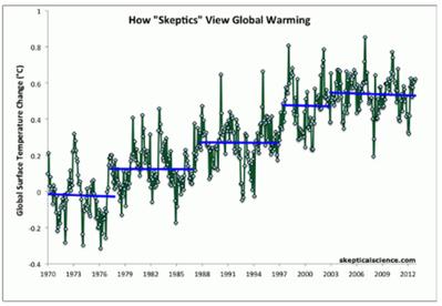
The counter-argument from ATTP is

If you look again at the information for this station the trend before adjustments was -1.37oC per century, after quality control it was -0.89 oC per century, and after adjusting for the station moves was +1.36 oC per century. Also, if you consider the same region for the same months, the trend is +1.37 oC per century, and for the country for the same months it is +1.28 oC per century. So, not only can one justify the adjustments, the result of the adjustments is consistent with what would be expected for that region and for the country.

Paul Homewood has investigated all the other stations in Paraguay or in neighbouring Bolivia and found similar ad hoc adjustments. It completely undermines ATTP’s arguments. This anonymous individual is wrong. Rather than face dealing that he is wrong, ATTP has deleted my comment. He is entitled to his beliefs, and in a free society can proselytize to his heart’s content. But there are boundaries. One of them is in suppressing evidence that undermines the justification for costly and harmful public policies. That is policies that are harming the poor here in Britain, but (and more importantly) can only be remotely successful by destroying the prospect of increasing living standards for over half the world’s population. Paul Homewood and others are increasingly uncovering similar biases in the temperature record in other parts of the world. The underlying data for the global surface temperature sets is in need of a proper, independent audit, to determine the extent of the biases within it. But when the accusation that the Paraguayan temperature data set is corrupted, people will point to ATTP’s blog post as evidence that there is but a single instance, and that instance has been debunked. Another boundary is a value that that many in the criminal justice system also hold dear. The more emotive the subject, the greater all concerned must go out of their way to compare and contrast the arguments. That way, the influence of our very human prejudices will be minimized. Again, independent audits will help eliminate this. If ATTP thinks he has all the answers then he will not be afraid to encourage people to look at both sides, evaluate by independent standards, and make up their own minds.

Kevin Marshall

Comment ATTP 310115

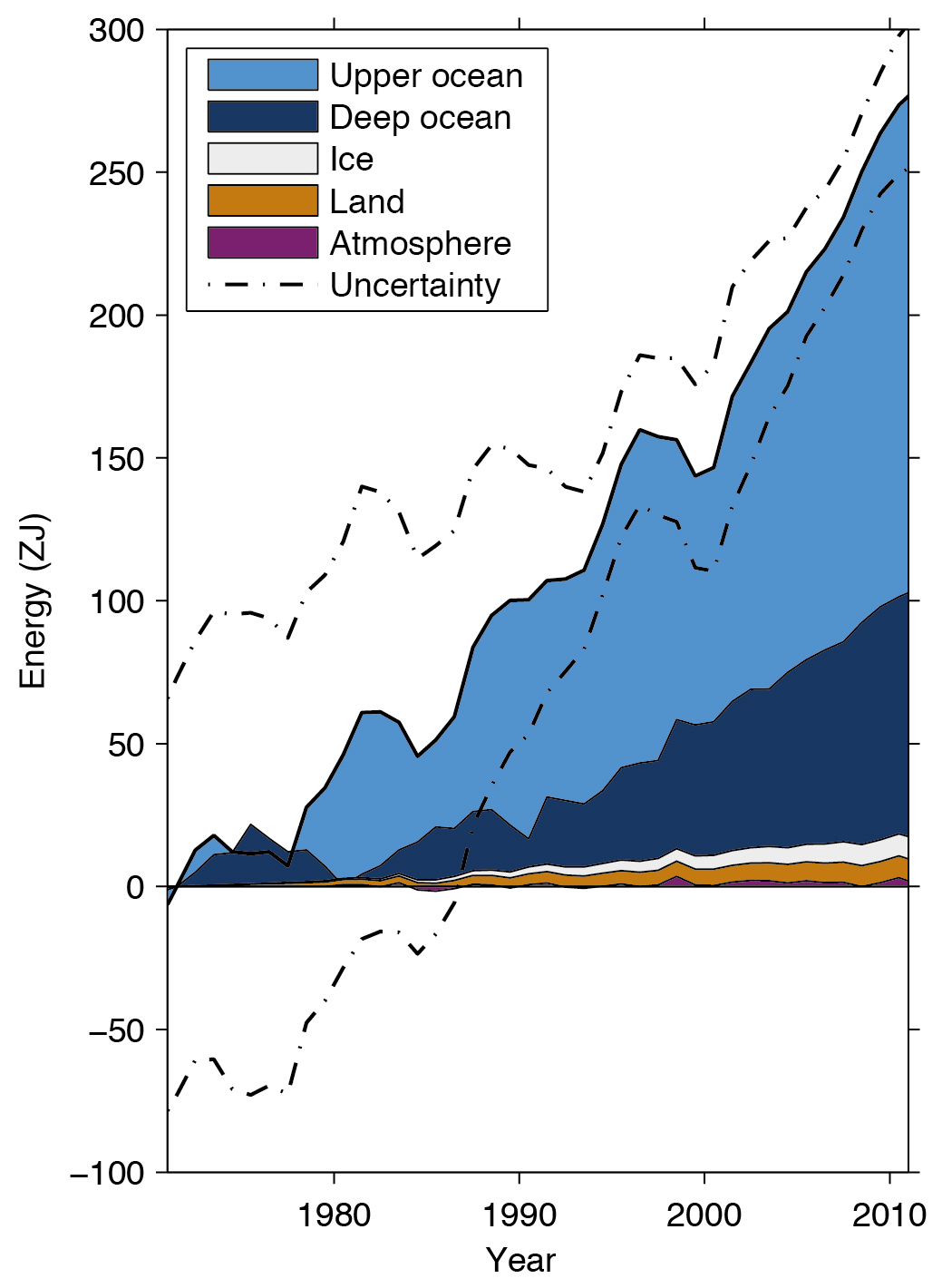
Instances of biases in the temperature sets

This will be added to when I get time.

Paul Homewood on San Diego data 30-01-15

Shub Niggareth looks into the Puerto Casado story 29-01-15

Paul Homewood on Reykjavik, Iceland 30-01-15

Jennifer Marohasy letter on Australian data 15-01-15

Update 01-02-15

I have invited a response from ATTP, by posting #comment-46021.
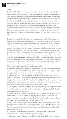
ATTP

You have deleted two of my comments in the last 24 hours that meet all of your moderation criteria except one – that you cannot face dealing with a challenge. That is your prerogative. However, the first comment, (now posted on my blog) I believe completely undermines your argument. Paul Homewood has shown that the Puerto Casado dataset homogenization did not make it consistent with neighbouring non-homogenized surface temperature stations, but that all the Paraguayan and neighbouring Bolivian surface temperature stations were “homogenized” in the same way. That is, rather than eliminating the biases that local factors can create, the homogenizations, by people far removed from the local situations, effectively corrupted the data set, in a way that fits reality to the data.

I might be wrong in this. But based on your arguments so far I believe that my analysis is better than yours. I also believe that who has the better argument will only be resolved by an independent audit of the adjustments. If you are on the side of truth you would welcome that, just as a prosecutor would welcome the chance to prove their case in court, or a pharmaceutical company would welcome independent testing of their new wonder-drug that could save millions of lives. Even if I am wrong, I will be glad at being refuted by superior arguments, as I will know that to refute my claims will require you to up your game. Humanity will be served by my challenging a weak case and making it stronger. You have generated over 500 comments to your post, so an appeal for help via email should generate some response. If that does not work there are many well-funded organisations that I am sure will rush to your assistance.

There are at least seven options I think you can take.

  1. Ignore me, and pretend nothing has happened. Bad idea. I will start analysing your posts, as you did with Wattsupwiththat, only rather than your pea-shooters firing blanks, I have the heavy artillery with HE shells.
  2. Do an attack post – like desmogblog or Bob Ward of the Grantham Institute might do. Bad idea, I will take that as perverting or suppressing the evidence, and things will get rather rough. After all, I am but a (slightly) manic ex-beancounter, and you have the consensus of science on your side, so why is should sending in the PR thugs be necessary unless you are on the losing side?
  3. Get together a response that genuinely ups the game. Win or lose you will have served humanity as I and others will have to rebut you. Engage and all will gain through greater understanding.
  4. Admit that there are other valid points of view. A start would be to release this comment, which will get posted on my blog anyway. I quite accept that you cannot come up with a rebuttal at the drop-of-a-hat. A simple comment that a response will be made sometime this year is fine by me.
  5. Also call for a truly independent audit of the surface temperature set. It could be for your own reasons, and if truly independent, I will support it. If a whitewash, like the enquiries that Gordon Brown ordered into Climategate, an audit will do more harm than good.
  6. Close down your blog and do something else instead. You choose to be anonymous, and I respect that. Walking away is easy.
  7. Admit that you got this one wrong. You will take some flack, but not from me.

Why no country should sign up to Climate Mitigation at Paris 2015

The blog “the eco experts“, has produced a map of the countries most likely to survive climate change.

The most populous country with a high risk is India. In fact it has more people than the 50+ nations of Africa, or nearly twice the population of the OECD – the rich nations club. It is determined not to constrain the rapid growth in emissions if it means sacrificing the rapid economic growth that is pulling people out of poverty. Is this sensible when rapidly increasing its emissions create the prospect of dangerous climate change?

Look at the pattern of vulnerability.

Why is Mongolia more vulnerable than Russia or China?

Why is Haiti more vulnerable than Guatemala & El Salvador, which in turn are more vulnerable than Mexico, which in turn is more vulnerable than the USA?

Why are Syria and Iraq more vulnerable than Iran, which in turn is more vulnerable than Saudi Arabia, which is in turn more vulnerable than the UAE?

Why is Madagascar more vulnerable than Tanzania, which in turn is more vulnerable than South Africa, which is in turn more vulnerable than Botswana?

The answer does not lie in the local climate system but in the level of economic development. As with natural extreme weather events, any adverse consequences of climate change will impact on the poorest disproportionately.

In the light of this, should India

  1. Agree to sacrifice economic growth to constrain emissions, having a significant impact on global emissions and maybe encouraging others to do likewise?

    OR

  2. Continue with the high economic growth (and hence emission growth) strategy knowing that if catastrophic climate change is real the population will be better able to cope with it, and if inconsequential they will have sacrificed future generations to a trivial problem?

    OR

  3. Continue with the high economic growth (and hence emission growth) strategy and invest in more accurately identifying the nature and extent of climate change?

Now consider that any Government should be first and foremost responsible for the people of that country. If that can be best progressed by international agreements (such as in trade and keeping global peace) then it is the interests of that country to enter those agreements, and encourage other nations to do likewise. Global peace and globalisation are win-win strategies. But climate change is fundamentally different. It is a prospective future problem, the prospective harms from which are here clearly linked to stage of economic development. Combating the future problem means incurring costs, the biggest of which is economic growth. Technologically, there low-cost solutions are in place, and there is no example of any country aggressively weeding out ineffectual policies. Even if there were effective policies in in theory, for costs to exceed benefits would mean every major country either drastically cutting emissions (e.g. the OECD, China, Russia, Saudi Arabia, South Africa) or drastically constraining future emissions growth (India, Brazil, Indonesia, Vietnam, Thailand, plus dozens of other countries). If some countries fail to sign up then policy countries will be burdened with the certain actual costs of policy AND any residual possible costs of policy. Responsible countries will duck the issue, and, behind the scenes, help scupper the climate talks in Paris 2015.

Kevin Marshall

Veritasium Misinforms on Global Warming

Bishop Hill posts on a You-tube video “13 Misconceptions About Global Warming” from Veritasium (Dr Derek Muller), inviting readers to play a sort of bingo to “spot all the strawmen arguments, cherrypicking, out of date data, and plain old mistakes”. Here is my attempt, restricted to just 13 points.

  1. “Global warming” / “climate change” naming. It might be true that people can deny global warming by pointing to a localized cold weather snap. But it is also true that using the term “climate change” can result in any unusual weather event or short-term trend being blamed on anthropogenic global warming, along with natural global fluctuations. The term “global warming” reminds us that the adverse effects on climate are as a result of rising greenhouse gas levels warming the atmosphere. More importantly the use of the term “global” reminds us those changes in climate due to changes in greenhouse gases is a global issue requiring global solutions. Any mitigation policy that excludes 80% of the global population and two-thirds of global carbon emissions, will not work.


  2. Veritasium claims climate change is also about more extreme weather and ocean acidification, not just the average surface temperature is warming. But there is nothing in the greenhouse gas hypothesis that says a rise in temperatures will result in more extreme weather, nor does Veritasium provide the evidence of this happening. At Wattupwiththat there is a page that demonstrates weather is not getting more extreme from a number of different measures.


  3. Claim that it has not stopped warming as 13 of the 14 hottest years are in this century. This is a strawman, as there was significant warming in the last quarter of the twentieth century. We would only fail to have hottest years if global average temperatures had taken a sharp step decrease.


  4. Claims that taking the satellite data of global temperature anomalies into account shows that warming has not stopped. From Kevin Cowtan’s page (copied by Skeptical Science) we can calculate linear trends. It is the RSS satellite data that shows the longest period of no warming – 18 years from 1997-2014 based on the linear trend. It is just 13 years for GISTEMP and 14 years for HADCRUT4. The other satellite data is UAH, where there is just 6 years of no warming.


  5. What he is doing is comparing UAH satellite data that only shows the pause from 2009. There is now 35 years of satellite data, with the total recorded trend of 0.48oC. The RSS data shows 0.51oC of warming. The surface thermometer measures vary between 0.59 and 0.63 oC of warming. This is data cherry-picking.


  6. There is a claim that climate sensitivity is lower than thought in the 1980s. Not according to Nicholas Lewis, who found that the range of sensitivities is unchanged from the Charney Report 1979 through to AR5 WG1 of Sept-13


  7. Claims the central estimate for warming from a doubling of CO2 is 3.0oC of warming. Based on this from 2001 from HADCRUT4 shows no warming there would be 0.30oC of warming, when the trend from HADCRUT4 is zero. In a longer period from 1979 for which we have satellite data, an increase in CO2 from 336.8 to 398.5 ppm (Mauna Loa data) implies an increase in temperatures of 0.72oC – between 1.14 on 1.5 times greater than that measured by the temperature series. Even this is misleading, as there was no warming from 1944 to the late 1970s. In 1944 I estimate that CO2 levels were 308ppm, indicating a total warming in the last 70 years of 1.1oC, respectively 1.7 and 2.1 times greater than the trend in GISTEMP and HADCRUT4.


  8. This would appear to contradict this graph, which has no proper labelling showing have 3.0oC of doubling affects temperatures.

    Specifically from 1958 to 1980 CO2 rose from 315 to 339ppm, indicating warming of about 0.31 oC, but there was no warming in the IPCC projections. A rise in CO2 of 315 to 398.5 ppm from 1958 to 2014 would predict 1.0 oC in warming, almost double the actual data and the IPCC projections. Another point is with the “observed temperature”. It is not identified (probably GISTEMP) and ends on the high of 2010.


  9. Completely ignores the other greenhouse gases that contribute to warming, such as methane and halocarbons.


  10. Claims that sea level rise is another indication of global warming, through thermal expansion. This is not necessarily the case. The average temperature of the ocean is 3.9oC. A rise of to 4.0 oC will have zero expansion. If the rise in sea temperatures is confined to the Arctic or in the deep oceans where temperatures are below 4.0 oC, a rise in temperatures would mean a fall in sea levels. Below I have compiled a graph to show the expansion of a 100metre column of water by 0.1 oC from various starting temperatures.


  11. On Arctic Sea ice, is correct in saying that the 40% uptick in the last two years ignores the longer period of data. But in turn, Veritasium ignores evidence pre-satellites that were fluctuations in sea ice. Further, the uptick occurred at precisely the year when previous experts had predicted that summer sea ice cover would disappear. As a consequence, contraction of the sea ice is both less severe and less likely to be linked to human-caused warming than previously thought.


  12. Correctly points out that water vapour is the major greenhouse gas, but incorrectly claims to have evidence that water vapour is increasing in the atmosphere. The evidence is from a graphic from a 2007 PNAS paper.

    The evidence from 1900 is the average of 12 models. The confidence intervals are utter rubbish, appearing to be related to the magnitude of the average modelled anomaly. The actual (estimated) data in black does not have a confidence interval. It would appear that this estimated data has a step increase at roughly the time, or slightly before, when the warming stopped in the surface temperature records.


  13. Policy justification is totally wrong.

Veritasium says at 5.35

I’m not claiming it’s going to be some sort of crazy catastrophe, but we are going to get more intense storms, more droughts and floods, the oceans will become more acidic, sea levels will rise and my point is it would be better for all species on this planet and probably cheaper for us if we just started reducing emissions now than if we wait and pay the consequences later.

Every economic justification of policy projects “some sort of crazy catastrophe” that human being and other species will not be able to adapt to. Further they project that global emissions reductions will be both effective and relatively costless, which is contradicted by the evidence. But most of all, there is no political proposal in the climate talks that will reduce global emissions in the next twenty years. The proposals may only constrain the rate of increase.

Kevin Marshall

Climategate : The greatest quote is from Kevin Trenberth

As Paul Matthews at IPCC Report and Anthony Watts at Wattsupwiththat are pointing out, 17th November marked the 5th Anniversary of Climategate1. Paul Matthews has his pick of the most significant quotes. But I believe he misses the most important. Kevin Trenberth to Micheal Mann on Mon, 12 Oct 2009 and copied to most of the leading academics2

The fact is that we can’t account for the lack of warming at the moment and it is a travesty that we can’t. The CERES data published in the August BAMS 09 supplement on 2008 shows there should be even more warming: but the data are surely wrong. Our observing system is inadequate. (emphasis mine)

The first sentence is the mostly widely quoted. It is an admission that we, the experts, cannot explain what is happening. The end of the quote is even more important. There is a clear divergence between the predictions from the climate models – the theoretical understanding of the world – and the real world data. Trenberth’s reaction is that the data is wrong, not the theory. His later excuse for continuing belief in the climate models was coined a few months later. The truth is lurking in the murky depths. As with the mythical Loch Ness Monster, the believers in climate catastrophism hold that the evidence will be found, but we are not able to access it yet. This has created a new branch of climatology – the excuses for the pause. At the time of writing there are 65 excuses and new cases are appearing at more than two a week.

Kevin Marshall

Notes

  1. The term Climategate was coined by James Delingpole on 20th November 2009.
  2. Cc: Stephen H Schneider , Myles Allen , peter stott , “Philip D. Jones” , Benjamin Santer , Tom Wigley , Thomas R Karl , Gavin Schmidt , James Hansen , Michael Oppenheimer. This was an email between the high priests of the global warming movement.

The Climate Policy Issue Crystallized

There is a huge amount of nonsense made about how the rich industrialized countries need to cut carbon emissions to save the world from catastrophic global warming. Just about every climate activist group is gearing up to Paris 2015 where at last they feel that world agreement will be reach on restraining the growth of greenhouse gas emissions. Barak Obama will be pushing for a monumental deal in the dying days of his Presidency. There is a graphic that points out, whatever agreement is signed attempts to cut global emissions will be a monumental failure. It comes from the blandly named “Trends in global CO2 emissions: 2013 report” from the PBL Netherlands Environmental Assessment Agency. In the interactive presentation, there is a comparison between the industrialised countries in 1990 and 2012.


In over two decades the emissions of the industrialised countries have fallen slightly, almost entirely due to the large falls in emission in the ex-Warsaw Pact countries consequent on the collapse in the energy-inefficient communist system. In the countries formerly known as the “First World” the emissions have stayed roughly the same. It is the developing countries that account for more than 100% of the emissions increase since 1990. Two-thirds of the entire increase is accounted for by China where in less than a generation emissions quadrupled. Yet still China has half the emissions per capita of United States, Australia or Canada. It emissions growth will slow and stop in the next couple of decades, not because population will peak, or because of any agreement to stop emissions growth. China’s emissions will peak, like with other developed countries, as heavy industry shifts abroad and the country becomes more energy efficient. In the next 30-40 years India is likely to contribute more towards global emissions growth than China. But the “remaining developing countries” is the real elephant in the room. It includes 1050 million people in Africa (excluding South Africa); 185m in South America (excluding Brazil); 182m in Pakistan; 167m in Bangladesh, 98m in Philippines and 90m in Vietnam. The is over 2000 million people, or 30% of the global population that do not currently register on the global emissions scale, but by mid-century could have emissions equivalent to half of the 1990 global emissions. To the end of the century most of the global population increase will be in these countries. As half the countries of the world are in this group any attempt to undermine their potential economic growth through capping emissions would derail any chance of a global agreement.

Hattip Michel of trustyetverify

Kevin Marshall

Britain’s Folly in Attempting to Save the World from Global Warming

Last week in the House of Lords1 Viscount Ridley asked Baroness Verma, a minister at the Department of Energy and Climate Change, about the hiatus in global warming. Lord Ridley asked Lady Verma

Would you give us the opinion of your scientific advisers as to when this hiatus is likely to end.

Lady Verma replied

It may have slowed down, but that is a good thing. It could well be that some of the measures we are taking today is helping that to occur.

I already commented at Bishop Hill – repeated by James Delingpole

From 1990 to 2013 global emissions increased by 61%. Of that increase, 67% was from China & India. This is not surprising as they were both growing fast from a low base, and combined contain nearly 40% of global population. The UK, with less than 1% of global population managed to decrease its emissions by 19%. In doing so, they managed to offset nearly 1.2% of the combined increase in China & India.

However this is not the full story, particularly with respect to understanding future emissions growth. Here I extend the analysis of the CDIAC data set2 to give a more comprehensive picture. CDIAC (Carbon Dioxide Information Analysis Centre) have estimates of CO2 emissions in tonnes of carbon equivalent for all countries from 1960 to 2013. These I have split out the countries of India, China and UK. The rest I have lumped into three groups – The major developed ACEJU countries3, the Ex-Warsaw Pact countries4 and ROW5 (Rest of the World). For emissions I have taken the baseline year of 1990, the latest year of 2013 and then forecast emissions for 20206.

The major developed economies have virtually unchanged, although, along with the UK the proportion of global emissions has fallen from 45% to 28% between 1990 and 2013 and are forecasted to fall further to 23% of global emissions even without aggressive emission reduction policies.

The collapse of communism meant the collective emissions of the Ex-Warsaw Pact countries fell by 44% between 1988 and 1999. That in 2020 emissions levels will still be around 20% lower, even though the economies will be far richer, is due to the inefficiencies of the Communist system.

China and India had most of the emissions growth between 1990 and 2013, there emissions growing by 300% and 250% respectively. That growth was equivalent to 16 times the UK emissions in 1990. By 2020 China and India’s emissions growth over 30 years is likely to have cancelled out the UK’s 30% reduction 78 times over. That forecast emissions increase from 1990 to 2020 is also a third larger than the combined 1990 emissions of the major rich countries.

Finally there is the ROW countries, nearly half the World’s population now live and where emissions increased by 130% between 1990 and 2013.

To put these figures in context, we need to look at population figures, which are available from the World Bank7.

The big CO2 emitters in 1990 were the First and Second World countries. Over two-thirds of global emissions were produced by a quarter of the population. Those same countries now produce 40% of global emissions and have 20% of the global population. The population has grown, but only by 10%. In some of the countries it is already falling. China’s population grew by 20%, India’s by 44% and the Rest of the World by 55%, giving a global population growth of 35%. Looking at CO2 emissions in tonnes per capita puts the CO2 emissions problem into perspective.

China started from an extremely low base in terms of emissions per capita. It is unlikely to exceed the rich world’s 1990 emissions per capita in the next 10 years. However, due to slower population growth and its current stage of development, it is unlikely to be the major source of emissions growth through to 2050. It is likely to be overtaken by India, who in turn will be overtaken by the rest of the world before the end of the century. Unless very cheap non-CO2 emitting sources of energy are developed, global emissions will continue to grow. That emissions growth will be the result of genuine economic growth that will see grinding poverty disappear from every country that embraces the modern world.

The UK with less than 1% of the world’s population will continue to have no impact at all despite all the hype of having the World’s “greenest” energy policies. Even if the scariest scenarios of Lord Stern’s nightmares are true, there is absolutely no reason to continue with policies that are pushing ever greater numbers into fuel poverty and jeopardizing security of energy supply. The future impacts will be just the same, but with current policy, Britons will meet that future poorer than without. The British Government is like a doctor that prescribes useless medicine in the knowledge that it has nasty side effects. Most would agree that a GP who did that to a patient should be struck off, even if it were one patient in hundreds.

For the people who still genuinely believe that increasing CO2 emissions will cause catastrophic climate change there are two causes of action. First is to find a plentiful source of non-polluting energy where the full costs are less than coal, but just as reliable. There is genuine pollution from coal in the form of smog, so everyone should be in support of this. Shale gas, then thorium nuclear reactors might be a ways forward in the next few decades. Second is to far more accurately predict the catastrophic consequences of global warming, so adaptation can be made at minimal cost and waste of resources. Every prediction of short term catastrophe (e.g. worsening hurricanes) or a worsening situation (e.g. accelerating sea level rise) has proved to be false, hence the reliance on noisy publicists and political activists that discourage learning from past mistakes.


Please note that first time comments are moderated. I welcome debate. Please use the comments as a point of contact, with a request not to publish.

Kevin Marshall

Notes

  1. As reported by James Delingpole at Brietbart. Also reported at The Daily Mail, Bishop Hill, and Not a Lot of People Know That here and here.
  2. CDIAC is the Carbon Dioxide Information Analysis Centre. The 2014 Budget 1.0 contains estimates of CO2 emissions in tonnes of carbon equivalent for all countries from 1960 to 2013. I have converted the figures to tonnes of CO2.
  3. Australia, Canada, EU (the Western European 15, less UK), Japan and USA. This is most of what used to be called “First World”.
  4. This includes the former USSR countries, plus Eastern Europe. I have added in North Korea, Yugoslavia and Cuba.
  5. By definition this includes Central and South America, Africa, Middle East and South East Asia.
  6. Britain has committed to reduce its emissions by 30% of 1990 levels by 2020. China has pledged to “Reduce CO2 emissions per unit of GDP by 40–45% by 2020 compared to the 2005 level”. I assume 8% GDP growth and achieving a full 45% reduction, which is achievable. Similarly India has pledged to Reduce CO2 emissions per unit of GDP by 20–25% by 2020 compared to the 2005 level. Although it is unlikely to be achieved, based on emissions growth from 2005-2013, I have a assumed 7% GDP growth and achieving a minimum 20% reduction. For the other countries I have assumed half the emissions change from 1999-2013. This is likely to be an underestimate, as many other economies are growing emissions are a fast annual rate. For them this assumes a much reduced growth rate. Also many developed economies, particularly in Southern European showed sharp drops in emissions along with GDP in the credit crunch. They are now emerging, so should be expected to have higher emission growth rates.
  7. The 2020 population figures are assuming that each country’s population will change in the next seven years by the same number that it did in the previous seven. As world population growth in slowing, this might be a reasonable estimate. The result is a population increase of 550 million to 7,675 million.

São Paulo Drought – Climate Change is NOT the cause

Seca de São Paulo – Mudança Climática NÃO é a causa

The drought situation in São Paulo is critical. As of late October, the two principle reservoirs that serve the city were below 5% of capacity. Water pressures have been reduced to such an extent that people in the higher parts of the city are without water for most of the time. What is causing this?

The “Climate News Network” (website run by former Guardian & BBC journalists) they attribute this to deforestation and climate change1. They say

The unprecedented drought now affecting São Paulo, South America’s giant metropolis, is believed to be caused by the absence of the “flying rivers” − the vapour clouds from the Amazon that normally bring rain to the centre and south of Brazil.

Some Brazilian scientists say the absence of rain that has dried up rivers and reservoirs in central and southeast Brazil is not just a quirk of nature, but a change brought about by a combination of the continuing deforestation of the Amazon and global warming.

This combination, they say, is reducing the role of the Amazon rainforest as a giant “water pump”, releasing billions of litres of humidity from the trees into the air in the form of vapour.

Meteorologist Jose Marengo, a member of the Intergovernmental Panel on Climate Change, first coined the phrase “flying rivers” to describe these massive volumes of vapour that rise from the rainforest, travel west, and then − blocked by the Andes − turn south.

Satellite images from the Centre for Weather Forecasts and Climate Research of Brazil’s National Space Research Institute (INPE) clearly show that, during January and February this year, the flying rivers failed to arrive, unlike the previous five years.

This explanation of deforestation causing the drought does not hold water. The following is an account of why this drought explanation is flawed.

The “flying rivers” or “rios voadores” is being studied as a Petronas-sponsored long-term project at http://riosvoadores.com.br/english/. Project leader Gérard Moss explains the nature of “flying river”.

The question is, where does the rain come from?

Most of the evaporation comes from the sea… The wind pushes this air over the Amazon Forest, a region where it rains quite a lot. The humid air eventually reaches the Andes, which force it south and that is what we are calling a “flying river

So the most important part of the evaporation is from the sea. A minor part comes from evaporation the Amazon Forest. Yet the Climate News Network is under the impression that all of the evaporation comes from the Amazon. The same is true of the Ecologist, which seems to have used the same material. What is even worse, both sources claim that 22% of the Amazon has been lost. That would mean that the total evaporation from the Amazon region will have reduced by less than this figure and the total moisture content of the “flying rivers” by less than 10%. Even so, there is nowhere provided any data that shows the rainfall in the area is reduced. If the hypothesis were true, then the rainfall near the mouth of the Amazon would be largely unchanged, but as the “flying river” goes south into NE Bolivia and Paraguay, and the Brazilian states of Rondönia, Mato Grosso do Sul, São Paulo, Parana and Santa Catarina, there should be evidence of diminishing rainfall. But despite a quite expensive project employing a number of people and two light aircraft (one a sea plane) there seems to be no effort to gather the data that might falsify the data. Further, project leader Gérard Moss (who is a pilot and engineer) does not seem open to falsification of the hypothesis.
Starting at 7:10 he says:-

My dream is that the Flying Rivers project, through studying (the flying rivers) behaviour, will scientifically prove the amount of rainfall in the south and the Amazon forest. My dream is that we will finally stop exchanging the forest for grazing land and plantations. ….. (T)he project’s greatest challenge is to prove to all us Brazilians, that it’s no longer worth felling one single tree.

Gérard Moss is a pilot and engineer. He is the one who has the use of two aircraft. Further, since mid-2012, the project has been restricted to educational projects2. One such project gives a useful tool that monitors the prevailing wind trajectories. The latest one I downloaded and superimposed the wind direction of the “flying rivers” in think blue arrows.


It would seem that the prevailing easterly winds have shifted south coming ashore in arid Bahia and doing a short loop round to São Paulo, completely missing the Amazon.

Unfortunately, the only map prior to October is for 23/07/14. This gives a similar picture of prevailing winds completely missing the Amazon.


I have a simple hypothesis that can easily be contradicted by archived data held by the website. The cause of the current water shortage lies in January and February, with the failure of the normal summer rains. My hypothesis that this failure was due to similar wind patterns occurring in January and February as found on 27th October. This, naturally occurring, phenomena would have occurred at a similar time to the Gulf Stream shifting course – in the UK shifting north causing extreme storms in Southern England, with flooding in Somerset and the Thames Valley, and in the USA shifting south causing the extreme cold of the Polar Vortex.

There is, however, a further video by the BBC (in English) where Gérard Moss explains that half or more of the rainfall in São Paulo is from the Amazon, as opposed to the sea.

There are three potential sources of water vapour that could condense as rain in the city of São Paulo, but are not mentioned. First is sea evaporation that has not passed over the Amazon. Second is land evaporation from air currents that have not passed over the Amazon, like in the cases above. Third is evaporation from the “flying rivers” airflows after passing over the Amazon. There is up to 2,000 km between the end of the Amazon forest and São Paulo.

Summary

The current extreme drought in the city of São Paulo is not the result of Amazon deforestation for two reasons. First, the deforestation is insufficiently large to account for the drought levels. Second is that evidence points to a natural southerly shift in the current year in the easterly winds coming ashore in Brazil from near the Amazon delta to the much drier coast of Bahia.

But if the deforestation is not the cause of the draught, what are the likely causes? This will be the subject of a further post.

Update 1 14/12/14

I did not get round to the update. This is a background I wrote for the BishopHill discussion.

As my wife comes from Southern Brazil and I have visited the area a number of times, this caught my eye. Before linking the drought to climate change you need to consider the following geographical facts.

  • The City of São Paulo is built on a plateau about 700 metres above sea level. This means that although the Tropic of Capricorn passes through the North of the City, the climate is relatively temperate. The highest recorded temperature is just 35.3 °C.
  • The two principle reservoirs have been supplying the city since the 1920s when the population was less than a million, compared to twenty million today.
  • The area of São Paulo and Rio de Janeiro was once covered by the Atlantic forest. This once extended well south into Argentina and inland to Paraguay – an area bigger than Western Europe. According to Wikipedia 88% has disappeared. (Climate News Network and The Ecologist put the figure at 91.5%) From extensive travel in Parana, Southern São Paulo state and Northern Santa Catarina this figure seems accurate. Most of the deforestation occurred in the twentieth century.
  • The Rivers of São Paulo State mostly form part of the River Plate Basin – that meets the sea in Montevideo, Uruguay. This drains most of southern Brazil, the entire country of Paraguay, Northern Argentina as well as a corner of Bolivia1. The principle river serving the city is the Tietê.
  • São Paulo State is about the same area of the United Kingdom and has a population of 43 million.
  • Upstate there is extensive agriculture, including soybean, sugar cane and cattle.
  • This is the worst drought in 84 years, not ever recorded. The previous one was four years before the American dust bowel of 1934, so there might be common climate factors that have influenced the period.

My conclusion is that the seriousness of the current water crisis is due to the following factors, in order of importance.

  1. Investment in water supply not keeping pace with demand.
  2. A once-in-a-century drought.
  3. Location of a megacity on a plateau, limiting the ability to cheaply extend the water supply.
  4. Changes in rainfall patterns from deforestation.

Notes

  1. Over at the BishopHill blog, commentator Entropic Man has started a discussion thread on the current drought in São Paulo, which he claims is due to deforestation and climate change. As the BishopHill blog is almost entirely given over to climate issues, the inference by Entropic Man is that human-caused climate change is responsible.
  2. The website explains (in Portuguese)

    From the mid-2012, the project is restricted to educational, awareness actions and counts with the collaboration of the CPTEC in providing the data provided on the links of the weather mapsan important tool that allows the general public to see and track the trajectories of the flying rivers.

    Kevin Marshall

Pages2K Revised Arctic Reconstructions

Climateaudit reports

Kaufman and the PAGES2K Arctic2K group recently published a series of major corrections to their database, some of which directly respond to Climate Audit criticism. The resulting reconstruction has been substantially revised with substantially increased medieval warmth. His correction of the contaminated Igaliku series is unfortunately incomplete and other defects remain.

This post is on comparing the revised reconstruction with other data. In the comments Jean S provides a graph that compares the revised graph in red with the previous version in black. I have added some comparative time periods.

  1. The Maunder minimum of 1645-1715 corresponds to a very cold period in the Arctic. The end of the minimum was associated with a rebound in temperatures.
  2. The Dalton minimum of 1790-1820 corresponds to a period of sharply declining temperatures, with the end of the period being the coldest in 2,000 years. The end of the minimum was associated with a rebound in temperatures.
  3. The early twentieth century shows about 1.1oC of warming from trough to peak in a time period that corresponds to the 1911-1944 trough-to-peak warming of the global temperature series. It is about twice the size of that calculated globally by HADCRUT4 and GISTEMPa, consistent with there being greater fluctuations in average temperatures at the poles than in the tropics.
  4. The late twentieth century shows about 0.5oC of warming from trough to peak in a time period that corresponds to the 1976-1998 trough-to-peak warming of the global temperature series. This is broadly in line with that calculated globally by HADCRUT4 and GISTEMPa. This possibly corroborates data of individual weather stations having a warming adjustment bias (e.g. Reykjavik and Rutherglen) along with the national data sets of USA (Steve Goddard) and Australia (Jennifer Marohasy and Joanne Nova). Most of all, Paul Homewood has documented adjustment biases in the Arctic data sets.
  5. The proxy data shows a drop in average temperatures from the 1950s to 1970s. The late twentieth century warming appears to be a mirrored rebound of this cooling. Could the measured reductions in Arctic sea ice cover since 1979 partly be due to a similar rebound?

In conclusion, the Pages2K Arctic reconstruction raises some interesting questions, whilst corroborating some things we already know. It demonstrates the utility of these temperature reconstructions. As Steve McIntyre notes, the improvements partly came about through recognizing the issues in the past data set. Hopefully the work will continue, along with trying to collect new proxy data and refine existing techniques of analysis.

UPDATE 23.00

In the above, it is evident that the early twentieth century (c.1911-1944) Arctic warming in the revised reconstruction was twice the size of late twentieth century (c.1976-1978) warming, when global temperature anomalies show the later period as being greater in size. Steve McIntyre’s latest post shows that at least part of the answer may lie in the inclusion of the Okshola, Norway speleothem O18 and Renland, Greenland O18 series. These proxies both show a downturn at the end of the twentieth century. This might conceivably be a much greater influence on the discrepancy than either adjustment biases in temperature data, or differences between actual, not fully known, temperature anomalies between the Arctic region and the World. However, we will get a better understanding by eliminating the obvious outliers in the proxies and by continuing to positively seeking to eliminate bias in the global surface temperature anomalies.

Kevin Marshall

Notes

  1. Earlier this year I calculated the early twentieth century warming rates for the HADCRUT and GISTEMP series. They are


  2. From the same posting the 1976-1998 warming rates are


Prof Lewandowsky – Where is the overwhelming evidence of climate change?

On Stephan Lewandowsky’s blog (funded by the Australian people) he claims that there is overwhelming evidence of climate change. My question is as follows

You claim that there is “overwhelming scientific evidence on climate change”. Does this apply to:-

  1. The trivial proposition that there is a greenhouse effect, so a rise in GHG levels will cause some rise in temperature?

    OR

  2. The non-trivial proposition that the unmitigated increase in GHG levels will lead to significant warming with catastrophic consequences?

The trivial proposition is something for a few academics to ponder. It is only when there is reasonable scientific evidence for the non-trivial proposition that a global policy to mitigate could be seriously contemplated.

Having attended John Cook’s lecture at Bristol University a few days ago, I found out that the vast survey of academic papers found a 97% consensus was about belief in the trivial proposition, and some of the papers were authored by non-scientists. That is, Cook presented weak, secondary, evidence of the trivial proposition.

Cook’s lecture also mentioned the four Hiroshima bombs a second of heat accumulation in the climate system since 1998, the widget for which you have on the left-hand side of this blog. Stated this way, there appears to be a non-trivial amount of warming, that anybody can perceive. It is equivalent to the average temperature of the ocean’s increasing at a rate less than 0.0018oC per annum. That is weak evidence for the trivial proposition.

So where is the overwhelming evidence that can justify policy?


This gives rise to a question that Australian citizen’s may one to raise with their elected representatives.

Should Australian taxpayers be funding a partisan blog that is strongly critical of mainstream political opinion, whose sole current contributor is a non-Australian working outside of Australia?

Kevin Marshall

Notes on John Cook’s presentation at Bristol University

On Friday 19th September John Cook talked on “ Dogma vs. consensus: Letting the evidence speak on climate change” at Bristol University. He was introduced by Stephen Lewandowsky, who is now a professor there. The slides are available at Skepticalscience. Here are some notes on the talk, along with brief comments.

The global warming hypothesis

John Cook started by asking people to see if they can define the greenhouse effect as a way of detecting if people know what they are talking about. However, he did not then apply this criteria in evaluating consensus views.

He stated that there is no single cause of global warming (including solar and volcanic), but that there is a major or principle one. From then on Cook proceeded as if there was a single cause. There was no evidence for relative size of each cause of global warming. Nor was there any consideration of the implications if AGW accounted for half or less of the warming rather than the entirety of it.

He stated that there are multiple lines of evidence for AGW actually operating, no mention of the quality of the evidence, or of contrary evidence that the pattern of warming does not fit the models.

Cook et. al 97% scientific consensus paper

Cook than went on to talk about his 97% consensus paper. He then showed the Barak Obama tweet.

In the Q&A John Cook admitted to two things. First, the paper only dealt with declared belief in the broadest, most banal, form of the global warming hypothesis. That is greenhouse gas levels are increasing and there is some warming as a consequence. Second is that the included papers that were outside the realm of climate science1, and quite possibly written by people without a science degree. The Barak Obama tweet account seems to have got the wrong impression.

This should be seen in the light of a comment about why consensus is important.

Communicating consensus isn’t about proving climate change. It’s addresses a public misconception about expert opinion.

John Cook has spectacularly failed on his own terms.

Fake Experts

Cook pointed to a petition of a few years ago signed by over 31,000 American scientists, opposing the Kyoto Treaty on the basis that it would harm the environment, hinder the advance of science and technology and damage the health and welfare of mankind. They also signed to say that there was no convincing evidence of catastrophic global warming.

He calls these people “fake experts” because these “scientists”, but are not “climate scientists”. But as we have seen neither were all the authors on his climate consensus paper.

If scientists from other areas are “fake experts” on climate science, then this equally applies to those making statements in support of the “climate consensus”. That means all the statements by various scientific bodies outside of the field of “climate” are equally worthless. Even more worthless are proclamations by political activists and politicians.

But most of all neither is John Cook a “climate expert”, as his degree is in physics.

Four Hiroshima Bombs and a Zillion Kitten Sneezes

As an encore, Cook had a short presentation on global warming. There were no hockey sticks showing the last thousand years of warming, or even a NASA Gistemp global surface temperature anomaly graph for the last century. The new graph is the earth’s cumulative heat energy accumulation since 1970, broken down into components. It was a bit like the UNIPCC’s graph below from AR5 WG1 Chapter 3. However, I do not remember the uncertainty bands being on Cook’s version.

Seeing that, I whispered to my neighbour “Four Hiroshima Bombs”. Lo and behold the next slide mentioned them. Not a great prediction on my part, as skepticalscience.com has a little widget. But an alternative variant of this was a zillion kitten sneezes a second, or some such preposterous figure. The next slide was a cute picture of a kitten. Cook seems to be parodying his work.

The Escalator with cherries on top

The last slide was of Cook’s “Escalator” graph, or at least the “Skeptics” view. The special feature for the evening was a pair of cherries in the top left, to emphasise that “skeptics” cherry-pick the evidence.

It was left flickering away for the last 15 minutes.


My thoughts on the presentation

Some of the genuine sceptics who left the room were seething, although they hung around and chatted.

But having reviewed my notes and the slides my view is different. John Cook started the presentation by trying to establish his expert authority on the global warming hypothesis. Then he let slip that he does not believe all global warming is from rising greenhouse gas levels. The centrepiece was the 97.4% scientific consensus paper where he was lead author. But, as Cook himself admitted, the survey looked for support for the most banal form of global warming, and the surveyed papers were not all written by climate scientists. Yet Barak Obama is enacting policy based on the false impression of a scientific consensus of dangerous warming.

Then in dissing an alternative viewpoint from actual scientists, Cook has implicitly undermined years of hard campaigning and entryism by green activists in getting nearly every scientific body in the world to make propaganda statements in support of the catastrophic global warming hypothesis and the necessity of immediate action to save the planet. Cook then parodied his own “four Hiroshima bombs a second” widget, before finishing off with a flickering gross misrepresentation of the sceptics, a number of whom were in the room listening politely.

About the final question was from someone who asked about why nearly all the questions were coming from sceptics, when the vast majority of the people in the room were in support of the “science”. At the end there was polite applause, and the room quickly emptied. I think the answer to the lack of questions was the embarrassment people felt. If John Cook is now the leading edge of climate alarmism, then the game is up.

Kevin Marshall

Notes

  1. This was in response to a question from blogger Katabasis pointed out some papers that were clearly not climate science, I believe using Jose Duarte’s list.