IPCC & Greenpeace

The Shub Niggurath (Hattip BishopHill) arguments against the IPCC’s SSREN growth figures are complex. The Greenpeace model on which they were based basically took a baseline projection and backcast from there. A cursory look at the figure GDP figures shows that the economic models point to knife-edge scenario. The economic models indicate that the wrong combination of policies, but successfully applied, could cause a global depression for a nigh-on a generation and lead to 330 million less people in 2050 than the do-nothing scenario. But successful combination of policies will have absolutely no economic impact.

Shub examines this table :-

Table 10.3, page 1187, chapter 10 IPCC SRREN

(Page 32 of 106 in Chapter 10. Download available from here)

I have looked at the GDP per capita and population figures.


To see whether the per capita GDP projections are realistic, I have first estimated the implied annual growth rates. The IEA calculates a baseline of around 2% growth to 2030. The German Aerospace Centre then believes growth rates will fall to 1.7% in the following 20 years. Why, I am not sure, but it certainly gives a lower target to aim at. Projecting the 2030 to 2050 growth rate forward to the end of the century gives a GDP per capita (in 2005 constant values) of $56,000. That is a greater than five-fold increase in 93 years.

On a similar basis there are two scenarios examined for climate change policies. In the Category III+IV case, growth rates drop to 0.5% until 2030. It then picks up to 2% per annum. Why a policy that reduces global growth by 75% for 23 years should then cause a rebound is beyond me. However, the impact on living standards is profound. Almost 30% lower by 2030. Even if the higher growth is extrapolated to the end of the century, future generations are still 12% worse off than if nothing was done.

But the Category I+II case makes this global policy disaster seem mild by comparison. Here the assume is that global output per capita will fall year-on-year by 0.5% for nearly a generation. That is falling living standards for 23 years, ending up at little over half what they were in 2007. This scenario will be little changed in 2050 or 2100. Falling living standards mean lower life expectancy and a reduction in population growth. The model reflects this by projecting that these climate change policies will lead to 330 million less people than a do-nothing scenario.

Let us be clear what this table is saying. If the world gets together and successfully implements a set of policies to contain CO2 levels at 440ppm, the global output in 2050 will be 40% lower. There is a downside risk here as well – that this cost will not contain the growth in CO2, or that the alternative power supplies will mean power outages, or that large-scale, long-term government projects tend to massively overrun on costs and under perform on benefits.

Let us hark back to the Stern Review, published in 2006. From the Summary of Conclusions

“Using the results from formal economic models, the Review estimates that if we don’t

act, the overall costs and risks of climate change will be equivalent to losing at least

5% of global GDP each year, now and forever. If a wider range of risks and impacts

is taken into account, the estimates of damage could rise to 20% of GDP or more.

In contrast, the costs of action – reducing greenhouse gas emissions to avoid the

worst impacts of climate change – can be limited to around 1% of global GDP each

year.”

Stern looked at the costs, but not at the impact on economic growth. So even if you accept his alarmist prediction costs of 5% or more of GDP, would you bequeath that to your great grandchildren, or a 40% or more reduction lowering of their living standards along with the risk of the policies being ineffective? Add into the mix that The Stern Review took the more alarming estimates, rather a balanced perspective(1) then the IPCC case for reducing CO2 by more solar panels and wind farms is looking highly irresponsible.

From my own perspective, I would not have thought that the impact of climate mitigation policies could be so harmful to economic growth. If the models are correct that the wrong policies are hugely harmful to economic growth, then due diligence should be applied to any policy proposals. If the economic models from the IPCC are too sensitive to minor changes, then we must ask if their climate models suffer from the same failings.

  1. See for instance Tol & Yohe (WORLD ECONOMICS • Vol. 7 • No. 4• October–December 2006)

Update 27th July.

Have just read through Steve McIntyre’s posting on the report. Unusually for him, he concentrates on the provenance of the report and not on analysing the data.

Outflanking Al Gore & other alarmists

At Wattupwiththat there is a proposal to build a database by

Find(ing) every false, misleading, scary, idiotic, non-scientific statement they have made in the past twenty years. Create an index by name with pages listing those statement with links to the source. Keep it factual. Let their own words come back to haunt them.

My comment was

A database of all the exaggerations, errors and false prophesies on its own will do no good. No matter how extensive and thorough and rigorous, it will be dismissed as having been compiled by serial deniers funded by big oil. Getting a fair hearing in the MSM will be impossible. It the coming battle the alarmists have decided the field of battle and have impenetrable armour.

To be brief, there needs to be two analogies brought to the fore.

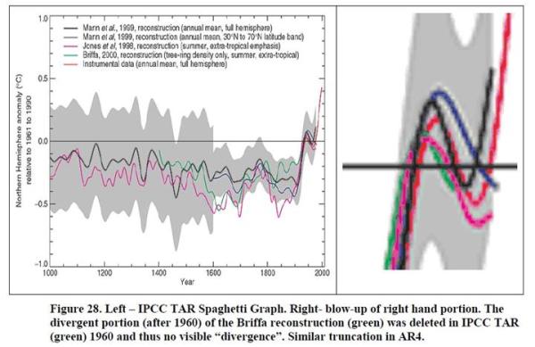
First is the legal analogy. If there is a case for CAGW, it must be demonstrated by primary, empirical evidence. That evidence must be tested by opponents. It is not the bits, that may be true – like lots more CO2 will cause some warming. But that there is sufficient CO2 to cause some warming, which will be magnified by positive feedbacks to cause even greater warming, and this substantive warming will destabilize the planet weather systems in a highly negative way. The counter-argument is two-fold – that many of dire, immediate, forecasts have been highly exaggerated and more importantly, the compound uncertainties that have been vastly underestimated. That the case is weak is shown by the prominence given to what is hearsay evidence, such as the consensus, or the proclamations of groups of scientists, or to the image of the hockey stick. In some cases, it has been tantamount to jury-tampering.

Second is the medical analogy. A medical doctor, in proscribing a painful and potentially harmful course of treatment, should at last have a strong professionally-based expectation that post treatment the patient will be better off than if nothing was done. The very qualities that make politicians electable – of being able to make build coalitions by fudging, projecting an image, and undermining the opponents by polarizing views – make them patently unfit for driving through and micro-managing effective policy to reduce CO2. They will of necessity overstate the benefits and massively understate the costs, whether financial or in human suffering. They will not admit that the problem is beyond their capabilities, nor that errors had been made. The problem is even worse in powerful dictatorships than democracies.

I have tried to suggest a method (for those who are familiar with microeconomics) the IPCC/Stern case for containing CO2 here.

https://manicbeancounter.wordpress.com/2011/02/11/climate-change-policy-in-perspective-%E2%80%93-part-1-of-4/

Also, why there is no effective, global political solution possible.

https://manicbeancounter.wordpress.com/2011/02/13/climate-change-in-perspective-%E2%80%93-part-2-of-4-the-mitigation-curve/

What is missing is why the costs of global warming have been grossly exaggerated.
Question for Sir John Beddington

According to Bishop HillSir John Beddington is seeking feedback on the climate impacts report I blogged about yesterday.”

My question is of a technical nature. Given that the Stern Review of 2006 received worldwide acclamation for its novel conclusions, I would have thought Sir John Beddington would have utilised this work. Apart from a footnote or two, the only reference is in a box on page 63.

Dear Sir John,

I am a humble beancounter, who spends his time in analysing complex project costs and application forms for capital expenditures. In this vein, on page 63 of your report you claim that the Stern Review had a social discount rate of 1.4%, whilst

conclude that the Lord Stern used a discount rate of 0.1%. Have we all misread the report?

Show Warming After it Has Stopped Part 2

Last week I posted how Miles Allen had pulled off a trick to show warming in the 21st century after that trend had stopped in 1998. According to David Middleton at Watts up with That, the BBC’s Richard Black is using a similar decadal comparison to show that warming has continued. There are two Richard Black’s claim that the GWPF are cherry-picking the data. First, that an employee of the UK state broadcaster should choose to use a foreign temperature record over the UK one. Second, why the switch to decadal comparisons, when the IPCC has long used the norm.

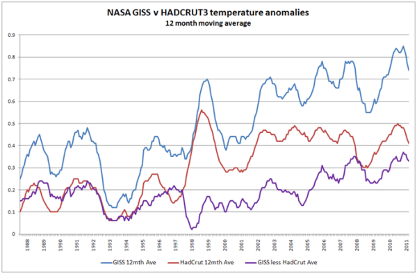
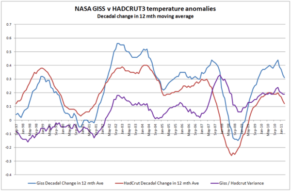
Let me break this down with two graphs. Like with the previous posting, I see no scientific reason to necessitate why the starting point for the earth’s orbit of the sun has to be on 1st January. I therefore include all 12 month moving averages. That is Jan-Dec, Feb-Jan, Mar-Feb etc. I have also included three lines on my analysis. First the NASA GISSTEMP; second the HADCRUT3 and third the difference between the two.

The first graph shows the decadal change in the NASA GISS figures that Richard Black is talking about. Sure enough the only period where the 12 month average temperature anomaly is lower than a decade before is in 2008. Using the HADCRUT3 data reveals a similar pattern, but the negative period is much longer. If The HADCRUT3 decadal change is subtracted from the GISSTEMP, there is shown to be a greater decadal warming trend in the NASA than in the UK figures. This might suggest the reason for Richard Black’s preference for foreign data over that paid for by the UK taxpayer’s.

The second graph shows the 12 month moving average data – and clearly shows the reasons for both using decadal temperature changes over annual, and foreign data over British. From 1988 to 1997, there was no real warming trend if the Pinatubo cooling is removed from 1995. However the NASA anomaly seems to be around twice as volatile is the Hadley. But in 1998 the position reverses. The natural 1998 El Nino effect is twice according to the British scientists, as it is to Dr Hansen and his team. Post 1998 the story diverges. According to NASA, the warming resumes on an upward trend. According to the Hadley scientists, the 1998 El Nino causes a step change in average temperatures and the warming stops. As a result the NASA GISS warming trend is mirrored by its divergence from the more established and sober British series.

Oppenheimer – False prophet or multi-layered alarmist?

Haunting the Library has a posting “Flashback 1988: Michael Oppenheimer Warn Seas to Surge 83 Feet Inland by 2020“.

Apart from being a false and alarmist forecast in retrospect, even if in 1988 the climate models on which it was based were correct and unbiased, there could still have been less than a 1 in 1000 chance of this scenario being forecast. Here is why.

The relevant quote from the “Hour” newspaper is

“Those actions could force the average temperature up by 2 degrees Fahrenheit in the next three decades….Such a temperature increase, for example, would cause the sea level to rise by 10 inches, bringing sea water an average of 83 feet inland”

There are at possibly three, or more, levels of alarmism upon which this conclusion depends:-

  1. The sea level rise was contingent on a 2oF (1.1oC) over 32 years would have been at the top end of forecasts. Although the centennial rate of increase is around 3.5oC, my understanding of the climate models it is not just the global temperatures that are projected to rise, but the decadal rate of increase in temperatures. This is consistent with the accelerating rate of CO2 increase. Normally the range of projections is over a 95% probability range, so the models would have projected a 2.5% chance of this temperature increase.
  2. The rise in sea levels would lag air temperature rises by a number of years. This is due to the twin primary causes of sea level rise – thermal expansion of the ocean and melting pack ice. Therefore, I would suggest a combination of three reasons for this projection. First, the models projection of 10 inch (25cm) rise was exaggerated, due to faulty modelling. (IPCC AR4 of 2007 estimates a centennial rise of 30cm to 60cm, with accelerating rates of sea-level rises correlating with, but lagging, temperature rises). Second it was at the top end of forecast probability ranges, so there was just a 2.5% change of the sea level rise reaching this level for a 2oF rise. Third, time lags were not fully taken into account.
  3. The mention of the impact on the horizontal average sea water movement of 83 feet (25m) is to simply spread alarmism. For low-lying populated coastal areas, such as Holland, it probably assumes the non-existence (or non-maintenance) of coastal defences. The calculation may also assume land levels do not naturally change. In the case of the heavily populated deltas and the coral islands, this ignores natural processes that have caused land levels to rise with sea levels.

So it could be that, based on the climate models in 1988, there as a 2.5% chance of a 2.5% chance of sea levels rising by 10 inches in 32 years, subject to the models being correct. There are a number reasons to suspect that the models of climate and sea level rise are extreme. For instance, the levels of temperature rise rely on extreme estimates of sensitivity of temperature to CO2 and/or the feedback effect of temperature increases on water vapour levels (See Roy Spencer here). Sea level rises were probably overstated, as it was assumed that Antarctic temperatures would rise in parallel with those of the rest of the world. As 70-80% of the global pack ice is located there, the absence of warming on the coldest continent, will have a huge impact on future sea level forecasts.

Although this forecast was made a climate scientist, it was not couched in nuanced terms that the empirical scientific modelling techniques require. But it is on such statements that policy is made.

Showing Warming after it has Stopped

Bishop Hill points to an article by Miles Allen that

“examines how predictions he made in 2000 compare to outturn. The match between prediction and outturn is striking…..”

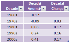
Bishop Hill points out that this using HADCRUT decadal data. Maybe a quick examination of the figures will reveal something? Using the HADCRUT3 data here is are the data for the last five decade.

This shows that the decadal rate of warming has been rising at a pretty constant rate for the last three decades. So all those sceptics who claim that global warming has stopped must have got it wrong then?

Let us examine the data a bit more closely.

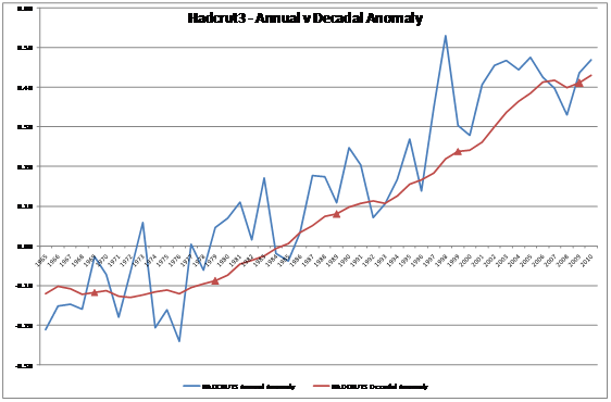
The blue line is the Hadcrut annual anomaly figures from 1965 to 2010. The smoother red line is the 10 year average anomaly, starting with the 1956-1965 average and finishing with the 2001-2010 average. The decadal averages are highlighted by the red triangles.

The blue would indicate to me that there was a warming trend from 1976 to 1998, since then it has stopped. This is borne out by the 10 year moving average, but (due to the averaging) the plateau arrives five years later. But the story from the decadal figures is different, simply due to timing.

So what scientific basis is there for using the decadal average? Annual data seems reasonable, at it is the time for the earth make one rotation around the sun. But the calendar is fixed where it is because 1500 years ago Dionysius Exiguus devised a calendar with a mistaken estimate of the birth (or conception) of Jesus Christ as Year 1, and we have number base 10 possibly to the number of fingers we have. Both are a human artefact. Further, the data is actually held in months, so it is only due to the Christian calendar that we go from January to December. This means of the 120 possible periods for decadal averages, Myles Allen shows a cultural prejudice, and in choosing decadal averages, he shows a very human bias, over real world selectivity.

How does this affect the analysis of the performance of the models? The global temperature averages showed a sharp uptick in 1998. Therefore, if the models simply predicted a continuation of the trend of the previous twenty years, they would have been quite accurate. The fact was the prediction was higher than the outturn, so the models overestimated. It is only by exploiting the arbitrary construct of decadal data that the difference appears insignificant. Drop to 5 years moving average, and you will get a bigger divergence. Wait a couple of years, and you will get a bigger divergence. Use annual figures and you will get a bigger divergence. The result is not robust.

Keynes, Hayek and Global Warming

Jo Nova points to the excellent Keynes versus Hayek rap videos and compares with global warming views. My own observations are more to do with the nature of theory.

To compare Keynes & Hayek, I believe that we need to separate Keynes from the mainstream Keynesians. Keynes saw theory as a means to get the policy he wanted. It was the Keynesians (starting with John Hicks’ IS-LM analysis) that started the modelling approach. Both Keynes and Hayek eschewed the mathematical modelling of modern economics. In this Keynes would be closer to the perspective of GLS Shackle than Keynesians

  1. Keynes saw the economic system as being essentially unstable. There was no tendency for the economic system to tend towards an optimal equilibrium. Rather it could get stuck for long periods with high unemployment. This seems to parallel to the notion of tipping points. The Keynesian multiplier The parallel in CAGW theory can be seen in the positive feedbacks and tipping points. When Bob Carter says that climate is homeostatic (or Warren Meyer at climate-skeptic uses his ball in a bowl illustration), they criticize the climate models for being Keynesian. I would think that the Carter/Meyer view of climate is similar to that of Hayek on economic phenomena. Climate is essentially chaotic, having only general empirical regularities. However, it has tendencies towards equilibrium. Please note that Hayek occupies a position close to Keynes this issue. Walrasian General Equilibrium with perfect knowledge and instantaneous leaps from one equilibrium to another is an extreme caricature of more mainstream economics. Here Keynes v. Hayek is more apt for the views on climate.
  2. Keynesians view all the essential features of the economic system as being essentially knowable, capable of being reasonably represented in mathematical models. Hayek calls this a “pretence of knowledge” (the title of his Nobel Prize lecture), as although we may know essential features of the system, the relationships are highly complex and changing. The problem is not just lack of measurement, it is having data that is capable of being modelled in order make manipulation of these variables possible. In economics, the manipulation is control of macro economy. In climate, it is to control the global average temperature.
  3. Keynesians believe that a few major measures are sufficient to describe an economy. CAGW theorists believe that the global surface temperature and atmospheric CO2 are key measures. Hayek questioned whether such variables were meaningful. CAGW theorists are on much shakier ground than the Keynesians here. Bob Carter points out in his book that the stored heat in the atmosphere is a tiny fraction of that stored in the oceans. When it comes to stored CO2 the problems are even greater.

But when it comes to the rhetoric of global warming, the analogy should not be with Keynes, but with Karl Marx. Climate models give true scientists perfect insight into the real nature of climate. Those who are on the outside are delusional and/or are either knowingly, or subconsciously, acting as lackeys of the oppressive class. In Marx the oppressive class are the bourgeois, in climate alarmism they are Big Oil.

British-Irish Council taken over by Climate Alarmists?

The Irish Times has carried a report that

THE BRITISH government could massively subsidise the Irish wind energy industry under proposals to be considered in London today.

Would that be the same British Government who are struggling to control a record budget deficit? A Government that presides over a territory which is in many parts extremely windy. Where would these windmills be located? The proposal would be offshore. So the UK is a short of coastline then?

Who put forward this proposal? The famous British-Irish Council. Their website is here.

And here is a screen-shot of that homepage.

It strikes as a little odd that the website should be hosted in Jersey. Or if you do a Google search you will find lots of references to renewable energy and the Isle of Man. Promoting the minor islands and wind power would be a major part of its’ purpose then?

To quote the website

Priority areas of work

At its first summit in London in December 1999, the council decided on a number of priority areas of work which would benefit from such co-operation. While the list is not exhaustive, it includes:

  • agricultural issues
  • health
  • regional issues
  • consideration of inter-parliamentary links
  • energy
  • cultural issues
  • tourism
  • sporting activity
  • education
  • approaches to EU issues
  • minority and lesser used languages
  • prison and probation issues

    So that would be a no then.

    It would seem that the original purpose of the British-Irish Council has been lost and that the organisation has been taken over by some Climate Alarmists from the Isle of Man, Jersey or Scotland. Perhaps the Council is no longer fit for purpose.

    Update

    The actual meeting in London was full of the wind issue. See the Irish Times and BBC Wales.

CAGW – Paralleling Kuhnian Science or New Labour Spin?

A review of Montford’s “Hockey Stick Illusion” suggests that it is an example science described by Thomas Kuhn in “The Structure of Scientific Revolutions”. Both the Hockey Stick in particular, and CAGW theory in general, I believe parallel something entirely different.

Catastrophic AGW theory is not an example of Kuhnian science. It was swallowed whole by the political establishment without going through the strictures of scientific acceptance. Furthermore, it is coupled with a major political policy objective – to constrain CO2 emissions. The IPCC was then set up to confirm and fortify the science and the policy. CAGW is thus not a proper science as such, but “politicised science”.

The Hockey Stick is the major example of this – a public relations ploy to promote policy and direct attention away from proper analysis of the data. The shenanigans may have milder and more short-lived parallels in other fields of science, but better parallels are to be found in New Labour Spin. That is, never admit to error; talk over opponents and view them as self-evidently wrong; deflect adverse comments by saying something different; deflect criticism and error by making an easily answerable point the major issue, or conceding a minor point; and then quickly moving the discussion onto safer ground. Most of all rely on image more than substance. In the case of CAGW, make peer review and agreement with collective experts the ultimate demarcations between science and non-science.

Comparing Politicians to Global Warming Deniers

At CafeHayek, Don Bordeaux has a post that requires careful reading. It is an attack on politicians and overbearing government, couched in a metaphor of global warming deniers.

My comment was

Using the metaphor of global warming is apt, but like any metaphor breaks down once examined closely. I would claim that a global warming “denier” has a more tenable position once the evidence is examined in detail and from different perspectives. Conversely, a denier of the unintended consequences of interventionism, like a holocaust denier, has a less tenable position once the alternative evidence is examined.

This brings me onto a second point. Politicians are selling themselves to get elected, which implies building up coalitions of diverse interest groups. Early Public Choice theory called this Pork-Barrel politics. A more successful approach in the television era is one based on image. That is projecting personality over policy substance. It goes against the notions of weighing up the pros and cons, learning from error in one’s past judgments, and recognizing limitations in one’s abilities and knowledge. Good government requires questioning skeptics, but has a propensity to elect the smooth-talking deniers.

An early example of image-based politics – indeed the forerunner in modern times – is JF Kennedy. A more recent example in Britain is New Labour. The image-based politics justified building up a structural deficit in the boom years. The need to save face, and the political ambitions of the key player, meant that the political business cycle did not operate after the 2005 general election. That is, according to Public Choice Theory, to boost the economy to get re-elected and then take the necessary measures to reduce the deficit immediately after.