Bishop Hill points to an article by Miles Allen that
“examines how predictions he made in 2000 compare to outturn. The match between prediction and outturn is striking…..”
Bishop Hill points out that this using HADCRUT decadal data. Maybe a quick examination of the figures will reveal something? Using the HADCRUT3 data here is are the data for the last five decade.
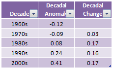
This shows that the decadal rate of warming has been rising at a pretty constant rate for the last three decades. So all those sceptics who claim that global warming has stopped must have got it wrong then?
Let us examine the data a bit more closely.
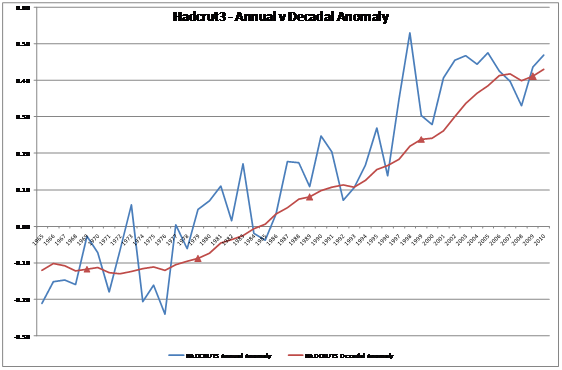
The blue line is the Hadcrut annual anomaly figures from 1965 to 2010. The smoother red line is the 10 year average anomaly, starting with the 1956-1965 average and finishing with the 2001-2010 average. The decadal averages are highlighted by the red triangles.
The blue would indicate to me that there was a warming trend from 1976 to 1998, since then it has stopped. This is borne out by the 10 year moving average, but (due to the averaging) the plateau arrives five years later. But the story from the decadal figures is different, simply due to timing.
So what scientific basis is there for using the decadal average? Annual data seems reasonable, at it is the time for the earth make one rotation around the sun. But the calendar is fixed where it is because 1500 years ago Dionysius Exiguus devised a calendar with a mistaken estimate of the birth (or conception) of Jesus Christ as Year 1, and we have number base 10 possibly to the number of fingers we have. Both are a human artefact. Further, the data is actually held in months, so it is only due to the Christian calendar that we go from January to December. This means of the 120 possible periods for decadal averages, Myles Allen shows a cultural prejudice, and in choosing decadal averages, he shows a very human bias, over real world selectivity.
How does this affect the analysis of the performance of the models? The global temperature averages showed a sharp uptick in 1998. Therefore, if the models simply predicted a continuation of the trend of the previous twenty years, they would have been quite accurate. The fact was the prediction was higher than the outturn, so the models overestimated. It is only by exploiting the arbitrary construct of decadal data that the difference appears insignificant. Drop to 5 years moving average, and you will get a bigger divergence. Wait a couple of years, and you will get a bigger divergence. Use annual figures and you will get a bigger divergence. The result is not robust.

Single Acts Of Tyranny
/ 06/07/2011If I may, this is very well reasoned ~ it rather makes me wish I had a better grasp of statistical models
manicbeancounter
/ 06/07/2011Thanks for the comment. Unfortunately it is not a “proper” statistical test at all, just comparing the summary of average global temperature anomaly per decade, with the one level down – of annual data. Given that there was a sudden leap in temperatures at the end of the 1990s, in 2000 you were pretty safe betting that the coming decade would be higher. For the average to have been lower, there would have to be significant cooling. No statistical test would give any significance to one extra data point – the decadal average – and using the annual figures would show no significant warming trend, when the models say the opposite. Using the decadal figures is to create an illusion – that is something different to what the figures really say.