Showing Warming when it has Stopped

There has been no statistically significant warming for at least 15 years. Yet some people, like commentator “Michael the Realist”, who is currently trolling Joanne Nova’s blog, are claiming otherwise. For instance

Again look at the following graph.

Now let me explain it to the nth degree.
# The long term trend over the whole period is obviously up.
# The long term trend has pauses and dips due to natural variations but the trend is unchanged.
# The current period is at the top of the trend.
# 2001 to 2010 is the hottest decade on the record despite a preponderance of natural cooling trends. (globally, ocean, land and both hemispheres)
# Hotter than the previous decade of 1991 to 2000 with its preponderance of natural warming events.
# Every decade bar one has been hotter than the previous decade since 1901.

Please explain why the above is true if not AGW with proof.

State of the climate 2012
http://www.climate.gov/news-features/understanding-climate/state-climate-2012-highlights

The three highlighted comments are the ones that this posting addresses.

Using decadal average temperature changes to cover up the standstill.

The latest way to avoid the truth that warming has stopped for 15 years or more is by decadal averages. This can be illustrated by using an approximate model of the data. Assume constant average temperatures from 1960 to 1975, a linear warming of 0.6oC from 1976 to 1998, followed by a further standstill.


The decadal averages are


So, instead of 24 years of warming, it is 4 consecutive decades, that are each warmer than the last. The 2000s are warmer than the 1990s simply because there was warming the 1990s. It is political spin, relying on an ignorance of basic statistics, that is needed to make such claims.


Electric Cars – toys of the rich, subsidised by the masses

Joanna Nova reports on a new study showing that electric cars produce more CO2 that either petrol or diesel cars if that electricity is produced principally from coal-fired power stations.

The most practical electric car

In Britain there is more a market for electric vehicles, but still puny sales. The European Car of the Year is the Chevrolet Volt, which has a 1.4 petrol engine to accompany the electric motor. At £29,995 it costs 50% more than a similarly-sized Ford Focus diesel, even with the £5,000 government subsidy. In fact, it is more than a similarly-sized Audi, BMW or Mercedes and will not last nearly as long. If you look at the detail, the Volt has a claimed CO2 emission 27 g/km, as against 99 g/km for the best diesels. This takes no account of the CO2 emissions from the power stations. In Britain electricity is mostly from gas, with much of the rest from coal and nuclear.

There is also a question of equity. Domestic electricity has a 5% tax added on. Diesel has over 120% added. So the cost for 100 km (using official figures and 15p per kwh + 5% vat) is £2.66 for the Volt and £6.00 for the equivalent diesel car (combined 67.3mpg and £1.43 per litre). But tax is £0.13 and £3.30, so most of the cost saving is in tax. In the UK the average is 12,000 miles or 19,300km per year. So the tax saving from driving the Volt is up to £610 per annum. Although if you travel that distance per annum there will be a number of long distance journeys. Let us assume half the 12,000 miles is on the petrol engine at 50mpg, with petrol at £1.38. Then the annual tax saving drops to just £70.

The biggest saving for electric car owners is in London, with the congestion charge. Drive 5 days a week for 11 months of the year into London, and the conventional car owner will pay £2,750 a year. Drive an electric car or hybrid and the charge is zero.

So what sort of people would be persuaded to buy such a device? It is the small minority who have money for at least two cars, but want to appear concerned about the environment. They have the open-top sports car for summer days, the luxury car for long journeys, and the Volt for trips to the supermarket or to friend’s houses. It is the new form of conspicuous consumption for the intelligentsia, making the Toyota Prius so last year.

The least practical electric car

Launched this year the Renault Twizy is claimed to be about the cheapest “car” available today. As a car it is also by far the smallest available as well, being more a quadricycle, with no proper doors. The cost is kept low by not including the battery which is rented for at least £48 a month. As the Telegraph concludes, it is an expensive toy. My 12 year old son said he would love one when he saw it in a car showroom recently. But he would soon regret it if he was transported to school in it every day, instead of riding on the top-deck of a bus. At least if his dad forgot to plug it in, it would be small enough for him to push.

“Fake Skeptics” – a term of intolerance

Tamino, the handle of blogger Grant Foster, uses the term “Fake Skeptic” to describe those he believes to be wrong. I believe Foster’s first use of the term was in his “Skeptics: Real or Fake?” article of 28th June 2011.

The term is “skeptic” is ambiguous. It is either John Cook’s definition of someone who “considers all the evidence in their search for the truth” or (following the Oxford English Dictionary) it is – more broadly – one who doubts or questions. This I discussed here, a few days ago. But either way, what it says to me is that anyone who dissents knows what the truth actually is, but they pretend otherwise. It is a roundabout way of saying “You are a liar, you know it and pretend otherwise“.

What evidence do I have for this extreme accusation?

  1. Lack of Substantiation by Tamino

    To quote from the article:-


    “I’ve often discussed Arctic sea ice, and specifically mentioned that it’s one of the strongest evidences of global warming. All by itself it’s not absolute proof, but as evidence goes it’s strong. Very strong. It’s also an excellent litmus test to separate real skeptics from fake ones.”

    This is evidence of past warming. The skeptics like Warren Meyer, Joanna Nova, Lord Monckton, Prof Richard Lindzen, Anthony Watts, Bishop Hill (Andrew Montford), Prof Bob Carter and Lord Nigel Lawson of the GWPF, do not deny that the earth has warmed in the last century or so, most of which is in the Northern Hemisphere. They do dispute whether the extreme summer minima of ice was entirely due to global warming (alternatively being due to an influx of warmer currents into the Arctic Ocean, like (maybe) in 1923). What they are all united on is that they deny a future catastrophe. That is, warming will accelerate, with catastrophic consequences for the planet. That is they accept that there was about 0.7 Celsius of warming in the twentieth century, but deny that this century there will be 3 to 6 degrees of warming, with severe climate disruption. Even if this were the case (as Lawson says), the current policies would be both ineffective to combatting the problem and would be economically disastrous.

  2. Tamino perverts the truth

    Grant Foster is highly intelligent and has great skill in statistical analysis. However, he is highly intolerant of those he disagrees with, fails to discourage intolerance in his blog comments and uses his considerable intellectual powers to turn invert empirical reality and defend corrupt science.

In short, Tamino is a climate bully-boy. He does not seek to advance understanding, but seeks to suppress it. He has once before deleted his blog. He should do so again, leaving only an apology.

The views expressed are my own. Tamino is not the only climate bully-boy, but a symbol of it. He is not the worst, but probably the most intelligent. I believe that the intolerance should be met with intolerance. This is simply an extension of the 21st Century British attitudes against discrimination, the older beliefs of fair play and that the best way to understand is to compare and contrast the arguments. Furthermore, modern history shows that those who keenest to suppress dissent have the weakest or most immoral case. I will shortly be inviting Tamino to reply by posting, unedited, on this blog.

Update – cross posted to Tamino’s blog. A sign of a climate bully-boy is that they are cowards underneath. They cannot cope when confronted with the reality of what they are doing. Like in George Orwell’s 1984, they edit reality to make it appear the opposite. The right of reply is yours Tamino. Do you believe in what you are doing, or are you just preaching to the converted and promoting intolerance?

manicbeancounter | May 3, 2012 at 12:13 am | Reply

The term “fake skeptic” is a term of intolerance. [edit]

[ResponseOn the contrary, the term is exactly correct.]

A Climate Change / Global Warming Spectrum

In politics, most people’s views can be placed on a spectrum, when it comes to climate change / global warming there is no such perspectives. The views are often polarized, particularly by those who believe in a future climate catastrophe. This is an initial attempt at a grid aimed at clarifying the issues. Your constructive advice is sought on how this might be improved.

When there are contentious or politicized issues, a spectrum of opinions emerge where there is free discussion of ideas. This is true in politics and the Christian religion. In both, there is not just a one-dimensional spectrum of ideas, but multi-dimensional perspectives. For instance, in politics it has been argued that the left-right spectrum should be split into economic and moral issues. The United States Libertarian Party has had a simple survey running since 1995. A more comprehensive (but still American-orientated) survey is the Political Spectrum Quiz.

Another idea comes from Greg Craven, who did a series of zany You-Tube videos on Climate Change, particularly such as The Most Terrifying Video You’ll Ever See” and “How it all ends“. He claimed that for the mass of non-scientists it was best to take a risk-based approach, grading the science on the credibility of those who made the claims. One objection with his analysis was it was based on polar extremes. That is either the worst climate catastrophe imaginable, or it is all a hoax. I proposed that there was a spectrum of possible outcomes, with the apocalyptic catastrophe at one extreme and the null outcome at the other. Basically there is a spectrum of views.

For this spectrum, the possible scenarios are from the null outcome on the left, rising to a huge climate catastrophe on the right.

Craven’s argument was to consider either 0 or 1000, whereas I claimed that the UNIPCC scenarios (representing the “consensus” of climate scientists), allowed for a fair range of outcomes. I have provided a log scale, as this puts clear distance between someone who believes in a low risk of catastrophe of extreme catastrophe to someone who says there is no risk at all. For instance, if someone believes that there is a 1% chance of the worst case, a 9% chance of loss of 100 and a 90% chance of a loss of 10, then their score would be 0.01*1000 + 0.09*100 + 0.90*10 = 28. In other words, for that person, especially if they are risk averse, there is still a very significant issue that should justify serious consideration of some type of global policy action.

But this measure of the prospective level of climate catastrophe needs to be based upon something. That something is scientific evidence, not people’s intuitions or gut feelings. If we imagine that the uncertainties can be measured as risks (as neoclassical economists do) then then the worst case scenario can only be attained if there is near certain, unambiguous scientific evidence in support of that prediction. If the evidence is weak statistically, gives highly variables results depending on methodology or data sets, or only tangential to the prediction, then a lower risk weighting lower than 1 will need to be ascribed. For an overall picture, we need to ascribe a weighting to the body of evidence. I propose a traffic light system. In outline green is for an overwhelming body of evidence, red is for no proper evidence whatsoever, and amber is for some weak evidence. Something along the following lines:-

Basically, an unambiguous case for impending global catastrophe must have a substantial body of strong scientific evidence to substantiate that case, with little or no contrary evidence. I will develop on another day the analogy with evidence presented to a criminal court by the prosecution. However, for the present, an analogy that is relevant is that this conclusion is only reached once the evidence fails to fall over under independent cross-examination.

This gives us a grid with the magnitude of the climate catastrophe on the X axis, and the scientific case on the Y axis. The grid, with my first opinion of where people various groups are placed, is given below. I know it is controversial – the whole aim is to get people to start thinking constructively about their views.

Alarmist Blogs (for instance Skeptical Science and Desmogblog) have an extreme black-and-white one world where they are always right, and anyone who disagrees is the polar opposite . “Deniers” is a bogeyman construct of their making.

If one reads the detail of UNIPCC AR4 report, the “Consensus” of climate scientists allow for some uncertainties, and for scenarios which are not so catastrophic.

The more Sceptical Scientists, such as Richard Lindzen, Roger Pielke Snr and Roy Spencer, view increasing greenhouse gases as a serious issue for study. However, they view the evidence as being both much weaker than the “consensus” and pointing to a much less alarming future.

The most popular Sceptic Blogs, such as Wattsupwiththat, Climate Audit and Bishop Hill I characterise as having a position of “The stronger the evidence, the weaker the relevance“. That is they allow for a considerable spread of views, but neither dismiss rise in CO2 as of no consequence, nor claim that the available evidence is strong.

Finally, the Climate Realists such as Joanne Nova and the British Climate Realists website. They occupy a similar position as the “deniers”, but from a much more substantial position. They can see little or no evidence of catastrophe, but huge amounts of exaggeration dressed up as science.

What are your opinions? What position do you think you lie on the grid? Is there an alternative (and more informative) way of characterizing the different positions?

Tamino on Australian Sea-Levels

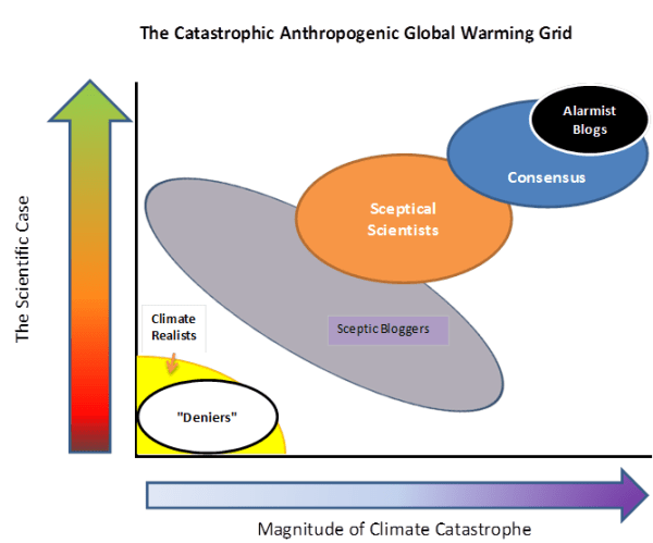
Tamino attempts a hatchet-job on a peer-reviewed paper on Australian Sea Levels. Whilst making some valid comments, it gives the misleading impression that he has overturned the main conclusion.

The sceptic blogs (GWPF, Wattsupwiththat, Jo Nova) are highlighting a front page article in the Australian about a peer-reviewed paper by P.J. Watson about Australian sea levels trends over the past century.

The major conclusion is that:-

“The analysis reveals a consistent trend of weak deceleration at each of these gauge sites throughout Australasia over the period from 1940 to 2000. Short period trends of acceleration in mean sea level after 1990 are evident at each site, although these are not abnormal or higher than other short-term rates measured throughout the historical record.”

The significance is that Watson shows a twentieth century rise of 17cm +/-5cm in Australia, whilst Government policy is based a sea level rise of up to 90cm by the end of the century. If there is deceleration from an already low base, then government action is no longer required, potentially saving billions of dollars.

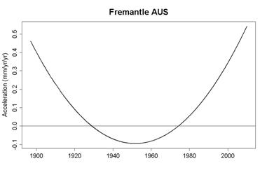
Looking for other viewpoints I found a direction from Real Climate to Tamino’s Open Mind blog. Given my last encounter when he tried to defend the deeply flawed Hockey Stick (see my comments here and here) I curious to know if this was another misdirection. I was not disappointed. Tamino manages to produce a graph showing the opposite to Watson. That is rapid acceleration, not gentle deceleration.

How does he end up with this contrary result? In Summary

  1. Chooses just one of the four data sets used. That is the Freemantle data set.
  2. Making valid, but largely irrelevant criticisms, to undermine the scientific and statistical competency of the author.
  3. Takes time to make the point about treating 20 year moving averages as data for analysis purposes. The problem is that it underweights the data points at the beginning and the end. In particular, any recent acceleration will be understated.
  4. Criticizes the modelling method, with good reasons.
  5. Slips in an alternative model that may answer that criticism.
  6. Shows the results of that model output.

Tamino’s choice of the Freemantle data set should be justified, especially as Watson gives the comment in the conclusion.

“There is evidence of significant mine subsidence embedded in the historical tide gauge record for Newcastle and a likelihood of inferred subsidence within the later (after the mid 1990s) portion of the Fremantle record. In this respect, it is timely and necessary to augment these relative tide gauge measurements with CGPS to gain accurate data on the vertical movement (if any) at each gauge site to measure eustatic sea level rise. At present only the Auckland gauge is fitted with such precision levelling technology.”

That is, the Freemantle data shows the largest acceleration towards the end and this extra acceleration might be because land levels are falling, not sea levels rising.

The underweighting of recent data is important and could be dealt with by looking at shorter period moving averages and observing the acceleration rates. That is looking at moving averages for 19, 18, 17 years etc. If the acceleration rates cross the 20cm a century rate with the shortening of the time periods then this will undermine Watson’s conclusion. Tamino does not do this, despite being well within his capabilities. Until such an analysis is carried out, the claim abstract in the abstract that “(s)hort period trends of acceleration in mean sea level after 1990 … are not abnormal or higher than other short-term rates measured throughout the historical record ” is not undermined.

Instead of pursuing the point, Tamino then goes on to substitute Watson’s modelling method for an arbitrary one plucked from the air, with the comment

“Finally, we come to the other very big problem with this analysis: the model itself. Watson models his data as a quadratic function of time:
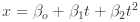
.

He then uses  (the 2nd time derivative of the model) as the estimated acceleration. But this model assumes that the acceleration is constant throughout the observed time span. That’s clearly not so. ”

Instead he flippantly inserts a quartic equation, which gives the time-varying acceleration (the second derivation) as a quadratic function against time.

There are some problems with a quadratic functions as a model against time. Primarily it only has one turning point. Extend the graph far enough and it reaches infinity. So at some point in the future sea levels will reach the sun, and later the rate of rise will be faster than the speed of light. More seriously, if this quadratic is the closest fit to all the data series, it will either have, or soon will have, overstated the actual acceleration. If used to project 90 years or more ahead, it will provide a grossly exaggerated projection based on known data.

On this basis I have edited to give all the inferences that can be drawn from rising sea levels in Australasia.

That is, a pure maths exercise in plotting a quadratic equation on a graph, unrelated to any reality.

An alternative to this is to claim simply that there is not sufficient valid data, or the analysis is too poor draw any long-term inferences.

An alternative approach is to relate the sea level rises to the global temperature rises. Try comparing Watson’s graph of rate of change in sea levels to the two major temperature anomalies.


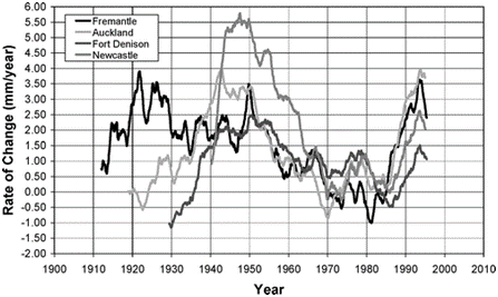
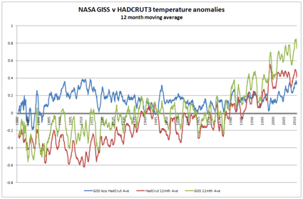
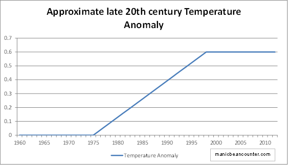
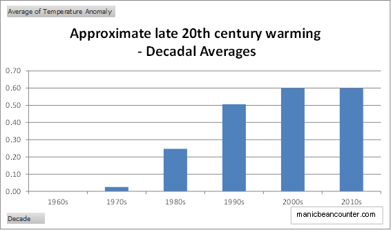
First it should be pointed out that Watson uses a twenty year moving average, so his data should lag the temperature data. The strong warming in the HADCRUT data in the 1920s to 1940s is replicated in Fort Denison and Auckland sea level data. The Lack of warming in the 1945 to 1975 period is replicated be marked deceleration in all four data sets from 1950 to the 1970s. The warming phase thereafter is similarly replicated in all four data sets. The current static phase, according to the more reliable HADCRUT data, should similarly be marked by a deceleration in sea level rise from an already low level. Further analysis of Watson’s data is needed to confirm this.

There is no reason in the existing data to believe that Watson’s conclusions are invalid. It is necessary to play fast and loose with the data and get lost in computer games models to draw alternative inferences. Yet if a member of the Australian Parliament says legislation to cope with sea level rise should be withdrawn due to a new study, the alarmist consensus, (who have just skimmed through Tamino’s debunking), will say that the study has been overturned. As a result, ordinary, coastal-dwelling people in Australia will continue to endure real hardship due to legislation based on alarmist exaggerations. (here & here).

Keynes, Hayek and Global Warming

Jo Nova points to the excellent Keynes versus Hayek rap videos and compares with global warming views. My own observations are more to do with the nature of theory.

To compare Keynes & Hayek, I believe that we need to separate Keynes from the mainstream Keynesians. Keynes saw theory as a means to get the policy he wanted. It was the Keynesians (starting with John Hicks’ IS-LM analysis) that started the modelling approach. Both Keynes and Hayek eschewed the mathematical modelling of modern economics. In this Keynes would be closer to the perspective of GLS Shackle than Keynesians

  1. Keynes saw the economic system as being essentially unstable. There was no tendency for the economic system to tend towards an optimal equilibrium. Rather it could get stuck for long periods with high unemployment. This seems to parallel to the notion of tipping points. The Keynesian multiplier The parallel in CAGW theory can be seen in the positive feedbacks and tipping points. When Bob Carter says that climate is homeostatic (or Warren Meyer at climate-skeptic uses his ball in a bowl illustration), they criticize the climate models for being Keynesian. I would think that the Carter/Meyer view of climate is similar to that of Hayek on economic phenomena. Climate is essentially chaotic, having only general empirical regularities. However, it has tendencies towards equilibrium. Please note that Hayek occupies a position close to Keynes this issue. Walrasian General Equilibrium with perfect knowledge and instantaneous leaps from one equilibrium to another is an extreme caricature of more mainstream economics. Here Keynes v. Hayek is more apt for the views on climate.
  2. Keynesians view all the essential features of the economic system as being essentially knowable, capable of being reasonably represented in mathematical models. Hayek calls this a “pretence of knowledge” (the title of his Nobel Prize lecture), as although we may know essential features of the system, the relationships are highly complex and changing. The problem is not just lack of measurement, it is having data that is capable of being modelled in order make manipulation of these variables possible. In economics, the manipulation is control of macro economy. In climate, it is to control the global average temperature.
  3. Keynesians believe that a few major measures are sufficient to describe an economy. CAGW theorists believe that the global surface temperature and atmospheric CO2 are key measures. Hayek questioned whether such variables were meaningful. CAGW theorists are on much shakier ground than the Keynesians here. Bob Carter points out in his book that the stored heat in the atmosphere is a tiny fraction of that stored in the oceans. When it comes to stored CO2 the problems are even greater.

But when it comes to the rhetoric of global warming, the analogy should not be with Keynes, but with Karl Marx. Climate models give true scientists perfect insight into the real nature of climate. Those who are on the outside are delusional and/or are either knowingly, or subconsciously, acting as lackeys of the oppressive class. In Marx the oppressive class are the bourgeois, in climate alarmism they are Big Oil.