Global Emissions Reductions Targets for COP21 Paris 2015

There is a huge build-up underway for the COP21 climate conference to be staged in Paris in November. Many countries and NGOs are pushing for an agreement that will constrain warming to just 2oC, but there are no publicly available figures of what this means for all the countries of the world. This is the gap I seek close with a series of posts. The first post is concerned with getting a perspective on global emissions and the UNIPCC targets.

In what follows, all the actual figures are obtained from three primary sources.

  • Emissions data comes from the Carbon Dioxide Information Analysis Centre or CDIAC.
  • Population data comes from the World Bank, though a few countries are missing. These are mostly from Wikipedia.
  • The Emissions targets can be found in the Presentation for the UNIPCC AR5 Synthesis Report.

All categorizations and forecast estimates are my own.

The 1990 Emissions Position

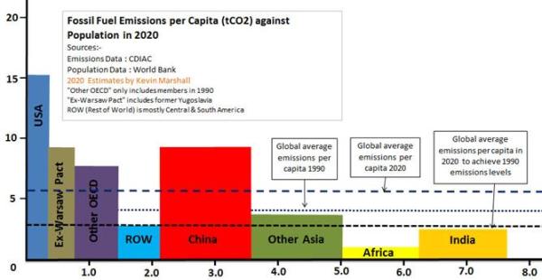
A starting point for emissions reductions is to stabilize emissions to 1990 levels, around the time that climate mitigation was first proposed. To illustrate the composition emissions I have divided the countries of the world into the major groups meaningful at that time – roughly into First World developed nations, the Second World developed communist countries and the Third World developing economies. The First World is represented by the OECD. I have only included members in 1990, with the USA split off. The Second World is the Ex-Warsaw pact countries, with the countries of the former Yugoslavia included as well. The rest are of the world is divided into five groups. I have charted the emissions per capita against the populations of these groups to come up with the following graph.

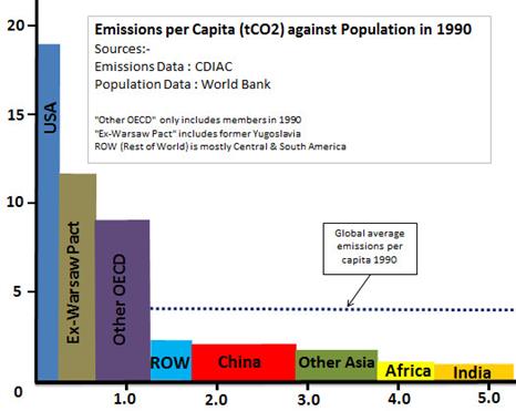
In rough terms, one quarter of the global population accounted for two-thirds of global emissions. A major reduction on total emissions could therefore be achieved by these rich countries taking on the burden of emissions reductions, and the other countries not increasing their emissions, or keeping growth to a minimum.

The 2020 emissions forecast

I have created a forecast of both emissions and population for 2020 using the data up to 2013 for both emissions and population. Mostly these are assuming the same change in the next seven years as the last. For emissions in the rapidly-growing countries this might be an understatement. For China and India I have done separate forecasts based on their emissions commitments. This gives the following graph.

The picture has changed dramatically. Population has increased by 2.4 billion or 45% and emissions by over 80%. Global average emissions per capita have increased from 4.1 to 5.2t/CO2 per capita. Due to the population increase, to return global emissions to 1990 levels would mean reducing average emissions per capita to 2.85t/CO2.

The composition of emissions has been even more dramatic. The former First and Second World countries will see a slight fall in emissions from 14.9 to 14.0 billion tonnes of CO2 and the global share will have reduced from 68% to 36%. Although total population will have increased on 1990, the slower growth than elsewhere means the share of global population has shrunk to just 19%. China will have a similar population and with forecast emissions of 13.1 billion tonnes of CO2, 33% of the global total.

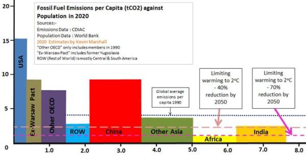
The picture is not yet complete. On slide 30 of their Synthesis Report presentation the UNIPCC state

Measures exist to achieve the substantial emissions reductions required to limit likely warming to 2oC (40-70% emissions reduction in GHGs globally by 2050 and near zero GHGs in 2100)

The baseline is 2011, when global emissions were 29.74 billion t/CO2. In 2050 global population will be nearly nine billion. This gives an upper limit of 2.2 t/CO2 per capita and lower limit of 1.1 t/CO2 per capita.

To put this in another perspective, consider the proportions of people living in countries that need emissions targets based on greater than 2.2t/CO2 emissions per capita.

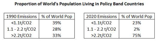
In 1990, it was just a third of the global population. In 2020 it will be three quarters. No longer can an agreement on constraining global CO2 emissions be limited to a few countries. It needs to be truly global. The only area that meets the target is Africa, but even here the countries of Algeria, Egypt, Libya, Tunisia and South Africa would need to have emission reduction targets.

Further Questions

  1. What permutations are possible if other moral considerations are taken into account, like the developed countries bear the burden of emission cuts?
  2. What targets should be set for non-fossil fuel emissions, such as from Agriculture? Are these easier or harder to achieve than for fossil fuels?
  3. What does meeting emission targets mean for different types of economies? For instance are emission reductions more burdensome for the fast-growing emerging economies that for the developed economies?
  4. What are the measures that IPCC claims exist to reduce emissions? Are they more onerous than the consequences of climate change?
  5. Are there in place measures to support the states dependent on the production of fossil fuels? In particular, the loss of income to the Gulf States from leaving oil in the ground may further destabilize the area.
  6. What sanctions if some countries refuse to sign up to an agreement, or are politically unable to implement an agreement?
  7. What penalties will be imposed if countries fail to abide by the agreements made?

Kevin Marshall

The Truth About Davey’s Energy Savings

Ed Davey’s claim that the DECC published “a complete picture of everything that affects final energy bills” is refuted by Paul Homewood below.
This is far from an exhaustive list. For instance there are also the costs of upgrading the National Grid to transport the generated the electricity generated in remote wind turbines to the centers of population; the impact on jobs and growth of increasing energy costs relative to other nations;and the more esoteric costs to democracy of having a dogmatic group of people with dogmatic beliefs in a specialist applied subject claiming that this gives them superior insights into public policy-making, policy implementation and economic theory.

Ed Hoskins: Capital Cost and Production Effectiveness of Renewable Energy in Europe – the Data

Ed Hoskins provides a very wide-ranging analysis on the capital costs of renewables in Europe, with information about all the major countries. Despite total investment of $500bn so far, renewables provide just 2.9% of actual power generated. Hoskins also provides some graphical data on “Intermittency and Non-dipatchability” of energy output, helping highlight that renewables are not just expensive, they are also pretty useless at providing power when required.
The one weakness in the analysis is in the costs per unit of output – something outside the main purpose of the post. The source of that data is the U.S. Energy Information Administration. This uses (Table 2-5 on page 44 of the pdf file) “Overnight Capital Cost” which measures capital and maintenance costs per unit of capacity. So, for instance, “Onshore Wind” appears to have only 2.2 times the capital cost of “Natural Gas Advanced Combined Cycle”. But assuming the former operates at 25% of capacity and the latter at 85%, the capital costs of wind power becomes 7.5 times that of gas. Similarly, assuming offshore wind operates at 35% of capacity, relative capital costs rise from 6.2 to 14.8 times that of gas.

http://www.eia.gov/forecasts/capitalcost/pdf/updated_capcost.pdf

Another point is that the EIA does not consider conventional coal-fired power stations, possibly inflating the price by some measure of “The Social cost of Carbon”. Using the average price in AR4 of $12 per tonne of CO2 (Synthesis Report Page 69) and that a coal-fired power station produces about 500kg per megawatt, this $6 per megawatt is trivial compared with the much higher cost of renewables.

tallbloke's avatarTallbloke's Talkshop

Guest post from Ed Hoskins
A comparison of both the Capital Cost and Energy Production Effectiveness of the Renewable Energy in Europe.

The diagrams and table below collate the cost and capacity factors of Renewable Energy power sources, Onshore and Off-shore Wind Farms and Large scale Photovoltaic Solar generation, compared to the cost and output capacity of conventional Gas Fired Electricity generation.

Screen Shot 2014-12-16 at 08.16.07

The associated base data is shown below:

View original post 2,794 more words

Nissan Leaf Fails The Test

Paul Homewood has a very useful comparison between the cost of the electric Nissan Leaf car and a couple of super-efficient Ford Focuses. The electric car turns out to be a much worse buy. But looking at the costs of motoring to the consumer, and the tax costs can be complex, so there are a couple of points that I would amend.
First is that the £5000 rebate on an electric car is relevant to the buying decision. Otherwise it would not be in place. The purchaser of the car ends up paying £5000 less, so that is a reduction in both the depreciation and the borrowing they will face. As a result the annual cost differential on your figures reduces from £3200 to £1350. However, due to the differential in maintenance this figure is more like £1700.
Second is the difference in tax revenue. New cars attract 20% VAT. For the Leaf this is £4750. After the rebate, the exchequer gives out £250. VAT on the focus Focus Diesel is about £3300. In 3 years, the net tax revenue on the Leaf (purchase price, 5% VAT on electricity, 20% VAT in maintenance) is £50. On both Fords it is £5100.
The figures, by chance, fall out the same. Buy a Nissan Leaf instead of a Ford Focus and both you and the Exchequer will be about £5000 worse off over three years.
The differences do not stop there. As AC Osborn rightly points out there is a problem with range. The Leaf is limited to about 100 miles before a recharge of over four hours. As such, for families, it becomes a second car, whereas the a Focus with a range of at least 400 miles and a five minute refill can both serve for the school run / daily commute and for longer trips as well. An electric car becomes more of a lifestyle car, so on cost the Leaf is competing with an Audi A3 or similar.
Kevin Marshall

Spending Money on Foreign Aid instead of Renewables

On the Discussion at BishopHill, commentator Raff asked people whether the $1.7 trillion spent so far on renewables should have been spent on foreign aid instead. This is an extended version of my reply.

The money spent on renewables has been net harmful by any measure. It has not only failed to even dent global emissions growth, it will also fail even if the elusive global agreement is reached as the country targets do not stack up. So the people of the emissions-reducing countries will bear both the cost of those policies and practically all the costs of the unabated warming as well. The costs of those policies have been well above anything justified in the likes of the Stern Review. There are plenty of British examples at Bishop Hill of costs being higher than expected and (often) solutions being much less effective than planned from Wind, solar, CCS, power transmission, domestic energy saving etc. Consequences have been to create a new category of poverty and make our energy supplies less secure. In Spain the squandering of money has been proportionately greater and likely made a significant impact of the severity of the economic depression.1

The initial justification for foreign aid came out of the Harrod and Domar growth models. Lack of economic growth was due to lack of investment, and poor countries cannot get finance for that necessary investment. Foreign Aid, by bridging the “financing gap“, would create the desired rate of economic growth. William Easterly looked at 40 years of data in his 2002 book “The Elusive Quest for Growth“. Out of over 80 countries, he could find just one – Tunisia – where foreign aid conformed to the theory. That is where increased aid was followed by increased investment which was followed by increased growth. There were plenty examples of where countries received huge amounts of aid relative to GDP over decades and their economies shrank. Easterly graphically confirmed what the late Peter Bauer said over thirty years ago – “Official aid is more likely to retard development than to promote it.

In both constraining CO2 emissions and Foreign Aid the evidence shows that the pursuit of these policies is not just useless, but possibly net harmful. An analogy could be made with a doctor who continues to pursue courses of treatment when the evidence shows that the treatment not only does not work, but has known and harmful side effects. In medicine it is accepted that new treatments should be rigorously tested, and results challenged, before being applied. But a challenge to that doctor’s opinion would be a challenge to his expert authority and moral integrity. In constraining CO2 emissions and promoting foreign aid it is even more so.

Notes

  1. The rationale behind this claim is explored in a separate posting.

Kevin Marshall

Michael Mann and John Cook at Bristol University

Lucia at The Blackboard last month publicized that the John Cook is to speak at Bristol University on Dogma vs. consensus: Letting the evidence speak on climate change on Friday 19th September. There are still 395 free tickets left for the event.

Stephen Lewandowsky also notes that Michael Mann is to lecture at the same event on Tuesday 23rd September on The Hockey Stick and the climate wars – the battle continues. Just 102 free tickets left for this event.

Given the Mann’s belief that the continued climate denial is due to “massive funding of climate change denial by monied interests” (HuffPo), it might provide some light entertainment for the students.

Update 19th Sept. There are still 309 tickets left for the John Cook lecture for tomorrow – Friday 20th September. See http://www.bristol.ac.uk/cabot/events/2014/488.html

The Michael Mann lecture is now SOLD OUT, or more accurately, all the tickets have been given away.

Understanding the role of Peer Review

In “Newton, Einstein, Watson and Crick, were not peer reviewed“, Jo Nova questions whether peer review is valid at all. I think the answer is somewhat more nuanced. This is an extended version of a comment made.

Before dismissing peer review, we should ask are the boundaries of peer review. That is what peer review can achieve and what it cannot.

Proper peer review should check that the thesis of paper is original and properly references other works in the field. It should also make sure that the claims made are coherent, not demonstrably false, have a reason (or reasons) for originality, and all assumptions are clearly stated. It might also check to ensure that certain ethical boundaries are not breached. There is more basic checking, like that of an editor.

Peer review cannot determine if the following criteria are valid:-

(1) The ultimate truth. Make sure that the claims made are the last word on the subject. That is the thesis will never be falsified, contradicted, or supplanted by more general theories.

(2) The best to date. Determine that the thesis is superior to what is already available. There is a place for literature reviews to compare and contrast the existing body of knowledge.(i)

(3) That every point is correct, or every assumption known and stated.

(4) That every conjecture that the paper is built upon is correct, or every assumption is valid. Certain stated hypotheses or conjectures might be themselves based upon other conjectures. Assumptions might be accepted, but be false or exclude other, contradictory but quite valid, lines of enquiry.

(5) That a paper is hugely significant, or of little consequence.

(6) That a paper is of outstanding quality, against mediocre.

(7) That the absence of, superior, contradictory views in the academic literature is not a demonstration of the truth or quality of a research program.

Academic study is a combination of building on the work of that has gone before, whilst noticing the empirical or logical gaps and anomalies. It can be quite valid to making conjectures upon conjectures, as long as you do not lose sight that the falsification of a root conjecture will partially or completely undermine every piece of work built upon it.(ii) In climatology the vast majority of papers are built upon looking at the consequences of the catastrophic warming hypothesis. Falsifying CAGW will mean entire research programs will be null and void. That includes many studies in other areas such as economics and public-policy making.


Notes

  1. For instance, the Journal of Economic Literature has long-performed this service in economics.
  2. Until Andrew Wiles proved Fermat’s last theorem, large areas of mathematical proofs relied upon a conjecture. Watch the video here.

Protected: Workings and data files March 2014

This content is password-protected. To view it, please enter the password below.

Ed Davey needs to understand the policy problem before denouncing climate change critics

EurActiv website interviewed Ed Davey, Secretary of State for Energy and Climate Change. They reported Davey as saying:-

“My recommendation to most politicians who want to talk about the climate is to listen to the scientists and listen to the evidence,” he said. “Of course you can question it, but when there is overwhelming evidence you should tend to shut it.”

Rather denounce critics Ed Davey needs to grasp the policy problem. Britain is the only country in the world committed to an aggressive carbon reduction policy. The sum of actual carbon reduction policies in place globally will do practically nothing to offset the growth in emissions from emerging economies. If, as Ed Davey believes, the science is correct about the catastrophic consequences resulting from all these emissions, then he is faced with a terrible truth. Britain will incur hundreds of billions of pounds of cost over the next few decades, yet leave future generations to bear 99% of the climate change problem when compared to having done nothing at all. Ed Davey is fronting policy that is net harmful to this country by any measure.

If Britain wants to truly lead the way on getting a global agreement on carbon emissions, it should show that it is possible to successfully transfer to a low carbon economy for costs of 1% of GDP (as Stern claimed), and with zero impact on long-term economic growth. Britain’s current policies are something any country would avoid like the plague, even if they had the same views on the “science” as Ed Davey. From the evidence to date in Britain and other countries, there are no policies of net benefit, even if the political issues can be sorted out. The fact that no other country has followed the UK’s lead in passing the Climate Change Act 2008 would suggest that see the harm that the policy is causing.

These comments were reported by The Daily Mail on 6th March and Bishop Hill on 8th March. I looked into this issue in the recent post “Why Climate Change Mitigation Policies Will Always Fail“.

First time comments are moderated. Please use this as a point of contact, requesting that the comment not be published.

Kevin Marshall

Notes Labour’s Analysis of the Energy Market

Labour’s Green Paper on Energy has been found by Alex Cull (comment at Dec 2, 2013 at 1:03 PM) at the site “Your Britain“, in the Agenda 2015 section. Having read it, I can see why the Labour Party are not keen for the electorate to find the document. Some quick observations, that I believe are sufficient to show that Labour have not bottomed out the only, let alone the best, explanation of why retail prices have risen so fast in last few years. What this clearly shows is that Labour’s proposed policy freeze is not just misplaced; it is positively harmful to Britain having future low-cost and secure energy supplies.

Note 03/12/13: This post will be added to over the coming days.

Update 04/12/13: Note on declining investment in “clean energy”

Billions not Millions

The Executive Summary states

Lack of competition in the retail market has resulted in consumers paying £3.6m more than they need to each year.

Caption to Table 1 on page 7 states

Lack of competition in the retail market has resulted in consumers paying £3.6 billion more than they need to

Error in Calculation

The source of the £3.6bn is from Which?

The consumer group Which? found that 75 per cent of customers are on the most expensive tariffs offered by suppliers – their standard tariff – and are not getting the cheapest deal in the market. They estimate that since 2011, families across the country have paid £3.6 billion a year more than they need to as a result. That means that households are on average paying £136 each year because the retail market is not working in the way that a competitive market should. If this market was genuinely competitive, energy companies would face stronger incentives to drive their costs down and pass savings to consumers through lower prices and cheaper tariffs; but this is not happening.

That implies that

  1. In a perfectly competitive market, the single price would be the very cheapest rate available.
  2. As a consequence the big six energy companies are pocketing the difference.

So, there is a monopoly profit of greater than £3.6bn. Ofgem monitors the big six energy firms. The BBC reported on 25th November that

Overall, profits in generation and supply across the half-dozen firms fell from £3.9bn in 2011 to £3.7bn in 2012.

So the competitive market profit fell from £0.3bn to £0.1bn? I don’t think so. The price differential is due to competition working, not due to its’ failure. Like in many areas, if you shop around you can get a better deal than those who do not, as sellers will discount to win your business. If you do not shop around, you will get a bad deal. Look at insurance, hotel rooms, flights or even consumer goods. Reducing competition will cause profits will rise, and the savvy consumer will lose out. Regulate enough and even those who never haggle will not get a good deal.

Decline in those switching suppliers

…. a confusing system of 900 tariffs makes it hard for consumers to actively engage in this market. Since 2008, the number of people switching energy supplier has fallen by over 50 per cent, and switching levels are now at the lowest level on record. Low levels of switching means that the big energy companies have a ‘captured market’ which reduces the incentives to keep prices competitive.

Fig 1 shows a decline in number of people transferring between suppliers between year to year. This shows a decline from around … to …. Is this evidence of a decline?

All other things being equal, then it is evidence of declining competitiveness. But all other things are not equal. A supplier can take action to retain the business. There is passive action and non-passive action.

Passive action is when the customer tries to move away, or threatens to. They are can offered a better deal to retain the business.

Proactive action is to offer the customer a better deal. For instance, I moved supplier in 2012 on a 12 month contract. In July, just before the end of the deal, the supplier offered me their best deal. This I accepted, after a quick check.

A decline in transfers could therefore be due to suppliers taking action to retain custom. This saves on their costs, and consumer’s inconvenience, whilst keeping the market competitive. As the cost to energy companies is less, this can keep overall costs down.

A test of this is to look at the differential between the standard tariff and the competitive tariffs over time for each supplier. If that has widened over time in line with the decrease in those switching then the Labour Party are correct. If it has widened, I would be surprised given the increasing number and sophistication of the price comparison websites. It would be a failure both of government policy over many years and the market to respond to those incentives.

Differential between wholesale and retail prices

Figure 2 on page 11 is meant illustrate for the electricity and gas markets how the wholesale prices have stayed roughly the same, but the retail prices have widened. The graphic for the electricity market is shown below.

The explanation is as follows.

Wholesale energy prices have been relatively stable since the winter of 2011, rising by an average of 1 per cent a year. However, the large energy companies have increased energy prices by an average of 10.4 per cent a year over this period (Figure 3). This has led to a growing gap between wholesale and retail prices that cannot be explained by the growth in network costs or policy costs which account for 20 per cent and nine per cent of the bill respectively.

So the explanation is derived from the following logic

  1. Prices have risen by over 30% in the last 3 years.
  2. Wholesale prices form the biggest part of the cost to the consumer and have not moved very much.
  3. Other costs have grown, but now only account for 29% of the bill.
  4. By implication, the profits of the energy companies have increased at the expense of the consumer.

Let us first assume that the scales are comparable. The left hand scale is the wholesale cost in £/MWh. The right hand scale in the average annual retail cost per household. In 2010 the average household was paying about £430 for their electricity, compared with £550 in Jan-2013. The wholesale price component rose from around £280 to £310. So “other costs” rose by around £90. This is a huge increase in costs. With around 26 million households, this is around £2.4bn – well on the way to accounting for the £3.6bn claimed above. There is gas as well remember, so there could be an argument.

But what are the other costs?

These include

  1. Standing charges. The costs of operating the National Grid, and replacing meters in homes, along with subsidies for the poor.
  2. Renewables Obligations (RO) and Feed-in-tariffs (FIT). That is the subsidies that the owners of wind turbines and solar panels get over and above the wholesale price of electricity. For instance, operators of offshore wind turbines will get a similar amount in RO as from the market price.
  3. The small, but growing STOR scheme.
  4. The fixed costs of the retail operation. That is the staff to produce the bills, operate the call centres, along with the cost of a sales force to get you to switch.
  5. The net is the retail margin.

Let us assume that “network costs or policy costs” and policy costs doubled in three years as a proportion of the total electricity bill. That is from 14.5% to 29%. That would be £97 of the £90 increase in margin. This hypothetical example needs to be tested with actual data. However, the lack of the rise in profits is corroborated by OFGEM figures for the Big 6 Energy Companies, as I summarized out last week.

The margins on “supply” have not increased, and are still at the level of a discount supermarket. The margins on “generation” derive from selling at wholesale and the proceeds of the subsidies. Unless Labour are implying that the “Big 6” are guilty of false reporting to OFGEM, the vast majority of the increase in differential between wholesale cost and selling price is accounted for by factors other than profits to the energy companies. Labour are implying the vast majority of the increase in differential between wholesale cost and selling price is accounted for by the profits to the energy companies, and therefore misleading the electorate.

Interpretation of clean energy investment figures

Figure 4 is the following chart

The fall in investment, at a time when it should be accelerating, is a result of the policy environment and protracted decision-making by Government. The Government has been widely blamed for failing to provide the policy certainty needed to de-risk investment.

There is an alternative way to interpret this data. Labour lost the general election in May 2010. What might be more significant is the passage of the Climate Change Act 2008. In the next year investment was nearly 3 times higher, then falling each year since. The Climate Change Act 2008 greatly enhanced the incentives for “clean energy” investment, hence the leap. There are only a finite number of opportunities, so the investment is reducing year-on-year. This being despite the biggest source of revenue coming from index-linked subsidies loaded onto electricity bills. Another reason is that many in the industry saw problems with the technology, that are only now coming to light. In particular the lifespan of the turbines might be shorter than previously thought. Further, the opposition to the wind turbines (where most of the investment is concentrated) is increasing, such as against the proposed Atlantic Array that would have blighted the Bristol Channel. Campaigners are also increasingly concerned about noise pollution.

Therefore, I propose that declining investment is not due to Government spin doctors failing to sweet-talk big business, but due to the reality of “clean energy” turning out to fall far short of the sales patter.

NB First time comments are moderated. The comments can be used as a point of contact.

Kevin Marshall