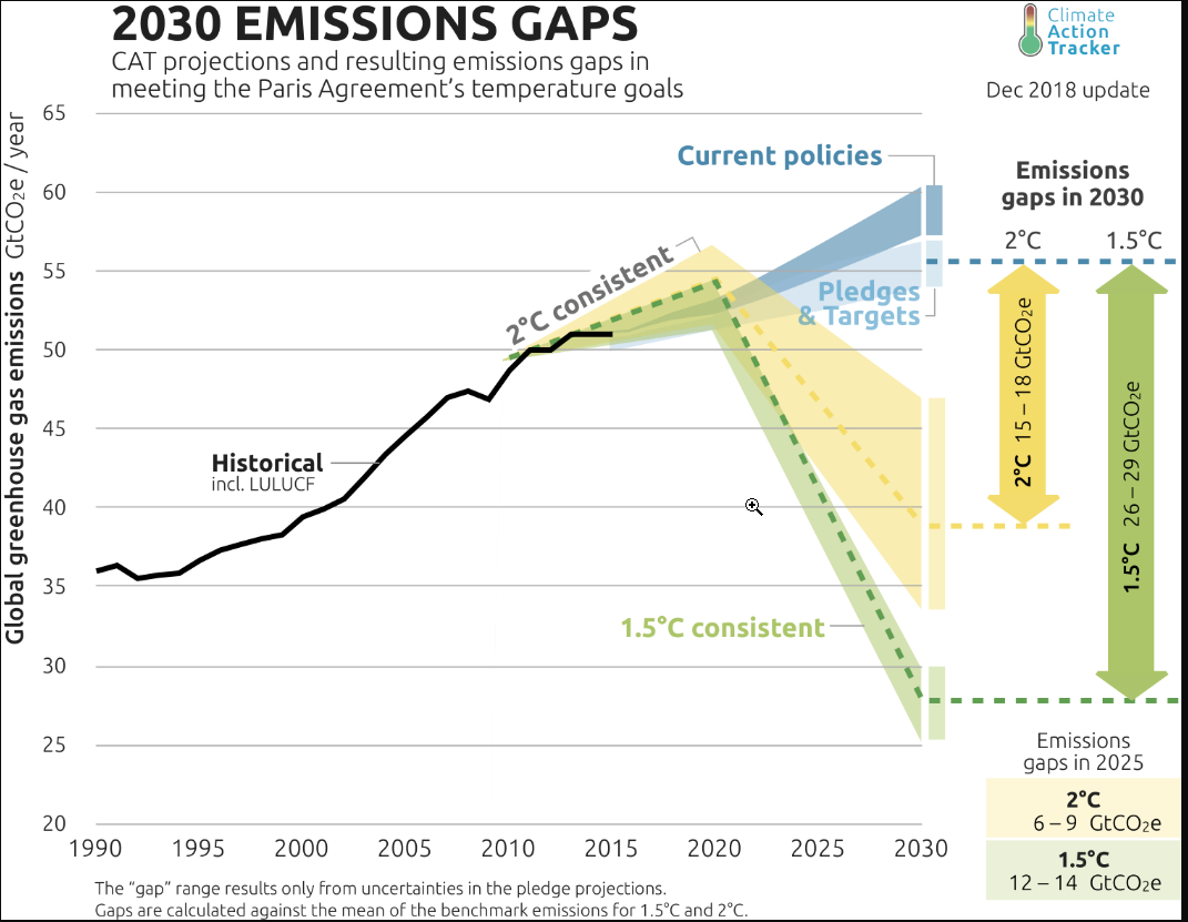
In a recent Amicus Brief it was stated that the Petroleum Industry was told
– CO2 would cause significant warming by the year 2000.
– Time was running out to save the world’s peoples from the catastrophic consequence of pollution.
The Amicus Brief does not mention
– The Presentation covered legislative impacts on the petroleum industry in the coming year, with a recommendation to prioritize according to the “thermometer of legislative activity”.
– The underlying report was on pollution in general.
– The report concluded CO2 emissions were not controllable at local or even the national level.
– The report put off taking action on climate change to around 2000, when it hoped “countervailing changes by deliberately modifying other processess” would be possible.
The Claim
In the previous post I looked at a recent Amicus Brief that is in the public domain.
In this post I look at the following statement.
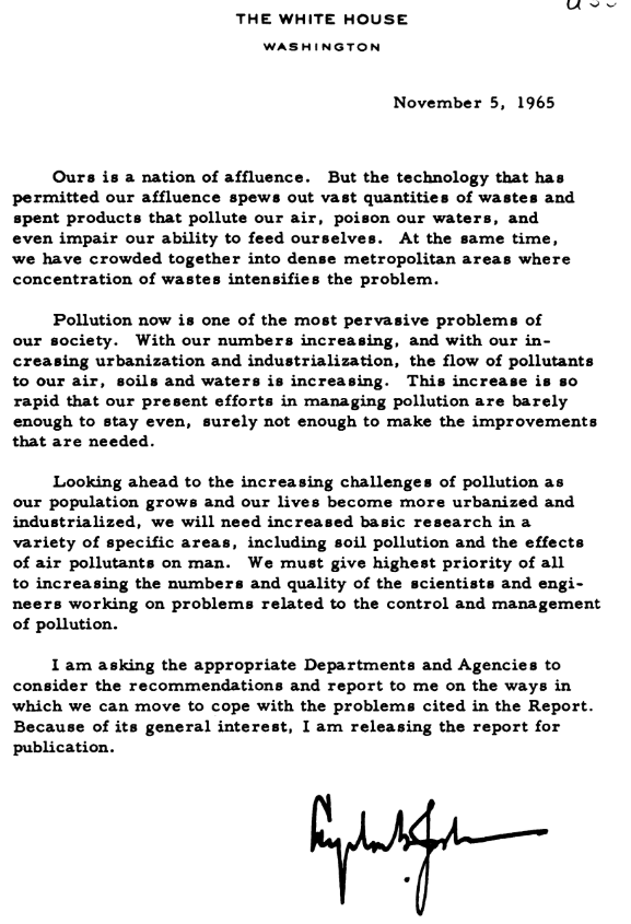
Then in 1965, API President Frank Ikard delivered a presentation at the organization’s annual meeting. Ikard informed API’s membership that President Johnson’s Science Advisory Committee had predicted that fossil fuels would cause significant global warming by the end of the century. He issued the following warning about the consequences of CO2 pollution to industry leaders:
This report unquestionably will fan emotions, raise fears, and bring demands for action. The substance of the report is that there is still time to save the world’s peoples from the catastrophic consequence of pollution, but time is running out.
The Ikard Presentation
Note 6 contains a link to the presentation
6. Frank Ikard, Meeting the challenges of 1966, Proceedings of the American Petroleum Institute 12-15 (1965), http://www.climatefiles.com/trade-group/american-petroleuminstitute/1965-api-president-meeting-the-challenges-of-1966/.
The warning should be looked at in context of the presentation.
– Starts with the massive increase in Bills introduced in the current Congress – more than the previous two Congresses combined.
– Government fact gathering
– Land Law Review
– Oil and Gas Taxation
– Air and Water Conservation where the alleged statement was made above.
– Conclusion
The thrust of the presentation is about how new legislation impacts on the industry. I have transcribed a long quotation from Air and Water Conservation section, where the “time is running out” statement was made.
Air and Water Conservation
The fact that our industry will continue to be confronted with problems of air and water conservation for many years to come is demonstrated by the massive report of the Environment Pollution Panel of the President’s Science Advisory Committee, which was presented to President Johnson over the weekend.
This report unquestionably will fan emotions, raise fears and bring demands for action. The substance of the report is that there is still time to save the world’s peoples from the catastrophic consequence of pollution, but time is running out.
One of the most important predictions of the report is that carbon dioxide is being added to the earth’s atmosphere at such a rate that by the year 2000 the heat balance will be so modified as possibly to cause marked changes in climate beyond local or even national efforts. The report further states, and I quote: “… the pollution from internal combustion engines is so serious, and is growing so fast, that an alternative nonpollution means of powering automobiles, buses and trucks is likely to become a national necessity.”
The report, however, does conclude that urban air pollution, while having some unfavourable effects, has not reached the stage where the damage is as great as that associated with cigarette smoking. Furthermore, it does not find that present levels of pollution in air, water, soils and living organisms are such as to be a demonstrated cause of disease or death in people: but it is fearful of the future. As a safeguard it would attempt to assert the right of man to freedom from pollution and to deny the right of anyone to pollute air, land or water.
There are more than 100 recommendations in this sweeping report, and I commend it to your study. Implementation of even some of them will keep local, state and federal legislative bodies, as well as the petroleum and other industries, at work for generations.
The scope of our involvement is suggested, once again, by the thermometer of legislative activity this past year. On the federal level, hearings and committee meetings relating to air and water conservation were held almost continuously. The results, of course, are the Water Quality Act of 1965 and an important amendment to the Clean Air Act of 1963.
My reading is that Ikard is referring to a large report on pollution as a whole, with more 100 recommendations, when saying “time is running out”. However, whether the following paragraph on atmospheric CO2 is related to the urgency claim will depend whether the report treats tackling pollution from atmospheric CO2 with great urgency. Ikard commends the report for study, prioritizing by the “thermometer of legislative activity”.
Further. this Amicus Brief was submitted by a group of academics, namely Dr. Naomi Oreskes, Dr. Geoffrey Supran, Dr. Robert Brulle, Dr. Justin Farrell, Dr. Benjamin Franta and Professor Stephan Lewandowsky. When I was at University, I was taught to read the original sources. In his presentation Frank Ikard also commends listeners to study the original document. Yet the Amicus Brief contains no reference to the original document. Instead, they make an opinion based on an initial opinion voiced just after publication.
1965 Report of the Environmental Pollution Panel
Nowadays, mighty internet search engines can deliver now-obscure documents more quickly than a professional researcher would think where to find the catalogues with a reference in a major library.
I found two sources.
First, from the same website that had the Ikard presentation – climatefiles.com.
http://www.climatefiles.com/climate-change-evidence/presidents-report-atmospher-carbon-dioxide/
As the filename indicates, it is not a copy of the full report. The contents include a letter from President Johnson; Contents; Acknowledgements; Introduction; and Appendix Y4 – Atmospheric Carbon Dioxide. Interestingly, it does not include “Climatic Effects of Pollution” on page 9.
Fortunately a full copy of the report is available at https://babel.hathitrust.org/cgi/pt?id=uc1.b4315678;view=1up;seq=5
I have screen-printed President Johnson’s letter and an extract of Page 9, with some comments.
President Johnson made a general reference to air pollution in general, but nothing about the specific impacts of carbon dioxide on climate. Page 9 is more forthcoming.
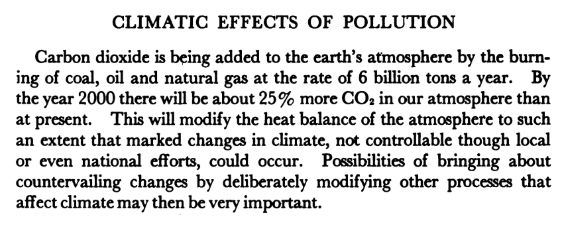
CLIMATIC EFFECTS OF POLLUTION
Carbon dioxide is being added to the earth’s atmosphere by the burning of coal, oil and natural gas at the rate of 6 billion tons a year. By the year 2000 there will be about 25% more CO2 in our atmosphere than at present. This will modify the heat balance of the atmosphere to such an extent that marked changes in the climate, not controllable though local or even national efforts, could occur. Possibilities of bringing about countervailing changes by deliberately modifying other processes that affect climate may then be very important.
The page 9 paragraph is very short. It makes the prediction that Ikard referred to in his presentation. By 2000, there could be “marked changes in climate not controllable though local or even national efforts”. I assume that there is a typo here, as “not controllable through local or even national efforts” makes more sense.
I interpret the conclusion, in more modern language, is as follows:-
The earth is going to warm significantly due to fossil fuel emissions, which might cause very noticeable changes in the climate by 2000. But the United States, the world’s largest source of those emissions, cannot control those emissions. Around 2000 there might be ways of controlling the climate that will counteract the impact of the higher CO2 levels.
Concluding Comments
Based on my reading of API President Frank Ikard’s presentation, he was not warning about the consequences of CO2 emissions when he stated
This report unquestionably will fan emotions, raise fears, and bring demands for action. The substance of the report is that there is still time to save the world’s peoples from the catastrophic consequence of pollution, but time is running out.
This initial interpretation is validated by the lack of urgency given in the report to rising tackling possible impacts of rising CO2 levels. Given that Ikard very clearly recommends reading the report, one would have expected over fifty years later for a group of scholars to follow that lead before formulating an opinion.
The report is not of the opinion that “time is running out” for combating the climatic effects of carbon dioxide. It further pushes taking action to beyond 2000, with action on climate seeming to be of a geo-engineering type, rather than adaptation. Insofar as Izard may have implied urgency with respect to CO2, the report flatly contradicts this.
The bigger question is why the report chose not to recommend taking urgent action at the time. This might inform why people of the time did not see rising CO2 as something for which they needed to take action. It is the Appendix Y4 (authored by the leading American climatologists at that time) that makes the case for the impact of CO2 and courses of action to tackle those impacts. In another post I aim to look at the report through the lens of those needing to be convinced.