Did Wivenhoe dam operators SEQwater swallow the CAGW hype on Australian Droughts?

The Australian “The Climate Sceptics Blog” takes a look at the Wivenhoe dam’s involvement in the catastrophic Queensland flood. I disagreed with the opinion that it might be sufficient to show that operators SEQwater did not undertake a proper, impartial risk assessment.


The question of having to prove the “AGW is not true” in the Wivenhoe case may be a little extreme.

Rather, they would need to show that the operators had a revised policy that gave due weighting to the Australian Government’s Report. I have only read the results. It says here quite clearly

“Observed trends in exceptionally low rainfall years are highly dependent on the period of analysis due to large variability between decades.”

In other words the results are not robust. This is not surprising. The report only looked at period of 40 years, so could say little about the frequency of once-in-a-generation extreme events. It does not say that floods will never occur again, like they have in the area since time immemorial.

If the authorities did not undertake a proper risk assessment of future scenarios based upon a balance of existing knowledge, and the report, then the change of purpose from flood management to reserve storage facility is flawed. This is unless there is near certainty that a climatic shift has occurred in a definite way. This was because

  1. The Report clearly stated that its results were not robust, AND did not predict that extreme rainfall would never happen again.
  2. There is a further complication that may hold. If there is not an extreme climatic shift (or only a partial one, or are in a slow transition from one state to another), then an area with extreme floods in the past will still likely have extreme floods in the future.
  3. Further, the lack of extreme floods for an extended period might pose a greater risk of extreme flooding in the immediate future.

This whole thing becomes a complex matter of balance of risks. That is why they should have solicited expert opinion on risk management from different perspectives, and tried to eliminate any corporate or individual biases. Furthermore, a risk management body should have publicly stated this change of use of the Wivenhoe Dam, so that householders could make adjustments to their risk portfolios.


These conclusions are based analysis of unfolding news reports hype on droughts and floods; the hype that exists for Catastrophic Anthropogenic Global Warming; and my developing analysis of Climate Change (see here, here and here) This comment is not intended as a legal opinion on the case, nor should it be taken as such.

A Climate Change / Global Warming Spectrum

In politics, most people’s views can be placed on a spectrum, when it comes to climate change / global warming there is no such perspectives. The views are often polarized, particularly by those who believe in a future climate catastrophe. This is an initial attempt at a grid aimed at clarifying the issues. Your constructive advice is sought on how this might be improved.

When there are contentious or politicized issues, a spectrum of opinions emerge where there is free discussion of ideas. This is true in politics and the Christian religion. In both, there is not just a one-dimensional spectrum of ideas, but multi-dimensional perspectives. For instance, in politics it has been argued that the left-right spectrum should be split into economic and moral issues. The United States Libertarian Party has had a simple survey running since 1995. A more comprehensive (but still American-orientated) survey is the Political Spectrum Quiz.

Another idea comes from Greg Craven, who did a series of zany You-Tube videos on Climate Change, particularly such as The Most Terrifying Video You’ll Ever See” and “How it all ends“. He claimed that for the mass of non-scientists it was best to take a risk-based approach, grading the science on the credibility of those who made the claims. One objection with his analysis was it was based on polar extremes. That is either the worst climate catastrophe imaginable, or it is all a hoax. I proposed that there was a spectrum of possible outcomes, with the apocalyptic catastrophe at one extreme and the null outcome at the other. Basically there is a spectrum of views.

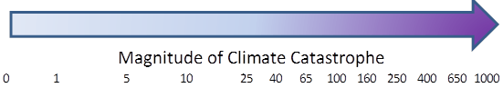
For this spectrum, the possible scenarios are from the null outcome on the left, rising to a huge climate catastrophe on the right.

Craven’s argument was to consider either 0 or 1000, whereas I claimed that the UNIPCC scenarios (representing the “consensus” of climate scientists), allowed for a fair range of outcomes. I have provided a log scale, as this puts clear distance between someone who believes in a low risk of catastrophe of extreme catastrophe to someone who says there is no risk at all. For instance, if someone believes that there is a 1% chance of the worst case, a 9% chance of loss of 100 and a 90% chance of a loss of 10, then their score would be 0.01*1000 + 0.09*100 + 0.90*10 = 28. In other words, for that person, especially if they are risk averse, there is still a very significant issue that should justify serious consideration of some type of global policy action.

But this measure of the prospective level of climate catastrophe needs to be based upon something. That something is scientific evidence, not people’s intuitions or gut feelings. If we imagine that the uncertainties can be measured as risks (as neoclassical economists do) then then the worst case scenario can only be attained if there is near certain, unambiguous scientific evidence in support of that prediction. If the evidence is weak statistically, gives highly variables results depending on methodology or data sets, or only tangential to the prediction, then a lower risk weighting lower than 1 will need to be ascribed. For an overall picture, we need to ascribe a weighting to the body of evidence. I propose a traffic light system. In outline green is for an overwhelming body of evidence, red is for no proper evidence whatsoever, and amber is for some weak evidence. Something along the following lines:-

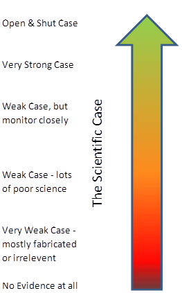
Basically, an unambiguous case for impending global catastrophe must have a substantial body of strong scientific evidence to substantiate that case, with little or no contrary evidence. I will develop on another day the analogy with evidence presented to a criminal court by the prosecution. However, for the present, an analogy that is relevant is that this conclusion is only reached once the evidence fails to fall over under independent cross-examination.

This gives us a grid with the magnitude of the climate catastrophe on the X axis, and the scientific case on the Y axis. The grid, with my first opinion of where people various groups are placed, is given below. I know it is controversial – the whole aim is to get people to start thinking constructively about their views.

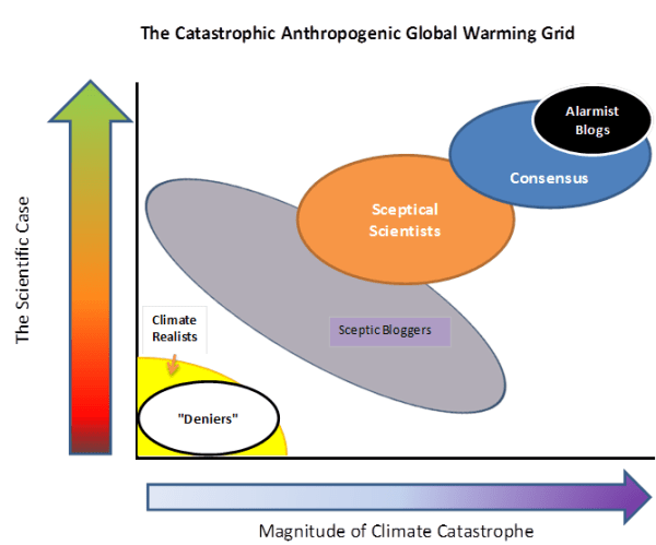
Alarmist Blogs (for instance Skeptical Science and Desmogblog) have an extreme black-and-white one world where they are always right, and anyone who disagrees is the polar opposite . “Deniers” is a bogeyman construct of their making.

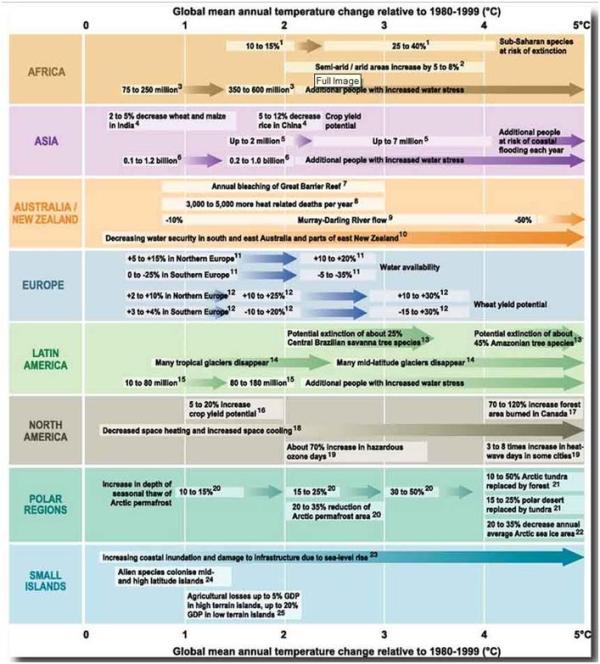
If one reads the detail of UNIPCC AR4 report, the “Consensus” of climate scientists allow for some uncertainties, and for scenarios which are not so catastrophic.

The more Sceptical Scientists, such as Richard Lindzen, Roger Pielke Snr and Roy Spencer, view increasing greenhouse gases as a serious issue for study. However, they view the evidence as being both much weaker than the “consensus” and pointing to a much less alarming future.

The most popular Sceptic Blogs, such as Wattsupwiththat, Climate Audit and Bishop Hill I characterise as having a position of “The stronger the evidence, the weaker the relevance“. That is they allow for a considerable spread of views, but neither dismiss rise in CO2 as of no consequence, nor claim that the available evidence is strong.

Finally, the Climate Realists such as Joanne Nova and the British Climate Realists website. They occupy a similar position as the “deniers”, but from a much more substantial position. They can see little or no evidence of catastrophe, but huge amounts of exaggeration dressed up as science.

What are your opinions? What position do you think you lie on the grid? Is there an alternative (and more informative) way of characterizing the different positions?

Cold water on sea level rise alarmism

The new article in Nature on “Recent contributions of glaciers and ice caps to sea level rise” (Jacob et al. 2012) is in stark contrast to what has gone before. It is far from the previous claims.

The main estimates before Jacob et al. 2012 were:-

  • The Himalayan Glaciers will disappear by 2035. (UNIPCC AR4 2007) Changed to the Himalayan Glaciers may disappear by 2350. (UNIPCC 2010)
  • The Grace Satellite data shows that the polar ice caps are not only melting, but the melt rate is accelerating. Velicogna 2009 claimed that the acceleration in Greenland was −30 ± 11 bnt/yr2 to 286 bnt/yr-1 in 2007 to 2009, and in Antarctica was −26 ± 14 bnt/yr2 to 246 bnt/yr-1 in 2007 to 2009. Concentrating on the period from 2006 to early 2009 for Antarctica only , Chen et al. 2009 estimated that the continent was losing ice at the rate of 190 ± 77 bnt/yr-1, two-thirds is of which comes from West Antarctica, covering about a quarter of the total land surface area. By 2010, the loss from both polar caps would, by Veligona’s estimate be 600 to 650 bnt/yr-1.
  • The average of these two articles was that in 2010 there would be around 600 bnt/yr-1 loss per year.
  • One of the articles’ authors, Prof John Wahr of University of Colarado, Boulder, had previously stated that the Grace measurements indicate an accelerating trend in Greenland. The current graph at Wahr’s website for Greenland shows a distinct accelerating trend through to the start of 2010.

    Mass variability summed over the entire Greenland Ice Sheet, monthly Gravity Recovery and Climate Experiment (GRACE) results (black line; the orange line is a smoothed version) April 2002 and December 2009.

    Prof John Wahl’s graph of Greenland Ice sheet loss, indicating a doubling of the rate of loss over the period to around 150 bnt/yr-1 in 2009.

  • In Zwally and Giovinetto 2011, using three separate estimation techniques, and including the pre-satellite data from 1992 to 2002, estimated the range of +27 to -40 bnt/yr-1.

The new paper in Nature:-

  • Estimates no net loss from the Himalayas in the period 2003 to 2010. When the claim that the Himalayas would lose their glaciers by 2035, Rajendra Pauchari, head of the UNIPCC said the doubts were “voodoo science”. Now even the more moderate claim of melting over hundreds of years looks to be in doubt. Josh has penned a cartoon to illustrate this point.

  • Velicogna 2009, seems somewhat extreme. The Nature paper would estimates a loss of 50% to 75% Velicogna estimate for 2010.
  • Most importantly, there is no mention of acceleration of ice melt from the polar ice caps. This sudden turn-around might be to a sudden change in the data. The sea level rise appears to have stalled in the last 18-24 months, so the sea ice melt (which the Nature paper estimates accounts for 40% of the sea level rise) may have stalled as well. (See Appendix 2). It is necessary to re-run the Nature paper numbers for 2011 data to confirm if this is the case.

In conclusion, it looks that the new nature paper reaches a more moderate position than previous papers using the GRACE satellite data, as it uses a longer period, and subjects the data to a more detailed breakdown. However, in terms of the polar ice melt, it still more extreme than a paper that uses a longer timeframe and three distinct methods of calculation.

Appendix 1 – Leo Hickman in the Guardian has a breakdown of the figures, that nicely puts the issue in context.

Glaciers
Ignore Region Rate (Gt yr-1)
1 Iceland -11.±.2
2 Svalbard -3.±.2
3 Franz Josef Land 0.±.2
4 Novaya Zemlya -4.±.2
5 Severnaya Zemlya -1.±.2
6 Siberia and Kamchatka 2.±.10
7 Altai 3.±.6
8 High Mountain Asia -4.±.20
8a Tianshan -5.±.6
8b Pamirs and Kunlun Shan -1.±.5
8c Himalaya and Karakoram -5.±.6
8d Tibet and Qilian Shan 7.±.7
9 Caucasus 1.±.3
10 Alps -2.±.3
11 Scandinavia 3.±.5
12 Alaska -46.±.7
13 Northwest America excl. Alaska 5.±.8
14 Baffin Island -33.±.5
15 Ellesmere, Axel Heiberg and Devon Islands -34.±.6
16 South America excl. Patagonia -6.±.12
17 Patagonia -23.±.9
18 New Zealand 2.±.3
19 Greenland ice sheet.+.PGICs -222.±.9
20 Antarctica ice sheet.+.PGICs -165.±.72
  Total -536.±.93
  GICs excl. Greenland and Antarctica PGICs -148.±.30
  Antarctica.+.Greenland ice sheet and PGICs -384.±.71
  Total contribution to SLR -1.48.±.0.26
  SLR due to GICs excl. Greenland and Antarctica PGICs -0.41.±.0.08
  SLR due to Antarctica.+.Greenland ice sheet and PGICs -1.06.±.0.19


Appendix 2 – University of Colarado Sea level Rise Estimates

Climate Change Impacts in AR5 – It is better than we thought

BishopHill has a screen shot of Climate change impacts for the new IPCC report. He notes the similarity to the AR4.

The differences are noticeable and demonstrate a subtle dilution of AR4.

First, the disappearing Himalayan Glaciers have disappeared – to be replaced by disappearing glaciers in Latin America.

Second, the potential disappearing Amazon forest has disappeared, to be replaced by tree species extinction.

Third, no mention of potential catastrophic losses of Antarctic sea ice or land ice. So that means that sea level rises are less of a problem.

Fourth, there is no mention of coastal storm damage. Roger Pielke Jnr has won the argument on hurricanes?

Fifth, species extinction is much more localised.

Sixth, global loss of wetlands reduced, to more seasonal coastal flooding in Asia. So that means that sea level rises are less of a problem.

Check out for yourselves.

2007 AR4

Which was developed from the Stern Review.

Climate Change Damage Impacts – A story embellished at every retelling

Willis Eschenbach has a posting on a recent paper on climate change damage impacts. This is my comment, with hyperlinks and tables.

My first reaction was “Oi– they have copied my idea!”

Well the damage function at least!

https://manicbeancounter.wordpress.com/2011/02/11/climate-change-policy-in-perspective-%E2%80%93-part-1-of-4/

Actually, this can be found by the claims of the Stern Review or AR4. Try looking at the table in AR4 of “Examples of impacts associated with global average temperature change” and you will get the idea.

A simpler, but more visual, perspective is gained from a slide produced for the launch of the Stern Review.

More seriously Willis, this is worse than you thought. The paper makes the claim that unlikely but high impact events should be considered. The argument is that the likelihood and impacts of potential catastrophes are both higher than previous thought. The paper then states

“Various tipping points can be envisaged (Lenton et al., 2008; Kriegler et al., 2009), which would lead to severe sudden damages. Furthermore, the consequent political or community responses could be even more serious.”

Both of these papers are available online at PNAS. The Lenton paper consisted of a group of academics specialising in catastrophic tipping points getting together for a retreat in Berlin. They concluded that these tipping points needed to include “political time horizons”, “ethical time horizons”, and where a “A significant number of people care about the fate of (a)

component”. That is, there is a host of non-scientific reasons for exaggerating the extent and the likelihood of potential events.

The Krieger paper says “We have elicited subjective probability intervals for the occurrence of such major changes under global warming from 43 scientists.” Is anybody willing to assess if the subjective probability intervals might deviate from objective probability intervals, and in which direction.

So the “Climate Change damage impacts” paper takes two embellished tipping points papers and adds “…the consequent political or community responses could be even more serious.”

There is something else you need to add into the probability equation. The paper assumes the central estimate of temperature rise from a doubling of CO2 levels is 2.8 degrees centigrade. This is only as a result of strong positive feedbacks. Many will have seen the recent discussions at Climateaudit and wattsupwiththat about the Spencer & Bracewell, Lindzen and Choi and Dessler papers. Even if Dessler is given the benefit of the doubt on this, the evidence for strong positive feedbacks is very weak indeed.

In conclusion, the most charitable view is that this paper takes an exaggerated view (both magnitude and likelihood) of a couple of papers with exaggerated views (both magnitude and likelihood), all subject to the occurrence of a temperature rise for which there is no robust empirical evidence.

Economic v Climate Models

Luboš Motl has a polemical look at the supposed refutation of a sceptics arguments. This is an extended version of my comment.

Might I offer an alternative view of item 30 – economic v climate models?

Economic models are different from climate models. They try to model empirical generalisations and (with a bit of theory & a lot of opinion) try to forecast future trends. They tend to be best over the short term when things are pretty much the same from one year to the next. The consensus of forecasts are pretty useless at predicting discontinuities in trends, such as the credit crunch. At there best their forecasts at little better than the dumb forecast that next period will be the same as last period. In general the accuracy of economic forecasts is inversely proportional to their utility.

Climate models are somewhat different according to Dr MacCracken.

“In physical systems, we do have a theory—make a change and there will be a response in largely understandable and calculatable ways. Models don’t replace theory; their very structure is based on our theoretical understanding, which is why they are called theoretical models. All that the computers do is to very rapidly make the calculations in accord with their theoretical underpinnings, doing so much, much faster than scientists could with pencil and paper.”

The good doctor omits to mention some other factors. It might be the case that climate scientists have all the major components of the climate system (though clouds are a significant problems), but he omits to include measurements. The interplay of complex factors can cause unpredictable outcomes depending on timing and extent, as well as the theory. The climate models, though they have a similarity of theory and extent, come up with widely different forecasts. Even this variation is probably limited by sense-checking the outcomes and making ad hoc adjustments. If the models are basically correct then major turning points should capable of being predicted. The post 1998 stasis in temperatures, the post 2003 stability in sea temperatures and the decline in hurricanes post Katrina are all indicators that models are overly sensitive. The novelty that the models do predict tend not to be there, but the novelties that do exist are not predicted.

If it is the case that climate models are still boldly proclaiming a divergency from trend, whilst economic models have much more modest in their claims, is this not an indicator of climate model’s superiority? It would be if one could discount the various economic incentives. Economic models are funded by competing in institutions. Some are private sector, and some are public sector. For most figures there is forecast verification monthly (e.g. inflation, jobs) or quarterly (growth). If a model were consistently an outlier if would lose standing, as the forecasts are evaluated against each other. If it was more accurate then the press would quote it, being good name placement for the organisation. In the global warming forecasts, there is not even an annual variation. The incentive is either to conform, or to provide more extreme (it is worse than we thought) prognostications. If the model projected basically said “chill-out, it ain’t that bad man”, they authors would be ostracized and called deniers. At a minimum the academics would lose status and ultimately lose out on the bigger research grants.

(A more extreme example is of a major earthquake forecast. “There will not be one today” is a very accurate prediction. In the case of Tokyo area over the last 100 years that would have been wrong only twice, an accuracy of greater than 1 in 10,000).

Another example of Censorship of Skeptics

The blog Zone5 (written by an environmentalist who is thoughtfully sceptical of global warming) has had an article taken down from what has been one of the more moderate pro-CAGW blogs. I left the following comment

The removal of your article is another small example of what you were writing about. Any attempt to offer counter arguments, or to criticize, is being shut down. This is true of blog comments or of peer-reviewed papers. But enough of the negative. Your article made some excellent points, particularly on Al Gore’s movie

First he misrepresents the science by claiming we are facing near certain doom, then he completely downplays the kind of changes we would have to make to prevent catastrophe if we accept the worst case scenario.

It is the crux of what I consider to be the problem of the climate change agenda. I believe there is quite strong science to back up the claim that a doubling of CO2 will cause about one degree of warming. Maybe the climate models are right, and this effect will be doubled or more by clouds feedbacks (though the virulence with which scientific papers that suggest otherwise have been attacked, and a similarly weak rebuttal suggesting the opposite praised greatly, suggests this is an Achilles heel). However, your comment on Al Gore’s film neatly summarises the issue in general. The potential effects of climate change are over-estimated in two ways – of magnitude and likelihood. The most important magnitude is time. For instance, the potential sea level rise is treated as if it would be in metres per year. So fast that large areas of land would be swamped before the harvest could be brought in. But even if global temperatures rose by five degrees in a generation (very unlikely), the resultant sea level rise would be sufficiently slow to relocate homes and agriculture, or to build dykes. People’s ability to adapt to rapidly to changes are remarkable, as emigrants from Britain to Australia (or from Asia to Britain) can testify, yet this is vastly underplayed.

The downplaying of effective policy issues is, if anything, even worse. It is assumed that with a little extra tax, everybody will switch to electric cars or bicycles, and plug a few drafts to cut heating bills by 90%. All this until we get a technological breakthrough in a few years to allow super-abundant carbon free power and near costless power. If Britain (or the EU) takes the lead, then everybody else will follow. No problem about over-running on costs, or pursuing the wrong type of green energy. No concern that a million or more families will enter fuel poverty every year, whilst still failing far behind on emissions reduction targets.

The overplay of risks / underplay of policy costs was put in a more sophisticated way in the Stern Review. I have attempted to analyse this at

https://manicbeancounter.wordpress.com/2011/02/11/climate-change-policy-in-perspective-%E2%80%93-part-1-of-4/

Please continue to encourage people to think for themselves and compare the various perspectives.

Is this another example of shutting down any sort of dissent, like the increasing dogmatism & extremism of sceptical science? (see here
here
here).

Feedbacks in Climate Science and Keynesian Economics

Warren Meyer posts of a parallel between Climate Science and Keynesian Economics. I posted about a subject close to his heart, and central to Keynesianism – Feedbacks. I have also attempted to update on the current debate on feedbacks.

Warren

There is a parallel between Keynes and the CAGW that is close to your heart – feedbacks. Pure Keynesianism is that an increase in government expenditure at less than full employment would have a positive feedback response. Keynes called the feedback measure the multiplier. (The multiplier is the reciprocal of the proportion of Government expenditure to GDP. So if government expenditure was 20% of GDP, then a $1bn fiscal boost would increase output by $5bn.)

By the 1950’s the leading sceptic was Milton Friedman who, in his 1962 book “Capitalism and Freedom”, estimated empirically that the multiplier was about 1 – that is it did not have any impact. Friedman was denounced as a denier and a dinosaur. (At the same time, mainstream economics adapted his verificationist methodology.) Indeed by the end of the 1960s it was generally agreed that the long-term feedback impact of government demand management was negative, as increased government expenditure crowded out the private sector, caused escalating inflation (as economic actors ceased to be fooled by the false signals 0f increased expenditure), slowed economic growth and generally undermined the very structures of the capitalist system. (see Friedman’s Nobel Prize lecture “Inflation and Unemployment“)

Keynesian thinking is that the capitalist economic system is inherently unstable. Stability is only achieved through the guiding hand of government. Keynes contrasted this with a caricature of neoclassical economics, with the macroeconomic system would rapidly come back into equilibrium. Similarly, the climate models assumption of chronic instability is contrasted by an extreme caricature of those who disagree with them. That is the “deniers” are saying that the climate is incredibly stable, with human beings having no influence. In both cases the consequence of this caricaturing is to automatically claim any extreme occurrence as vindification of their perspective.

The Positives of Global Warming in Context

David Friedman makes some good points about the positive aspects of global warming. I would like to put the positives of global warming into context and pointing the way to making the analysis of the consequences of global warming more rigorous.

The consequences of global warming may have positive and negative consequences. The severity of any consequence should be assessed according to three factors.

  1. Magnitude – how large it will be. This can be over a number of dimensions. So a predicted worsening of hurricanes, for instance, might be in frequency, power and area.
  2. Likelihood. The Probability of a forecast event it occurring.
  3. Randomness. It is predicted the weather systems will become destabilised, so the weather will become the norm.

When extreme events are postulated, the magnitude that is most often over-stated is time. So sea levels are imagined to rise by a foot a year, not a century at the current rate (3.2mm per year is the best estimate). The rate of change is crucial here. Incremental changes over generational times scale we will not notice globally, as economic conditions change much more rapidly than this. Also there are unstated assumptions about the likelihood of the events. From an economic point of view, the potential costs can be many times over-stated by a combination of magnitude and likelihood. There are two main reasons to believe this is the case – adaptation and way-markers.

Adaptation is people changing to changed circumstances. The reason that living standards are over 30 times greater and the world population is more than 10 times greater than 300 years ago is than the human race cannot just adapt to changing conditions – in wealthy countries extreme weather events and failed harvests are hardly a problem. Look back to the 1960s and 1970s, the mainstream forecasts were for increasing poverty and starvation. With the exceptions where governments are extremely bad (North Korea, Zimbabwe) or there has been extensive conflict (Zaire), this has not been the case. But many of the prophesies of doom assume no adaptation at all. So literally, farmers will grow the same crops they always have, and people will not think of moving as the sea immerses their houses.

Way-markers are the signals of climate change happening now. Many of the extreme short-term forecasts have been falsified, or shown to be based on pseudo-science. Sea levels have failed to rise by 25 metres anytime soon, the Arctic was not ice-free in the summer of 2008, nor will it be in 2013; the snows of Kilimanjaro are not primarily disappearing due to rising temperatures; and the Himalayan glaciers will not be gone by 2035. The Bangladesh landmass has increased; the Amazon rainforest is not about to reach a tipping point; and the Maldives will not disappear beneath the waves. With these clear near-term failures, it is reasonable to say that more long-term extrapolations will be unlikely and exaggerated in magnitude.

On the other side, whilst individuals and communities are incapable of adapting to changes, the assumption is that Governments can fix anything at minimal cost. So, subject to a global agreement, CO2 can be constrained (according to the UK Stern Review) at one fifth to one twentieth of the likely costs of doing nothing. No allowance is made that government projects tend to overrun on costs and underperform on benefits, nor that the this degree of underperformance tends to proportionately rise with lack of planning, vagueness of objections, complexity of organisations involved and scale.

Finally, for those with a grounding in economics, I have an unfinished project analysing the above issues graphically here and here.

A note on HADCRUT3 v GISSTEMP

Have just posted to WUWT the following on global temperature anomalies:-

Thanks Luboš for a well-thought out article, and nicely summarised by

“The “error of the measurement” of the warming trend is 3 times larger than the result!”

One of the implications of this wide variability, and the concentration of temperature measurements in a small proportion of the land mass (with very little from the oceans covering 70% of the globe) is that one must be very careful in the interpretation of the data. Even if the surface stations were totally representative and uniformly accurate (no UHI) and the raw data properly adjusted (Remember Darwin, Australia on this blog?), there are still normative judgements to be made to achieve a figure.

I have done some (much cruder) analysis comparing HADCRUT3 to GISSTEMP for the period 1880 to 2010, which helps illustrate these judgemental decisions.

1. The temperature series agree on the large fluctuations, with the exception of the post 1945 cooling – it happens 2 or 3 years later and more slowly in GISSTEMP.

2. One would expect greater agreement with recent data in more recent years. But since 1997 the difference in temperature anomalies has widened by nearly 0.3 celsius – GISSTEMP showing rapid warming and HADCRUT showing none.

3. If you take the absolute change in anomaly from month to month and average from 1880 to 2010, GISSTEMP is nearly double that of HADCRUT3 – 0.15 degrees v 0.08. The divergence in volatility reduced from 1880 to the middle of last century, when GISSTEMP was around 40% more volatile than HADCRUT3. But since then the relative volatility has increased. The figures for the last five years are respectively about 0.12 and 0.05 degrees. That is GISSTEMP is around 120% more volatile that HADCRUT3.

This all indicates that there must be greater clarity in the figures. We need the temperature indices to be compiled by qualified independent statisticians, not by those who major in another subject. This is particularly true of the major measure of global warming, where there is more than a modicum of partisan elements.

These graphs help illustrate the points made. Please note that I use overlapping moving averages, so it is for illustrative purposes only.

NB. Luboš Motl’s article was cross-posted from his blog here