NOAA Greenland Ice Sheet Report Card 2012 – False Statement on Ice Mass Balance Change

There is an error with my interpretation of the graph. Please see comment

On 14th January 2013, NOAA produced a 2012 report on the Greenland Ice Sheet by Box et al.

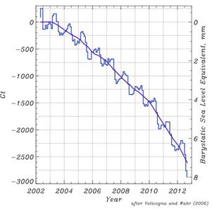
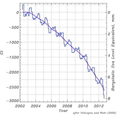
Under the section “Greenland Mass Changes from GRACE“, is contained the following graphic as Fig 5.19.


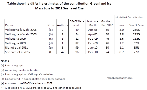
The Velicogna and Wahr 2006 citation should set alarm bells ringing for the following reasons.

  1. The paper only included observations to the end of April 2006. From 49 months of data the graph extrapolates a trend 74 months ahead.
  2. The title is “Acceleration of Greenland ice mass loss in spring 2004″. This should suggest that the authors found a discontinuity in the series bang slap in the middle of the data set. To quote the paper,

    A fit to the GRACE results for all Greenland before and after April 2004 yielded ice loss trends of 104 +/- 54 km3 yr-1 during April 2002–April 2004, and 342 +/- 66 km3 yr-1 during May 2004–April 2006.

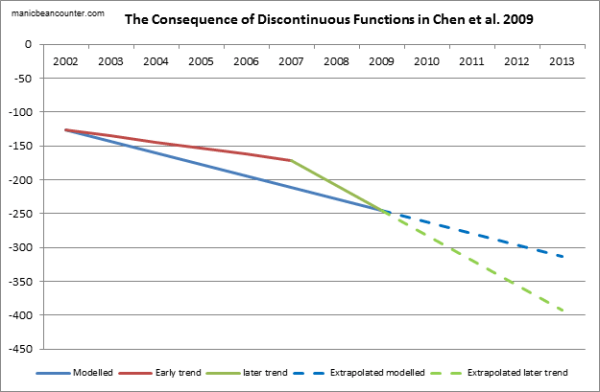
    That is the author’s found two functions. There is no quadratic function with 49 months of data to extrapolate, but two linear functions. The latter has just 24 months of data.

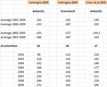
  3. The satellite is still operating, churning out data, and there are more recent scientific papers, with much better data. I have put some suggestions in a table below.
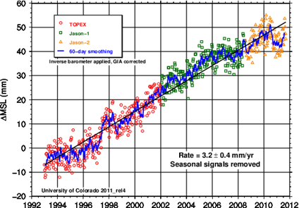
  4. Sea level rise trend has remained more or less linear at around 3.2mm per year over the last twenty years. So, if this graph is accurate, the contribution from Greenland ice melt has risen from 0% to 250% of the sea level rise in a decade. By implication, the contribution of all other factors (including Antarctica ice melt and cooling of the oceans) has slipped from 100% to -150% in the same period.


The Shepard paper has 47 authors, including Velicogna, Wahr, and 4 of the 5 contributors to Rignot 2011. Although only published weeks before the NOAA report card, John Wahr was an author on both.

Isabella Velicogna was co-author of both Rignot and Sheppard paper, but the Velicogna Research Group still posts up an updated graph from Velicogna 2009, in the full knowledge that that its 2012 predictions have been falsified by higher quality scientific papers that the professor has co-authored.

Finally, although the Shepard paper is likely to be the most accurate, total polar ice melt is modelled to have risen from 10% to 30% of sea level rise in 20 years. It would be an interesting exercise to try to reconcile the difference.

In summary, Fig 5.19 of the NOAA gives a modelled ice melt for Greenland Ice Sheet Report Card 2012 that is more than ten times the value of much more recent and higher quality data. Further, the expert on ice melt, John Wahr, was a co-author of the unpublished data, and therefore would have known that the graph did not fit experience. The other climate scientists should have enough knowledge of the rest of climatology to know that the graph was totally out of line with the consensus estimates of sea level rise.

Kevin Marshall

Rignot, E., I. Velicogna, M. R. van den Broeke, A. Monaghan, and J. Lenaerts (2011), Acceleration of the contribution of the Greenland and Antarctic ice sheets to sea level rise, Geophys. Res. Lett., 38,

Shepard et al. 2012. A Reconciled Estimate of Ice-Sheet Mass Balance, Science 338, 1183 (2012); DOI: 10.1126/science.1228102

Velicogna, I. (2009), Increasing rates of ice mass loss from the Greenland and Antarctic ice sheets revealed by GRACE, Geophys. Res. Lett., 36, L19503, doi:10.1029/2009GL040222

Velicogna, I. and J. Wahr. 2006. Acceleration of Greenland ice mass loss in spring 2004. Nature, 443(7109), 329-331. doi:10.1038/Nature05168.


Velicogna 2009 and Chen et al 2009 on Acceleration in Antarctic Ice Melt

This blog post started out as some musings on the different way of measuring the changes in the mass of Antarctic land ice, as a follow up to a couple of comments to Jo Nova’s posting “Antarctica gaining Ice Mass — and is not extraordinary compared to 800 years of data.” The problem with this is that it looks at just part of the total ice mass balance. These lead me to look at the major papers that looked to Total Mass Balance. There are two from 2009, using early data from the GRACE satellite gravity mission Velicogna and Chen et al. In comparing the various estimates, I discovered three anomalies that should have been detected as part of the peer review process.

Error in Velicogna Summary

The abstract notes

In Greenland, the mass loss increased from 137 Gt/yr in 2002–2003 to 286 Gt/yr in 2007–2009, i.e., an acceleration of −30 ± 11 Gt/yr2 in 2002–2009. In Antarctica the mass loss increased from 104 Gt/yr in 2002–2006 to 246 Gt/yr in 2006–2009, i.e., an acceleration of −26 ± 14 Gt/yr2 in 2002–2009.

When I tried to replicate this for Greenland, the figures worked out. Starting with 122 Gt/yr a year ice loss in 1992 and adding 30 to each year gives the “137 Gt/yr in 2002–2003 to 286 Gt/yr in 2007–2009“. But for Antarctica, adding 26 to each year cannot give “the mass loss increased from 104 Gt/yr in 2002–2006 to 246 Gt/yr in 2006–2009“. However, if the statement is rephrased with the Greenland timescales as “the mass loss increased from 104 Gt/yr in 2002–2003 to 246 Gt/yr in 2007–2009” then the numbers work out.


The spread sheet is easy to construct. For Velicogna Antarctica, start with -90 in 2002 and subtract 26 from the preceding year. The average uses the “=AVERAGE()” function in Excel.

So why did this dating error occur? There is no apparent reason in the Velicogna paper to use two different averages over such a short time frame. I might suggest that there is another reason. The two papers were published weeks apart (Velicogna 13th Oct and Chen 22nd Nov) and used the same data for Antarctica over similar periods (Velicogna Apr 02 – Feb 09 and Chen Apr 02 – Jan 09). The impact of both would be enhanced if they had comparative statistics. For instance Zwally & Giovinetto 2011 state

Table 2 includes two GRACE-based mass loss estimates of 104 Gt/year (Velicogna 2009) and 144 Gt/year (Chen et al. 2009) for the period 2002–2006 and two estimates of 246 Gt/year (Velicogna 2009) and of 220 Gt/year (Chen et al. 2009) for the period 2006–2009.

Correcting Velicogna, it becomes

Table 2 includes two GRACE-based mass loss estimates of 142 Gt/year (Velicogna 2009) and 144 Gt/year (Chen et al. 2009) for the period 2002–2006 and two estimates of 233 Gt/year (Velicogna 2009) and of 220 Gt/year (Chen et al. 2009) for the period 2006–2009.

That is, the two papers become far more consistent if the averages are corrected. It would appear that Velicogna changed the dates without doing the maths.

Form of the acceleration

Velicogna states in the abstract

We find that during this time period the mass loss of the ice sheets is not a constant, but accelerating with time, i.e., that the GRACE observations are better represented by a quadratic trend than by a linear one, implying that the ice sheets contribution to sea level becomes larger with time.

This quadratic trend is backed up by graphs on the NASA website (Antarctica) and NOAA websites (Greenland)


For ice melt Velicogna is stating that, not only would the trend be for each year to be greater than the previous year, but for the incremental increase to be greater than the last.

But, if ∂M is the change in ice mass, from the following functions were used in my spread sheet to replicate both Velicogna’s and Chen’s results.

For Velicogna 2009, Antarctica

∂M = -90 – 26(Year-2002)

For Velicogna 2009, Greenland

∂M = -122 + 30(Year-2002)

For Chen et al. 2009, Antarctica

∂M = -126 + 17(Year-2002)

These are all linear functions. I do not have access to Chen’s paper, but Velicogna’s abstract does not conform to her model.

Discontinuous functions in Chen et al. 2009

The abstract for Chen states

… our data suggest that East Antarctica is losing mass, mostly in coastal regions, at a rate of −57±52 Gt yr−1, apparently caused by increased ice loss since the year 2006.

Chen detection of increased ice loss is similar to Velicogna’s. But unlike Velicogna, Chen suggests that there is a discontinuous function. In other words, Chen’s graph would look like this.


Although it is possible to extrapolate from a discontinuous function, it would be highly misleading to do so. It suggests there is no underlying empirical relationship to be observed, in direct contradiction to Velicogna. Further, over a short period it is impossible to say whether this is the shift in the underlying rate of change in Antarctic melt, or if this new direction be quickly reversed. Fortunately, the two studies were published over three years ago, so there are alternative studies to compare the projection against. This will be the topic of the next post.

J. L. Chen, C. R. Wilson, D. Blankenship & B. D. Tapley Nature Geoscience 2, 859 – 862 (2009) Published online: 22 November 2009 doi:10.1038/ngeo694

Velicogna, I. (2009), Increasing rates of ice mass loss from the Greenland and Antarctic ice sheets revealed by GRACE, Geophys. Res. Lett., 36, L19503, doi:10.1029/2009GL040222

H. Jay Zwally, Mario B. Giovinetto (2011) Surveys in Geophysics September 2011, Volume 32, Issue 4-5, pp 351-376, Overview and Assessment of Antarctic Ice-Sheet Mass Balance Estimates: 1992–2009 10.1007/s10712-011-9123-5

Cold water on sea level rise alarmism

The new article in Nature on “Recent contributions of glaciers and ice caps to sea level rise” (Jacob et al. 2012) is in stark contrast to what has gone before. It is far from the previous claims.

The main estimates before Jacob et al. 2012 were:-

  • The Himalayan Glaciers will disappear by 2035. (UNIPCC AR4 2007) Changed to the Himalayan Glaciers may disappear by 2350. (UNIPCC 2010)
  • The Grace Satellite data shows that the polar ice caps are not only melting, but the melt rate is accelerating. Velicogna 2009 claimed that the acceleration in Greenland was −30 ± 11 bnt/yr2 to 286 bnt/yr-1 in 2007 to 2009, and in Antarctica was −26 ± 14 bnt/yr2 to 246 bnt/yr-1 in 2007 to 2009. Concentrating on the period from 2006 to early 2009 for Antarctica only , Chen et al. 2009 estimated that the continent was losing ice at the rate of 190 ± 77 bnt/yr-1, two-thirds is of which comes from West Antarctica, covering about a quarter of the total land surface area. By 2010, the loss from both polar caps would, by Veligona’s estimate be 600 to 650 bnt/yr-1.
  • The average of these two articles was that in 2010 there would be around 600 bnt/yr-1 loss per year.
  • One of the articles’ authors, Prof John Wahr of University of Colarado, Boulder, had previously stated that the Grace measurements indicate an accelerating trend in Greenland. The current graph at Wahr’s website for Greenland shows a distinct accelerating trend through to the start of 2010.

    Mass variability summed over the entire Greenland Ice Sheet, monthly Gravity Recovery and Climate Experiment (GRACE) results (black line; the orange line is a smoothed version) April 2002 and December 2009.

    Prof John Wahl’s graph of Greenland Ice sheet loss, indicating a doubling of the rate of loss over the period to around 150 bnt/yr-1 in 2009.

  • In Zwally and Giovinetto 2011, using three separate estimation techniques, and including the pre-satellite data from 1992 to 2002, estimated the range of +27 to -40 bnt/yr-1.

The new paper in Nature:-

  • Estimates no net loss from the Himalayas in the period 2003 to 2010. When the claim that the Himalayas would lose their glaciers by 2035, Rajendra Pauchari, head of the UNIPCC said the doubts were “voodoo science”. Now even the more moderate claim of melting over hundreds of years looks to be in doubt. Josh has penned a cartoon to illustrate this point.

  • Velicogna 2009, seems somewhat extreme. The Nature paper would estimates a loss of 50% to 75% Velicogna estimate for 2010.
  • Most importantly, there is no mention of acceleration of ice melt from the polar ice caps. This sudden turn-around might be to a sudden change in the data. The sea level rise appears to have stalled in the last 18-24 months, so the sea ice melt (which the Nature paper estimates accounts for 40% of the sea level rise) may have stalled as well. (See Appendix 2). It is necessary to re-run the Nature paper numbers for 2011 data to confirm if this is the case.

In conclusion, it looks that the new nature paper reaches a more moderate position than previous papers using the GRACE satellite data, as it uses a longer period, and subjects the data to a more detailed breakdown. However, in terms of the polar ice melt, it still more extreme than a paper that uses a longer timeframe and three distinct methods of calculation.

Appendix 1 – Leo Hickman in the Guardian has a breakdown of the figures, that nicely puts the issue in context.

Glaciers
Ignore Region Rate (Gt yr-1)
1 Iceland -11.±.2
2 Svalbard -3.±.2
3 Franz Josef Land 0.±.2
4 Novaya Zemlya -4.±.2
5 Severnaya Zemlya -1.±.2
6 Siberia and Kamchatka 2.±.10
7 Altai 3.±.6
8 High Mountain Asia -4.±.20
8a Tianshan -5.±.6
8b Pamirs and Kunlun Shan -1.±.5
8c Himalaya and Karakoram -5.±.6
8d Tibet and Qilian Shan 7.±.7
9 Caucasus 1.±.3
10 Alps -2.±.3
11 Scandinavia 3.±.5
12 Alaska -46.±.7
13 Northwest America excl. Alaska 5.±.8
14 Baffin Island -33.±.5
15 Ellesmere, Axel Heiberg and Devon Islands -34.±.6
16 South America excl. Patagonia -6.±.12
17 Patagonia -23.±.9
18 New Zealand 2.±.3
19 Greenland ice sheet.+.PGICs -222.±.9
20 Antarctica ice sheet.+.PGICs -165.±.72
  Total -536.±.93
  GICs excl. Greenland and Antarctica PGICs -148.±.30
  Antarctica.+.Greenland ice sheet and PGICs -384.±.71
  Total contribution to SLR -1.48.±.0.26
  SLR due to GICs excl. Greenland and Antarctica PGICs -0.41.±.0.08
  SLR due to Antarctica.+.Greenland ice sheet and PGICs -1.06.±.0.19


Appendix 2 – University of Colarado Sea level Rise Estimates