My forecast for the Welsh Council Elections in terms of percentage share of the vote compared to 2012 are Labour -7%, Conservative +3%, Independents +1%, Plaid Cymru +1% and Lib-Dems +1-2%. In terms of seats, Labour -150 to -160, Conservative +80, with the others gaining 70 to 80 seats.
My previous two posts looked at a forecast for the forthcoming local elections in the English County and Unitary Councils. On 4th of May there will also be significant local elections in Wales and Scotland. With respect to Wales, there is good background in a briefing at Britain Elects. Of note
- All 22 councils are up for election. In 2012 there were 21 councils elections, with Anglesey (Ynys Mon) having its last elections in 2013.
- There are 1234 seats for election, of which Labour hold 46 per cent and Independents hold 24 per cent.
- Plaid Cymru are next with 14 per cent of seats.
- Labour are the biggest party in 14 of the 22 councils and control 10, all in the South.
- Labour gained over 200 seats in 2012 and control of 8 councils.
- Independents are the biggest grouping on 4 councils, and form majorities in Powys and Pembrokshire.
To put this in a little more context, consider Wikipedia’s summary of the 21 council results from 2012, reproduced as Figure 1.
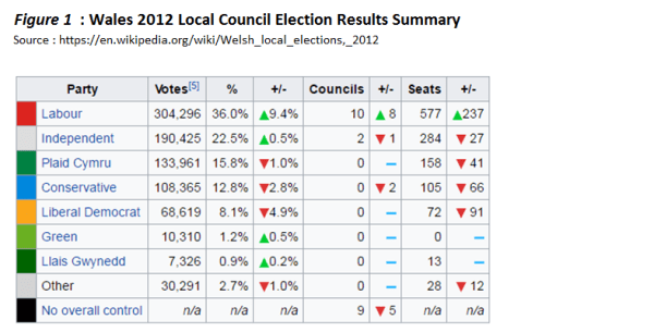
Compared with 2008, 2012 was a very good result for Labour. Their percentage gain in seats was about twice the 9.4% increase in the share of the vote. The biggest losses were by the Lib Dems, losing over half their council seats, but the Conservatives and Plaid Cymru also lost significant numbers as well. To put this in context, from LGC Elections Centre Report “Local Elections in Wales 2008” – Colin Rallings and Michael Thrasher I have reproduced two tables as Figure 2.
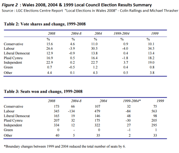
The Independents and Plaid Cymru appear to have fairly stable shares of the vote and numbers of seats. From 1999 to 2008 both Labour in Government slipped in its share of the vote, effectively regaining the 1999 in 2012. In the same period the Liberal Democrats held had the similar vote shares , but increased their number of seats. In 2012 they took a nosedive in both vote share and seats. The Conservatives made headway whilst in opposition, from a low base reached in the 1990s.
Recent Opinion polls
UK Political Info has General Election poll tracker going back to 2010. UK polls show fair stability from 2010 to 2016 when compared with the gap that has opened up after the EU Referendum. Labour were mostly ahead up to 2015, and regained the poll lead in the period around the Welsh Assembly elections in May 2016. At the time of the last elections in 2012 the Labour lead was 5-8% ahead of the Conservatives. After the Referendum Labour have trailed the Conservatives by an increasing amount. In the last couple of months that gap has been around 16-18%. It seems inconceivable that this huge should not have some impact on the Welsh local elections. ICM opinion polls for the Guardian split out the poll for Wales. This component is usually questioning less than 100 people, and shows highly variable results. However, in the six polls so far this year, the gap between Labour and Conservatives is far smaller than in the actual result in the local elections of 2012, yet there are no Independents. However, local factors may play a big role.
Forecast
In this forecast I will make some bold assumptions and give some fairly precise figures. In so doing any variances from my estimates can give a greater understanding of the underlying changes in a period of political turmoil. I will proceed in ascending order of impact.
UKIP are unlikely to gain any seats, despite grabbing 12.5% of the vote and 7 regional seats in the Welsh Assembly Elections just 12 months before. See Table 1. The party is in turmoil following the resignations of its only MP Douglas Carswell and AM Mark Reckless crossing to the Conservatives.
The Liberal Democrats slipped quite badly in 2012. They may gain 1-2% of the vote share and 20-30 seats. They may do quite well in Cardiff and Swansea, where they already have a few seats, and where there was quite strong support for Remain in the EU Referendum.
The Independents and Plaid Cymru I expect to gain respectively a 23% and 17% share of the vote and 300 and 200 seats. These are small gains of about 25 seats each if Ynys Mon is included.
The leaves the two large Westminster parties to share just under half the vote, if the minor parties are included. Like in previous Welsh local elections I expect to the greatest volatility being between Labour and the Conservatives.
Based on the National opinion polls I forecast the best result for the Conservatives in over twenty years, achieving 16% of the vote and a gain of about 80 seats. This is only fractionally higher than in 2008.
By difference I forecast the Labour Party to see a reduction in their vote share of 7% to 29%, and the loss of 150-160 seats.
The Forecast in context
There are two ways to look at the forecast. First in relation to other forecasts and second in relation to opinion polls.
Conservative peer Robert Hayward has forecast across In England for Labour to lose 125 seats and Conservatives to gain about 100. I have forecast Labour to lose more and the Conservatives gain slightly less in Wales with half the number of seats being fought over. Yet in the context of the change between 2008 and 2012/3, the change is smaller. I forecast Labour to lose two-thirds of the gains they made in the previous elections. Yet the party is more unpopular than in 2008, and also quite split over policy and direction the party should take. In no other major political party would nearly 80% of elected representatives vote no confidence in the leader and then a few months down the line both those representatives and the leader still hold office, carrying on as if nothing had happened. Conversely the Conservatives are more popular than in 2008, and have a confidence, sense of purpose and party unity that is stronger than at any time in the last 30 years.
Kevin Marshall