There is an error with my interpretation of the graph. Please see comment
On 14th January 2013, NOAA produced a 2012 report on the Greenland Ice Sheet by Box et al.
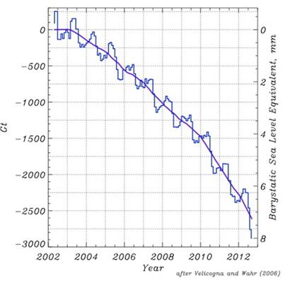
Under the section “Greenland Mass Changes from GRACE“, is contained the following graphic as Fig 5.19.
The Velicogna and Wahr 2006 citation should set alarm bells ringing for the following reasons.
- The paper only included observations to the end of April 2006. From 49 months of data the graph extrapolates a trend 74 months ahead.
-
The title is “Acceleration of Greenland ice mass loss in spring 2004″. This should suggest that the authors found a discontinuity in the series bang slap in the middle of the data set. To quote the paper,
A fit to the GRACE results for all Greenland before and after April 2004 yielded ice loss trends of 104 +/- 54 km3 yr-1 during April 2002–April 2004, and 342 +/- 66 km3 yr-1 during May 2004–April 2006.
That is the author’s found two functions. There is no quadratic function with 49 months of data to extrapolate, but two linear functions. The latter has just 24 months of data.
- The satellite is still operating, churning out data, and there are more recent scientific papers, with much better data. I have put some suggestions in a table below.
-
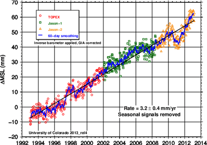
Sea level rise trend has remained more or less linear at around 3.2mm per year over the last twenty years. So, if this graph is accurate, the contribution from Greenland ice melt has risen from 0% to 250% of the sea level rise in a decade. By implication, the contribution of all other factors (including Antarctica ice melt and cooling of the oceans) has slipped from 100% to -150% in the same period.
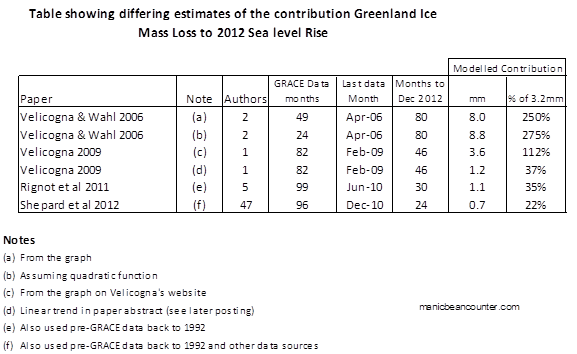
The Shepard paper has 47 authors, including Velicogna, Wahr, and 4 of the 5 contributors to Rignot 2011. Although only published weeks before the NOAA report card, John Wahr was an author on both.
Isabella Velicogna was co-author of both Rignot and Sheppard paper, but the Velicogna Research Group still posts up an updated graph from Velicogna 2009, in the full knowledge that that its 2012 predictions have been falsified by higher quality scientific papers that the professor has co-authored.
Finally, although the Shepard paper is likely to be the most accurate, total polar ice melt is modelled to have risen from 10% to 30% of sea level rise in 20 years. It would be an interesting exercise to try to reconcile the difference.
In summary, Fig 5.19 of the NOAA gives a modelled ice melt for Greenland Ice Sheet Report Card 2012 that is more than ten times the value of much more recent and higher quality data. Further, the expert on ice melt, John Wahr, was a co-author of the unpublished data, and therefore would have known that the graph did not fit experience. The other climate scientists should have enough knowledge of the rest of climatology to know that the graph was totally out of line with the consensus estimates of sea level rise.
Kevin Marshall
Rignot, E., I. Velicogna, M. R. van den Broeke, A. Monaghan, and J. Lenaerts (2011), Acceleration of the contribution of the Greenland and Antarctic ice sheets to sea level rise, Geophys. Res. Lett., 38,
Shepard et al. 2012. A Reconciled Estimate of Ice-Sheet Mass Balance, Science 338, 1183 (2012); DOI: 10.1126/science.1228102
Velicogna, I. (2009), Increasing rates of ice mass loss from the Greenland and Antarctic ice sheets revealed by GRACE, Geophys. Res. Lett., 36, L19503, doi:10.1029/2009GL040222
Velicogna, I. and J. Wahr. 2006. Acceleration of Greenland ice mass loss in spring 2004. Nature, 443(7109), 329-331. doi:10.1038/Nature05168.

daddyjames
/ 26/06/2013You compare two different values with one another.
NOAA report http://www.arctic.noaa.gov/reportcard/greenland_ice_sheet.html
states that the Greenland ice sheet contributed +8.0 mm to the global averaged sea level rise since 2002. This is the sea level as measured in height averaged from various places around the globe.
This is not the rate (how fast it is changing) that global averaged sea level is changing each year.
Using your own calculations:
Sea level is changing at a rate of 3.2mm per year.
Given 10 years, 2002-2012, that would be a sea level rise of +32 mm.
Which would mean that the contribution from the Greenland ice sheet would be 8mm/32mm or only 25%.
Not the 250% you claim.
Greenland’s contribution to the rate of change in mean sea level rise over the same time period (2002-2012) would be 8mm/10 = 0.8mm/yr
Using you calculated rate of sea level change per year: 3.2mm/yr
The contribution to the rate of change in sea level rise for the past 10 years would still be 25%, not the 250% you claim.
A simple mistake.
manicbeancounter
/ 27/06/2013Posted at WUWT
Further to earlier comment, the source of my confusion is the between this statement in Velicogna and Wahr 2006:-
This after having earlier read the later papers like Rignot et al 2011, which states:-
The earlier paper did not state acceleration, but a step change in annual rate. I saw acceleration in the graph and therefore saw acceleration in the words. Unfortunately I had not cross-checked the words in the paper with the maths. I apologise again for the confusion caused.
However, even as a cumulative, the graph appears to show a year-on-year acceleration. From the statement above, the total change over the 4 year period is 2(-104-342) = -892. Multiply this by 10/4 and you get a cumulative decadal loss of -2230 on the graph. In mid-2006 the hand-drawn trend is around -700. The last 4 years (mid- 2008 to mid-2012) have a cumulative loss of about double that. Therefore, although I have mistaken annual for cumulative, there are still two sub-issues here I state in a longer article on my blog.
First is about using old research, when more recent and higher quality research is available. This is particularly the case when projecting forward from actual data. Second, is about observing discontinuities in a short period, and modelling a trend. Like many other aspects of climate, changes in ice mass are hugely difficult to measure and highly variable year-on-year.
Kevin Marshall